Functionalist building rises to new glory
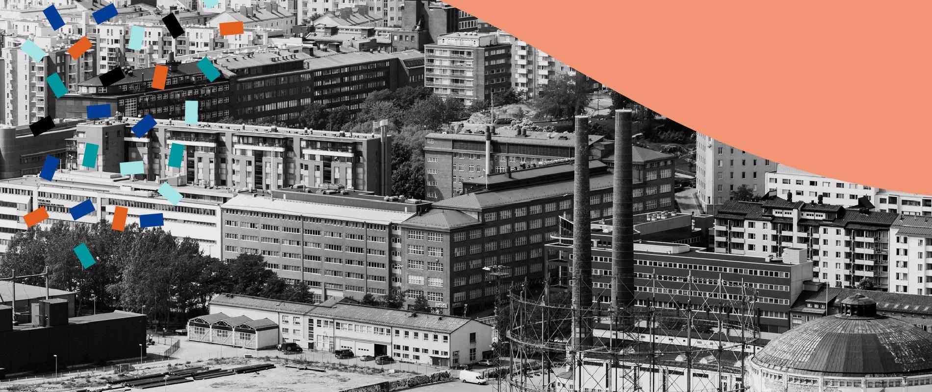
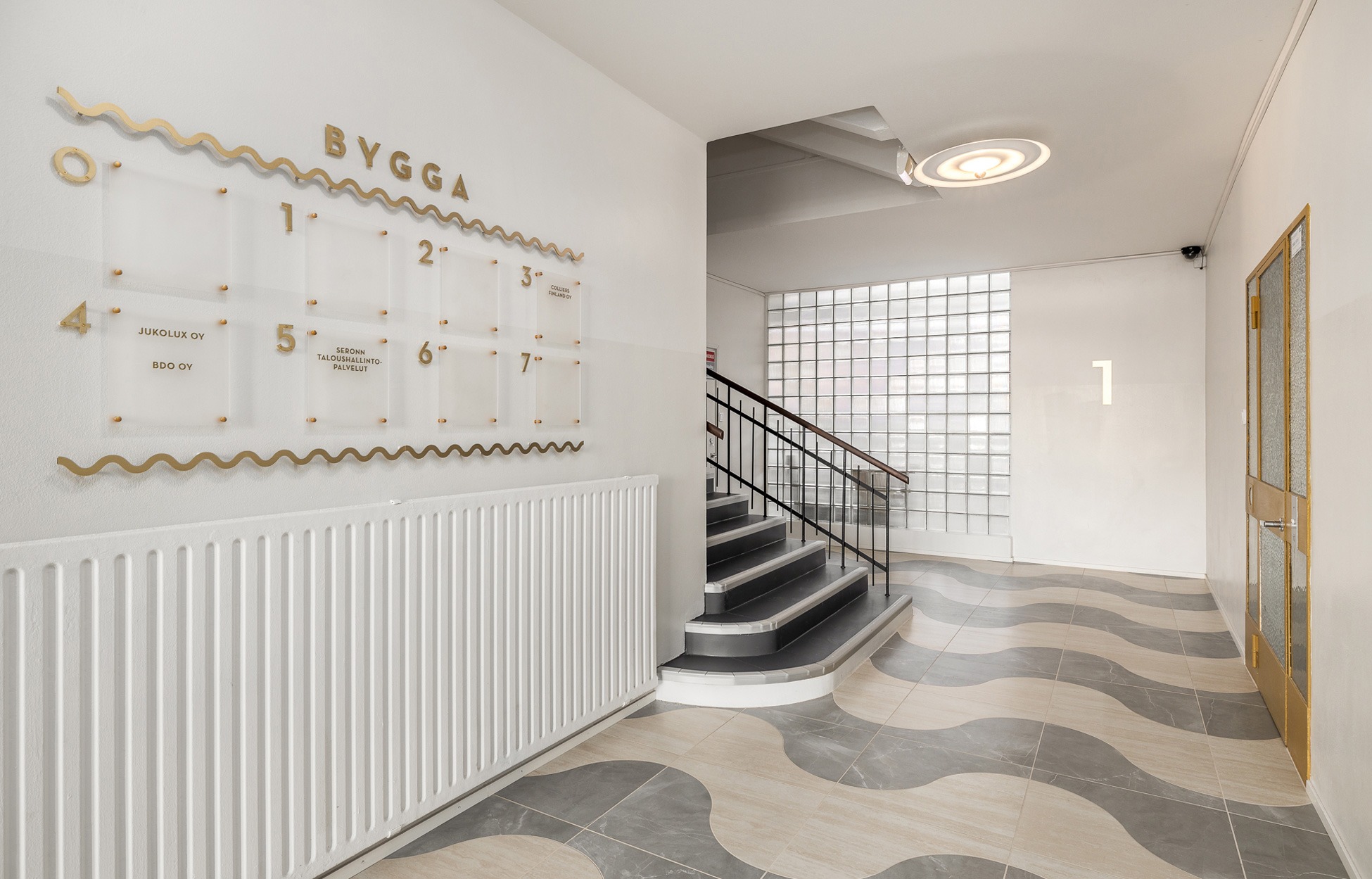
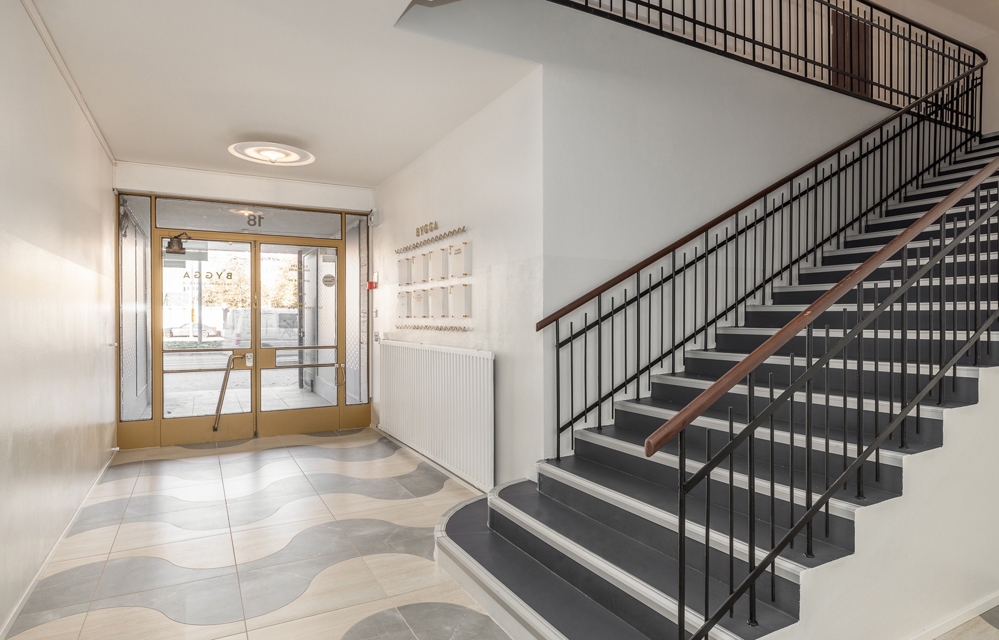
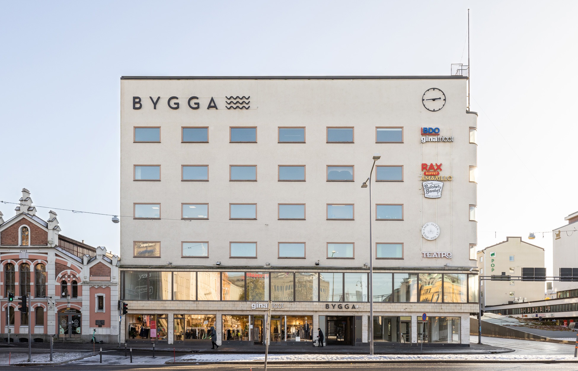
Located at Vaasa Market Square, Hallintalo is one of the most famous functionalist buildings in the city. It is the first work of the famous architect Viljo Revell from 1939. The building has been a prominent feature of the Vaasa cityscape for decades, and it was renovated respecting the layers of its rich history. The illuminated facade logo, the large wall clock that was inspired by Hercule Poirot and the wave-patterned flags that serve as reference to the nearby sea ensure that the building can be seen from afar. Indoors, the renovated lobbies and stairwells combine features typical of functionalism: simplicity, airiness and circular forms.
Photos Christoffer Björklund
Bygga – more attractive than ever
VVT Kiinteistösijoitus acquired Hallintalo, a building comprised of commercial premises and office space, in 2016. The aim of the project was to raise Hallintalo, or as it is nowadays called, Bygga, to new glory and ensure its attractiveness also on the contemporary real estate market. “The surfaces of this property, which was built in the 1930s, needed updating to improve its rentability. The aim was to honour the existing functionalist elements with a modern twist,” says Jere Fredriksson from VVT Kiinteistösijoitus. “The building has a strong history, and it has been important for the city’s residents in many ways. In order to maintain and renew the value of the centrally located property, some branding work was required,” says Johanna Happonen, Lead Designer for the project.

The design of the property’s own brand was guided by the following themes, which were defined together with the VVT employees:
- renewable, contemporary icon
- visible and present
- known landmark
- style conscious
- meeting place
- Swedish-speaking Finns
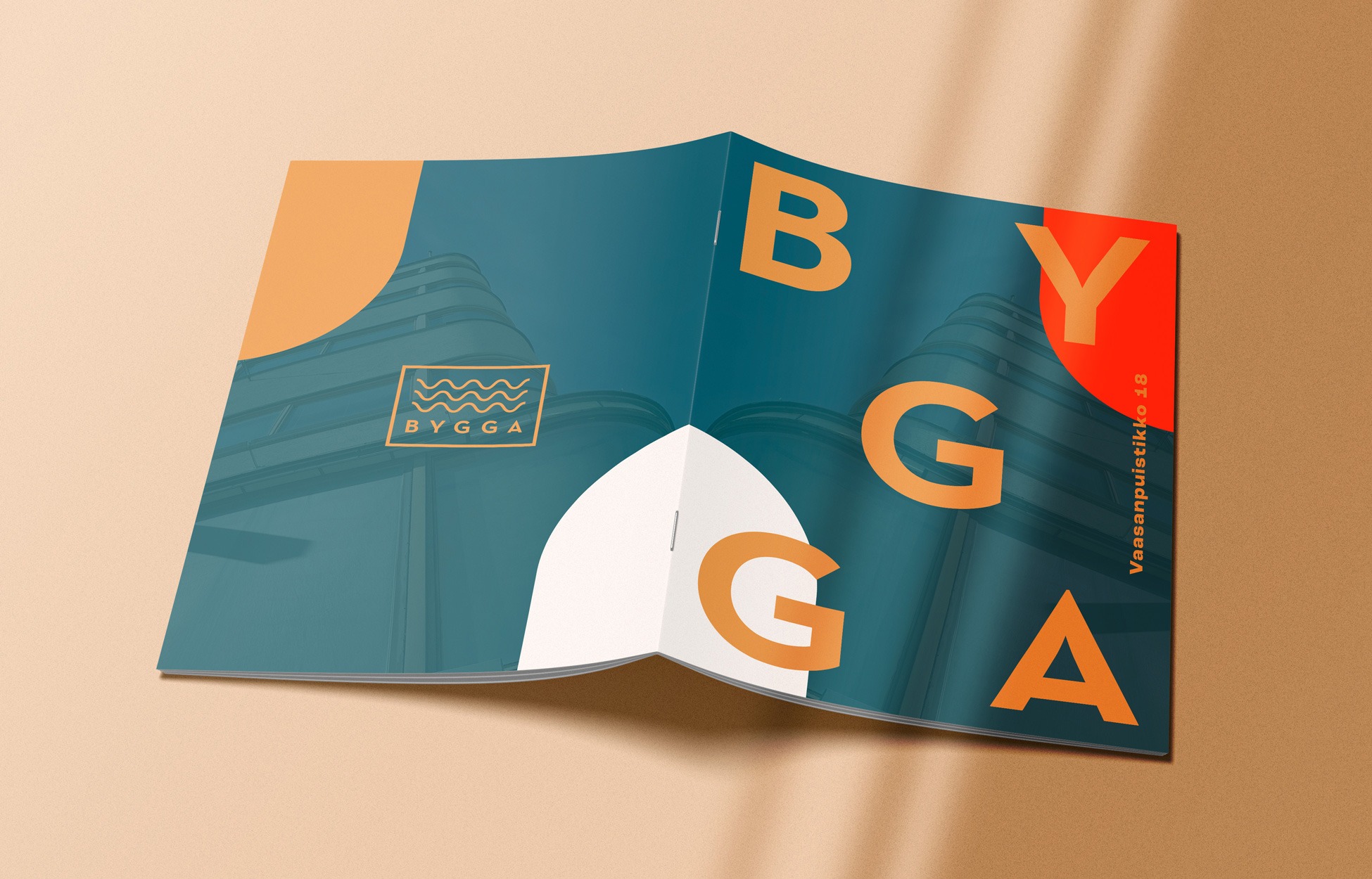
Rune & Berg Design was responsible for the property’s branding, which included the conceptualisation of graphic and spatial elements for the facade, lobbies and stairwells, as well as the planning of their implementation. In addition, we summarised the interior design concept into a concept manual and a brochure that the customer can use when renting the property. “The project and the process went well, we could find a shared understanding easily and the customer’s wishes were well respected. The good thing was that instead of just talking about physical space, we discussed the overall brand. You were a “one stop shop” that provided everything we needed,” Jere says, describing the contents and smoothness of the project.
Harmonious experience outdoors and indoors
The creation of the brand began with the history of the building, its architecture and its relationship with the environment. As the building is such a fine example of functionalism and has a central location in Vaasa, the entire property follows the principles of functionalism. “In terms of form, the entire look and feel is functional, right down to the smallest details. We sought inspiration not only from Revell’s other work but also, for example, from the early functionalist visual elements of the original Hercule Poirot opening credits,” says Riikka Kuukka, AD.
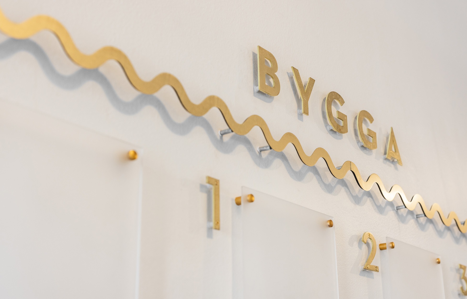
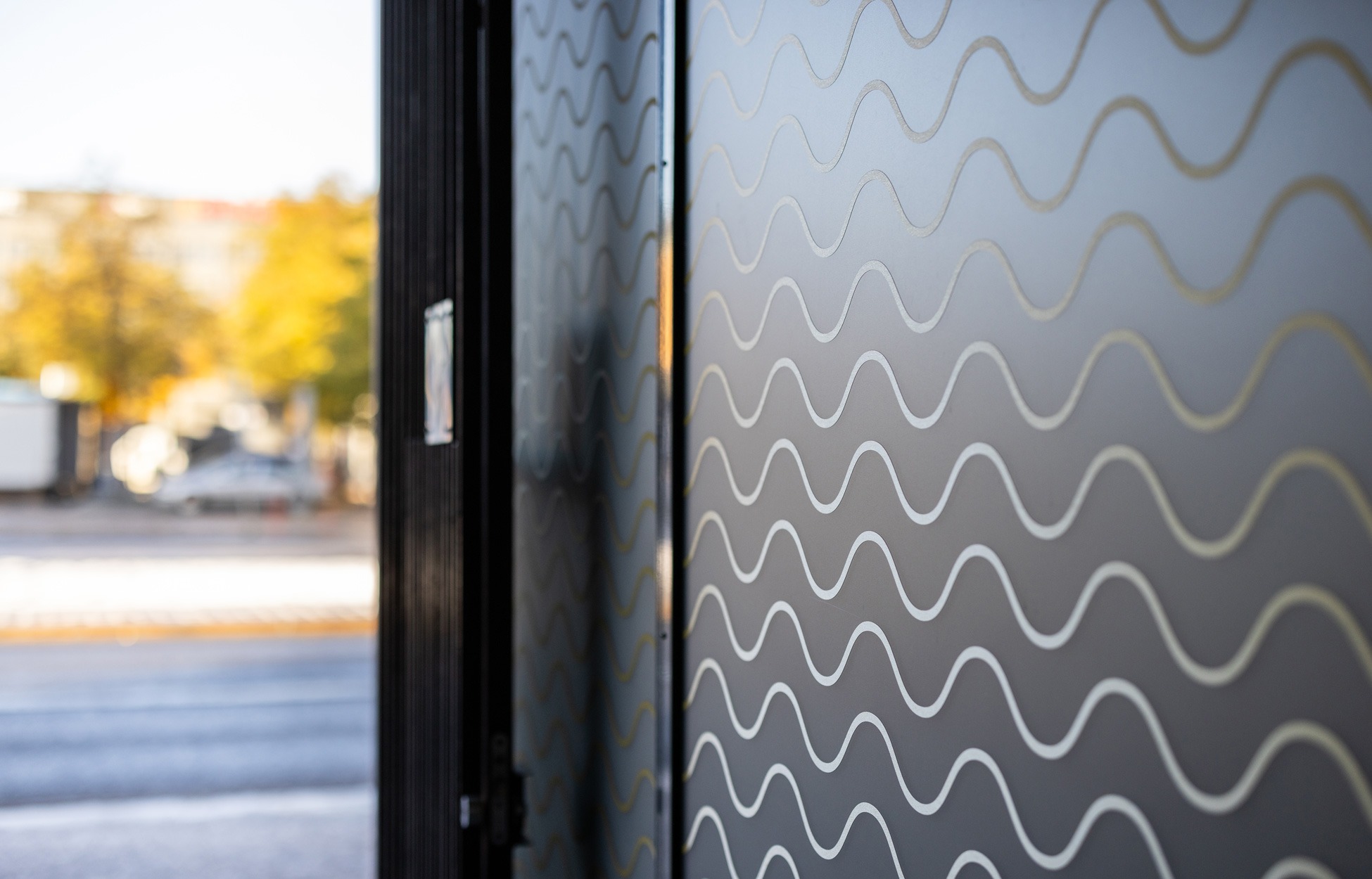
The facade’s simple but easily visible “Bygga” logo was paired with wave-like patterns that refer to the location’s proximity to the sea and the circular forms typical of functionalism. There is also a famous clock outside the property, which the local residents use for checking the time when meeting someone on the market square or waiting for the bus. “The capitalised name “Bygga” is perfect for Vaasa and the property, it feels as if it has always been there. Many have asked whether we have renovated the entire facade, although we have only changed the lights and the logo,” Jere says, describing reactions to the renovated property.
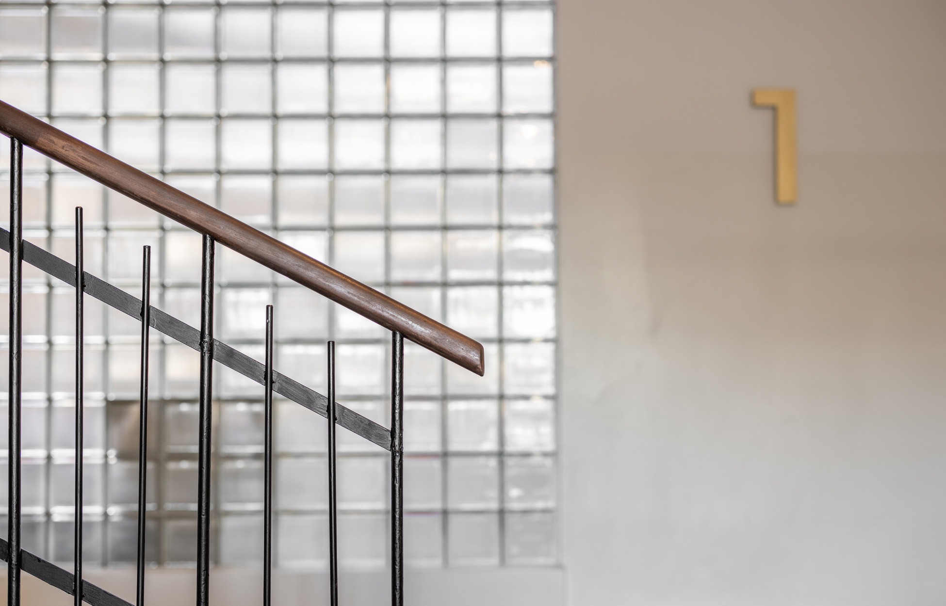
The interiors are also designed in the functionalist style. The wave-like decals and the customised stone floor of the entrance hall welcome visitors. The stairwells and the interior wayfinding system were also renewed in line with the interior design concept. “The property is a nice combination of the graphic look, the property brand and the spatial implementation. It has a coherent story that starts with the architecture and functionalism, respecting history,” Johanna says, describing the successful experience.
"The good thing was that instead of just talking about physical space, we discussed the overall brand. You were a “one stop shop” that provided everything we needed."
Jere Fredriksson, Fund Manager
The renovated property has attracted interest
The end result is a harmonious property that is also easy to market to potential tenants, thanks to the digital brochure and conceptual presentation. The brochure provides general information about the property and presents the renewed brand, while the conceptual presentation illustrates the materials and furniture available for boutique offices in different price ranges. “We created a coherent story for the property, allowing the spatial and graphic materials to support each other,” says Noora Malmström, Graphic Designer for the project.
The owner of the property, VVT, is satisfied with the result, and the renovated property has not gone unnoticed on the business premises market in Vaasa: “The result is a success – it respects history in a fresh and interesting way. It is like a whole new property. Interest in it has already soared,” Jere concludes happily.
Get familiar with other similar projects