Upgraded and international Hotel Ilves
adds a touch of luxury to every day
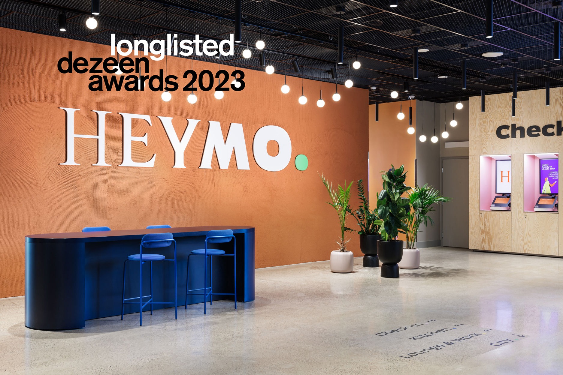
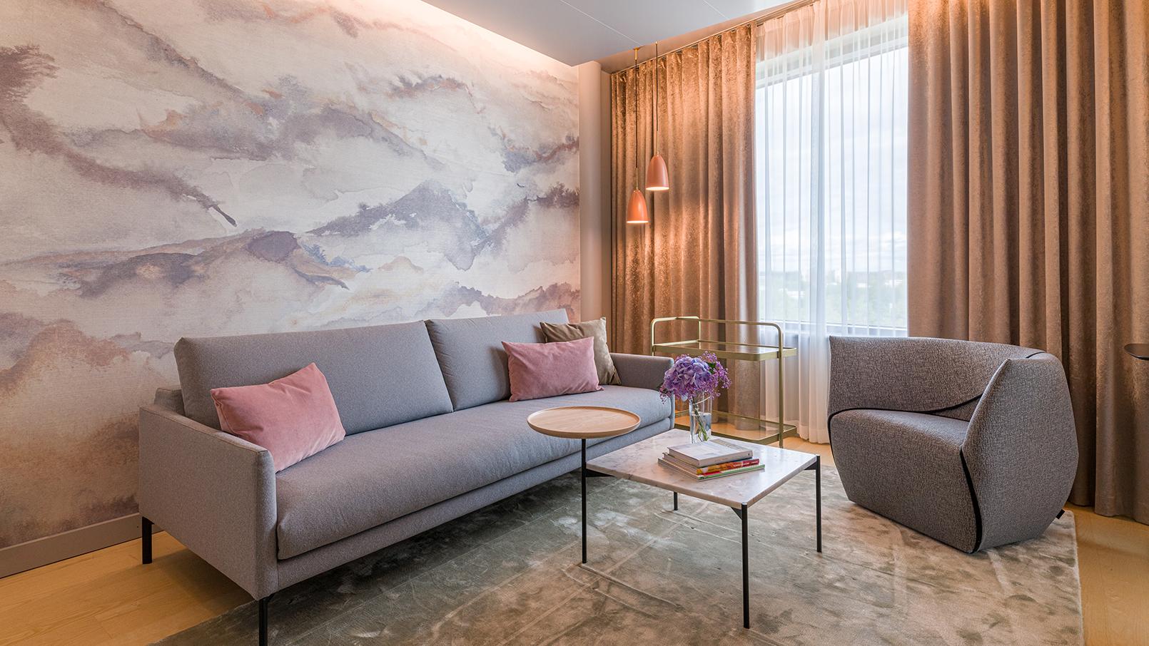
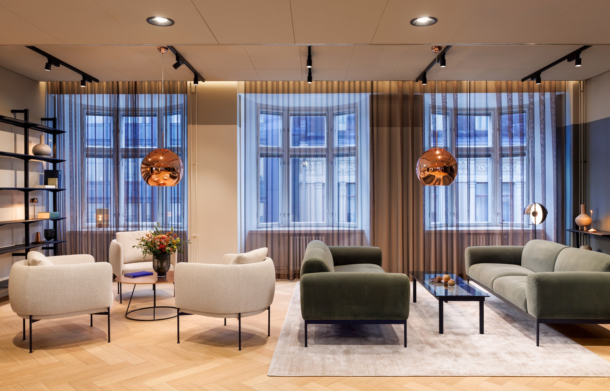
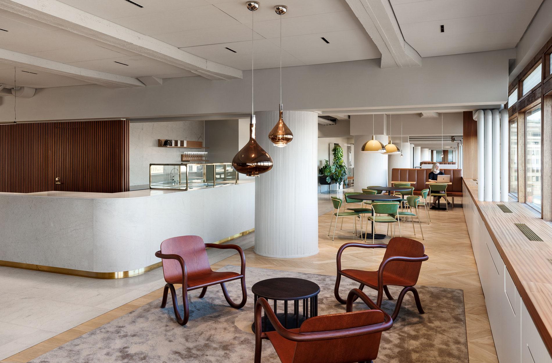
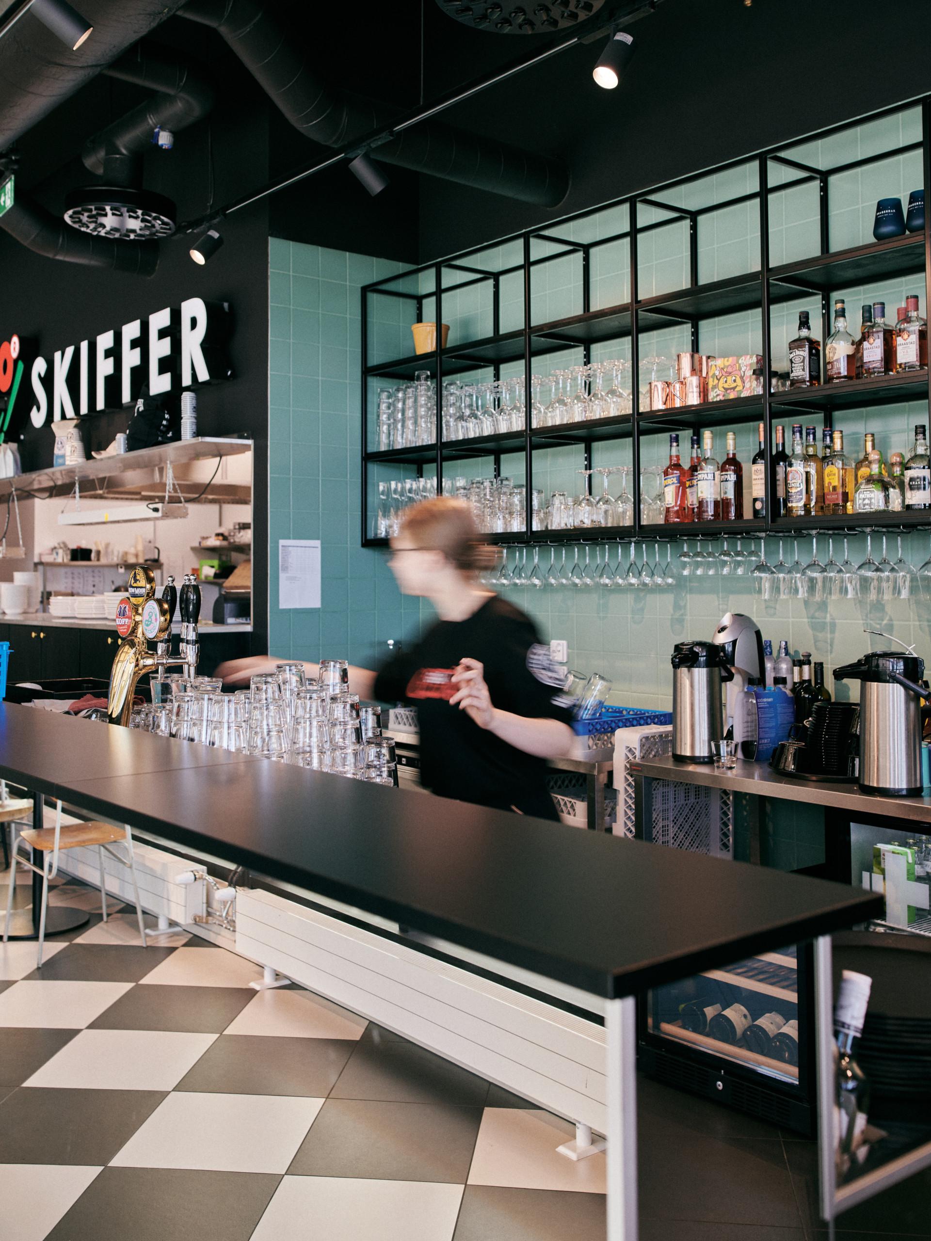
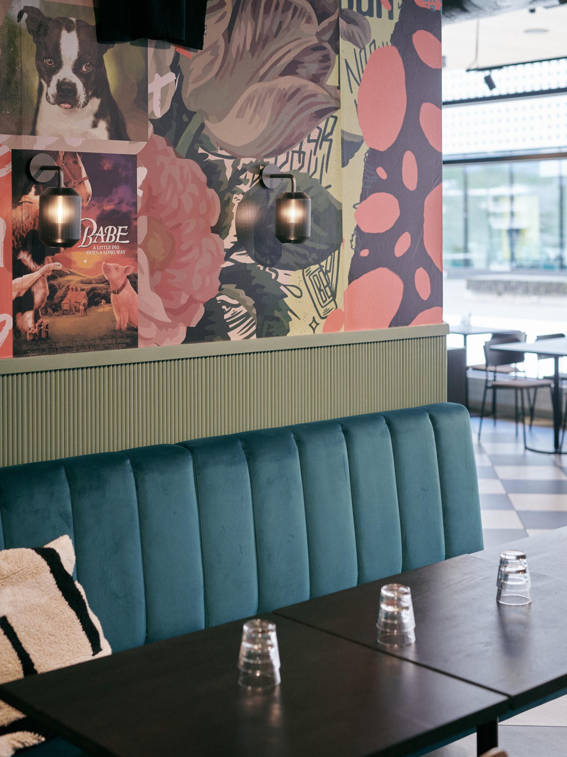
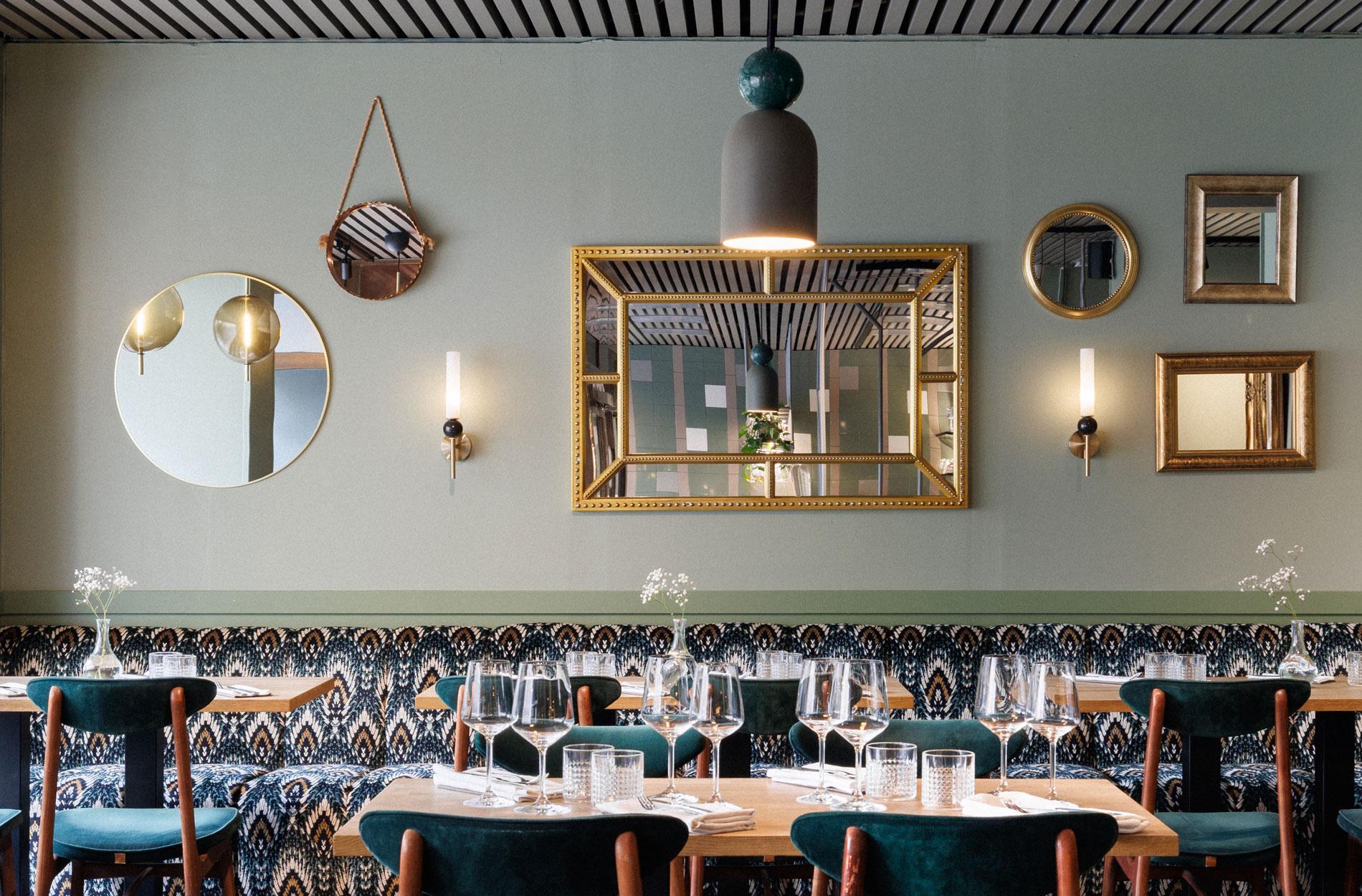
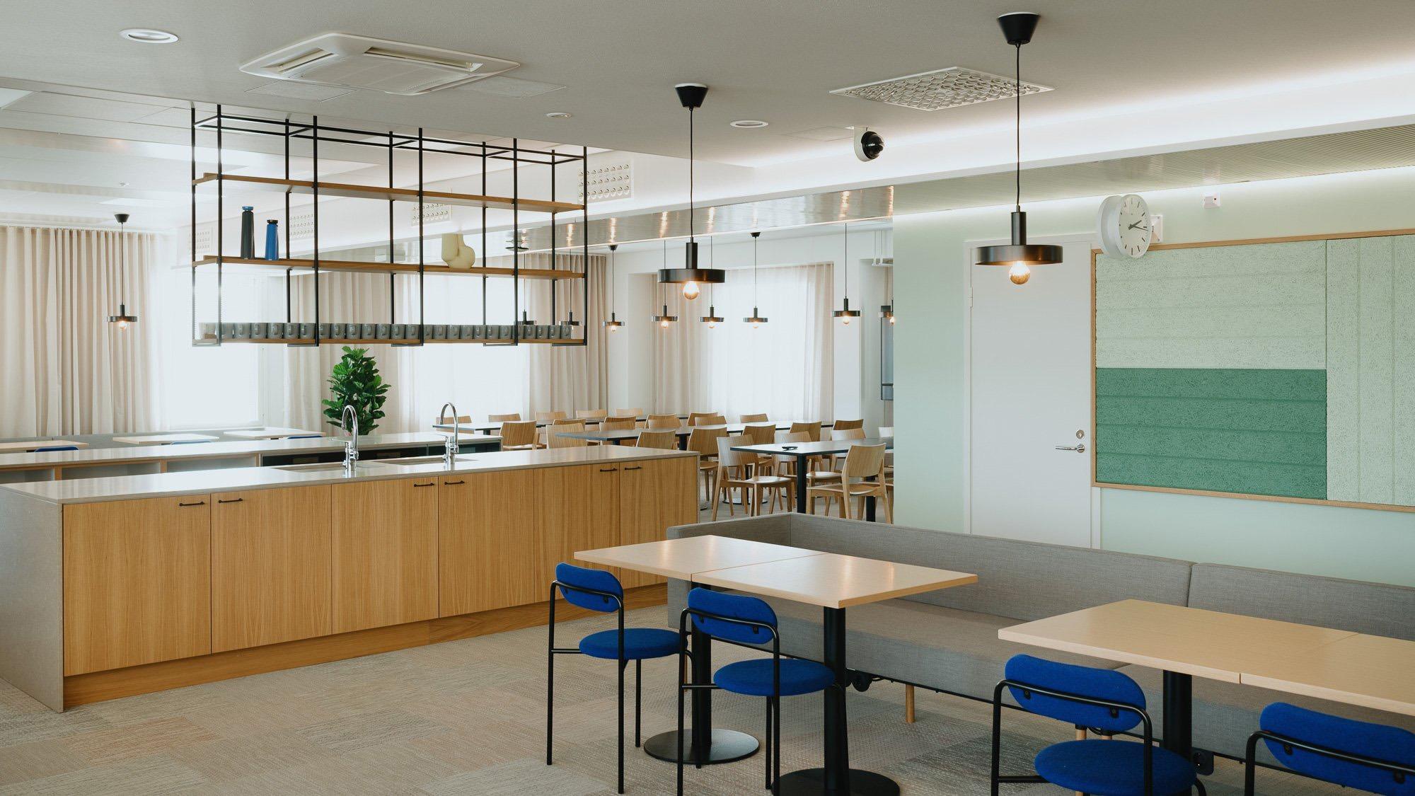
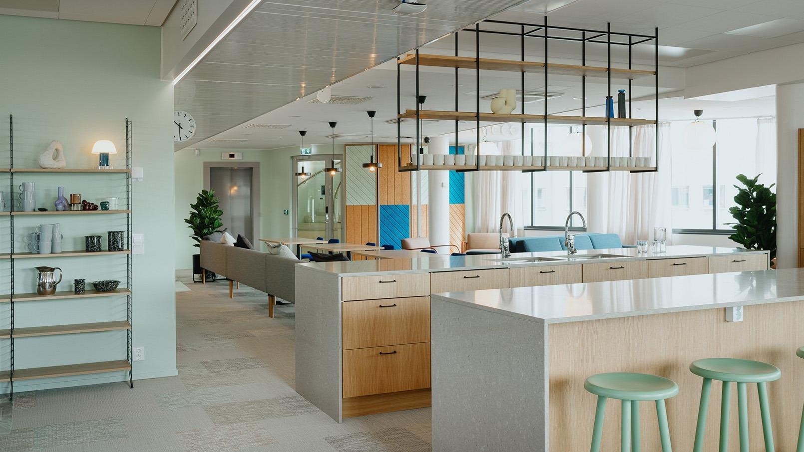
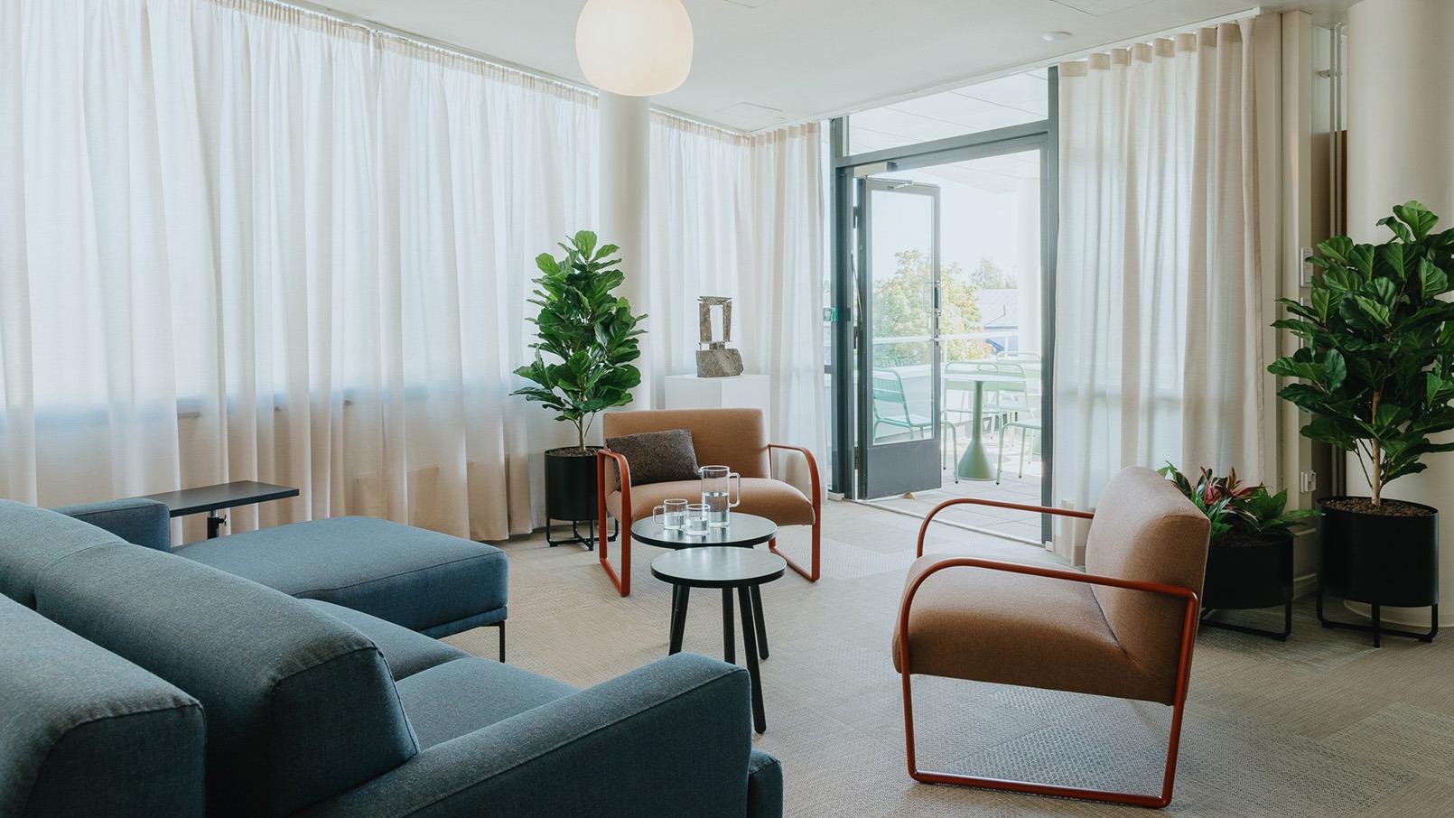
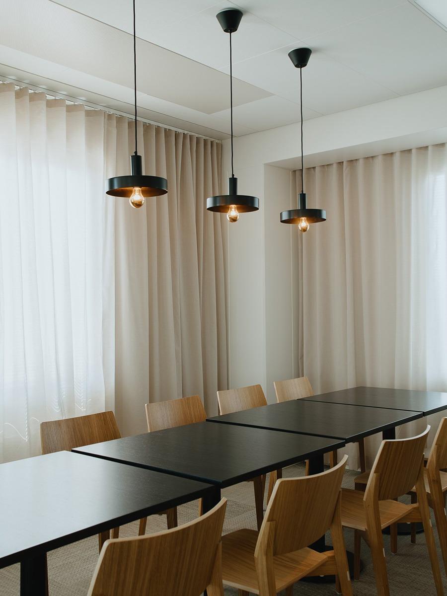
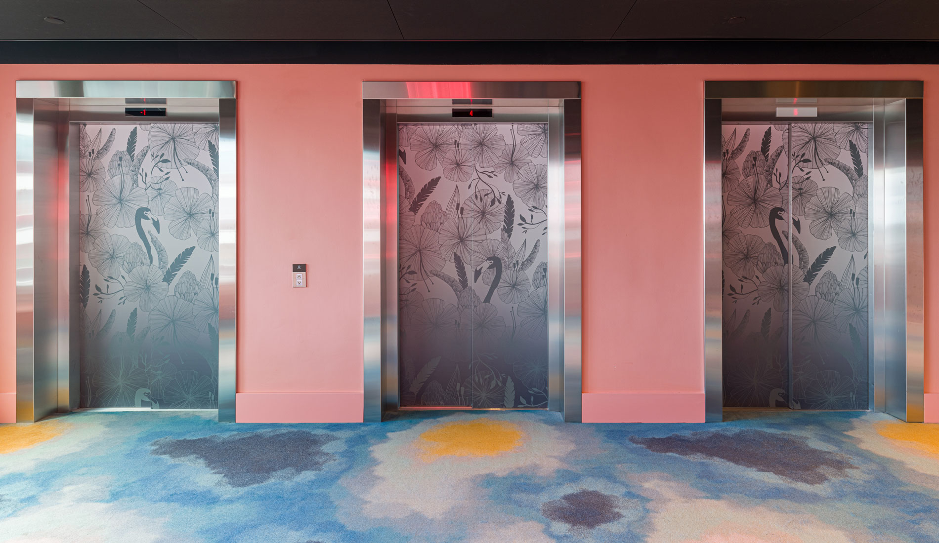
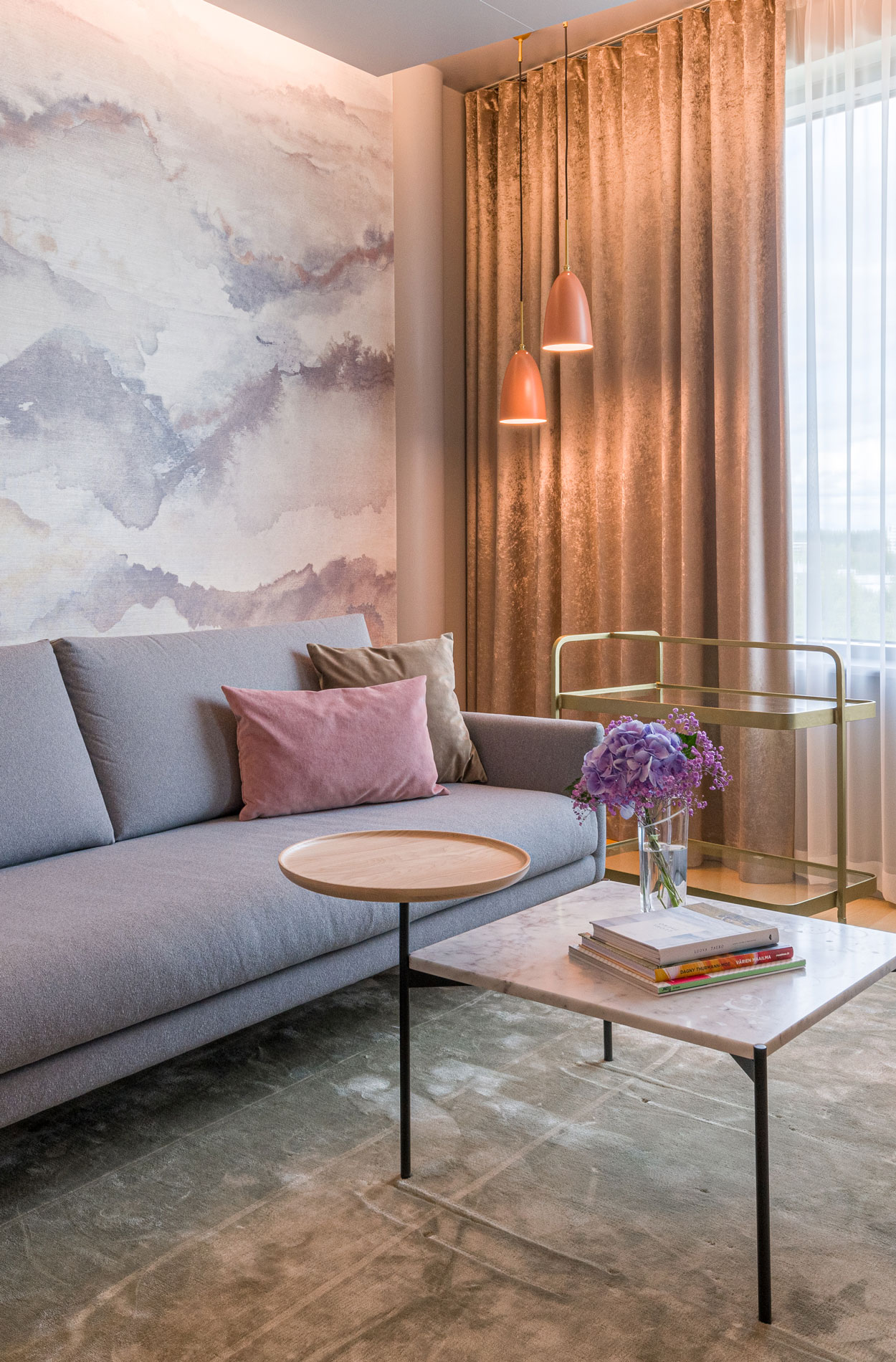
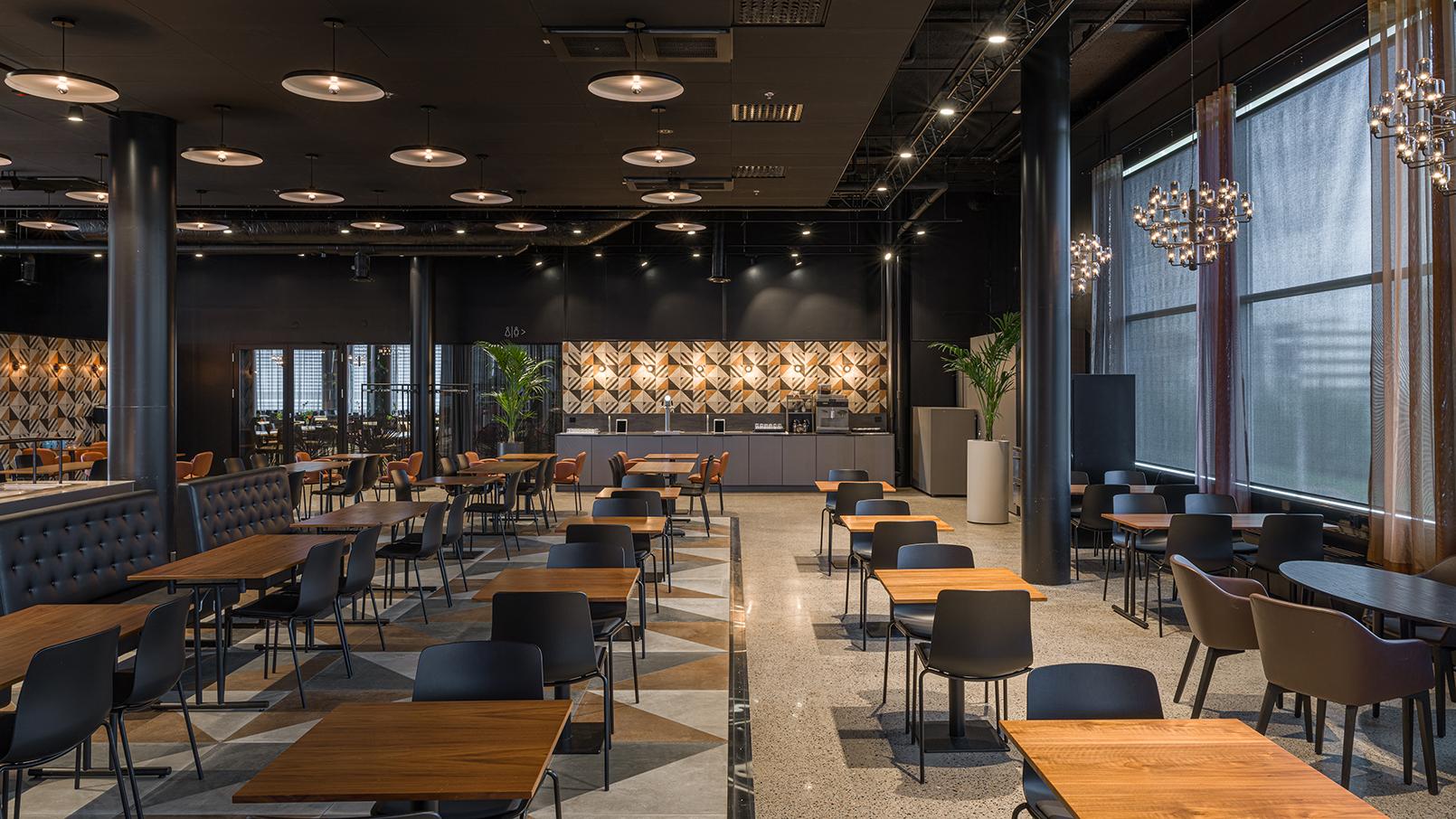
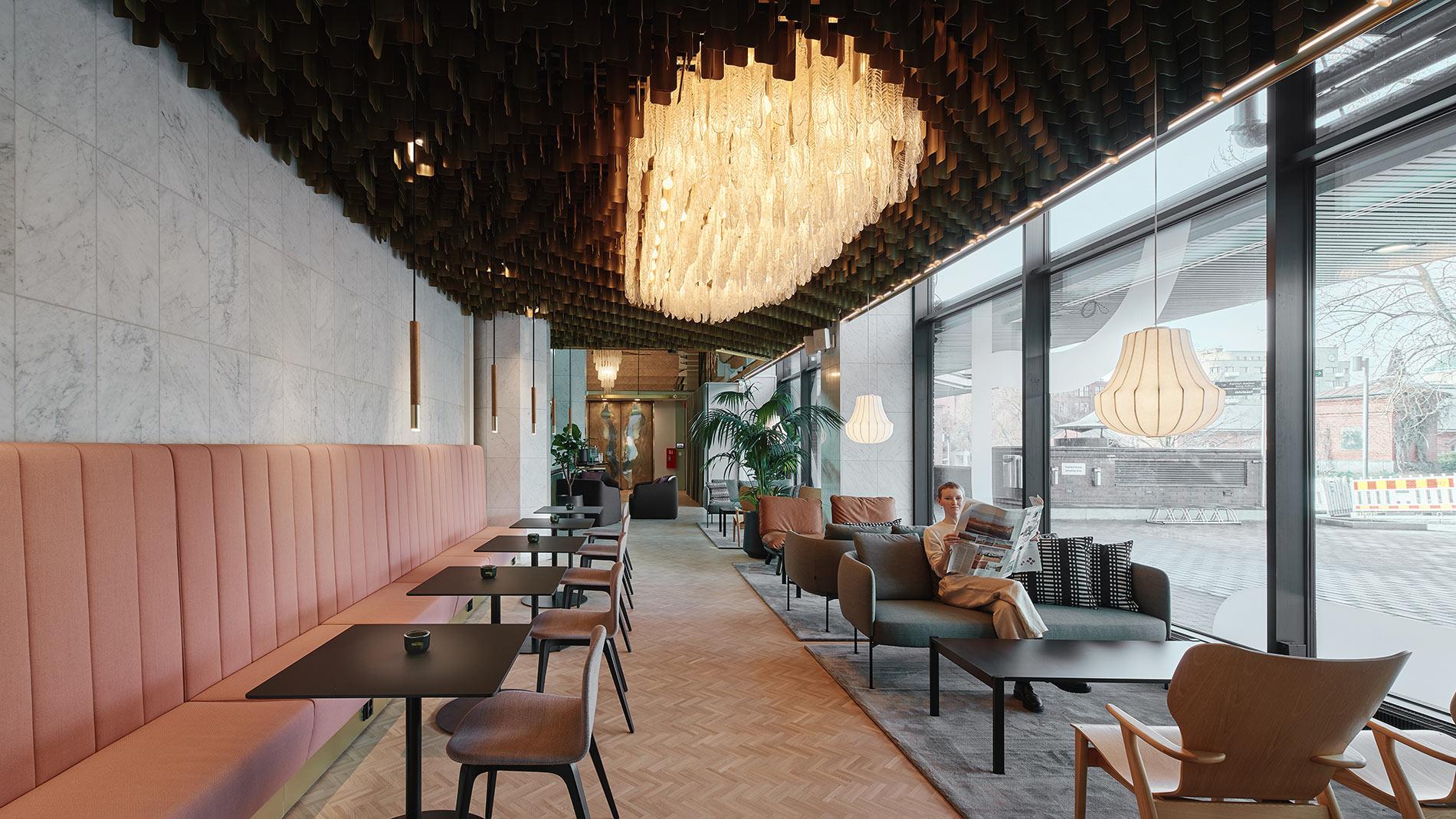
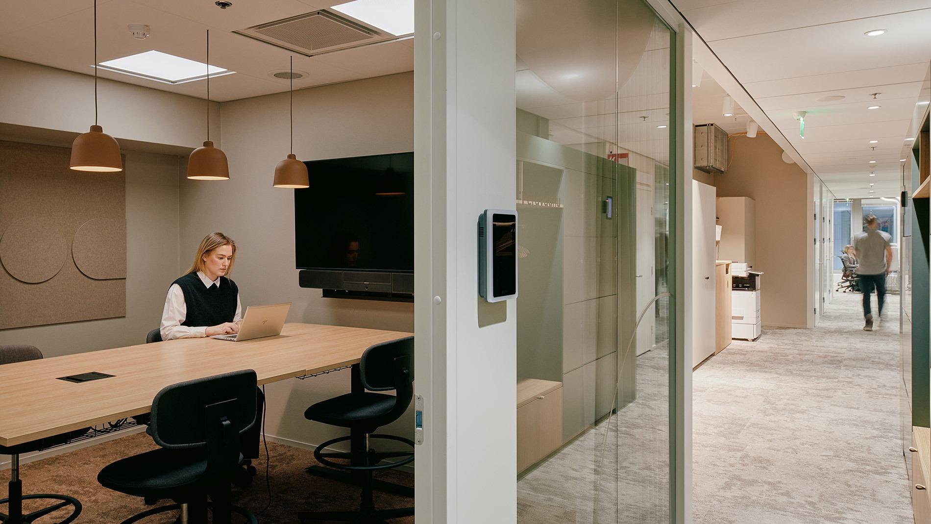
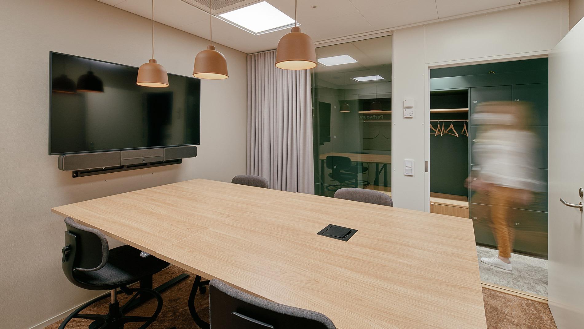
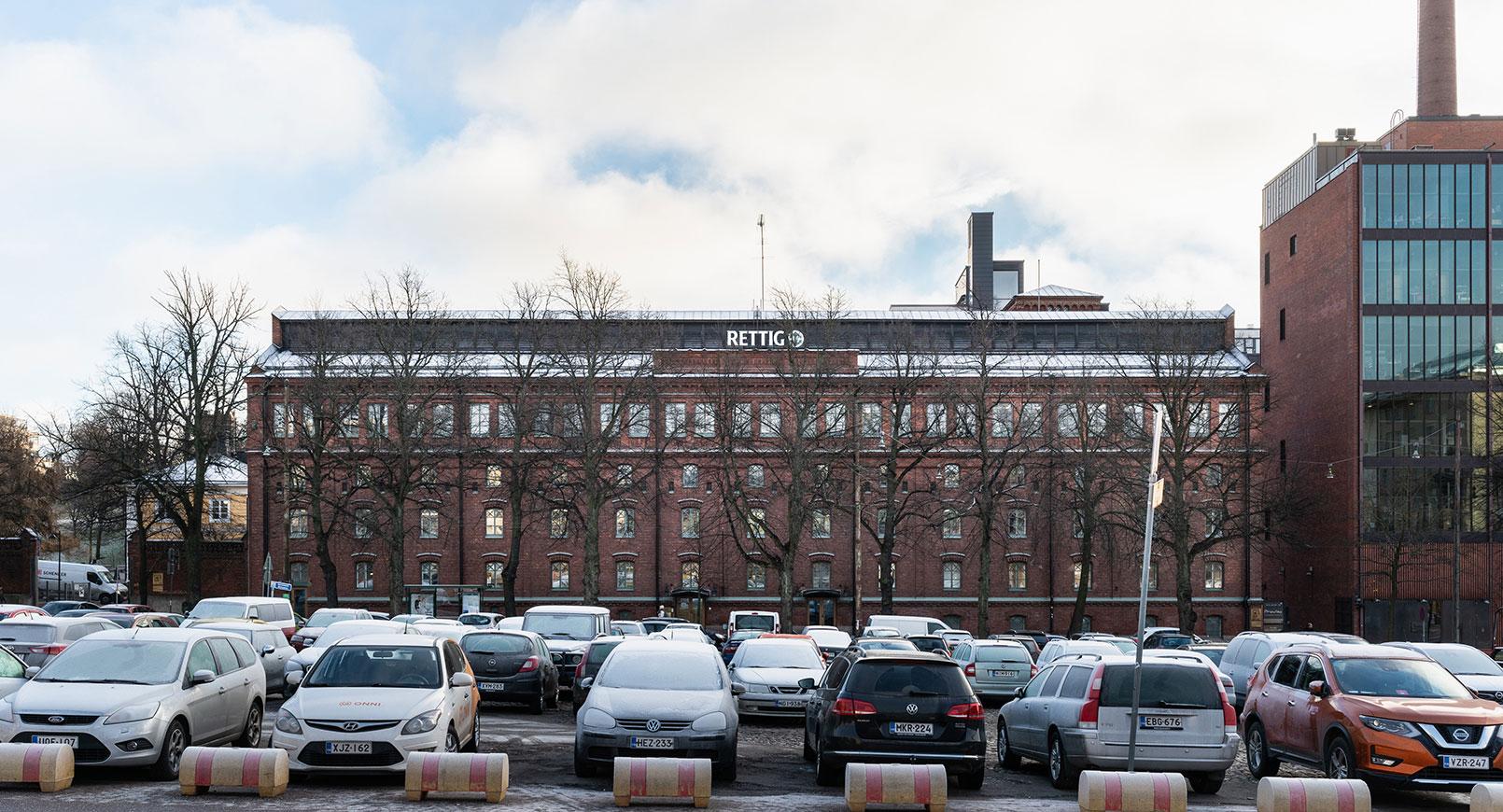
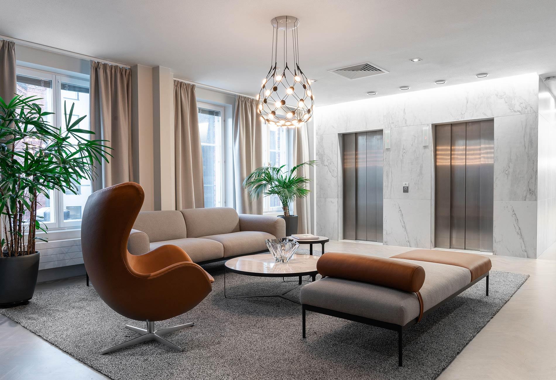
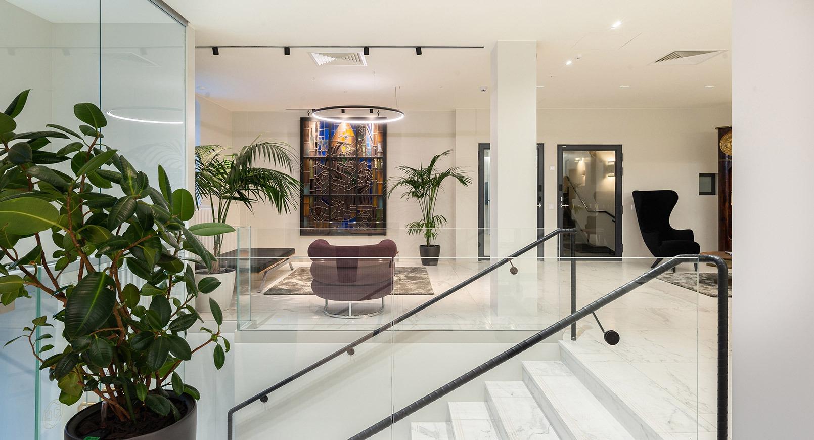
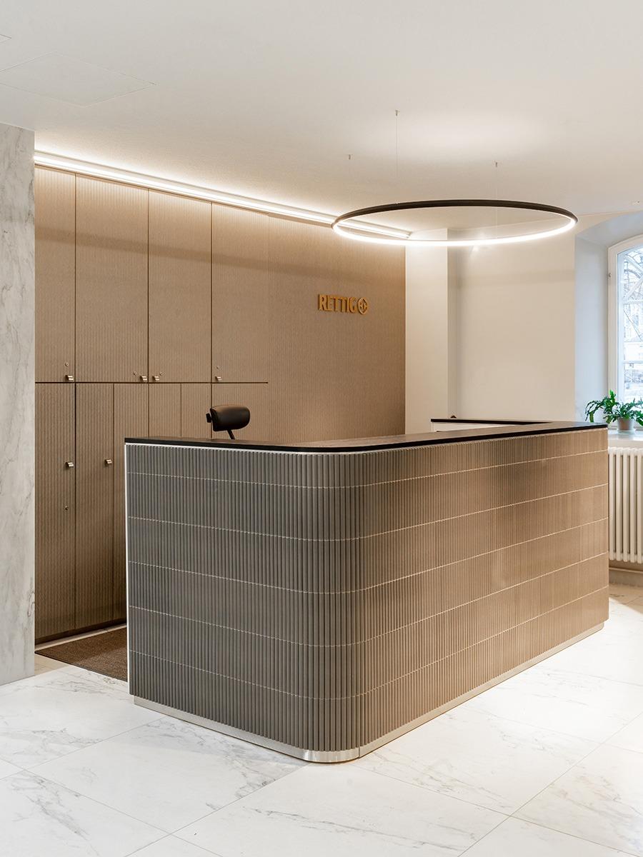
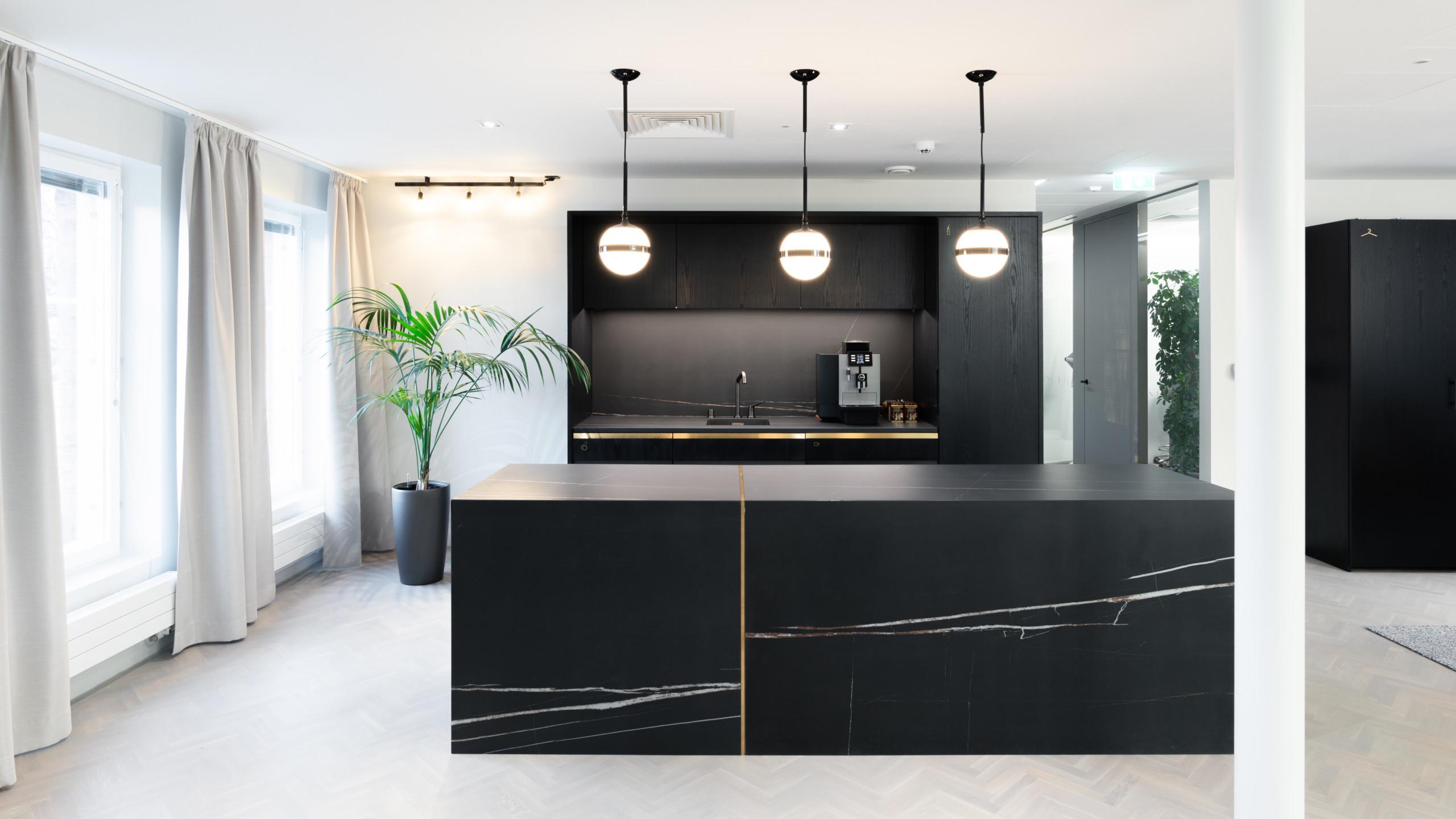
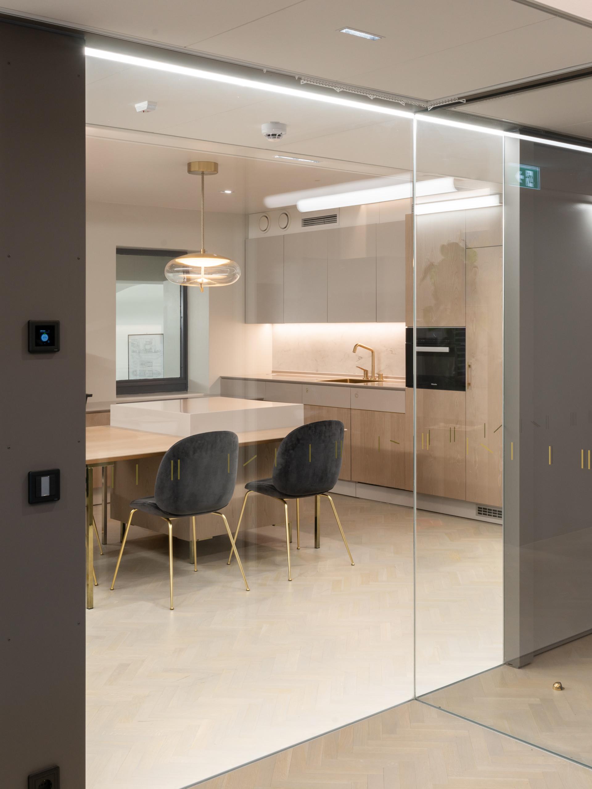
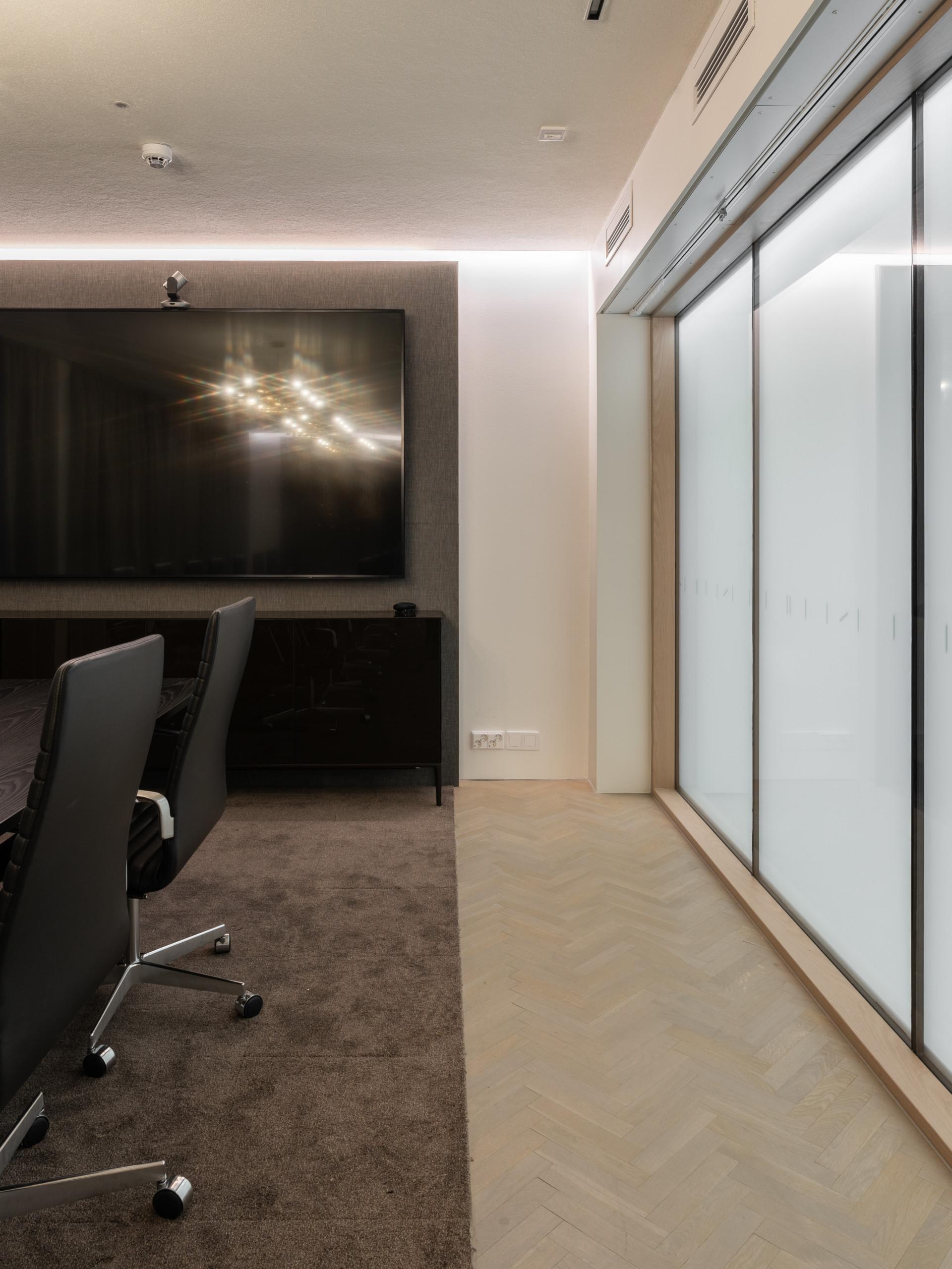
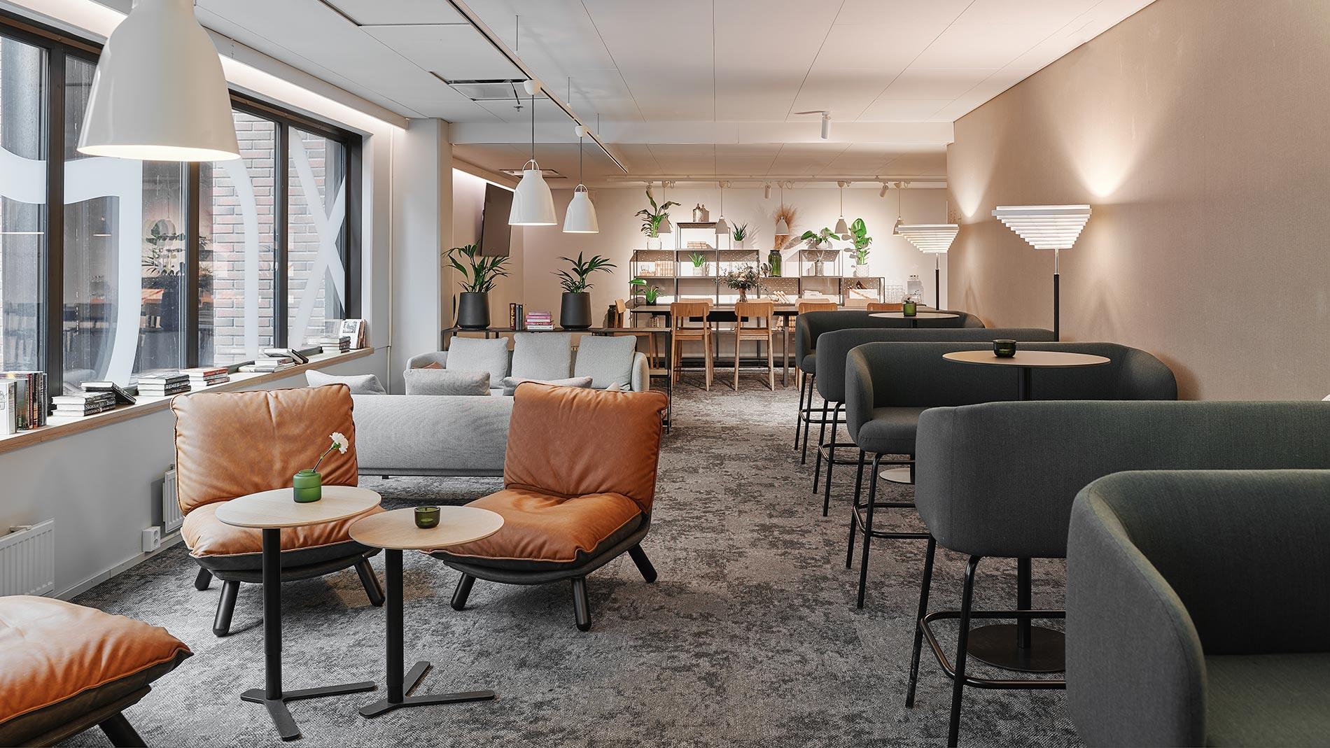
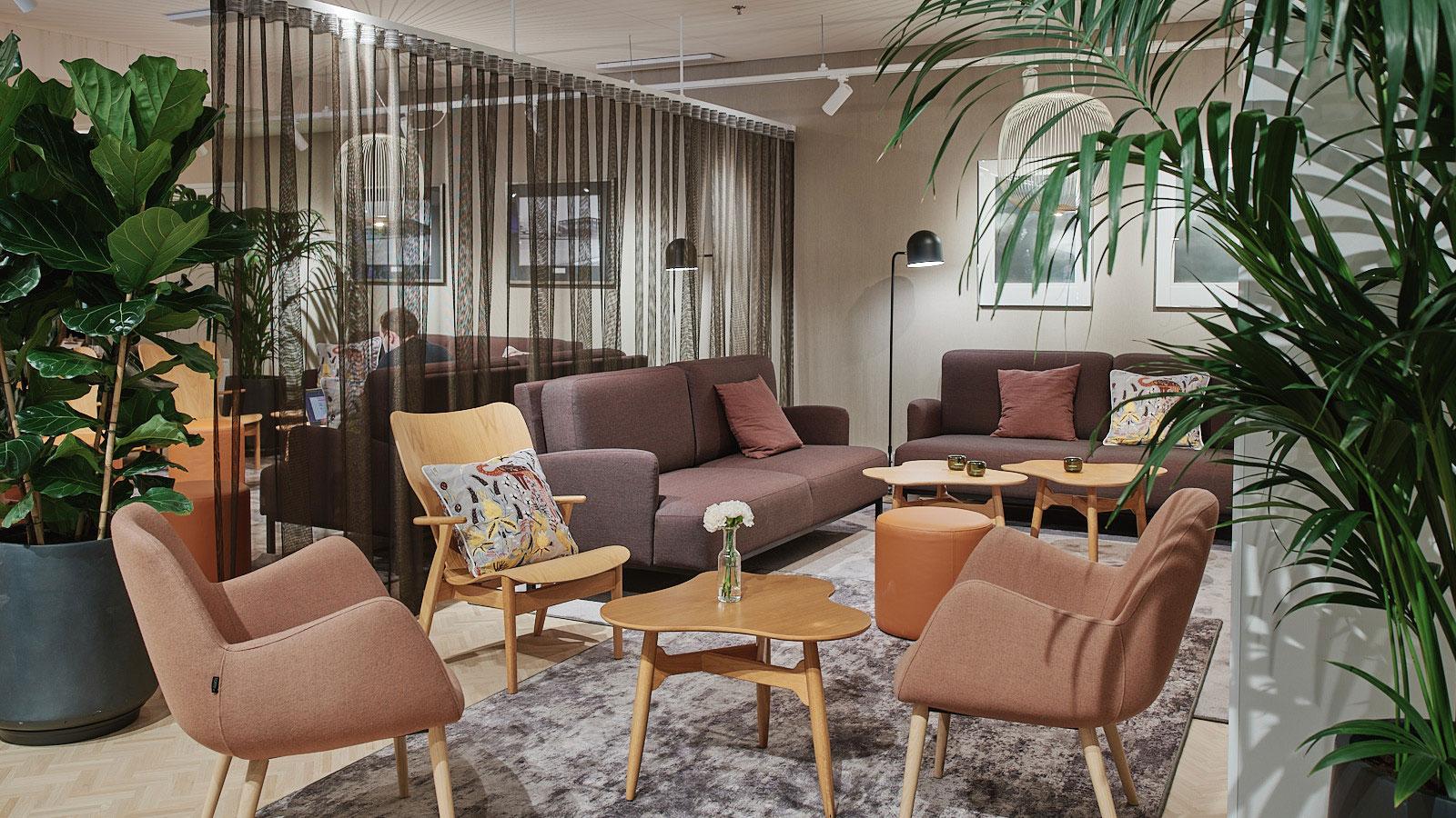
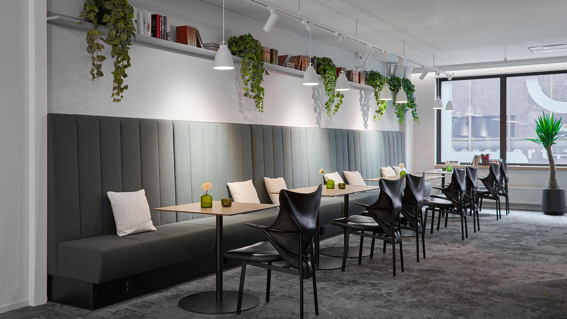
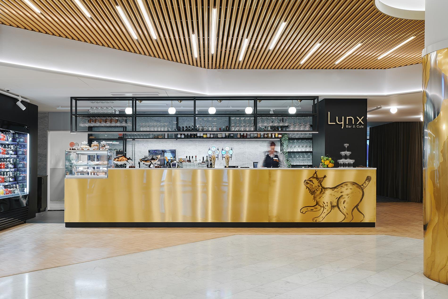
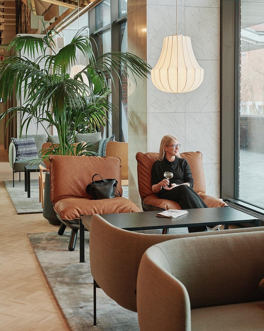
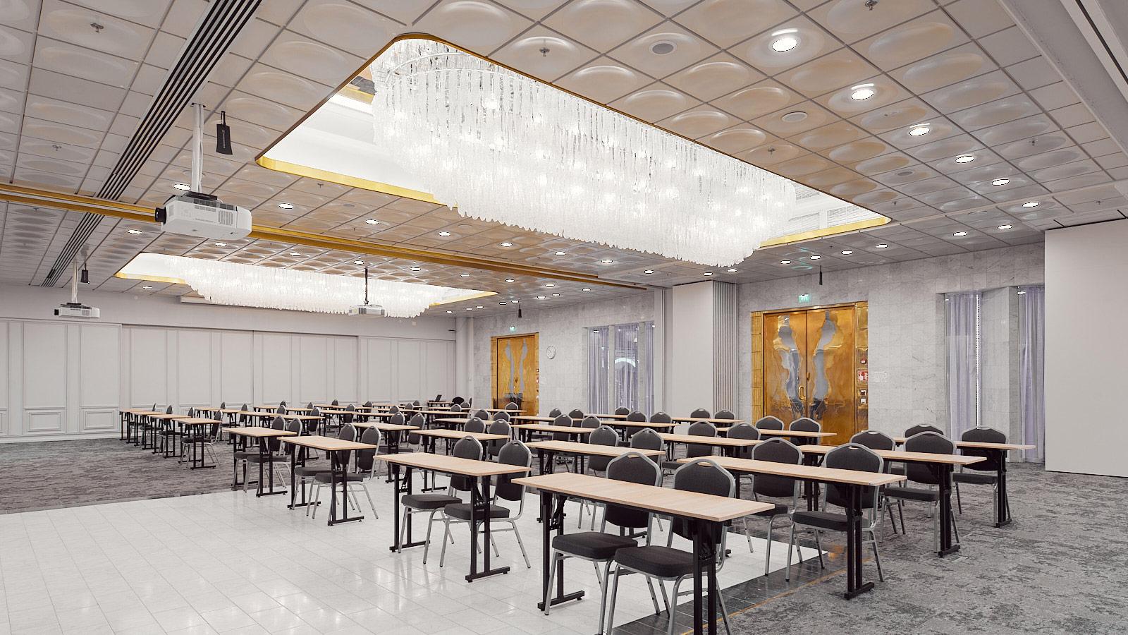
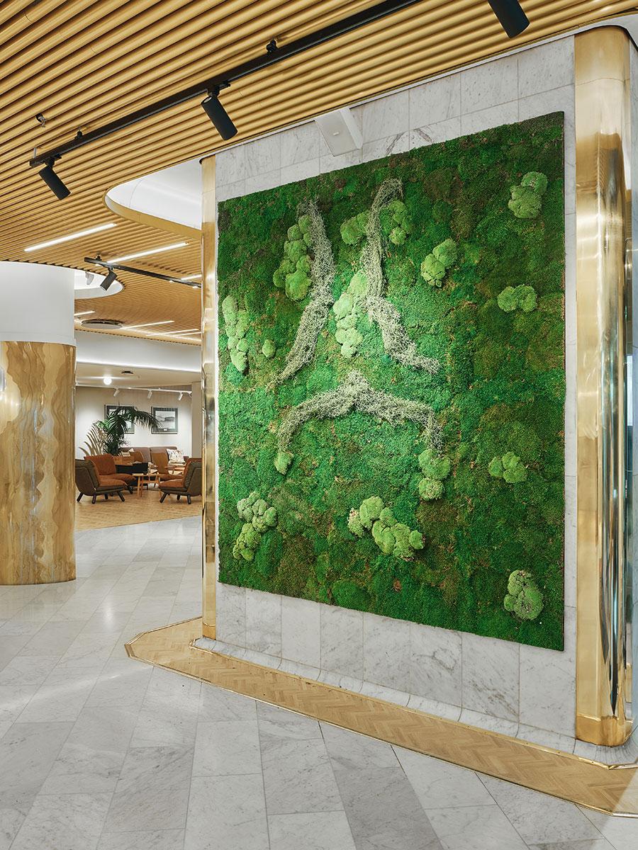
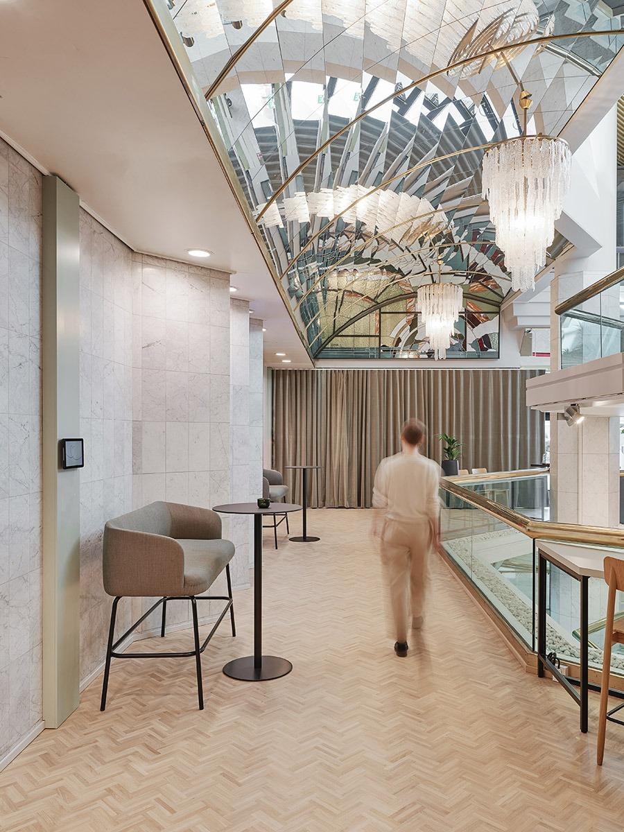
The upgraded Original Sokos Hotel Ilves opened its doors to visitors on 16 March 2022. True to its original identity, the hotel features a pleasant terrace that is popular among both hotel guests and local residents. The elegant and light lobby and lounge make visitors feel welcome. The charming, individual and thoughtfully placed reception desks ensure personal service and smooth navigation in the space. The nearby Lynx Bar & Cafe is the heart of the hotel, serving as a cosy living room for guests and locals as well as a casual co-working space or relaxed venue for a night out. The three adaptable ballrooms can be combined to accommodate even hundreds of people in large meetings or, for example, weddings. Lynx, the mascot of the legendary hotel on the bank of the Tammerkoski rapids, is featured in the modern graphic elements. The lynx adds a playful touch to the interiors and makes staying in this international hotel more memorable and unique. The renewed hotel is excellent for business travellers, conference customers, families on a city break and staycationers who are looking for a touch of luxury.
Photos: Aleksi Tikkala
Surprisingly different, proudly local
and thoroughly Finnish
Original Sokos Hotel Ilves is operated by Sokotel Oy, a Finnish hotel and restaurant chain with 14 Sokos Hotels and seven Radisson Blu Hotels. Each of the hotels is unique, and so is Ilves. The legendary Ilves was built in the 1980s, and inspiration for this international-style venue was sought all the way from the USA. The living legend has now been upgraded, respecting the existing architecture and the established brand image. The new Ilves is warm, adaptable and attractive, a refreshing hotel experience that adds a touch of luxury to every day. “Ilves has been a landmark of Tampere for almost 36 years, and its popularity and customer experience are unrivalled. At the early stages of the design, we decided that the identity that has been built over the decades must be cherished and strengthened,” says Heli Engblom, Director for Sokotel’s hotel business, describing the starting point of the renewal.

Design drivers specified together with the client:
- Luxurious every day: uplifting experiences the customers remember for a long time
- Inviting: spacious living room for locals and an experience hub in the Tampere city centre
- Adaptable: lighting and furniture that adapt to different situations and the needs of customers
- Personal: boldly different, proud of its iconic identity, feminine
Enjoyable: warm service, straightforward and pleasant atmosphere
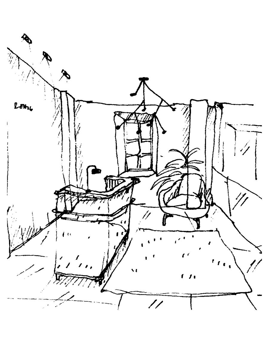
“Your sketches and mood board images stood out in the tendering phase – they were in line with our vision. You know that a sketch has done its job and deserves to be implemented when it touches your soul and appeals to your emotions.”
Heli Engblom, Director for Hotel Business, Sokotel
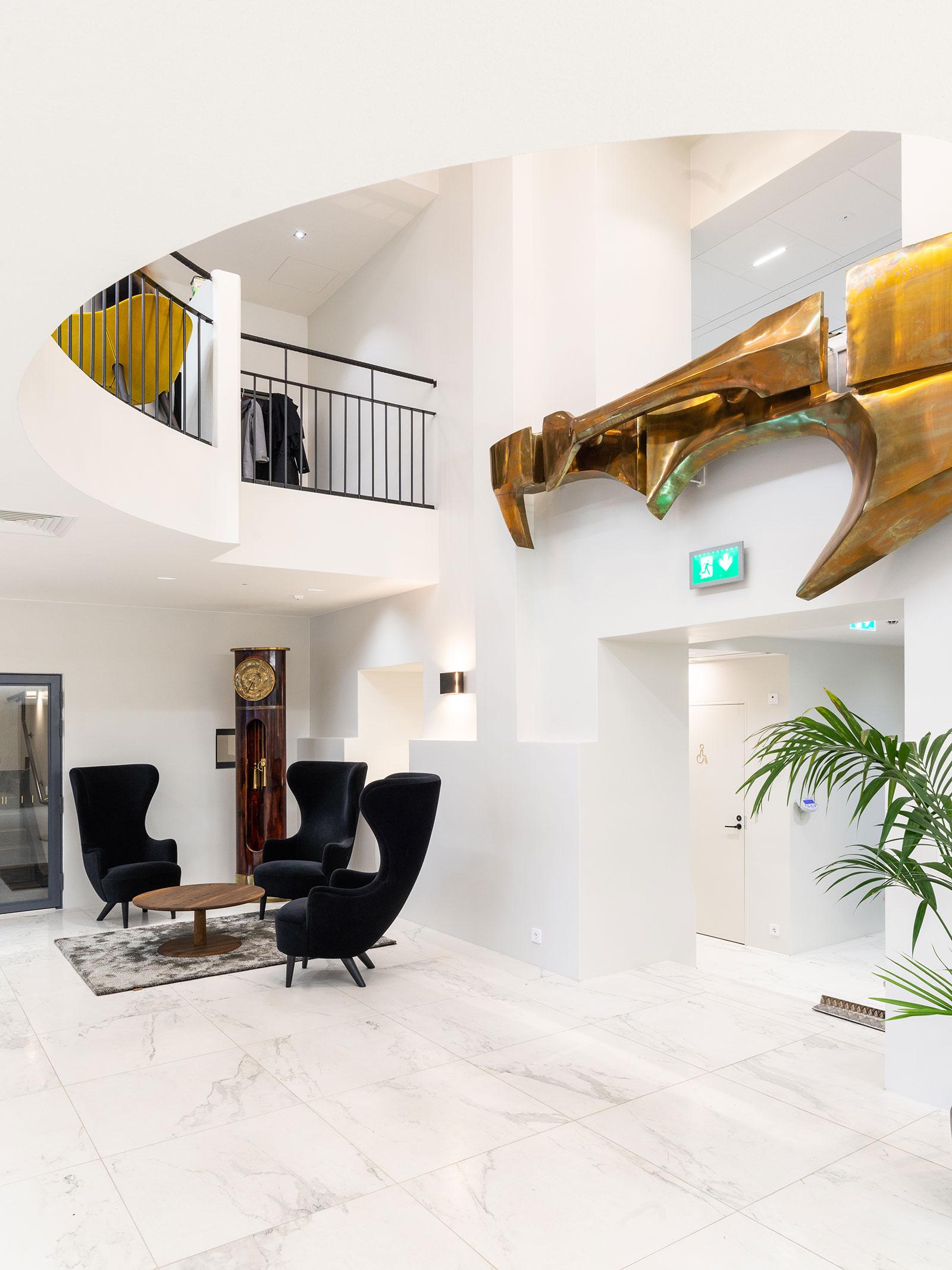
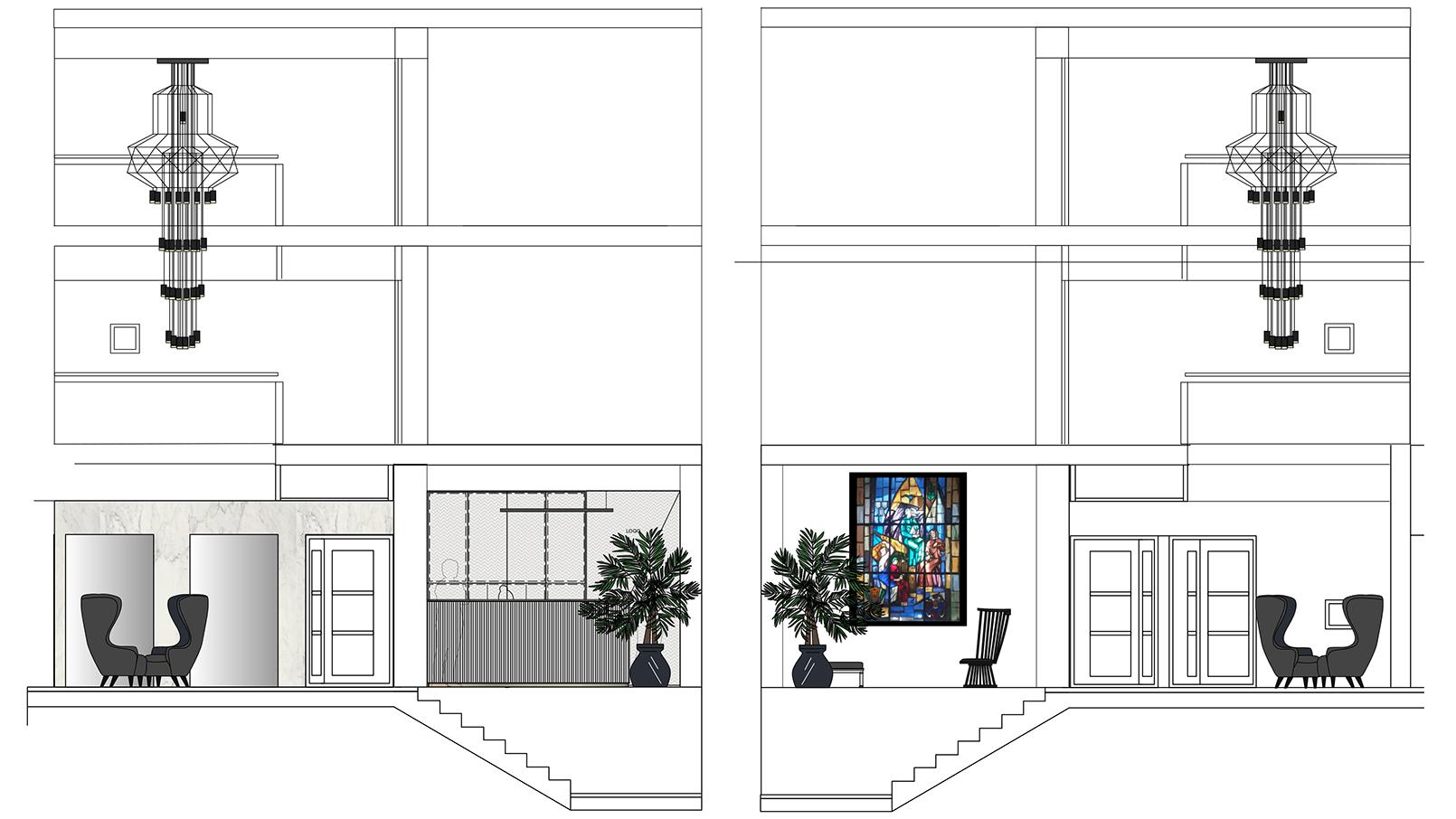
Rune & Berg Design was responsible for the interior architecture design of the terrace, reception and lobby area, lounge bar and ballrooms of the iconic hotel and favourite living room of the locals. The project also included designing the distinctive graphic look and signs. Rune & Berg’s designers familiarised themselves with the world of Ilves by staying at the hotel and observing customer path and the personnel working at and around the reception. The guest rooms and conference facilities were designed by Vallila, and the chain restaurants by Visionary Design Partners. “We realised that the lobby is extremely important, because that is where the guests first feel welcome. It must have a wow factor! When the renewal plan is on the desk of a trusted partner, we know our project is in good hands,” Heli says, explaining the choice of Rune & Berg.
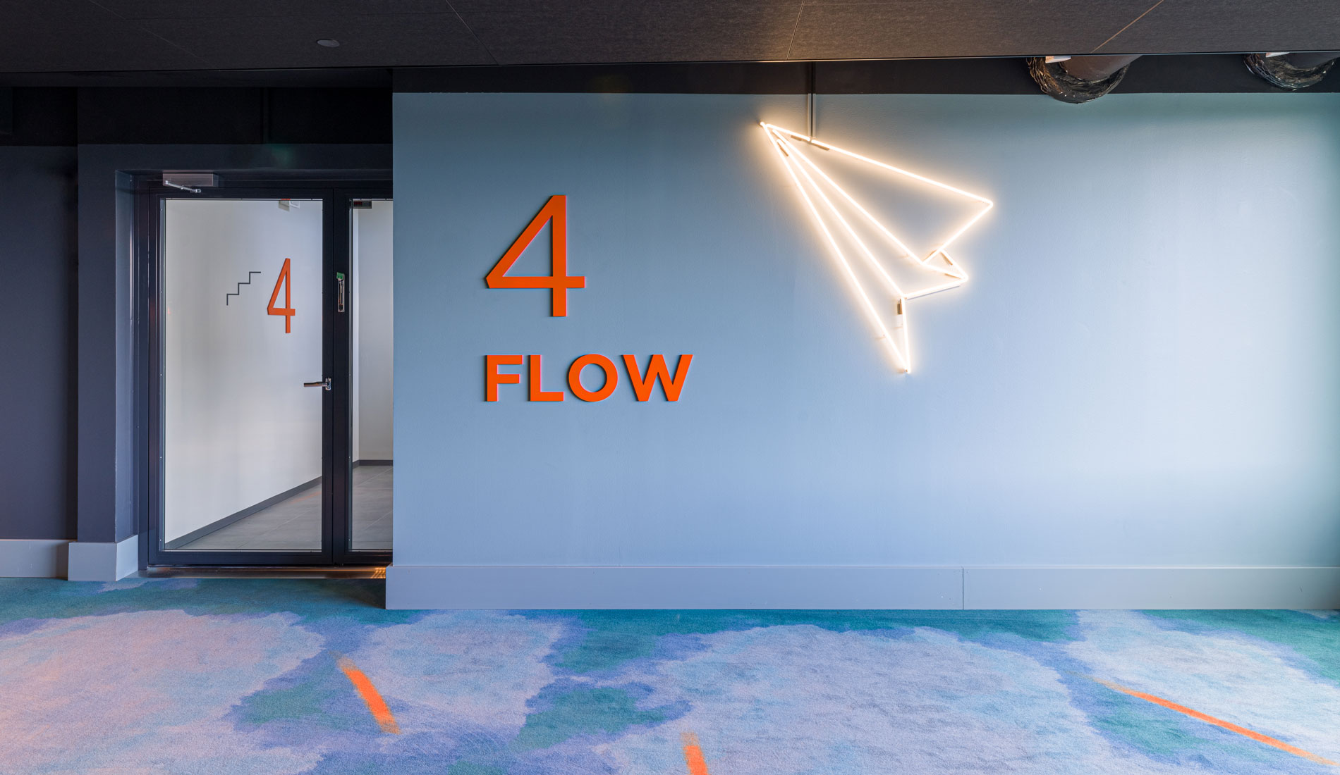
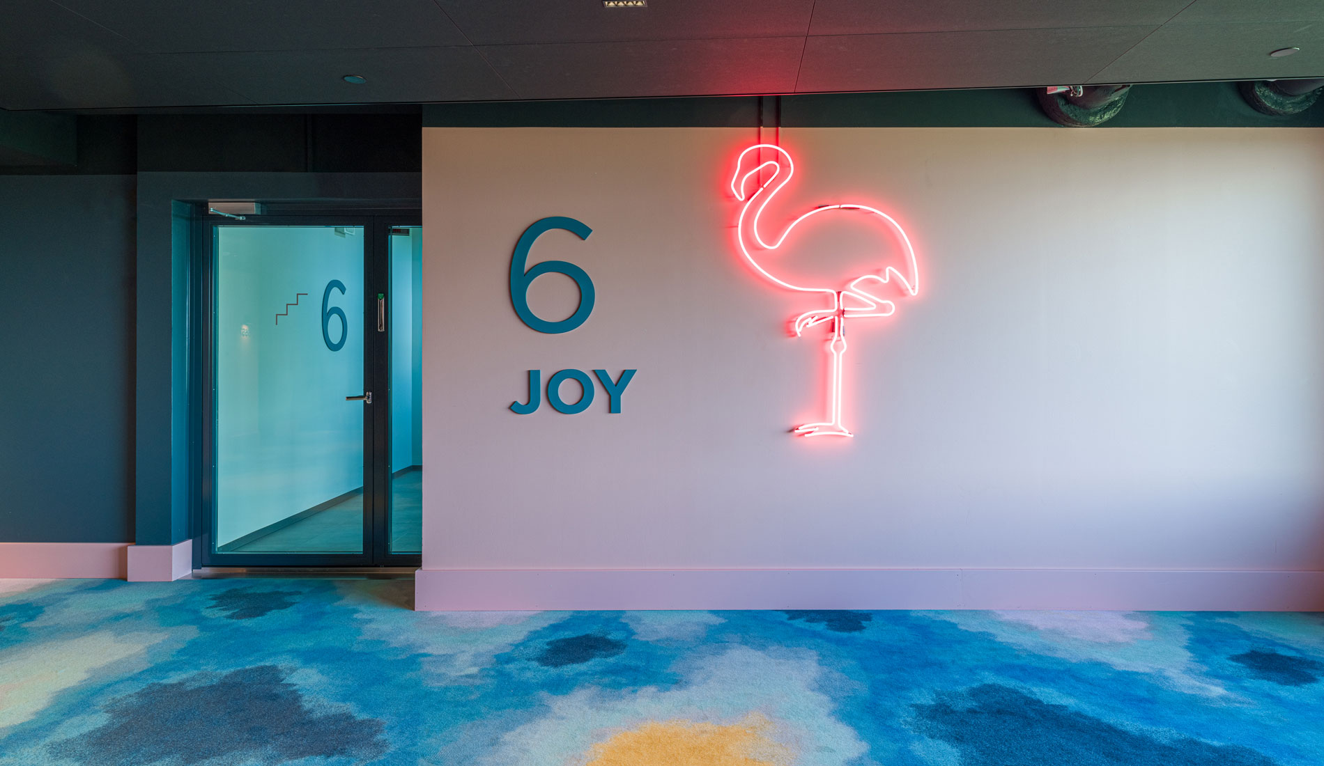
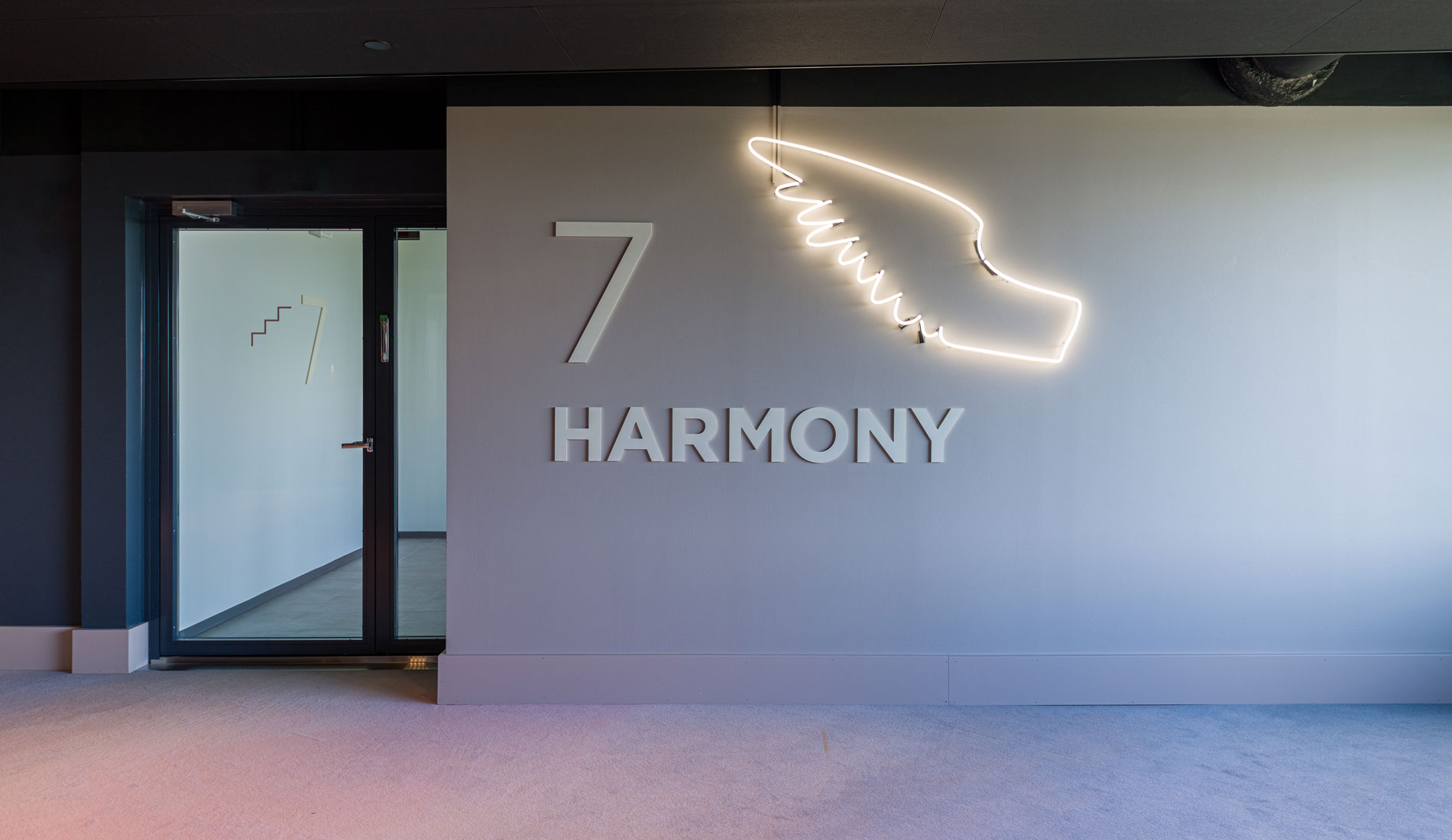
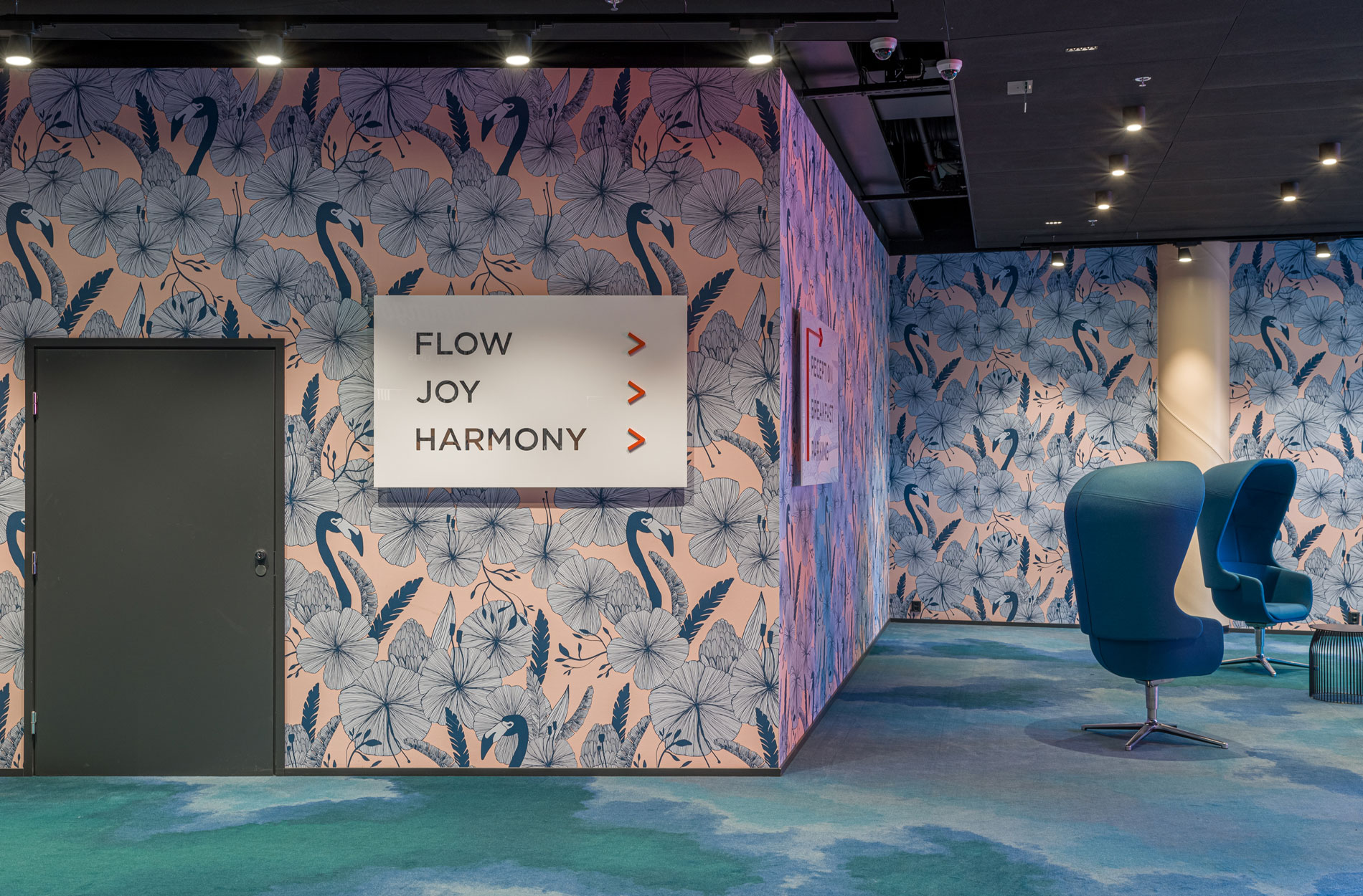
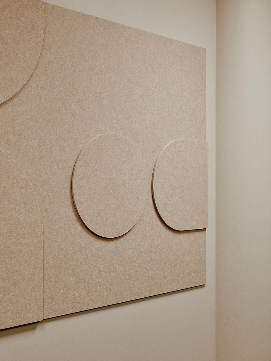
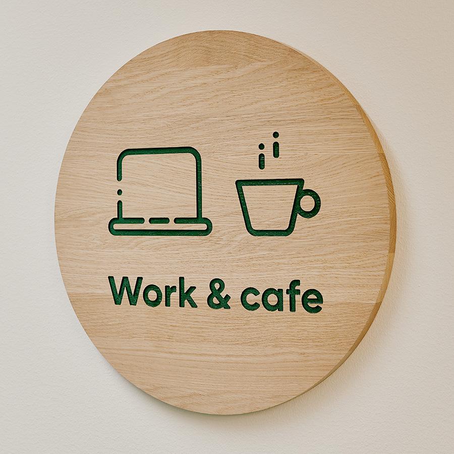
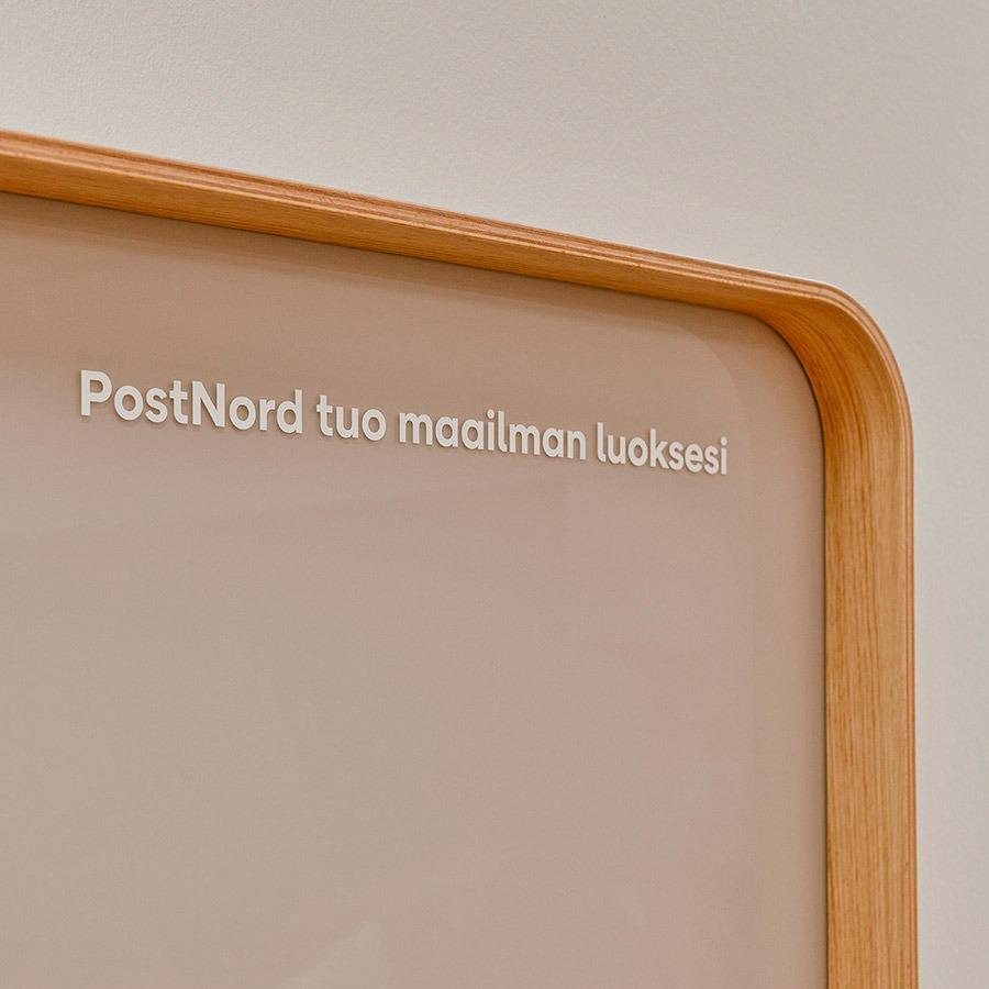
Easy-to-navigate space and graphic design bring out the iconic identity
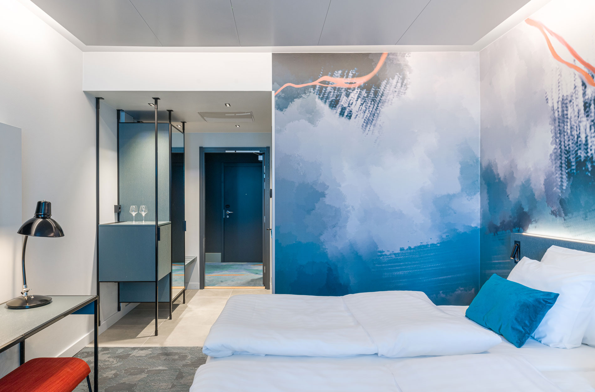
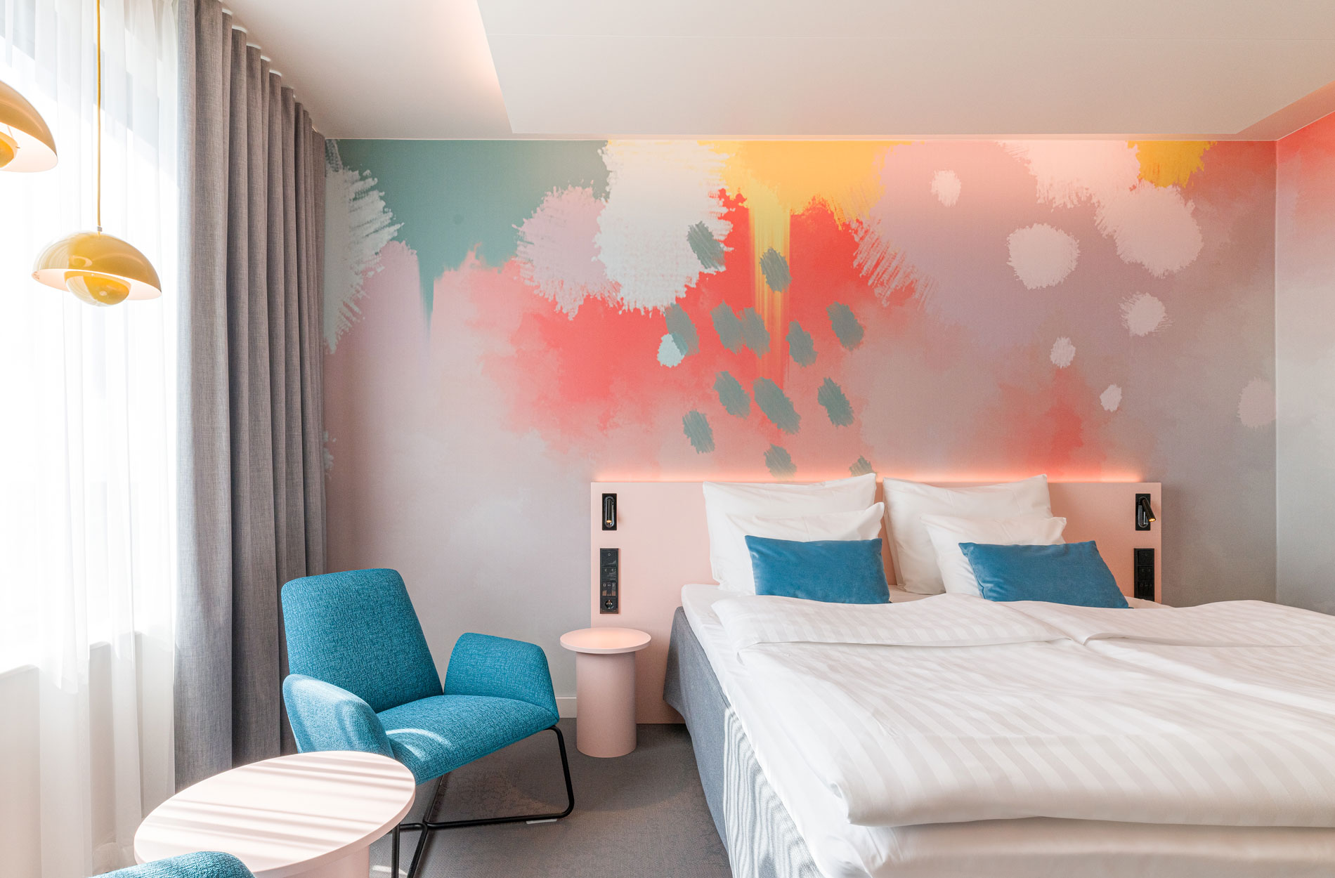
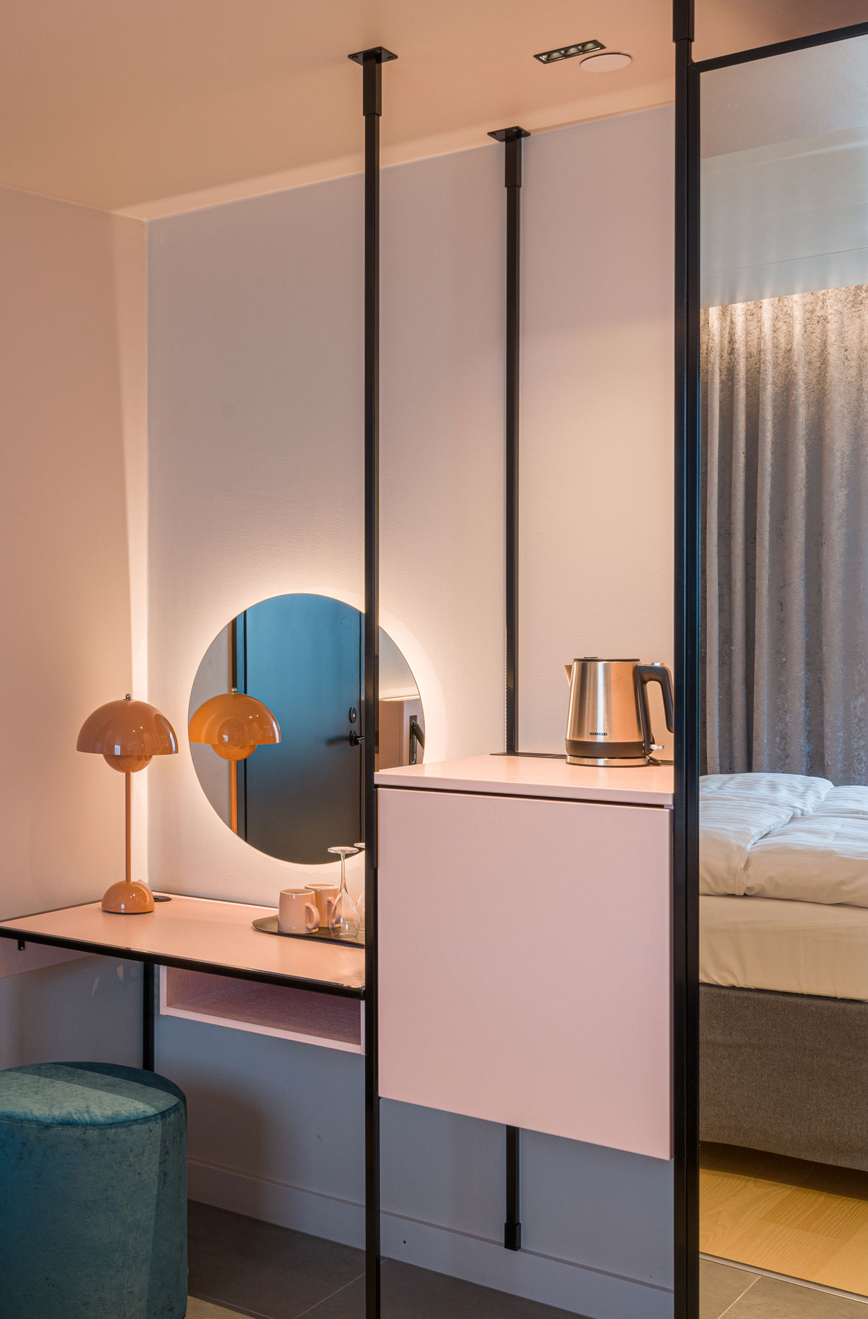
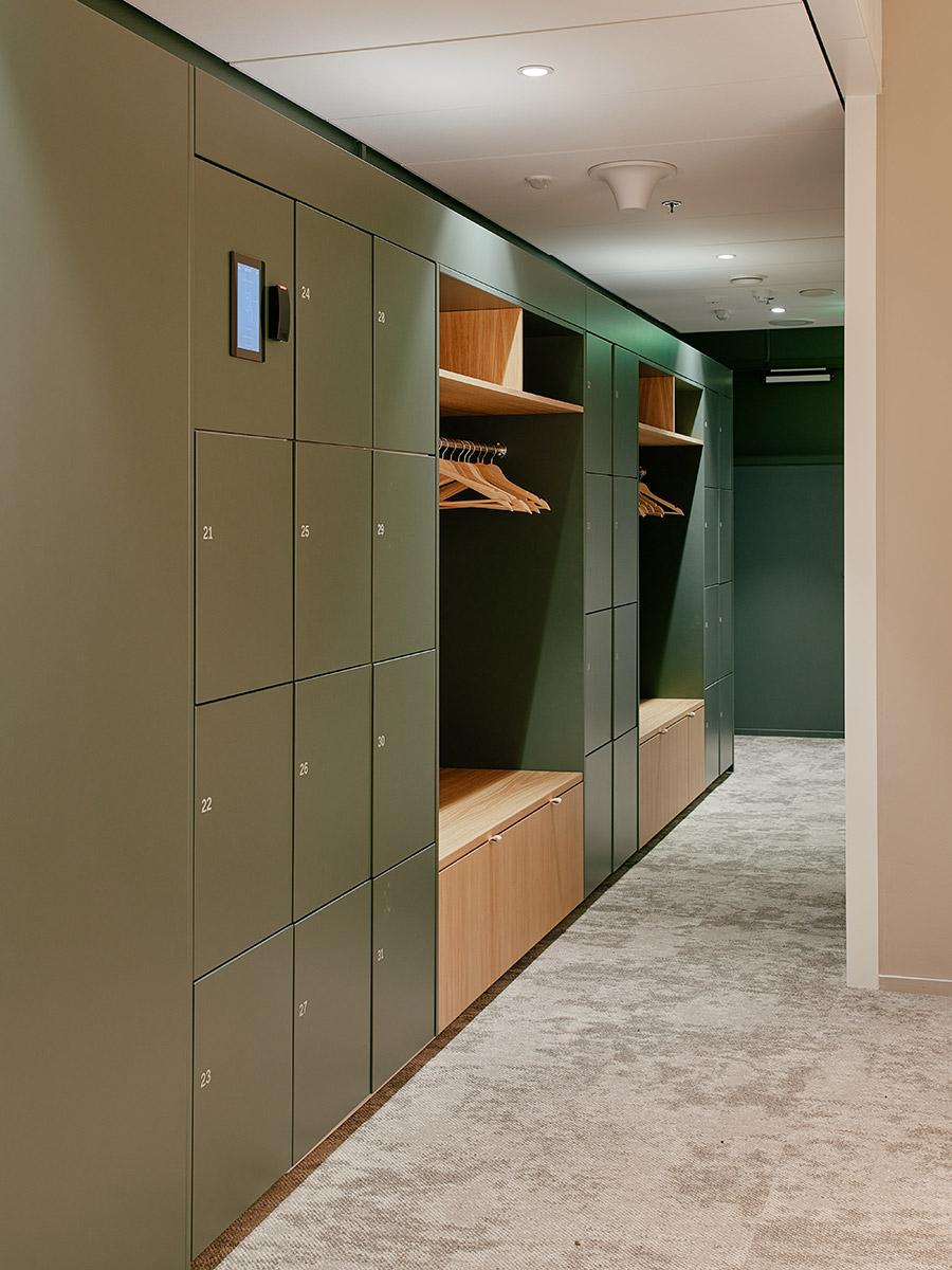
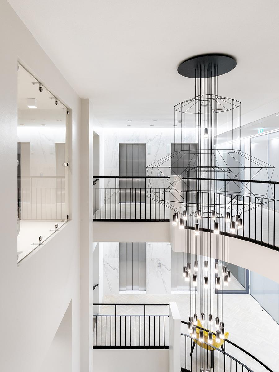
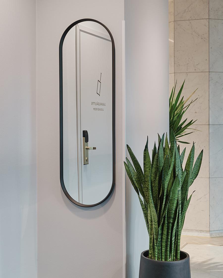
Navigation in the renewed reception and lobby of Ilves is intuitive: when the customer steps in, they immediately know where to go next. “We removed all nooks and crannies and made the space clearer. For example, we moved the luggage room to make the reception area more harmonious,” Riina Ruska says, describing the background of the design. The third ballroom is also in use again, and the wayfinding system has been upgraded. All in all, the space was designed with a special focus on customer paths and user needs. The atmosphere adapts to different events, thanks to adaptable lighting and furniture. “The added value of using a professional design company is that the designers bring their vision to the table, give us their input and paint visions of different alternatives for the look and feel of the space. A professional designer can also give comments on the spatial programme, passageways and functional materials. People flow is vital: smoothness is an essential element of the customer experience,” Heli says.
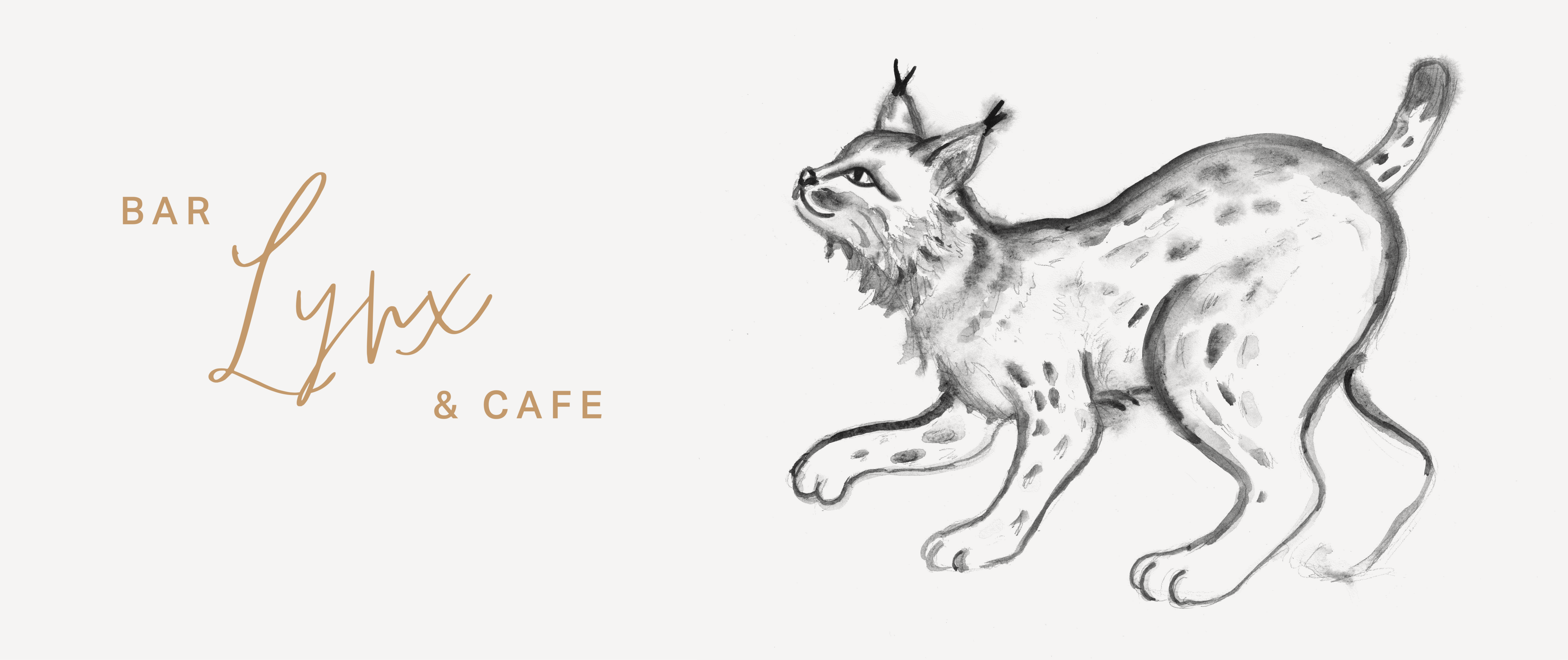
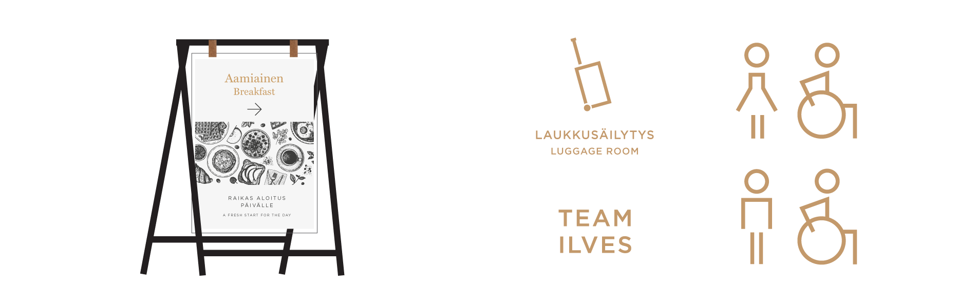

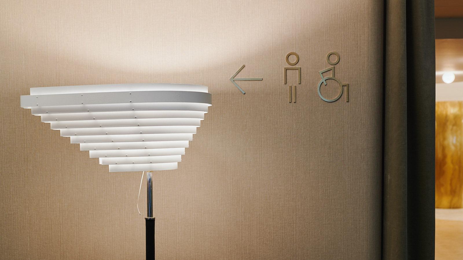
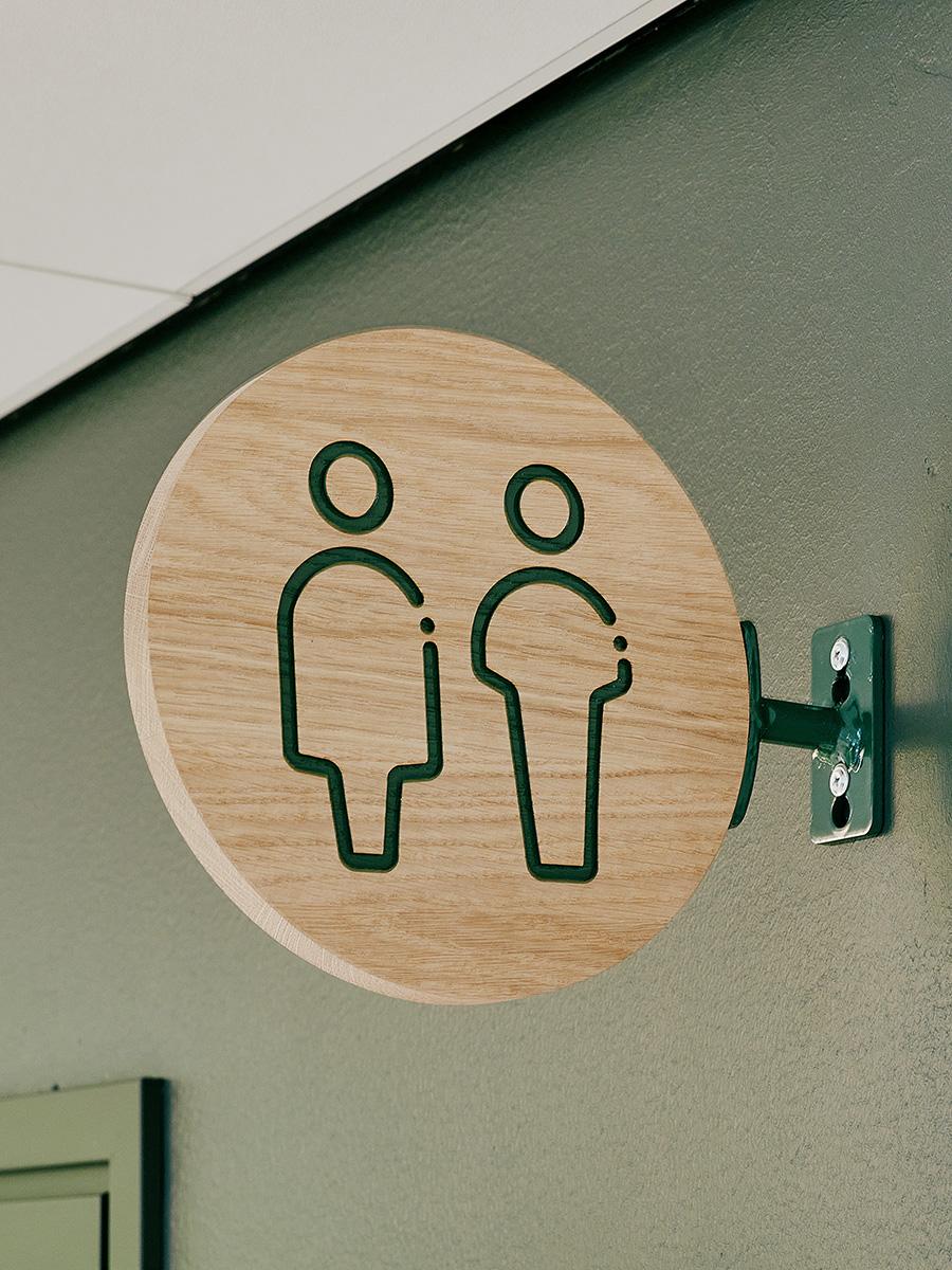
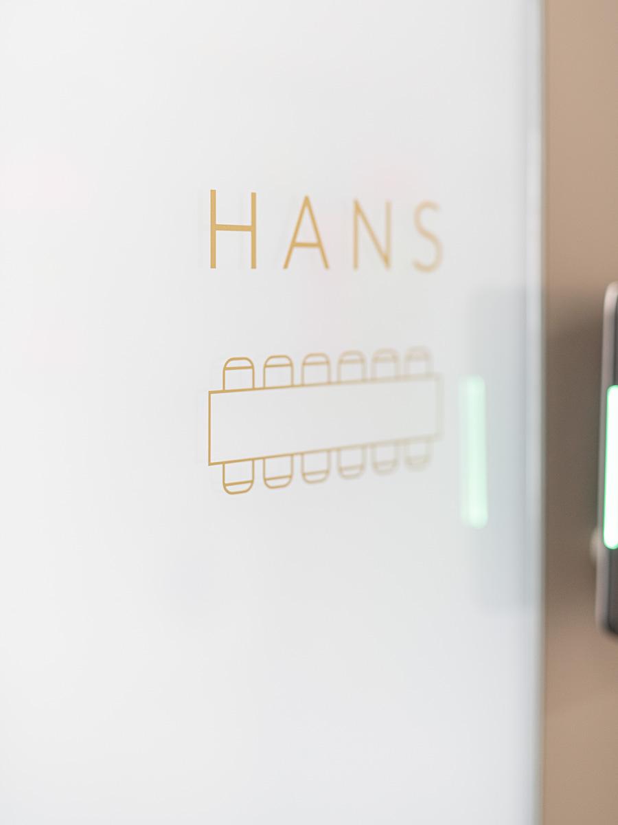
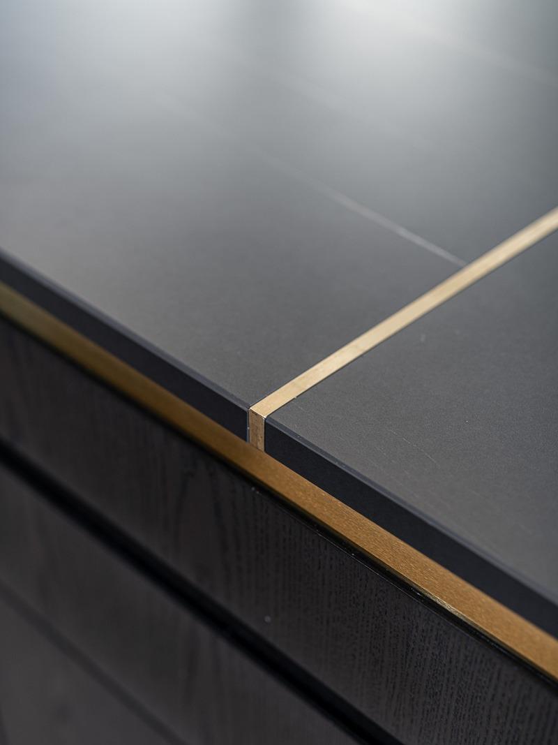
The tailored graphic look and the wayfinding system that emphasises the identity of the legendary hotel complete the luxurious everyday atmosphere of Ilves. “The more feminine, luxurious atmosphere of Ilves differs from the dark, industrially romantic style of Solo Sokos Hotel Torni, appealing to a different target group,” Riina Ruska, Lead Designer in the project sums up. The signs feature brass elements, feminine typography and memorable lynx imagery. The result strengthens the iconic identity of Ilves and its position as an attractive and diverse hotel.
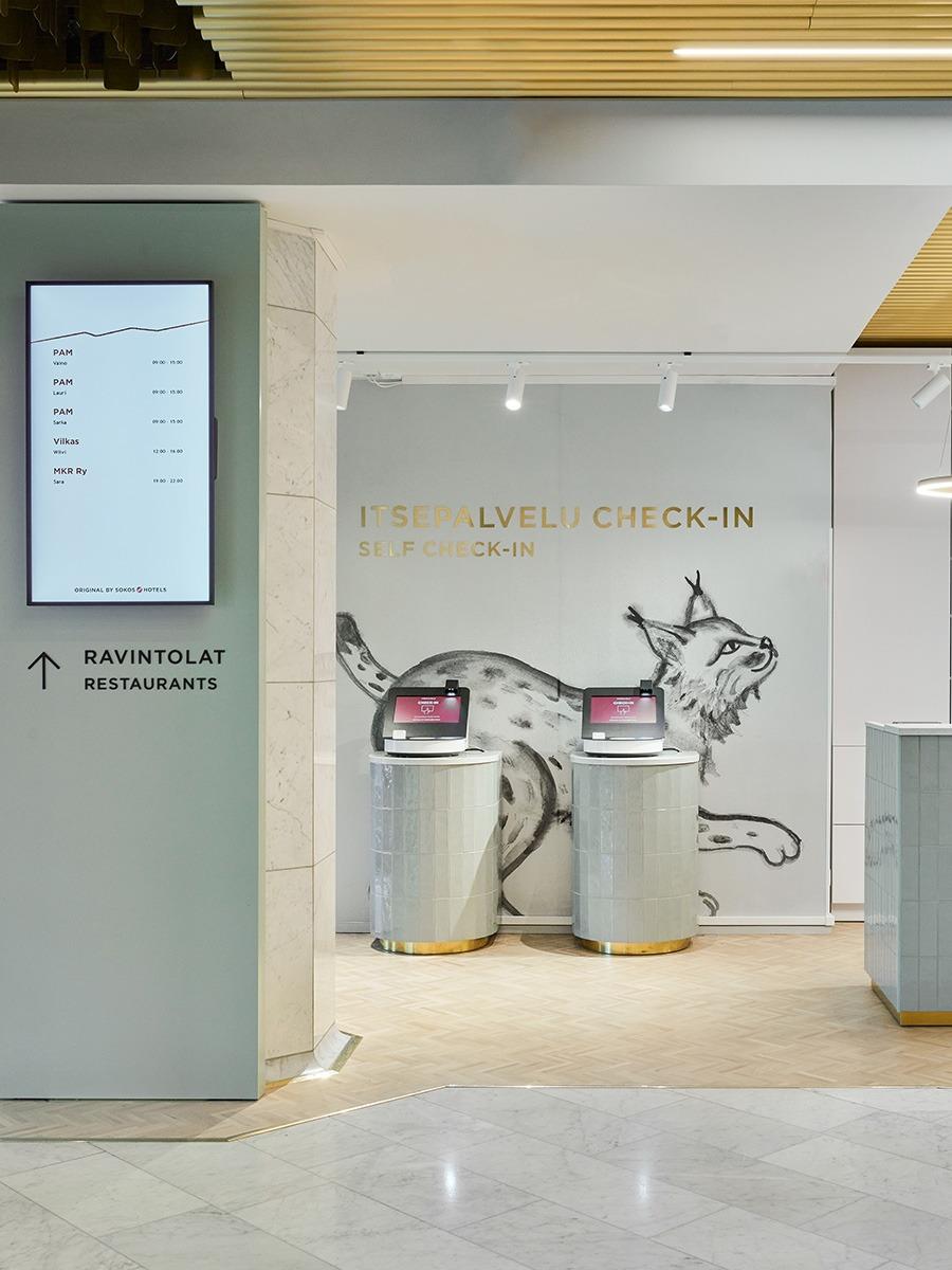
“Spaces must be adaptable, and they must have safe and clear routes. Self-service machines and queue numbers facilitate the peak check-in times.”
Heli Engblom, Director for Hotel Business, Sokotel
Would you like to read more about the upgraded Hotel Ilves?
Read the Sokotel press release or article in Projektiuutiset (both in Finnish).