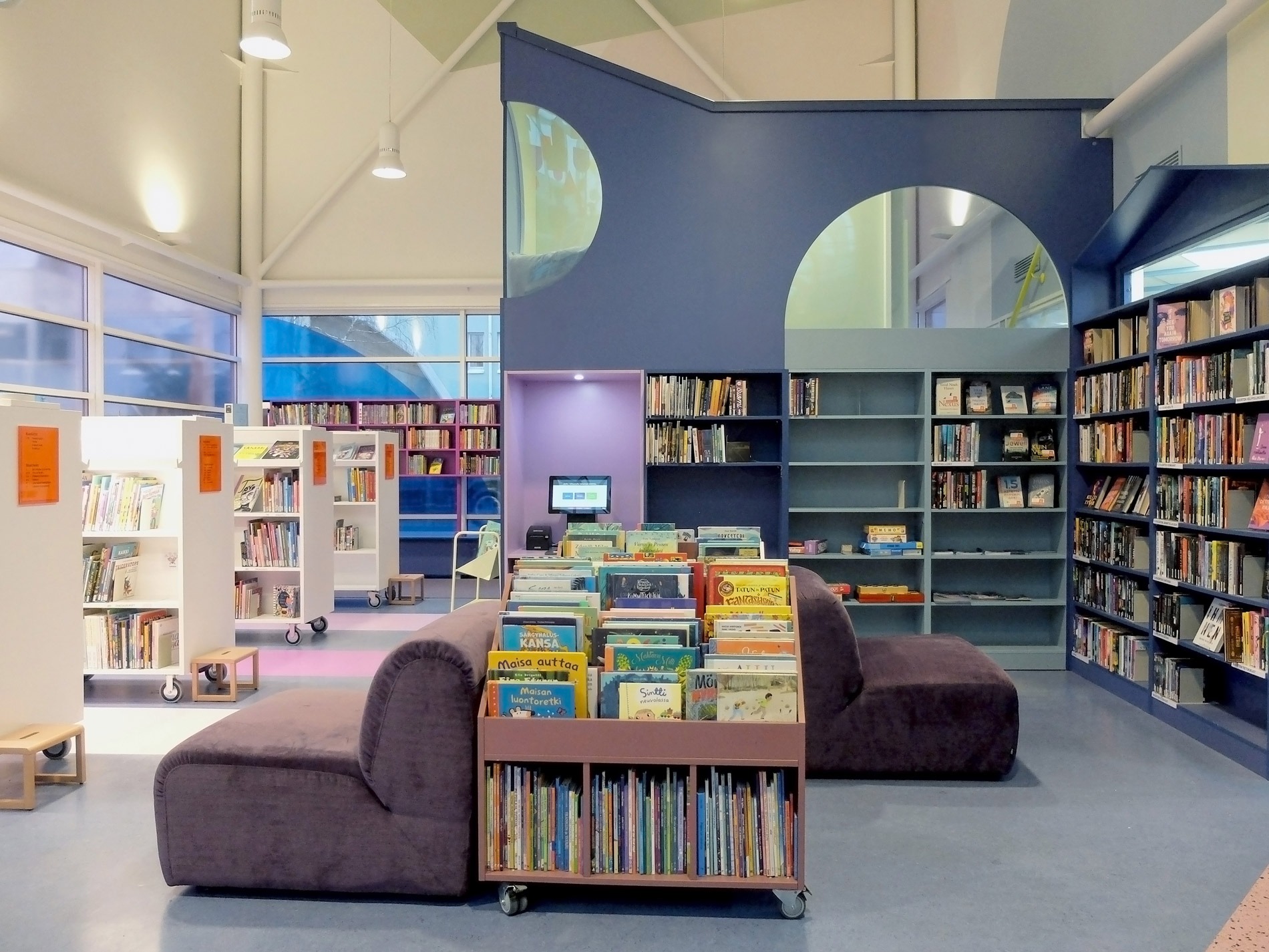
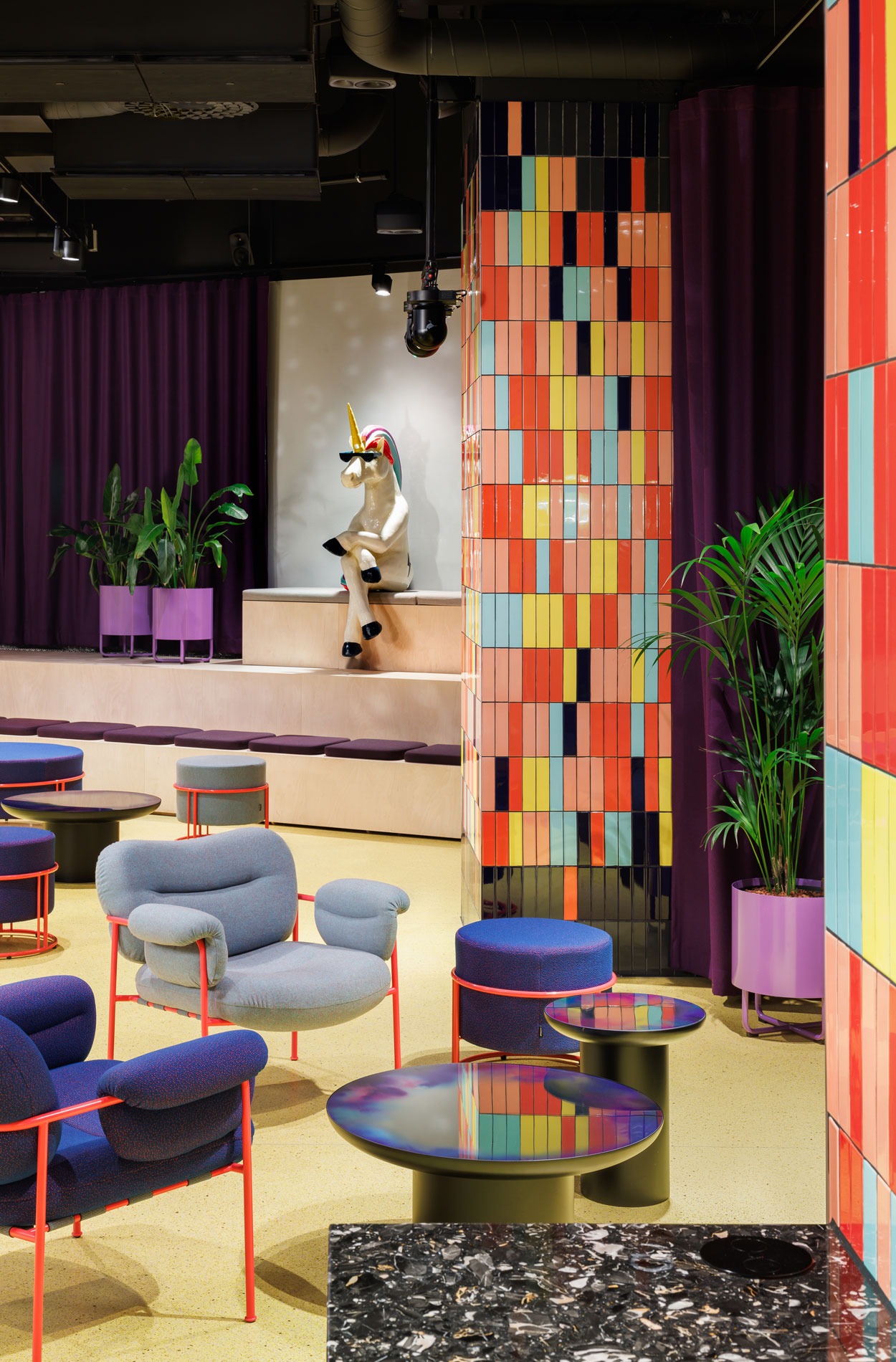
Playful library challenges the familiar
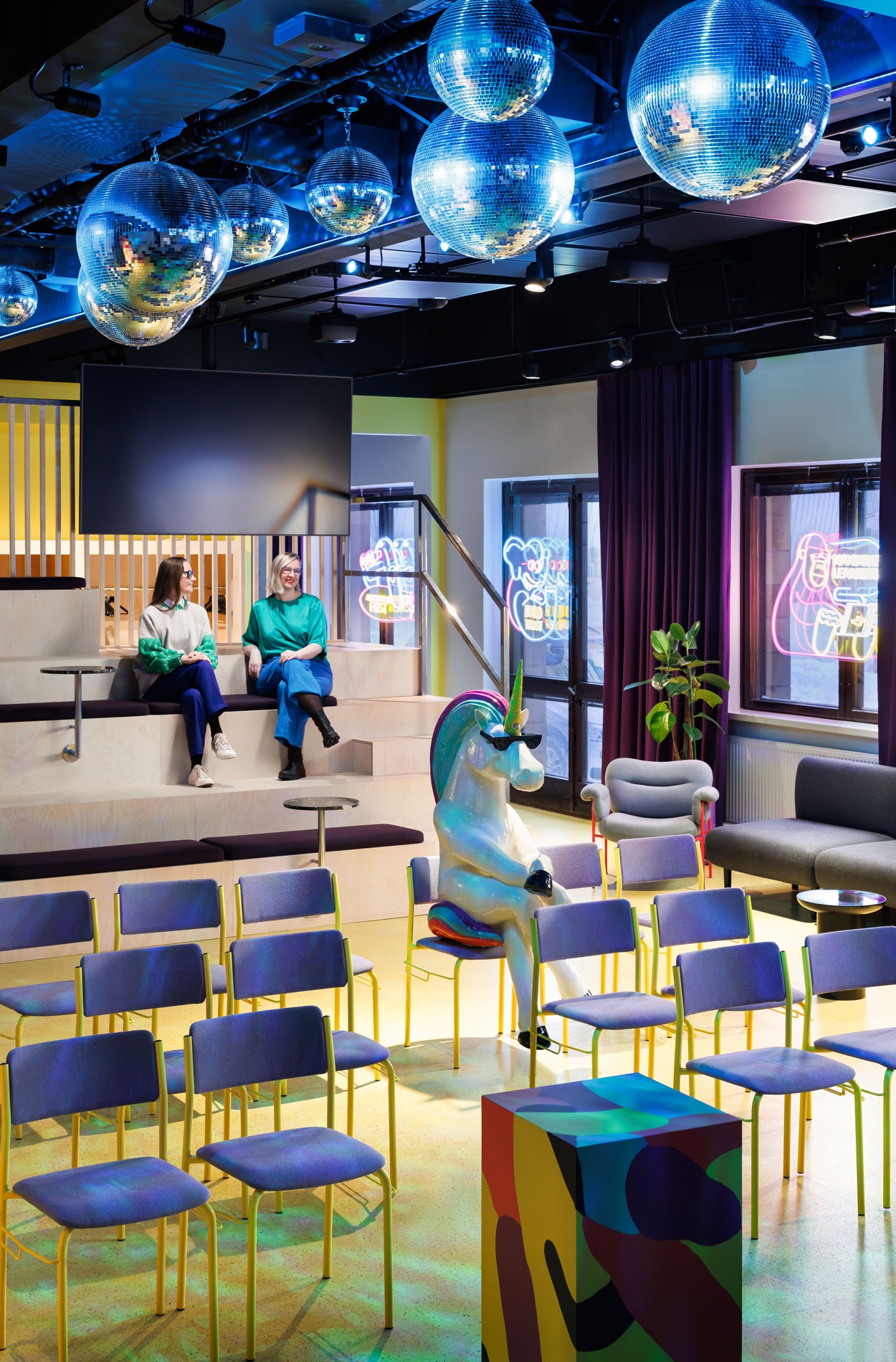
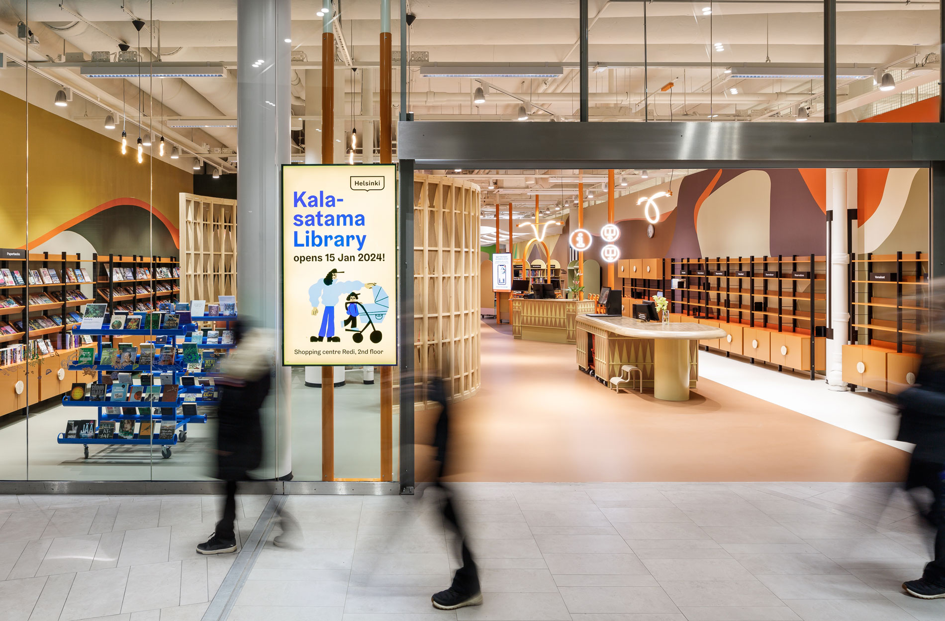
The new Kalasatama Library that plays with colours and shapes opened at Redi shopping centre in early 2024. The library was inspired by Max Velthuij’s story “The Little Boy and the Big Fish”, where the sky turns out to be the sea and a bird can be a fish. As in the story, the library, too, challenges the familiar: the architectural borders of the rooms have been blurred to create an environment that welcomes people to enjoy themselves and forget their old ways of thinking. Loved by users and the media alike, the library was created together with local residents and the library staff.
A strategically important and experiential local library
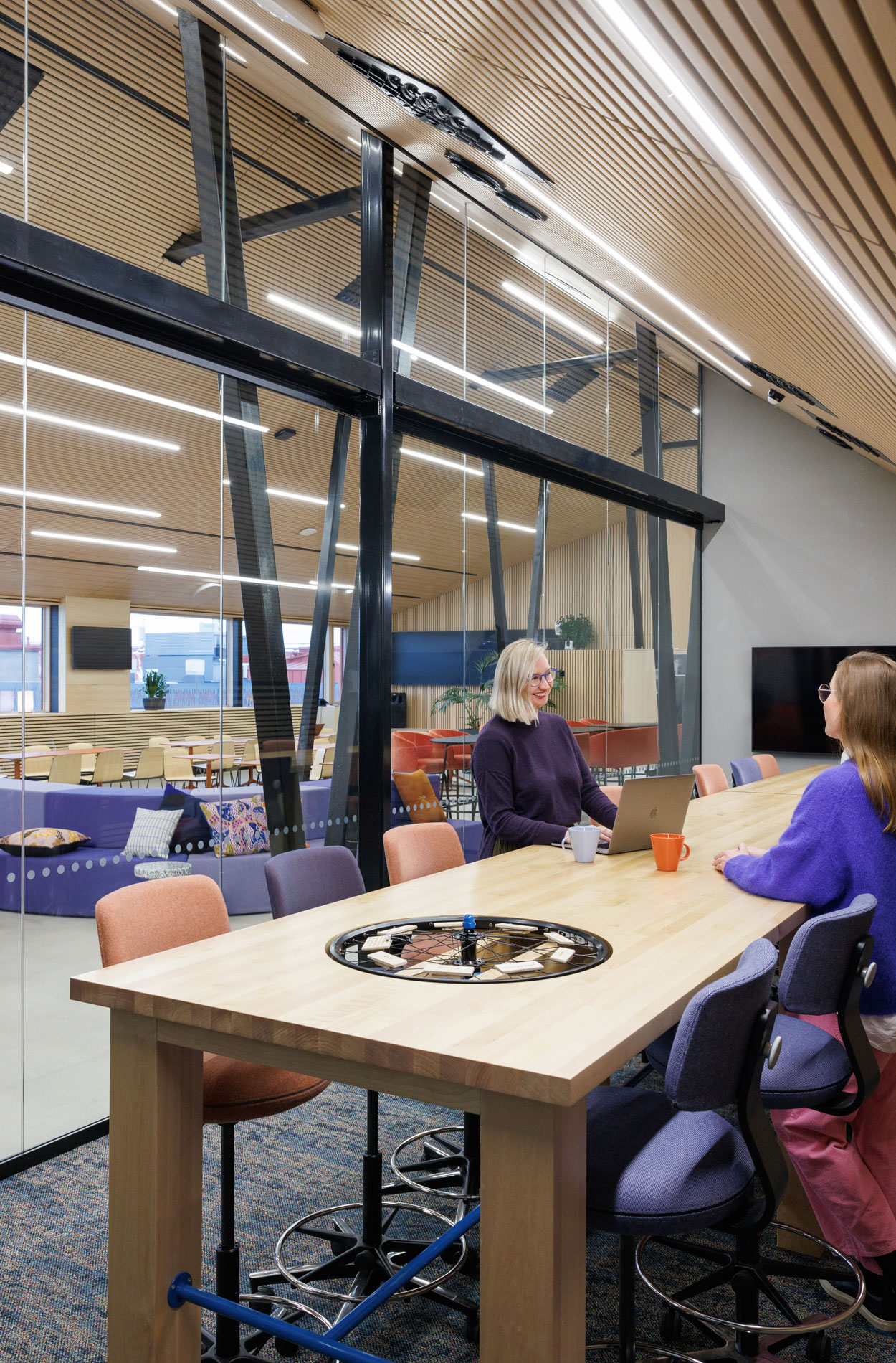
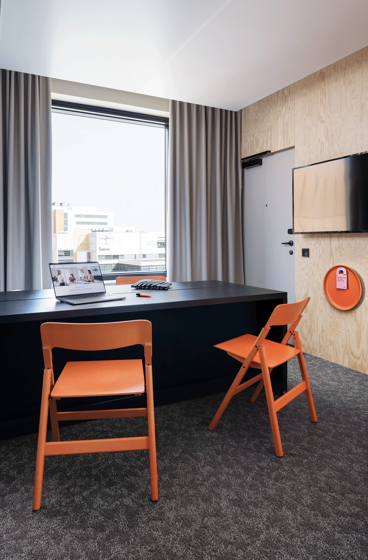
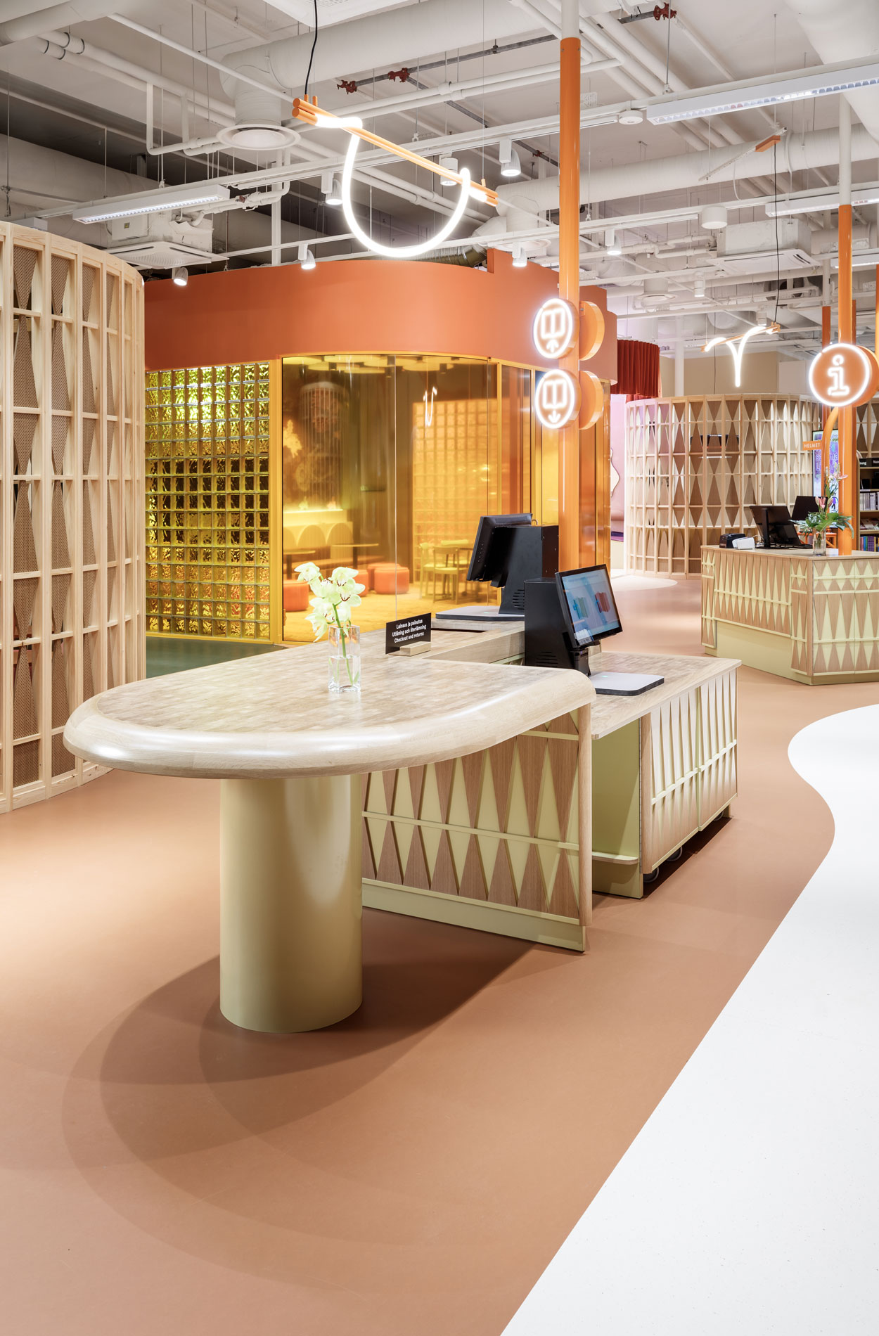
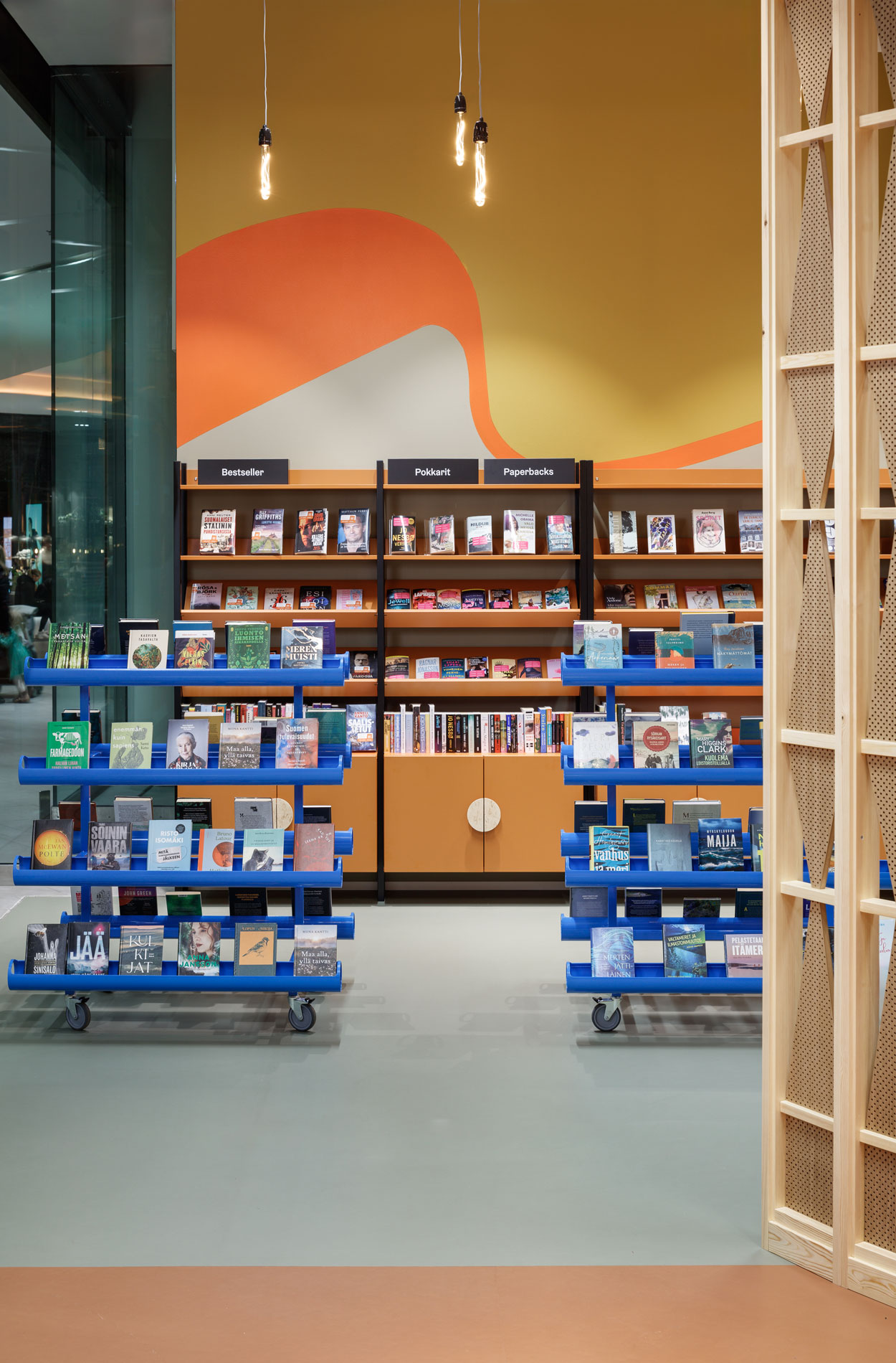
The aim of the project was to make Kalasatama Library into a meaningful and bold space that challenges the role of local libraries. The 400-square metre library is located in a busy transport hub on the second floor of Redi shopping centre, in a constantly growing and evolving neighbourhood. The space resembles a piece of art and is tightly linked to the city’s strategic target of renewing the role of libraries and strengthening art and culture that bring people joy and unite them after difficult times. Kalasatama Library has been made from many small observations and great ideas shared by the city, the library staff, schoolchildren, residents and senior citizens. “We got a wonderful, colourful and comfortable space into Kalasatama. The new library supports the realisation of the most important goal, i.e. encouraging people to read”, Erna Marttila, director of Kalasatama’s library, states happily.
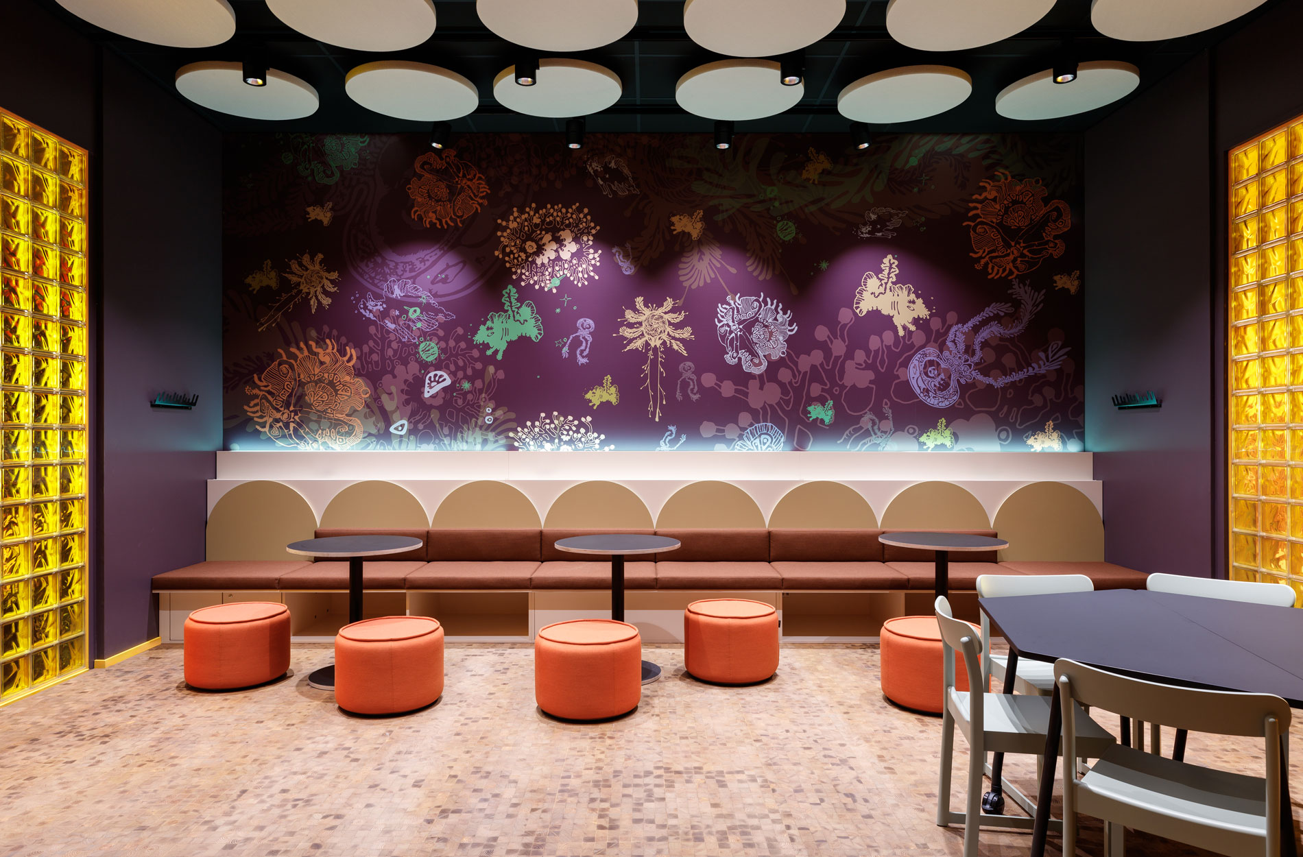
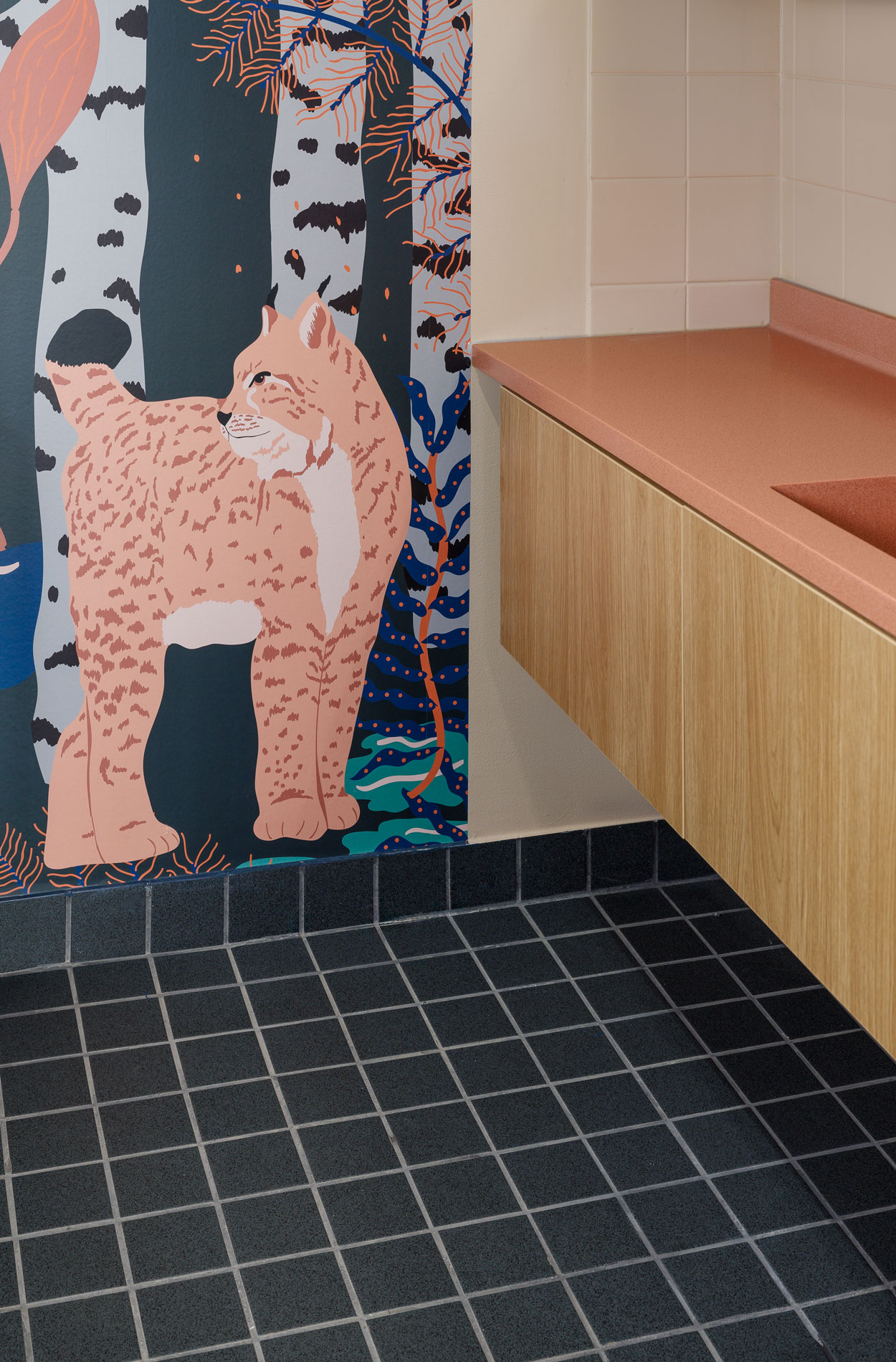
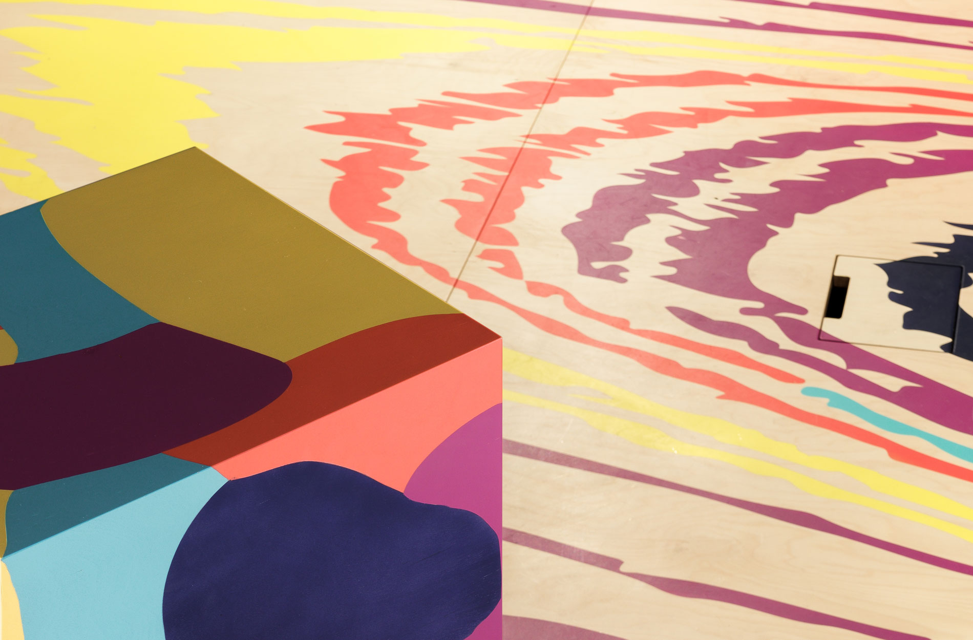
The wallpaper in the groupwork room is one-of-a-kind. Each image is drawn by hand, and the contrasting colours glow in the dark, creating different atmospheres in the space.
The following five themes drove the design of the spatial experience:
- Undefined: Everyone may define themselves here. We are by your side!
- Discovery: You are permitted to experiment and discover here. We encourage it!
- Safe: We need a safe atmosphere where we can define ourselves and open our minds to discover something new.
- Dream-like: The space does not give ready-made answers, only hints that we may interpret as we wish. We permit you to dream and find new ideas.
- Surprising: Surprises remind us of our thought patterns. Let’s redefine the ordinary.
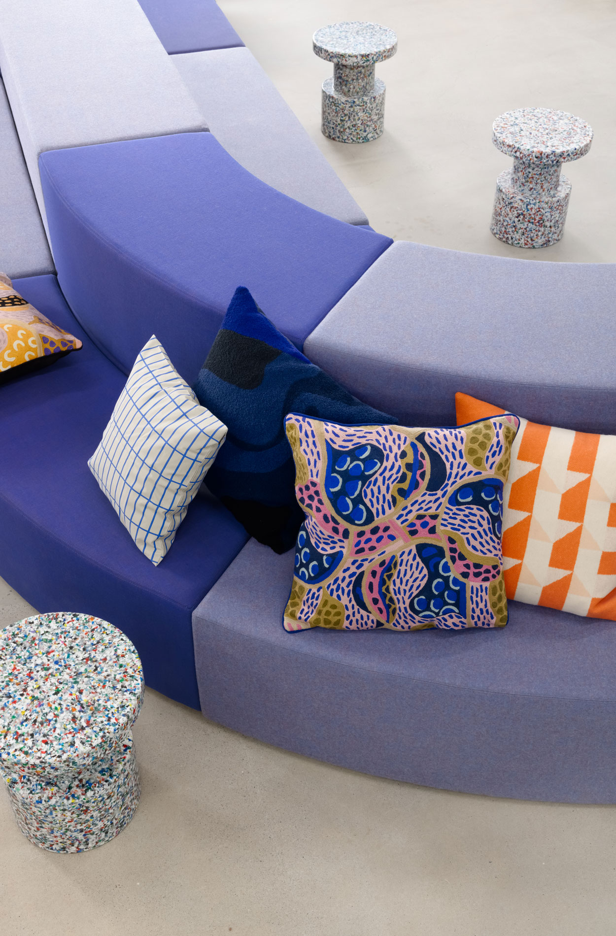
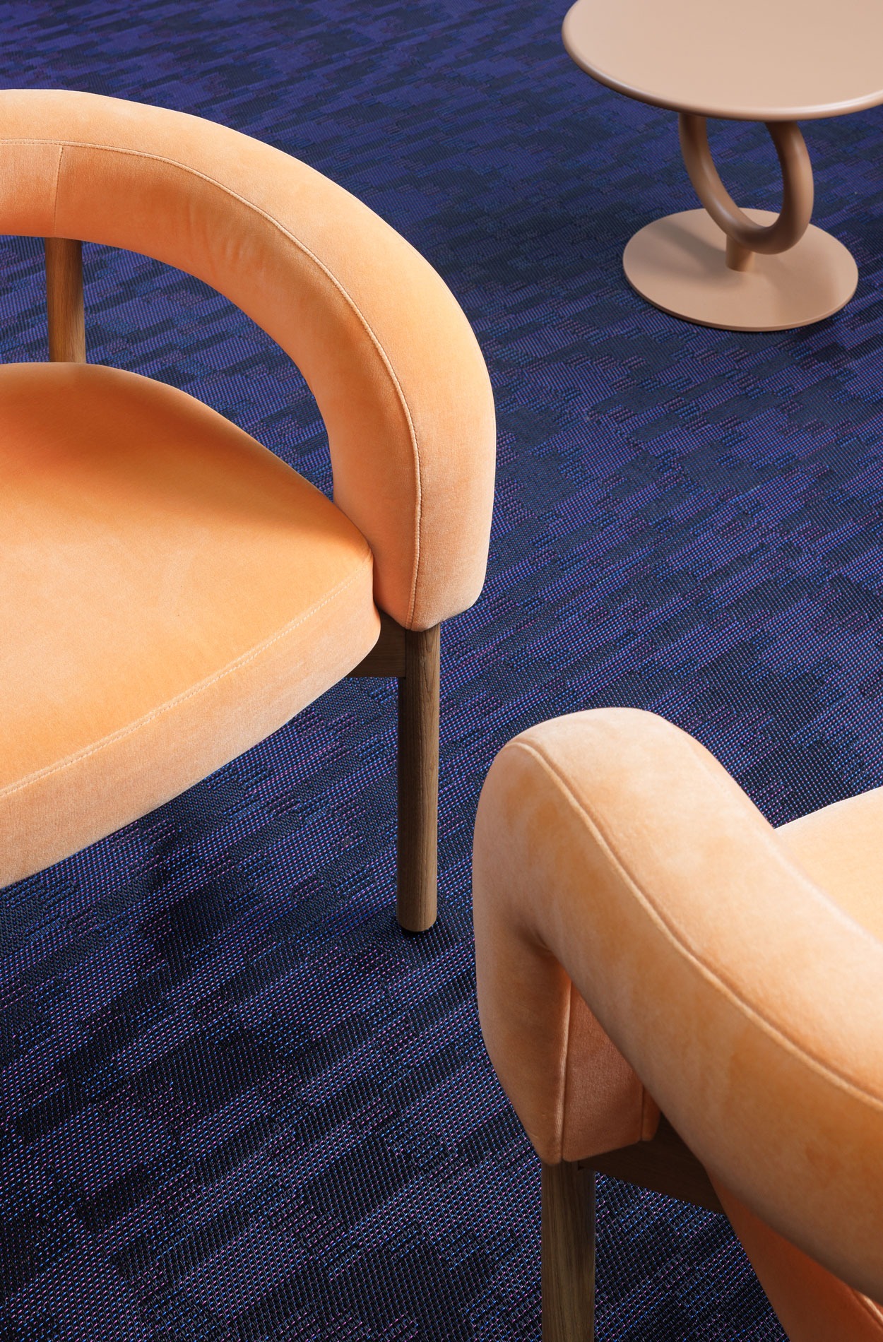
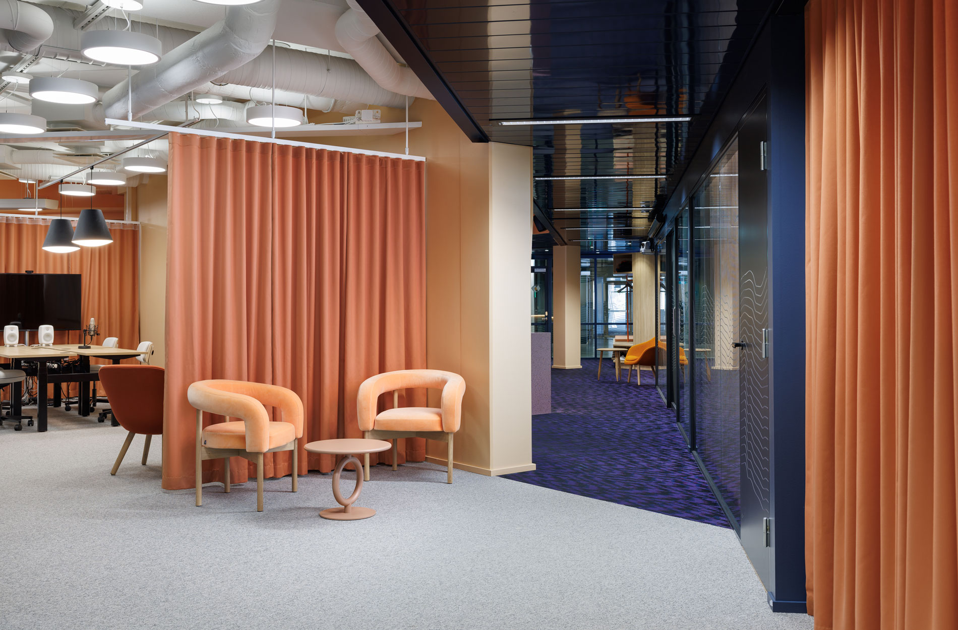
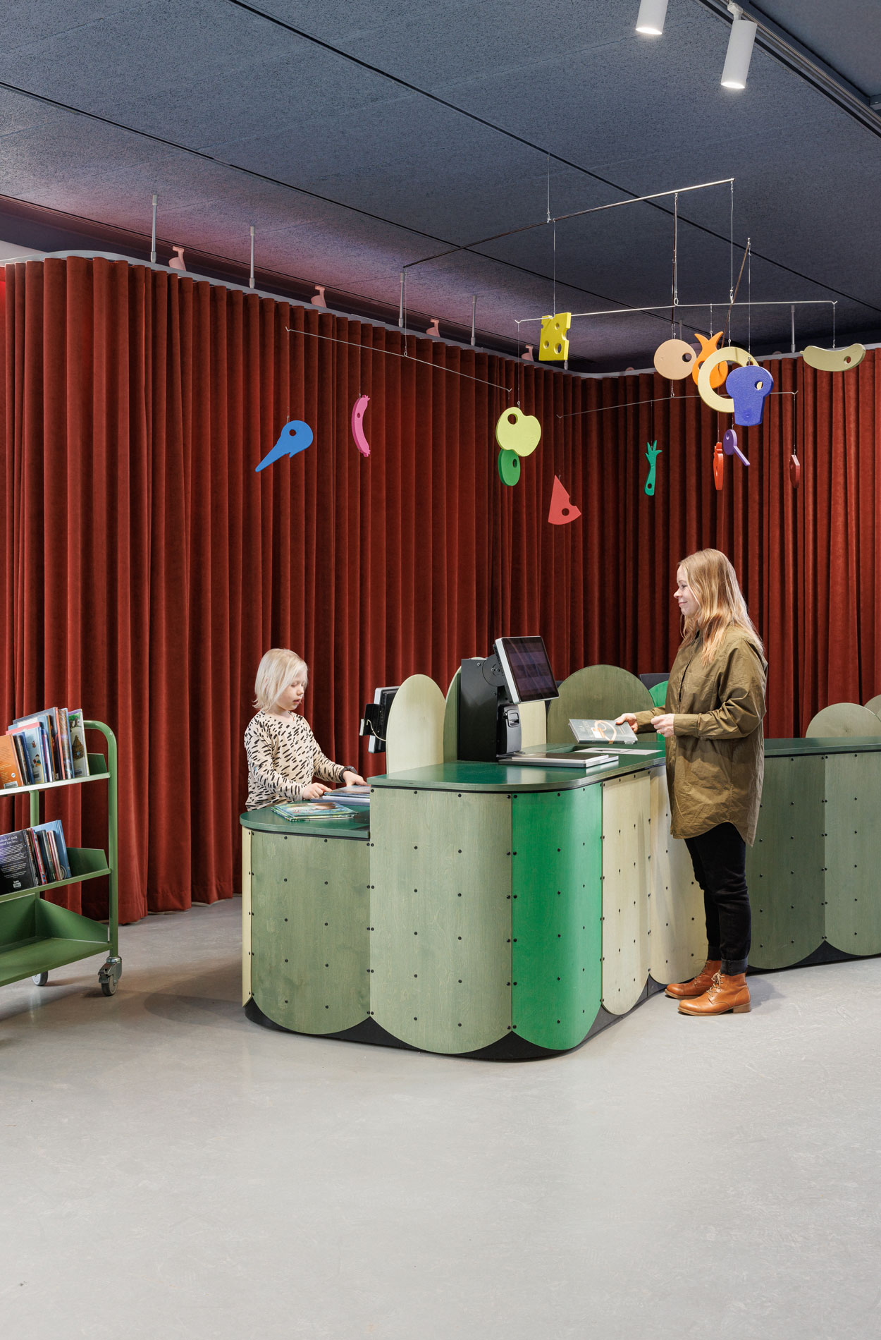
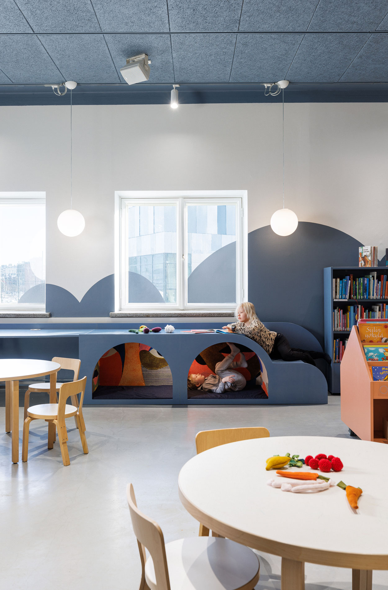
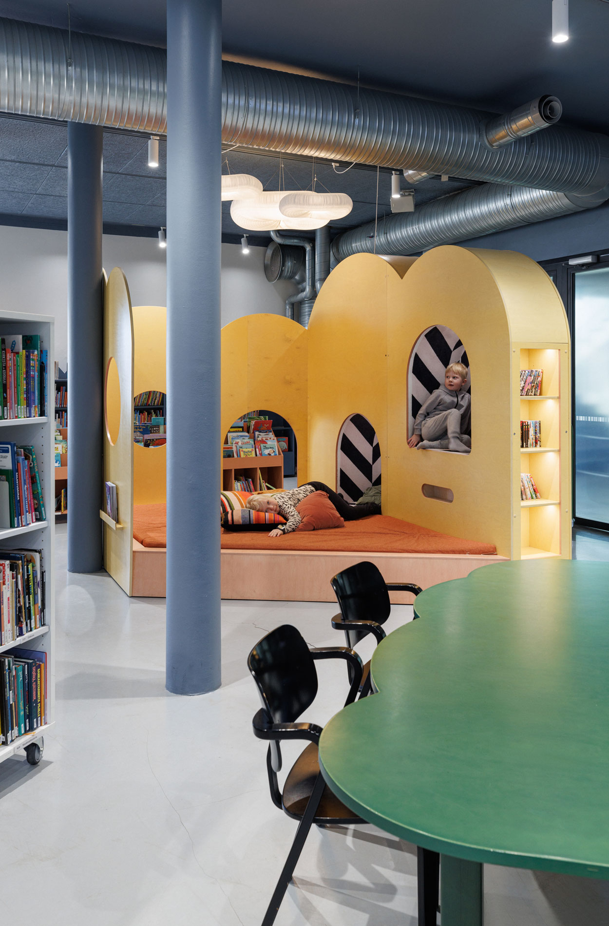
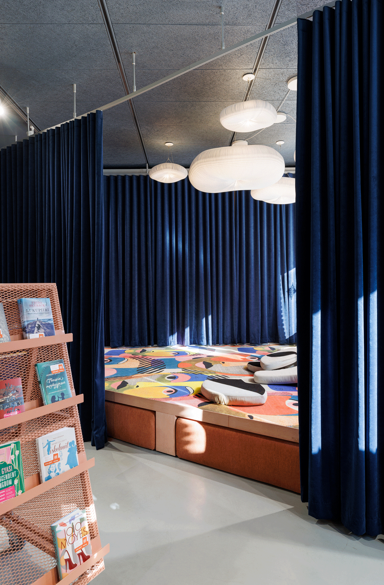
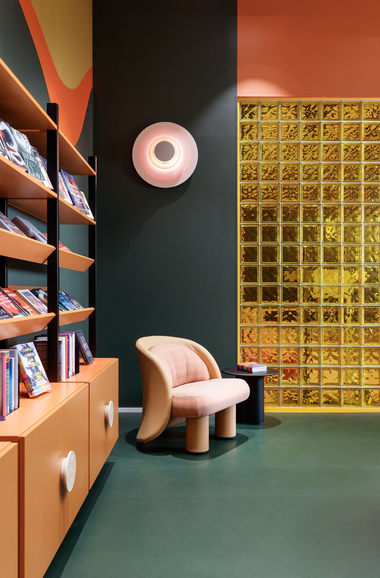
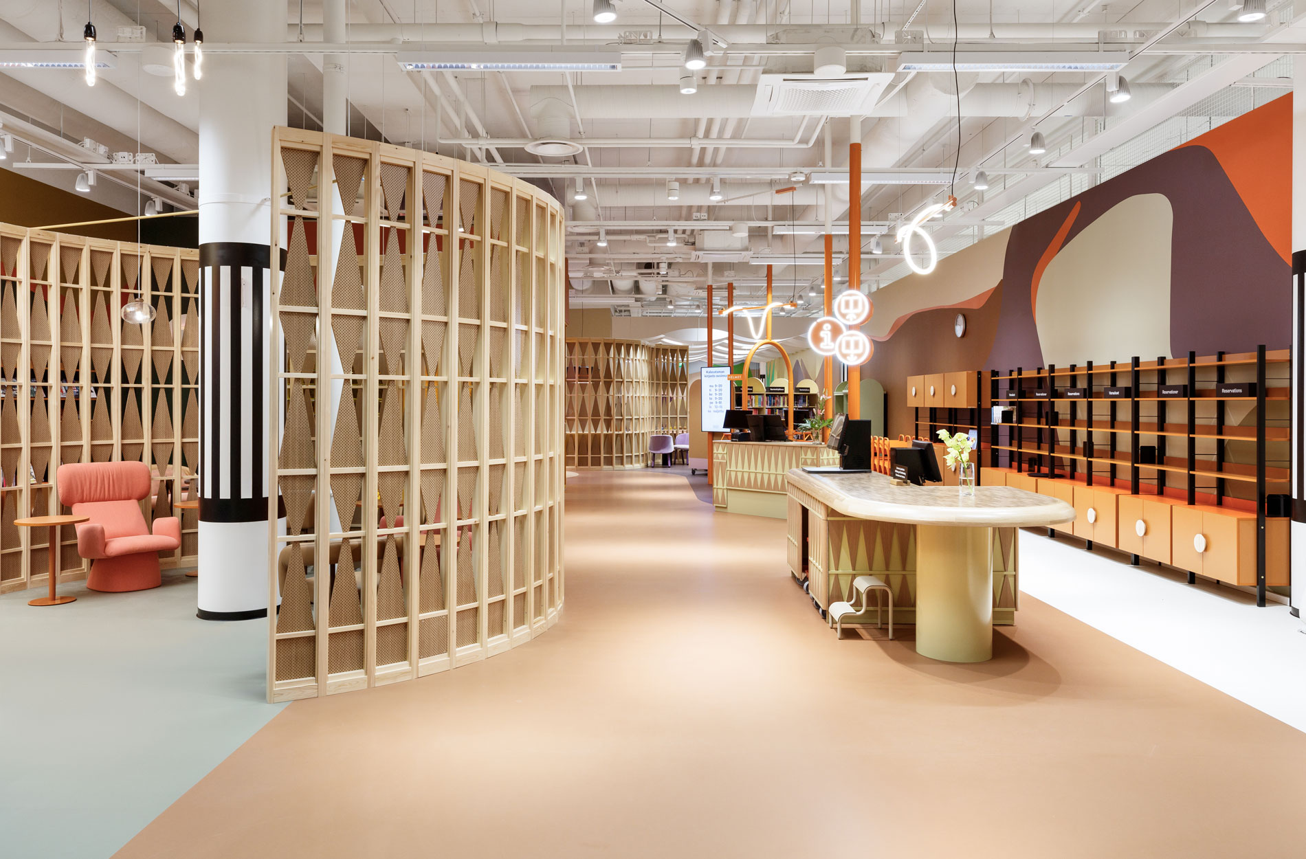
Rune & Berg Design was responsible for the overall concept, interior architectural design and graphic look of the library, as well as project management. The project team also included a graphic designer intern who let their imagination fly in the graphic illustrations. Resident involvement was another key part of the project and Rune & Berg Design’s tasks. The underlying theme was a longing for peace to balance hectic and noisy daily life. People wanted quiet nooks, colours, joy, playfulness, softness, casualness, surprises, permissibility and participation.
“The library serves two different use cases: quick visits, such as returning a book, and on the other hand, it also offers a peaceful place to hang out. In addition, the functions and customer service furniture have been placed so that library personnel can be reached as easily as possible by customers”, Erna describes the end result.
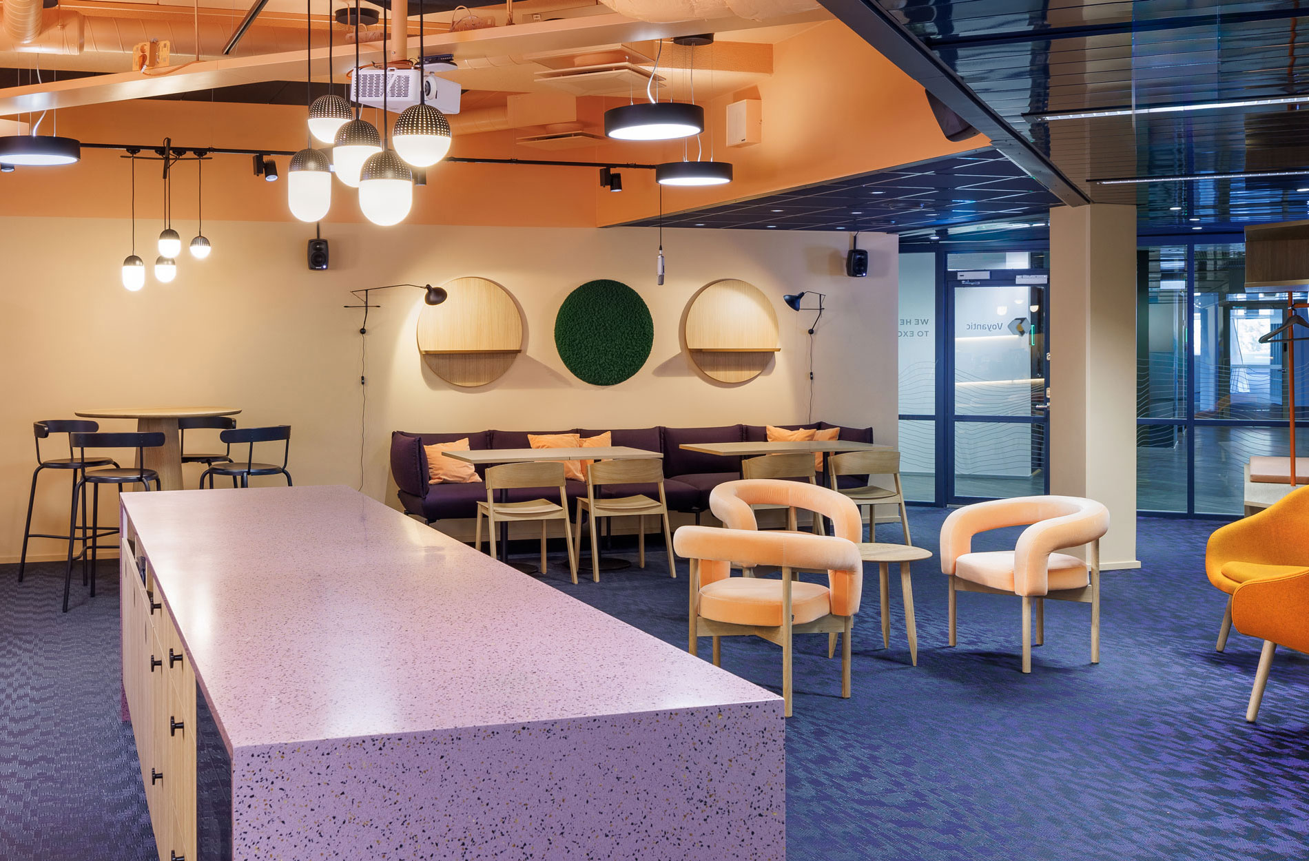
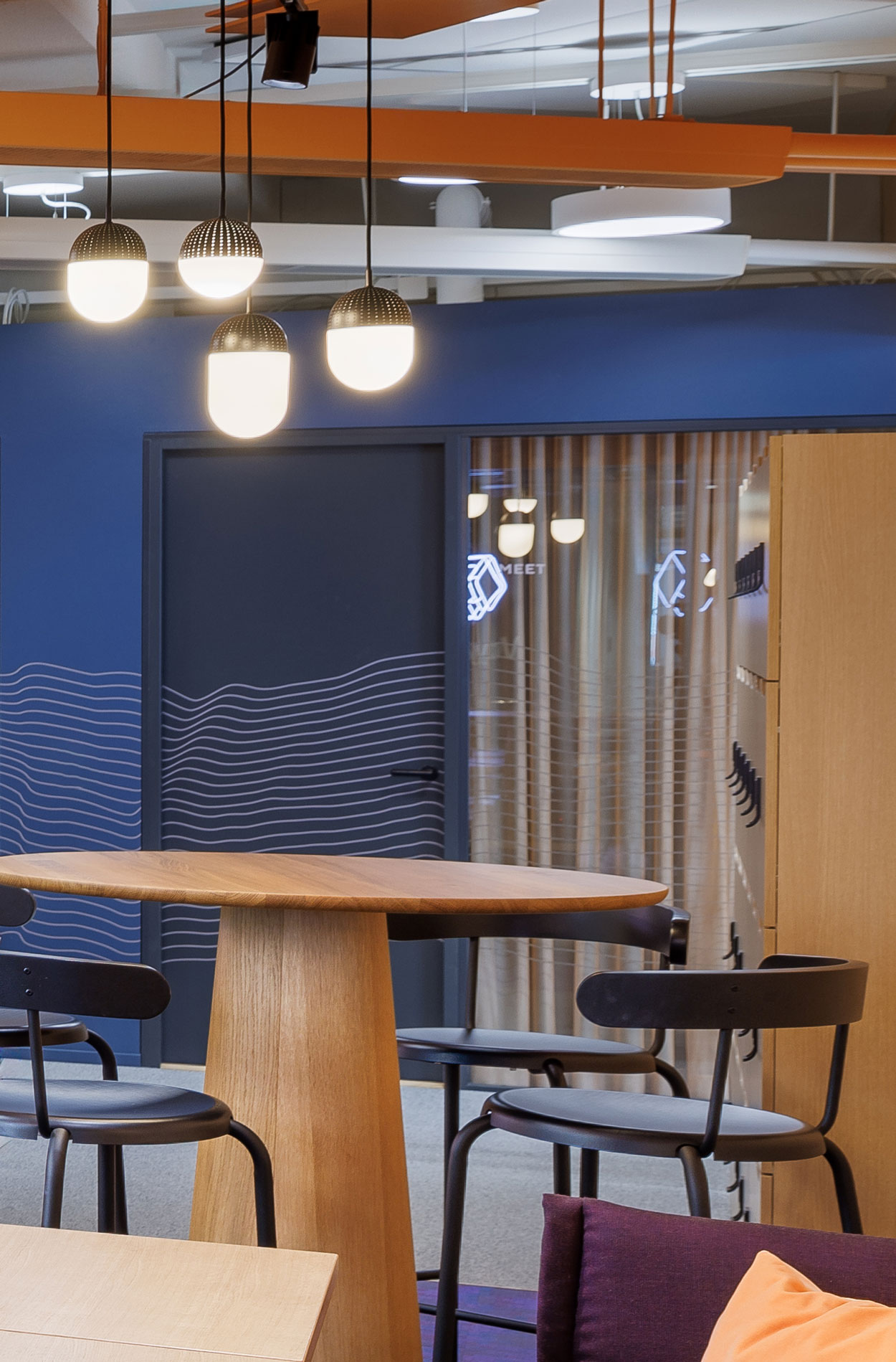
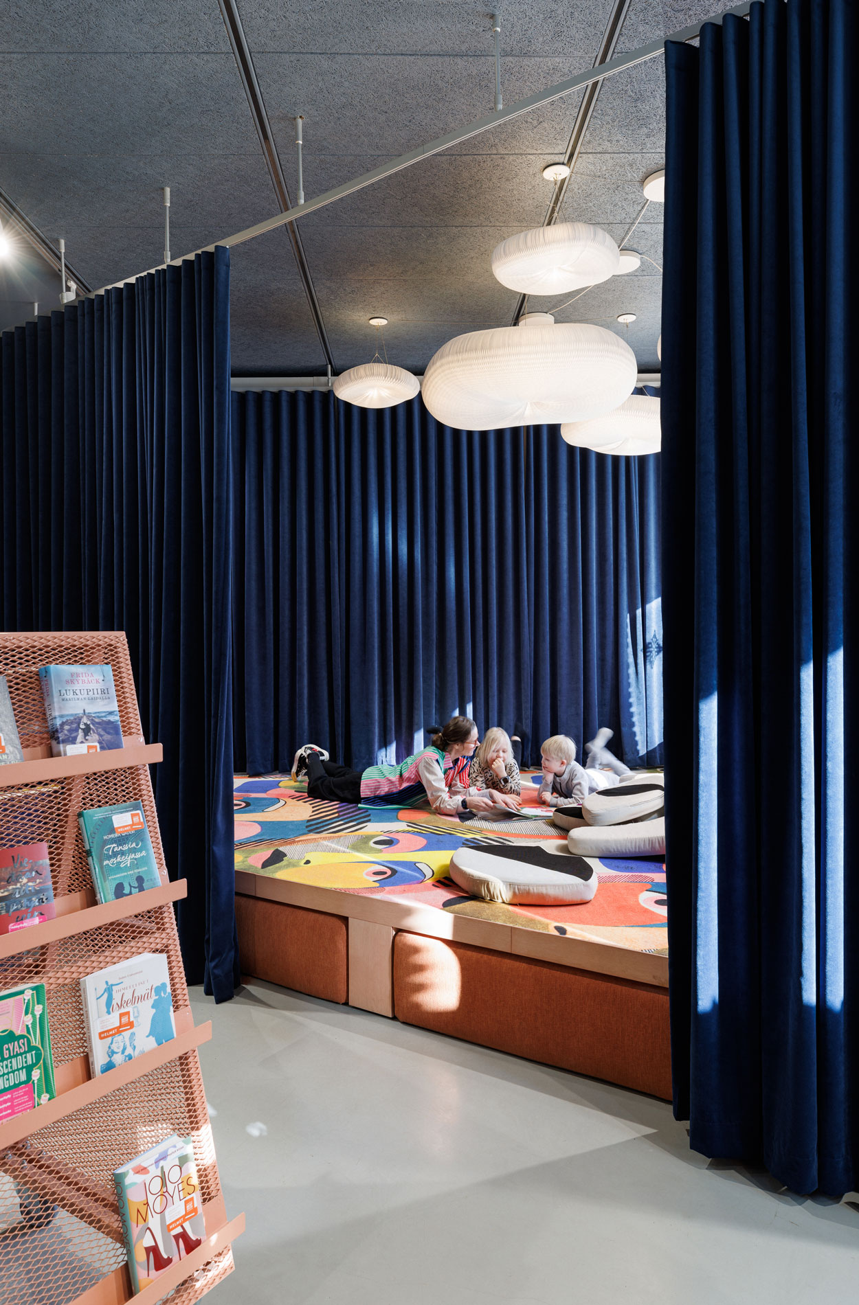
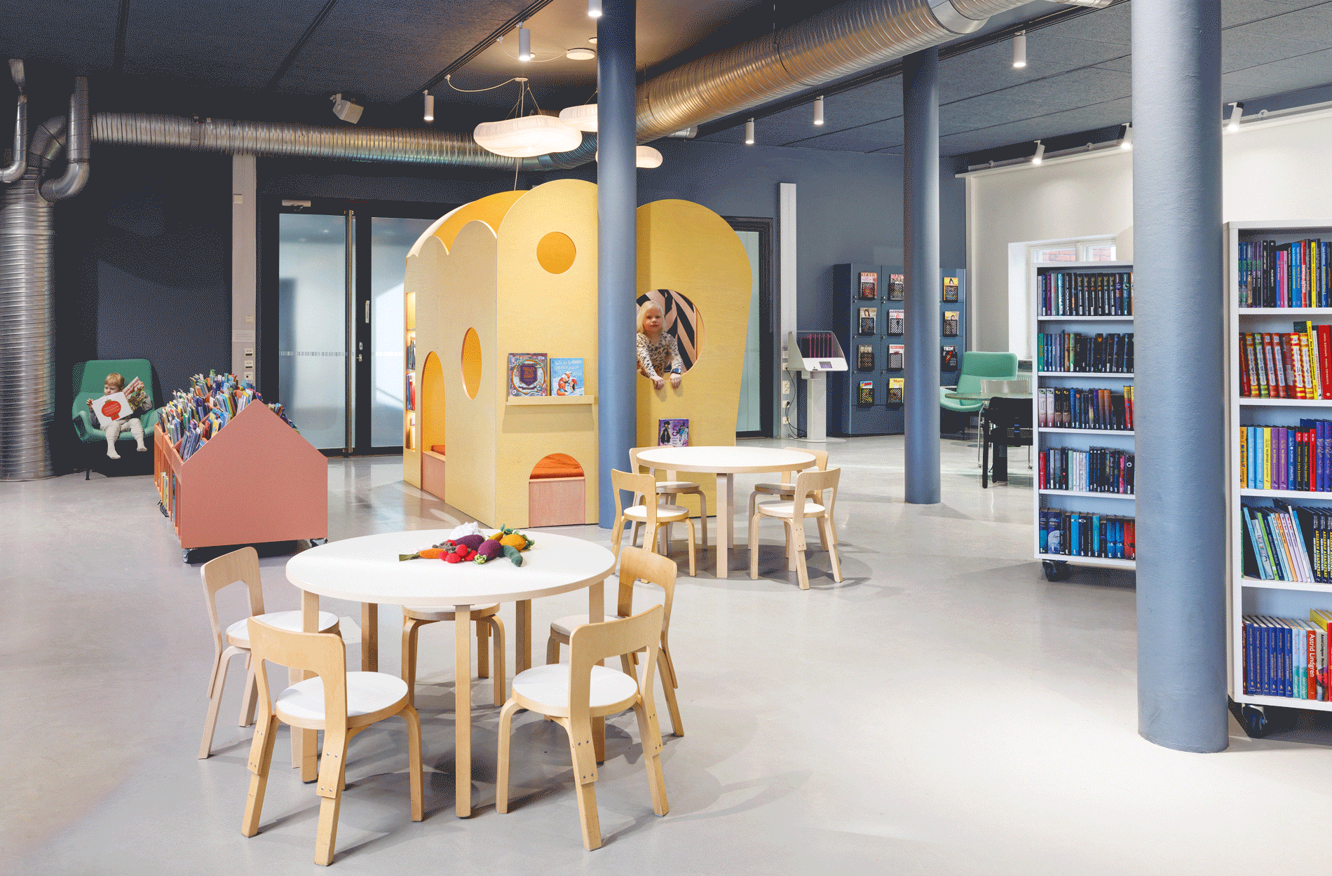
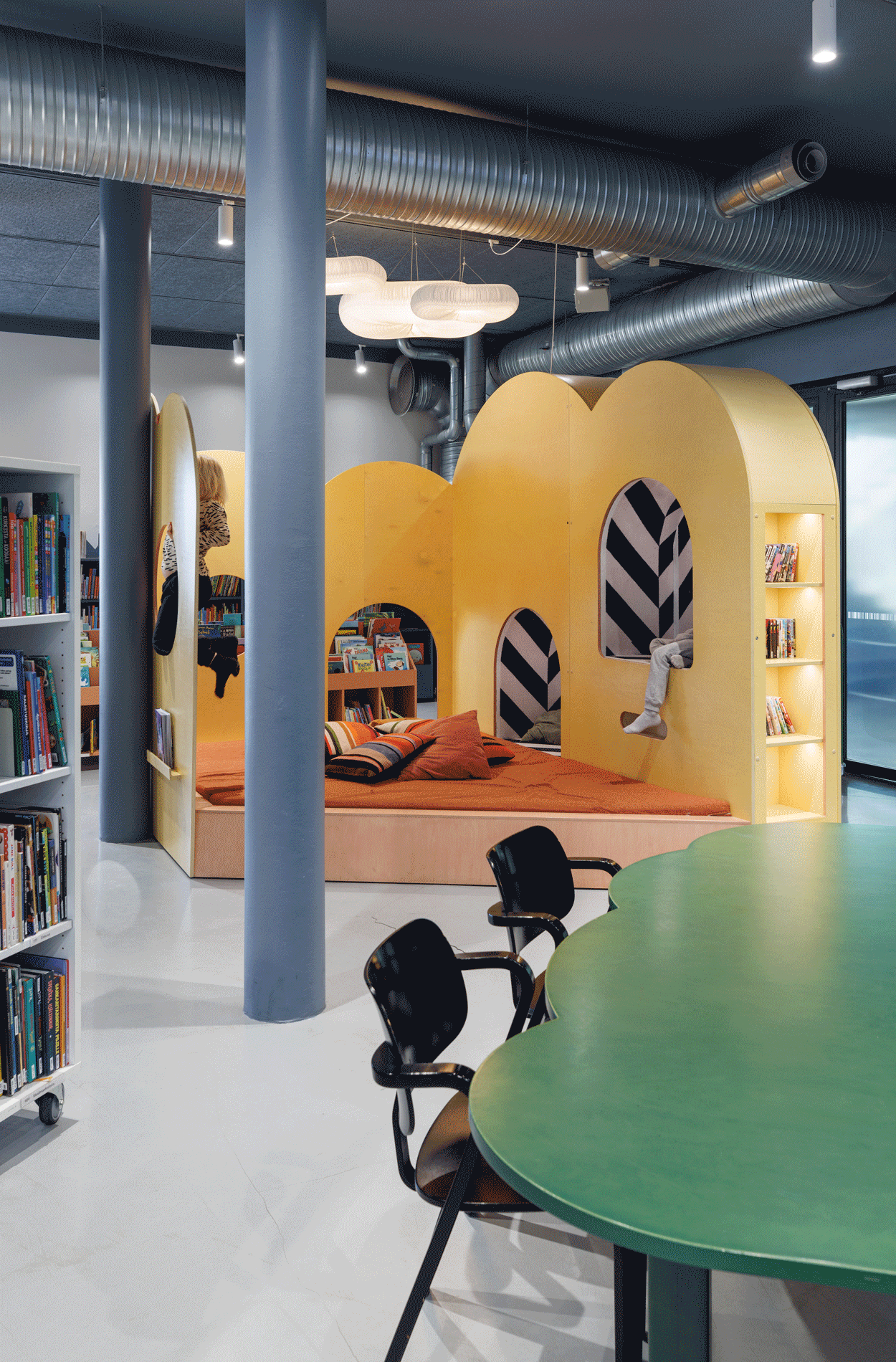
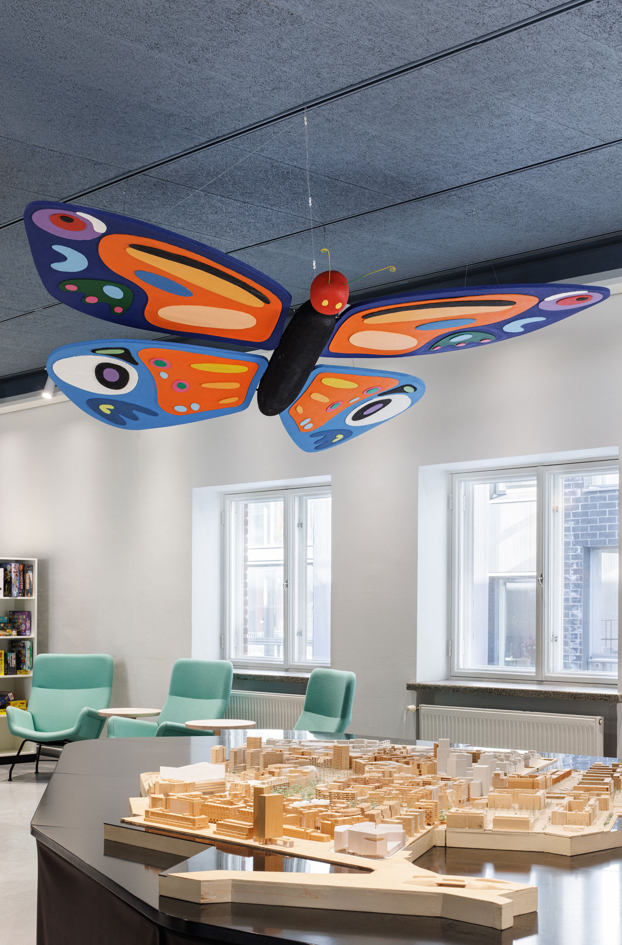
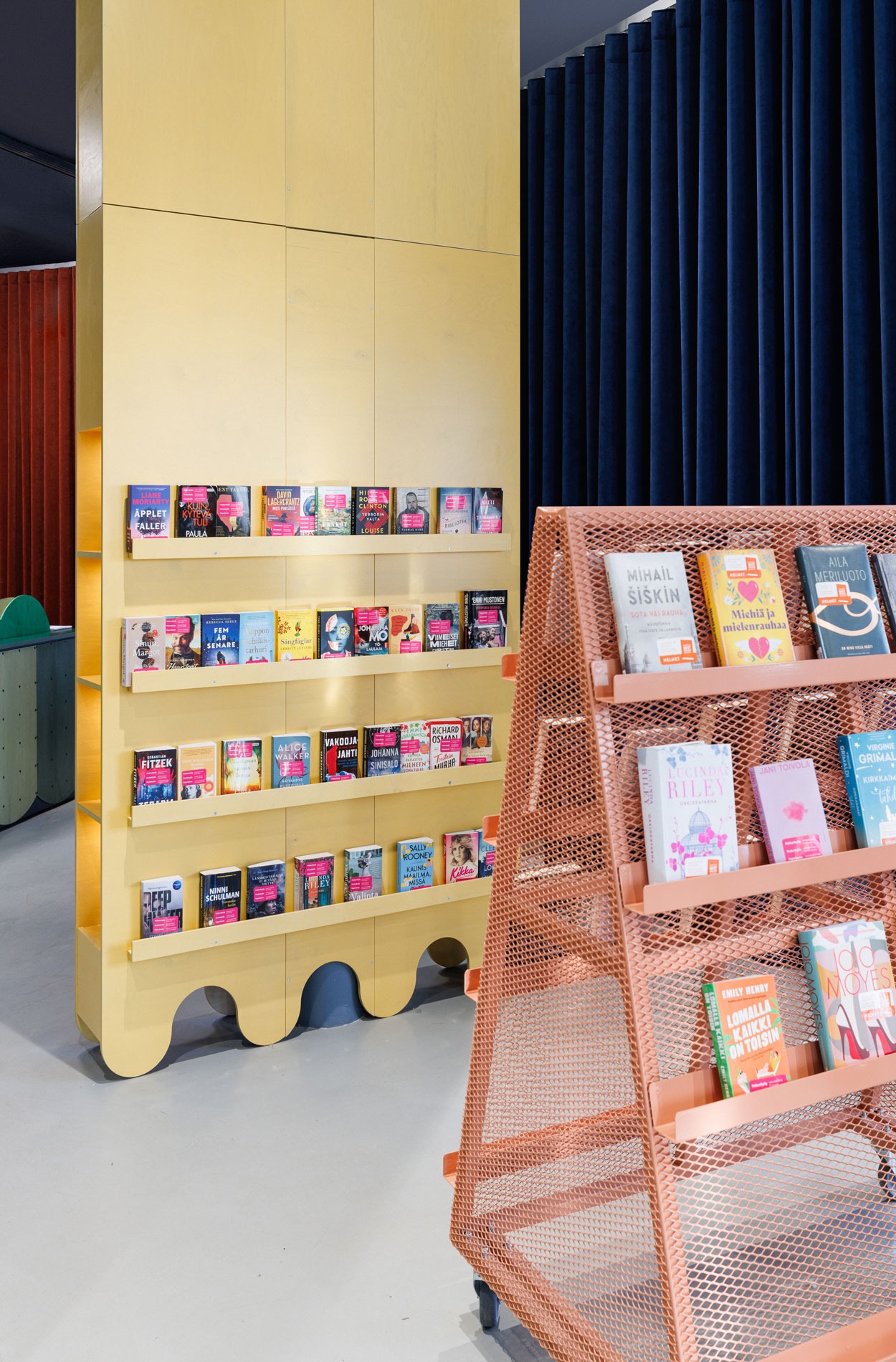
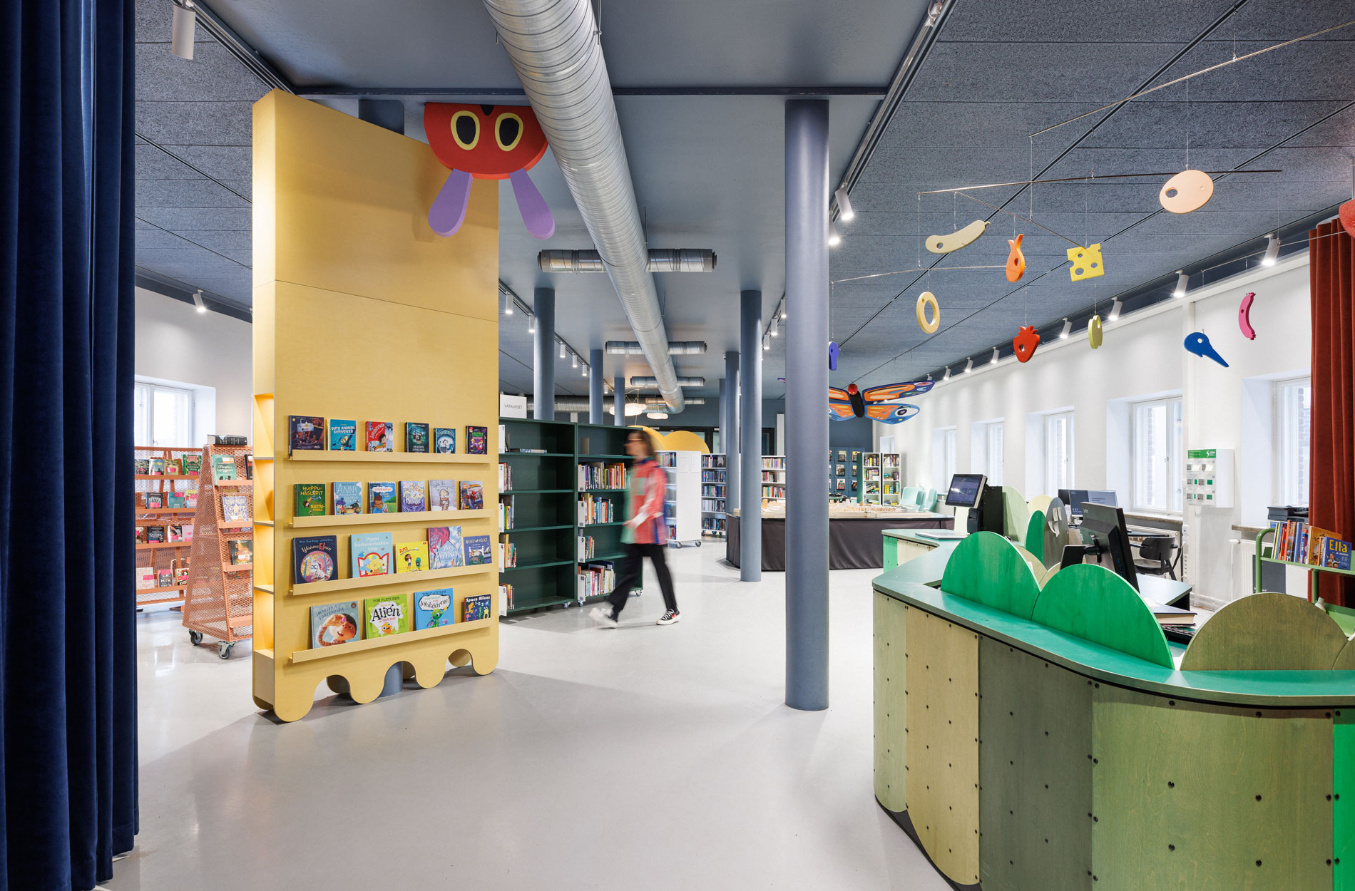
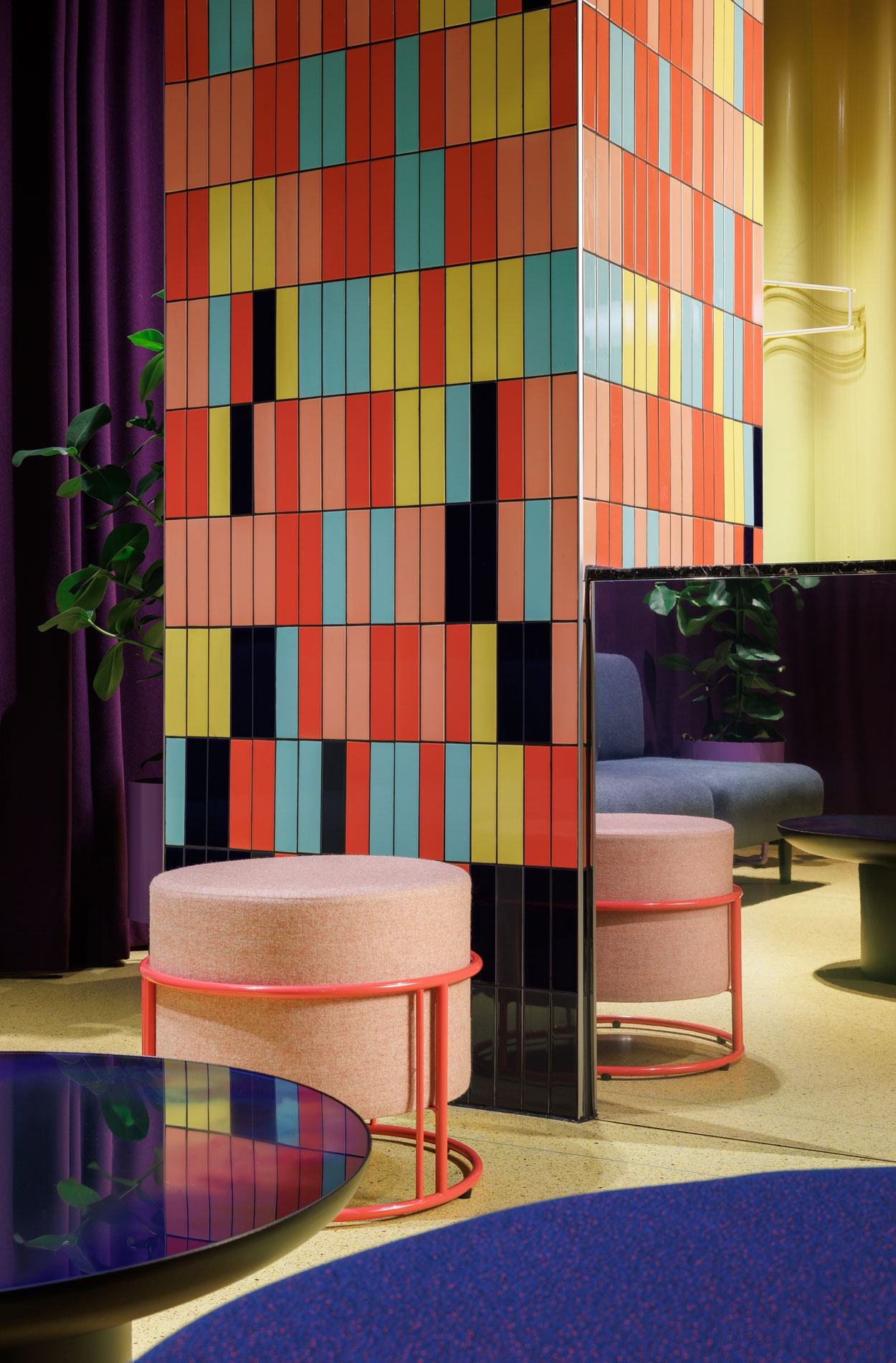
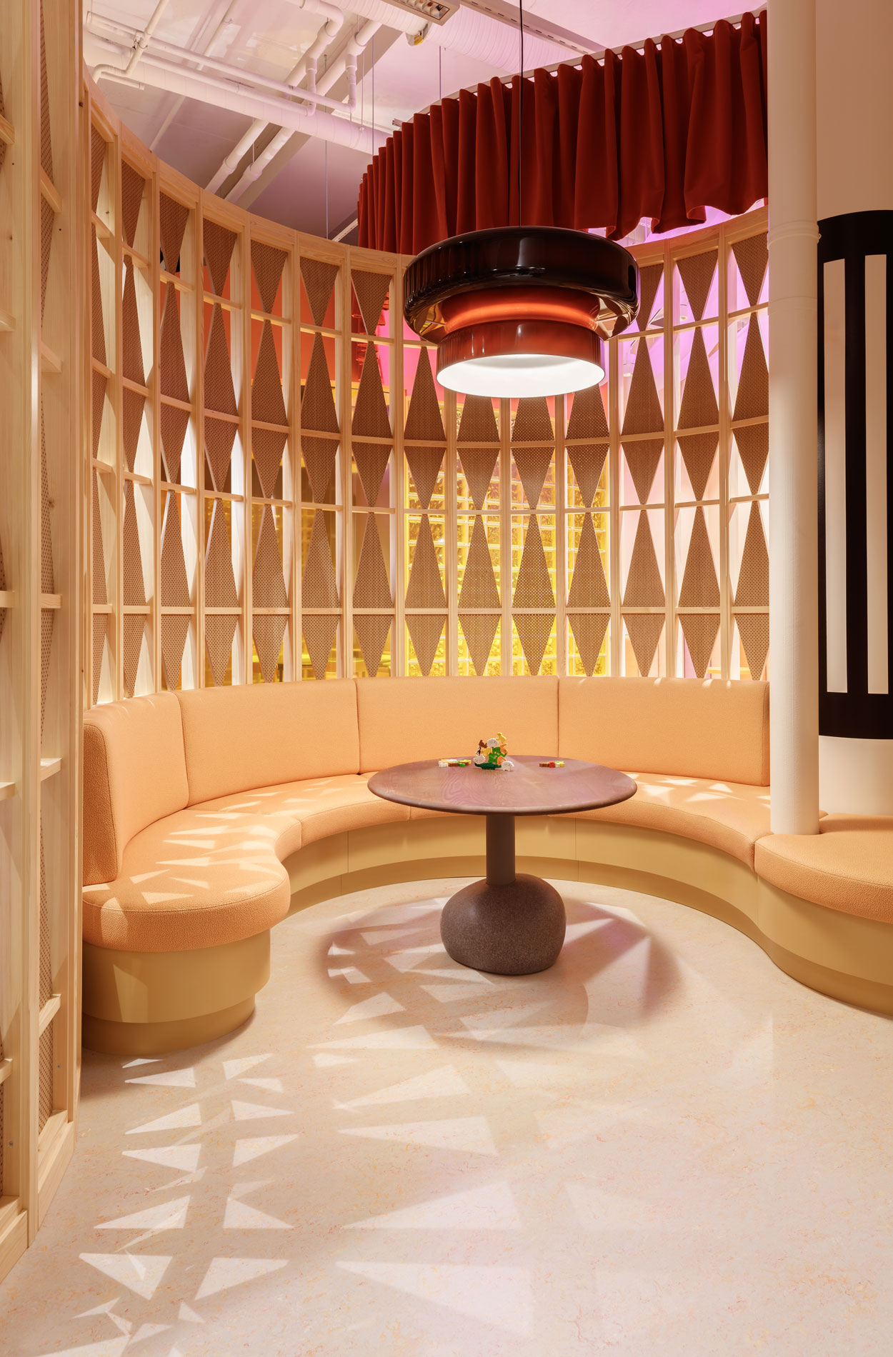
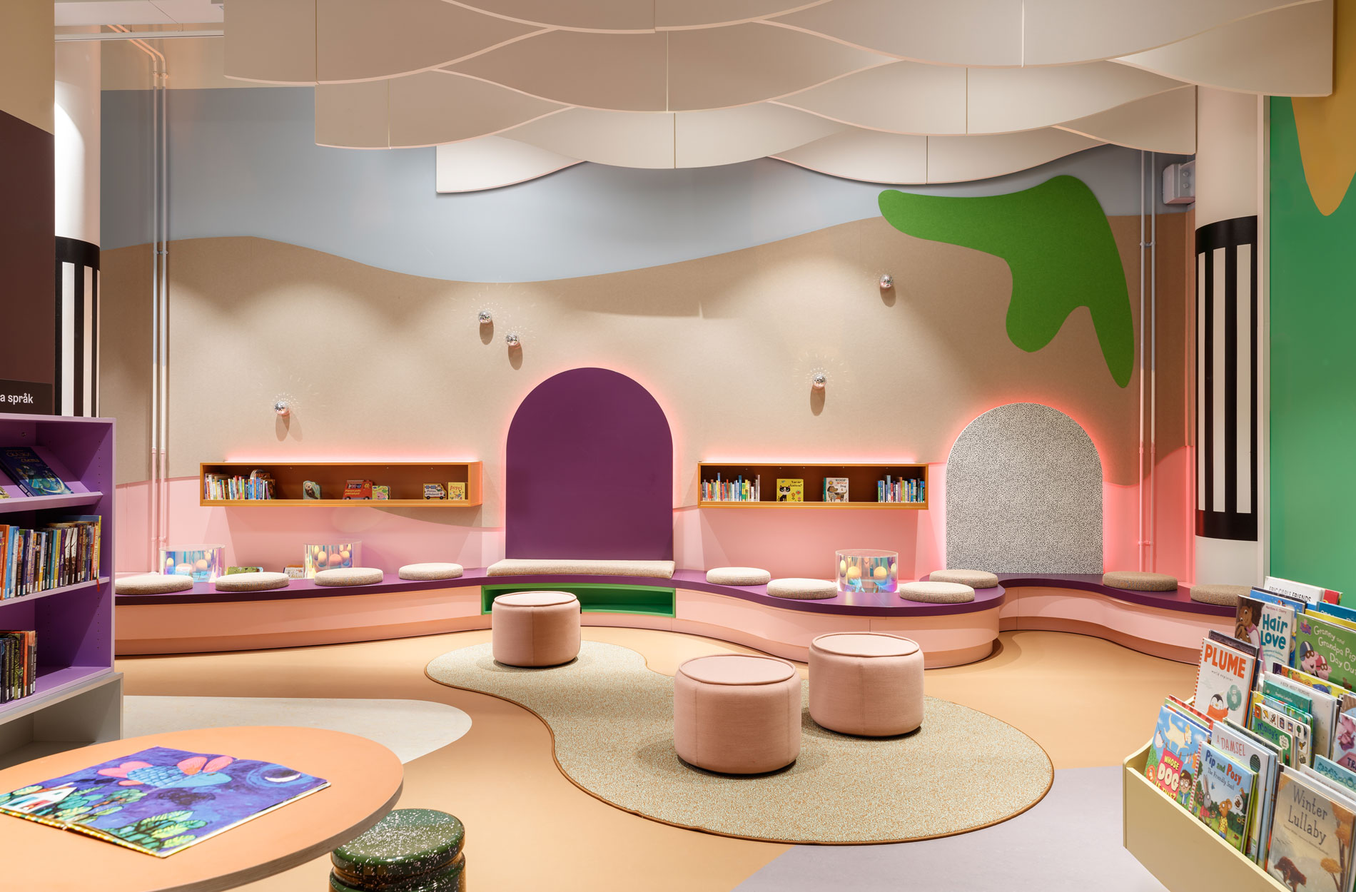
Spatial art that breaks boundaries
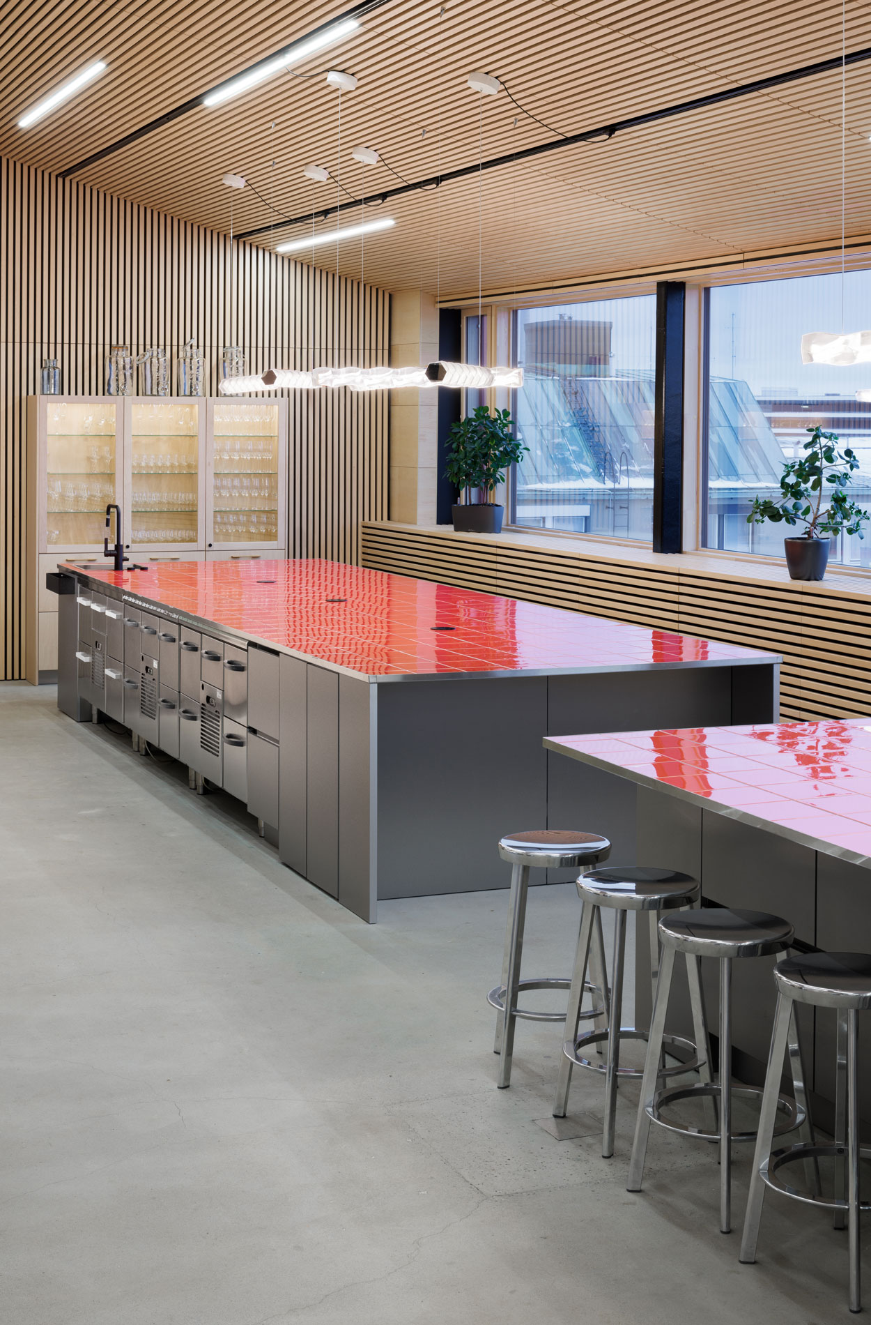
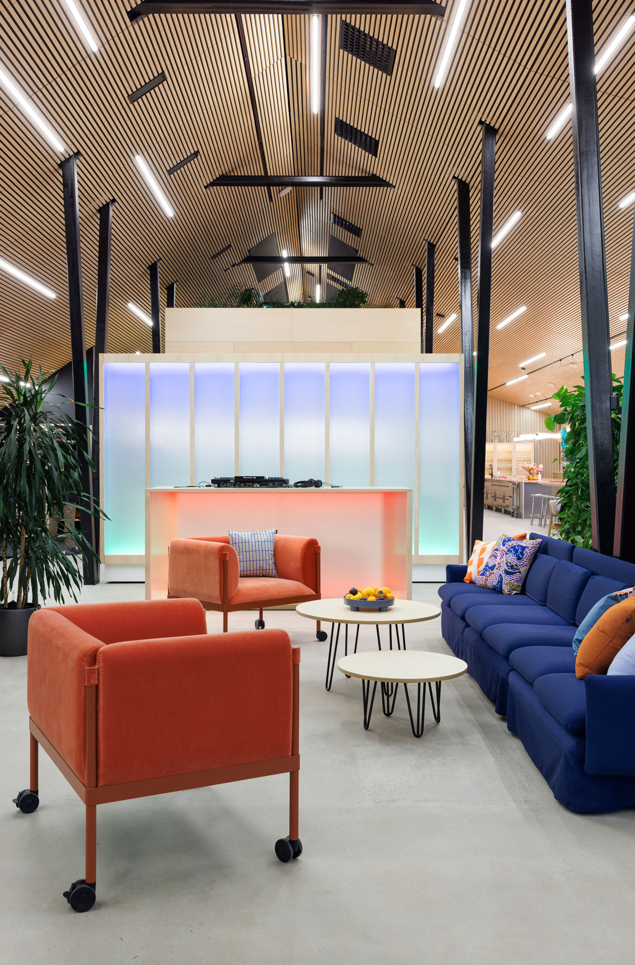
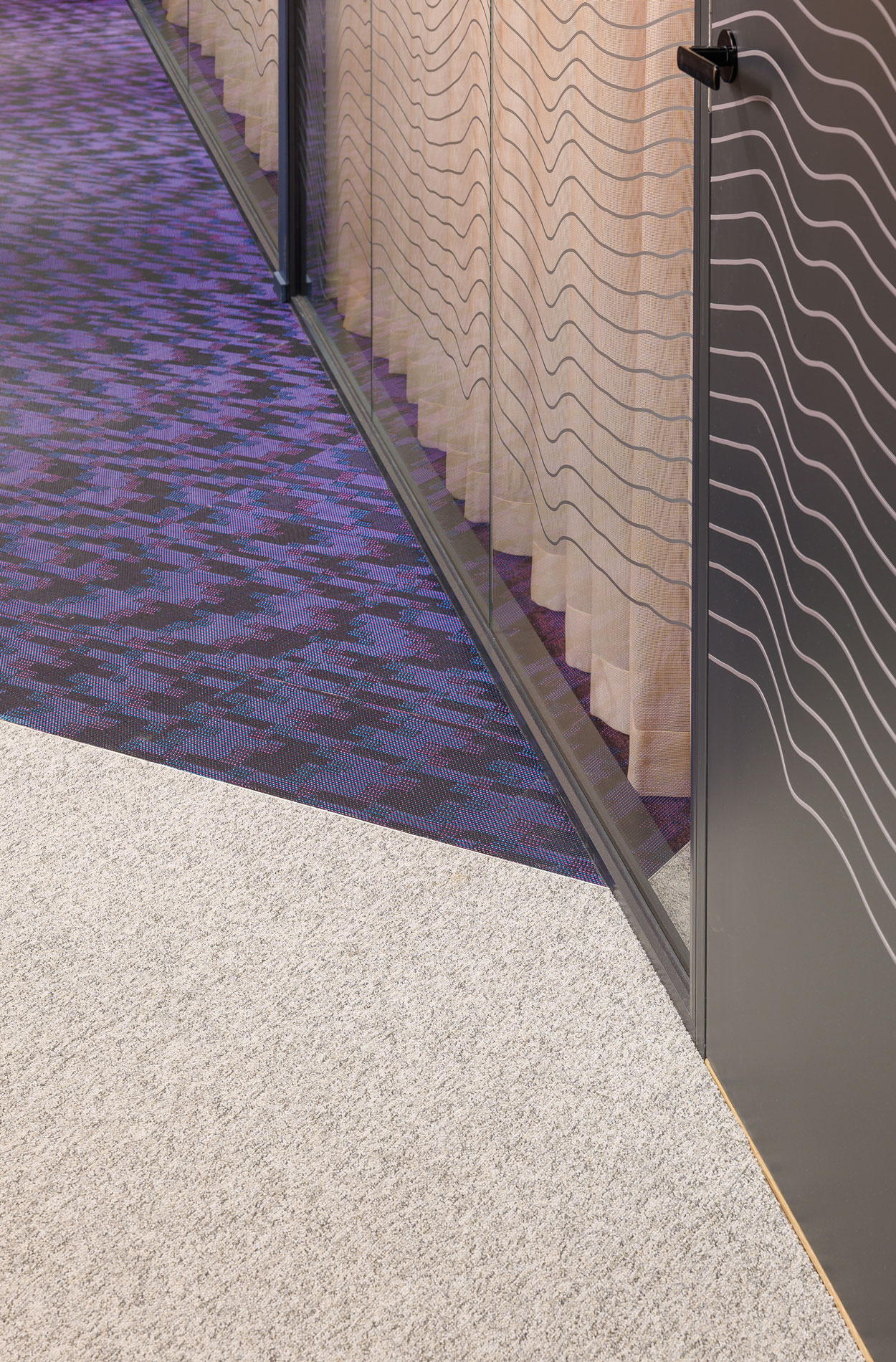
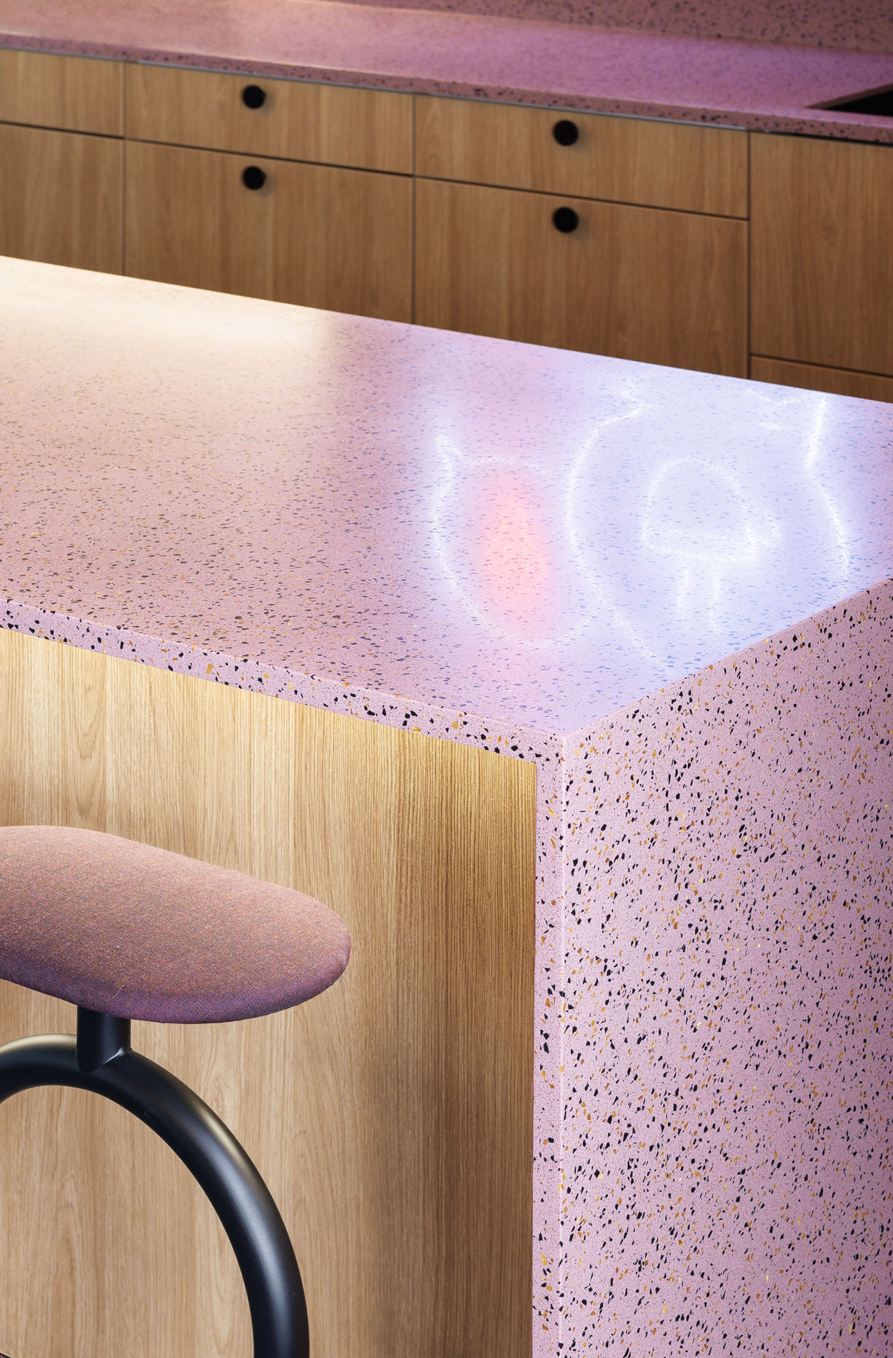
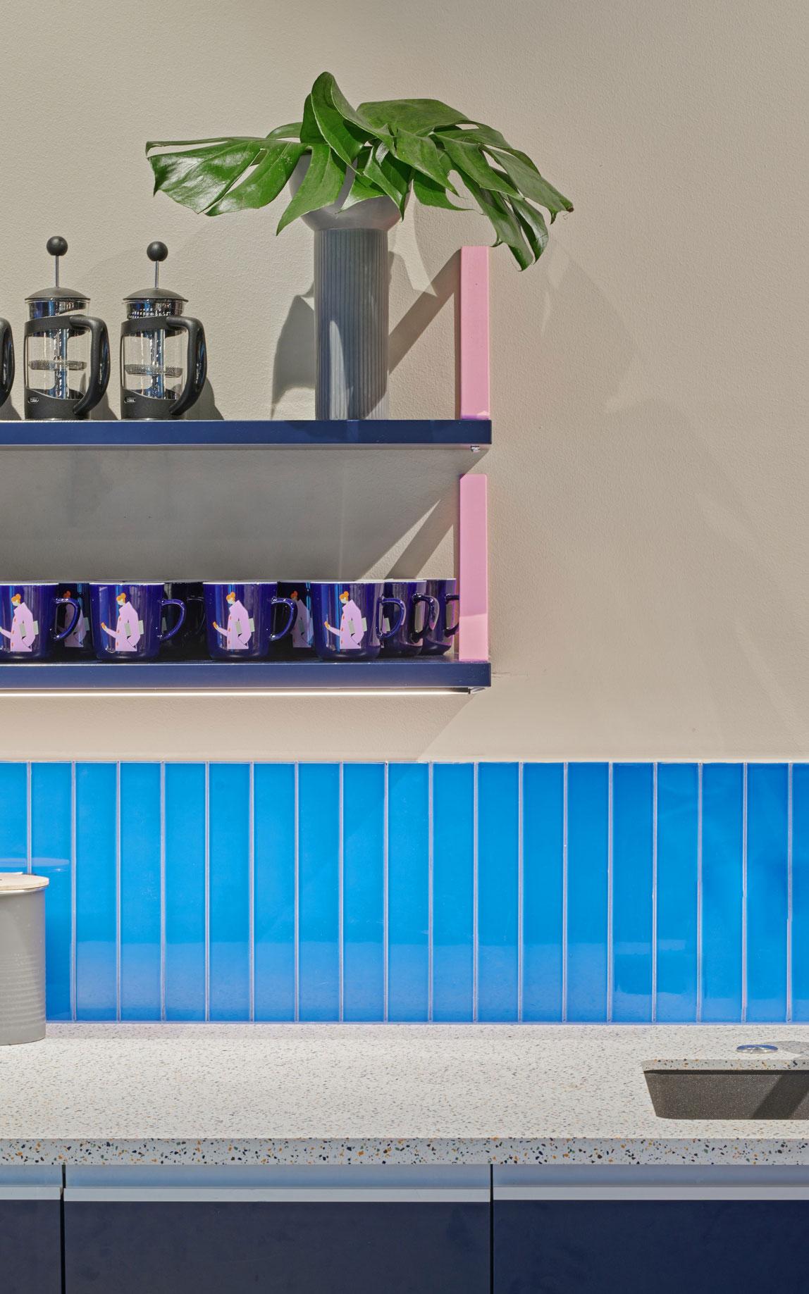
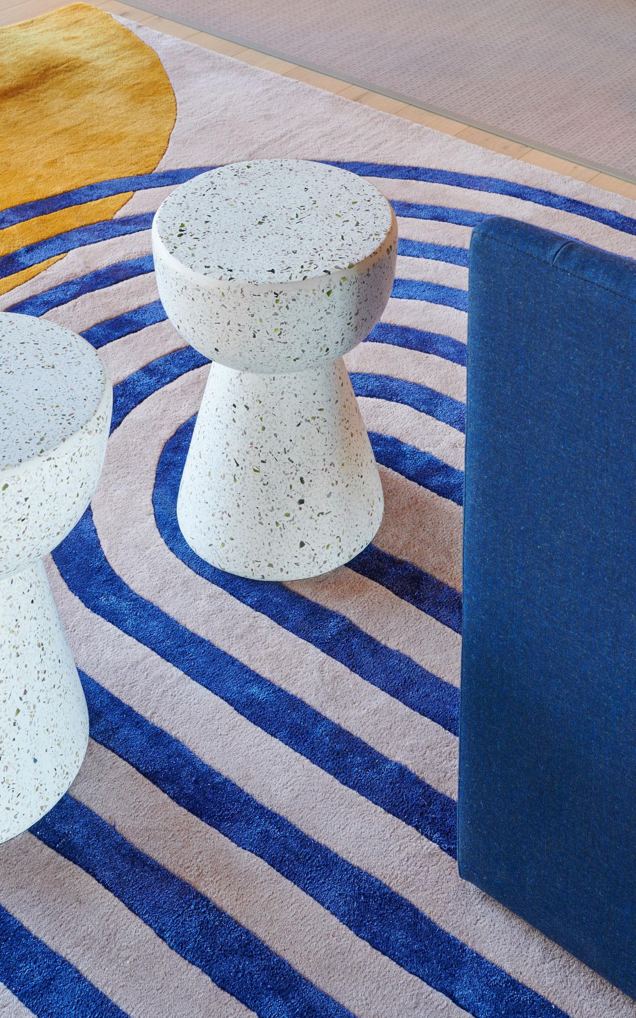
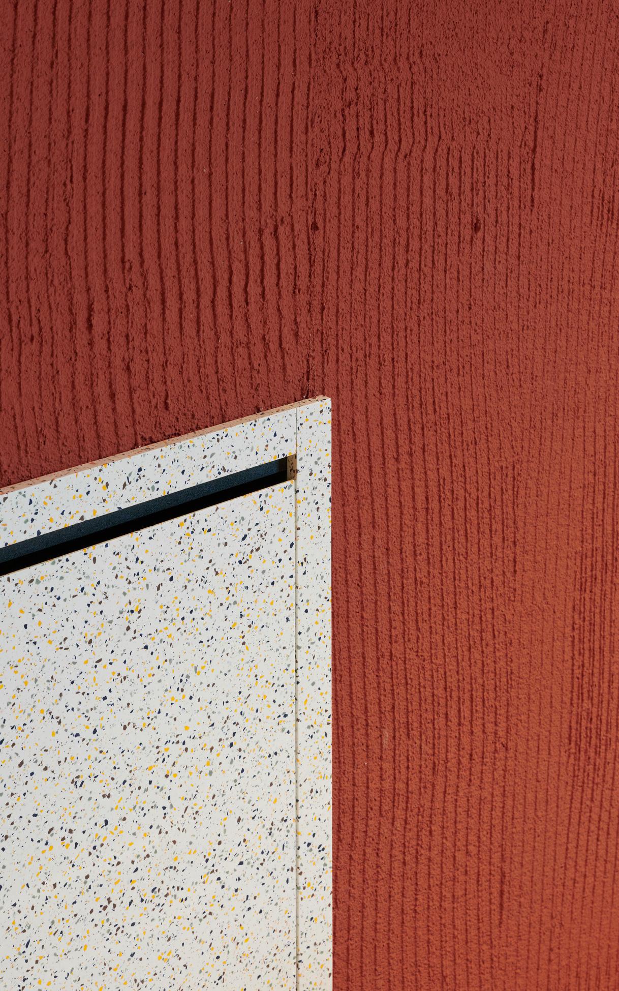
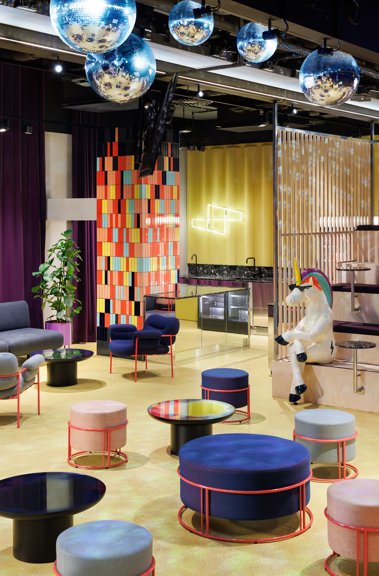
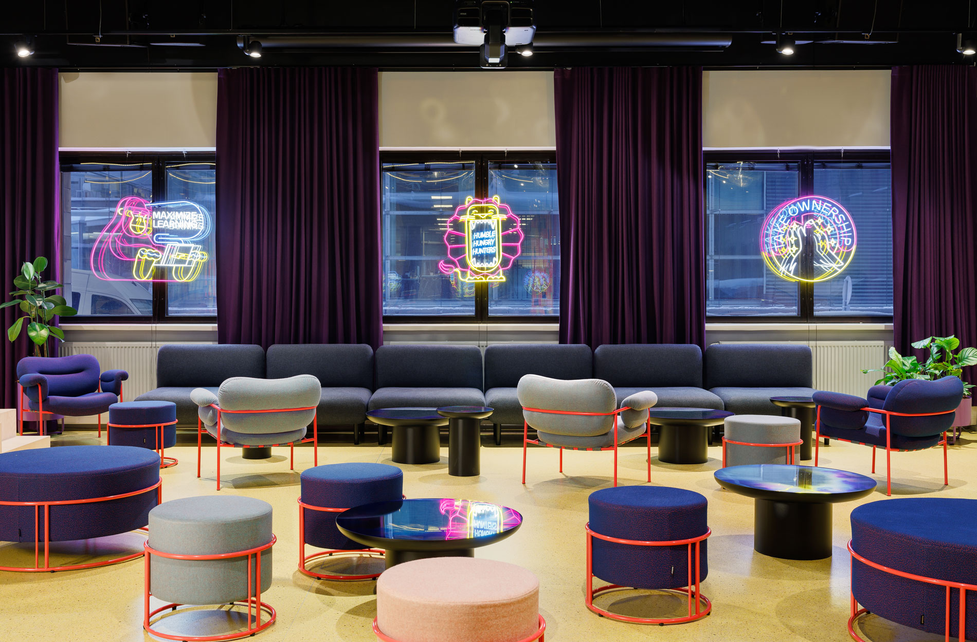
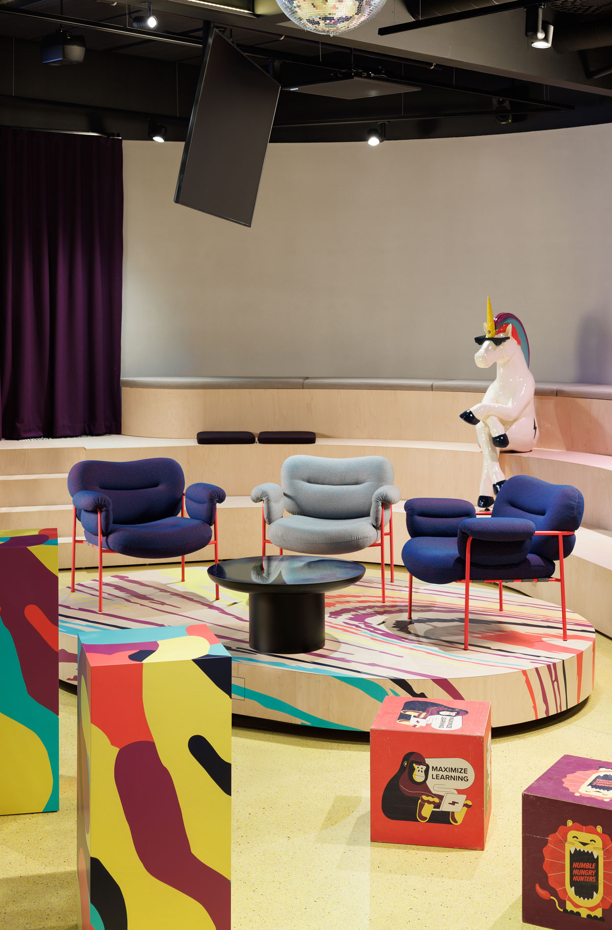
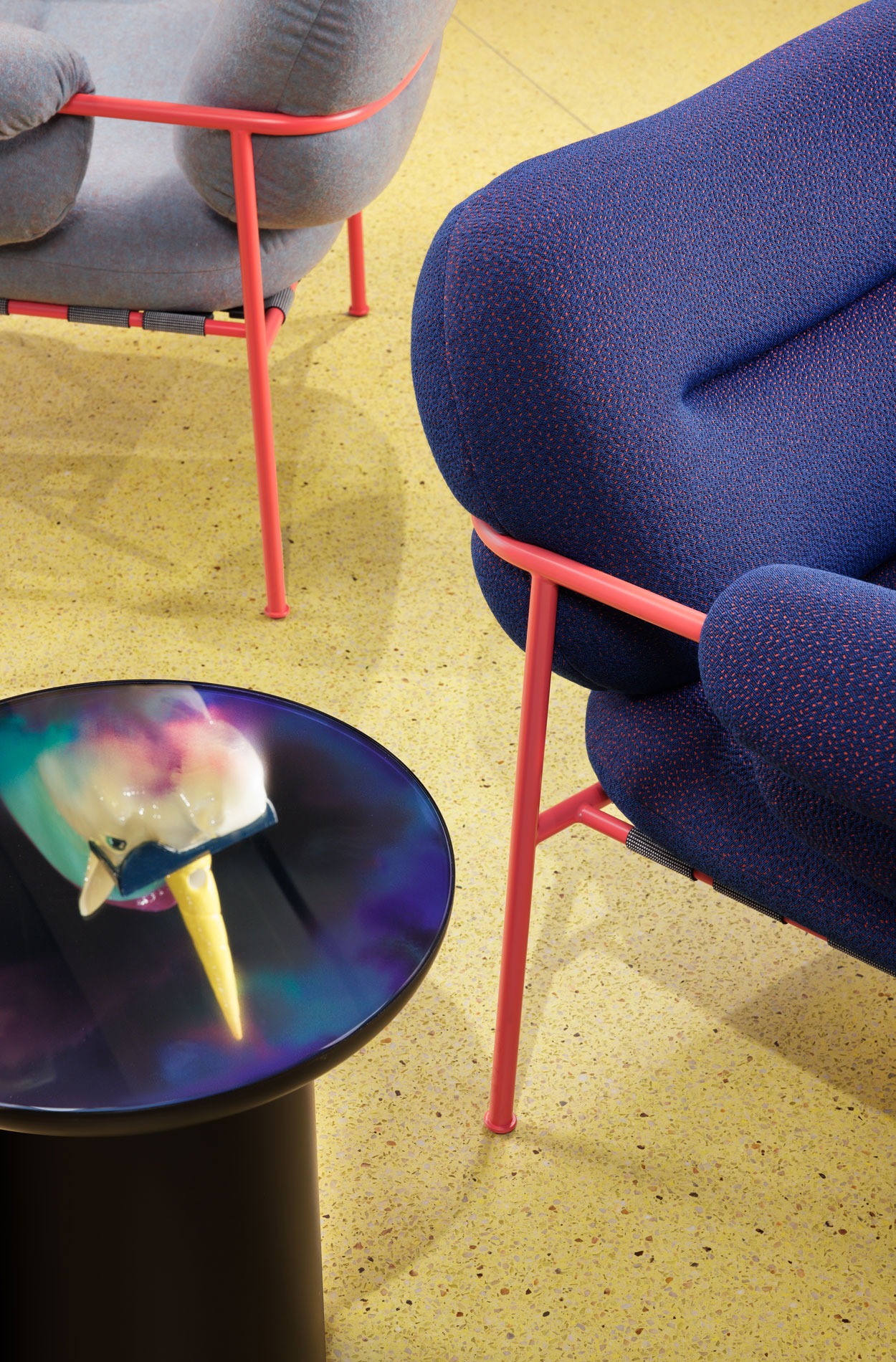
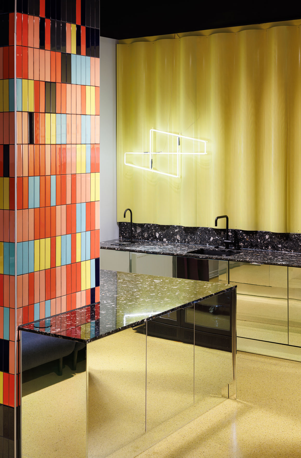
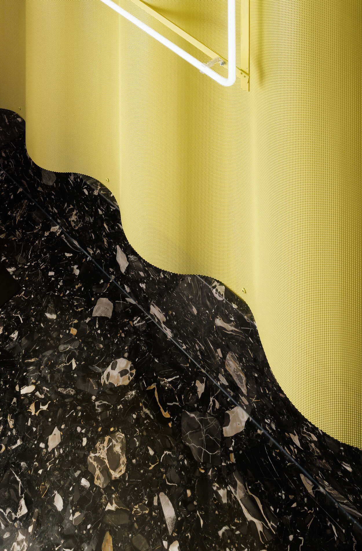
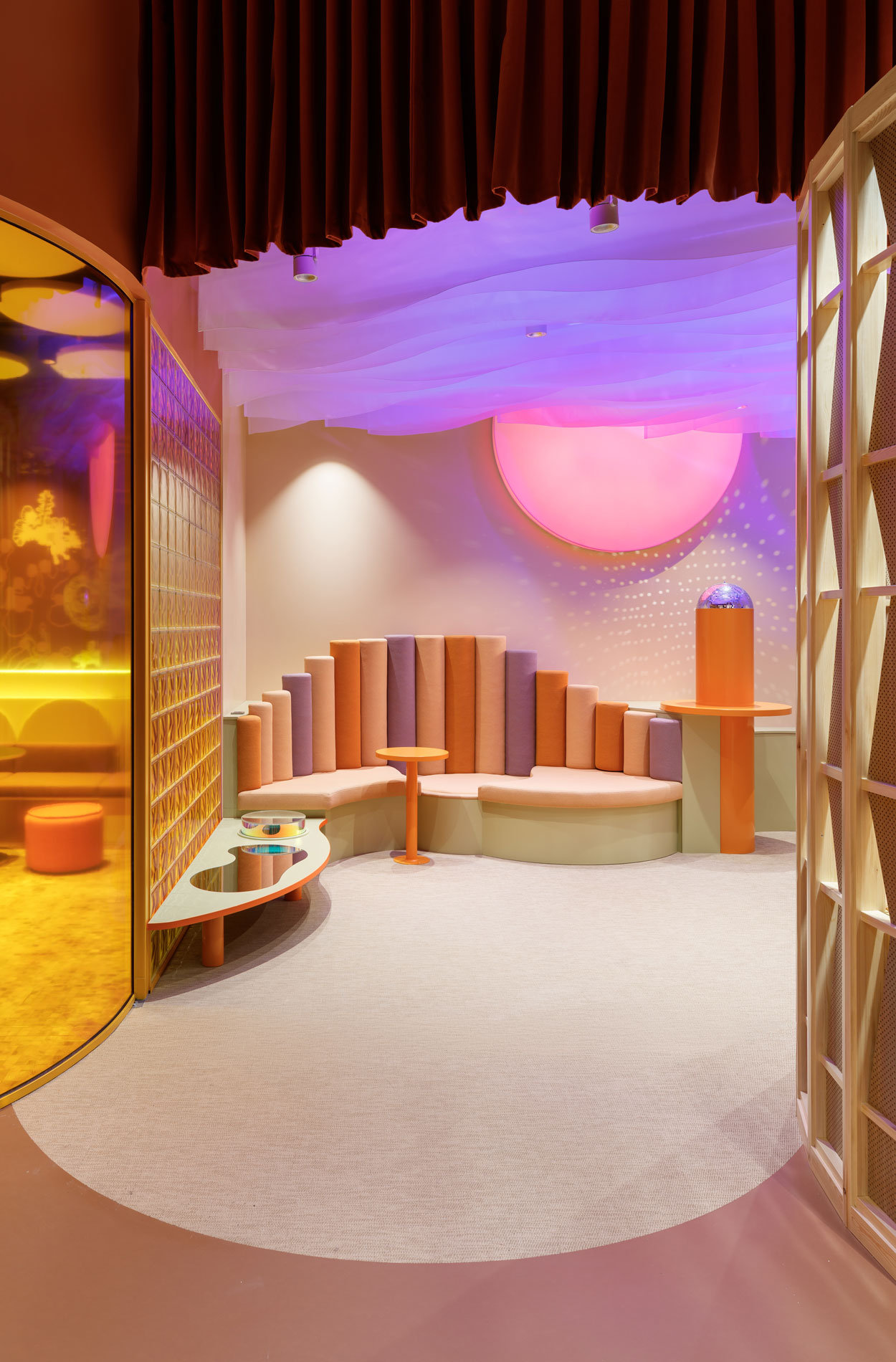
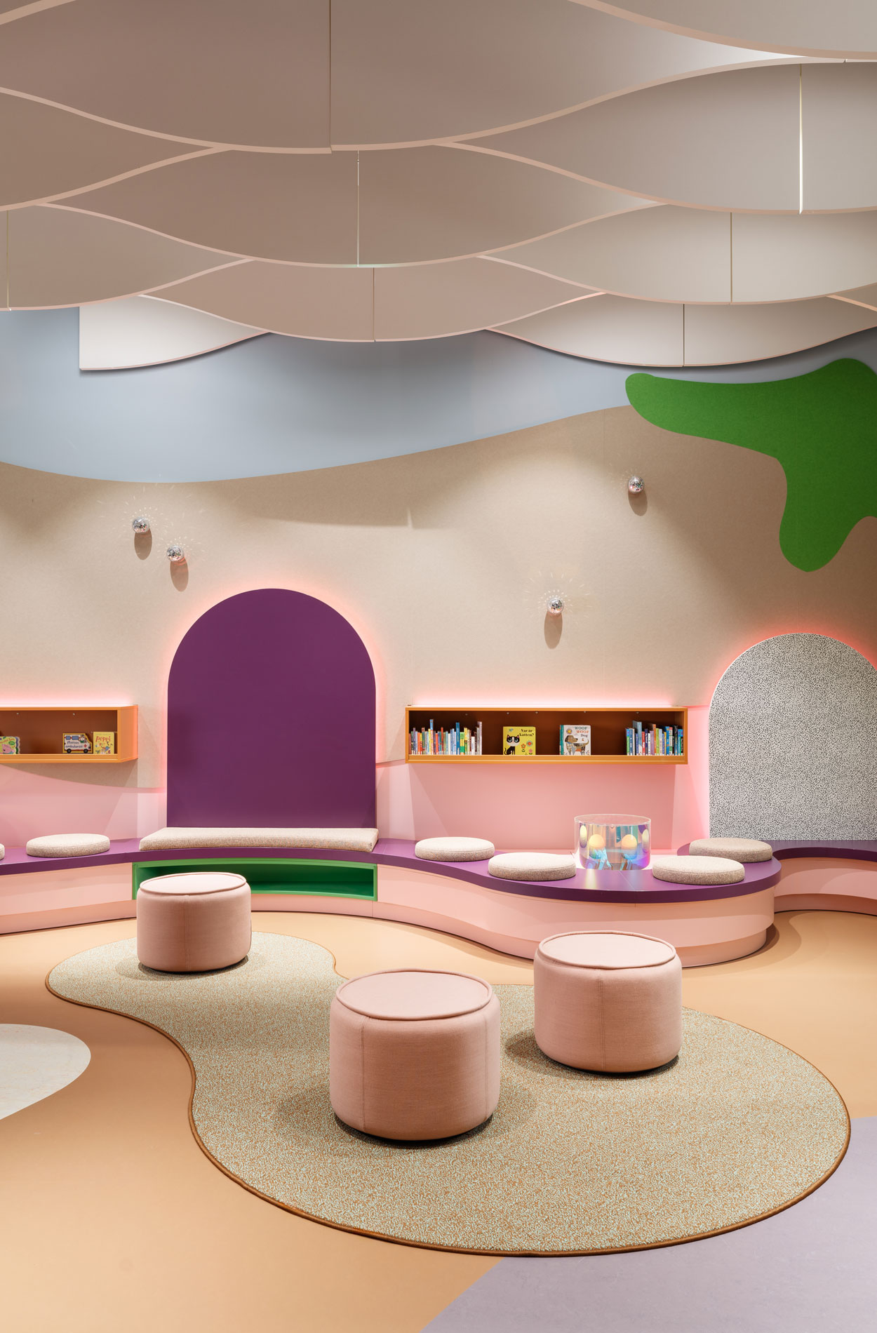
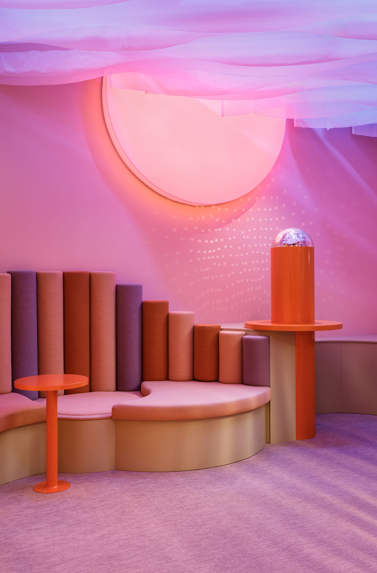
The new library is an experiential and holistic piece of spatial art that inspires its visitors to find something new. It offers charming areas of recreation and different atmospheres for relaxing, playing games, reading or meeting others. The space wants to question the definition of normal and let everyone re-define it. For example, in the dream-like corner the sky merges with the sea. The sun changes its colour and sets below the horizon upside down, which send our thoughts flying. The modifiable lighting enable changing and enhancing the atmosphere of the space.
Light and shadow, reflections and glitter create points for discovery
“The aim was to think about what a local library could be in a completely new way. That is why we did not start from shelf meters, as is often the case with such projects. I knew that you can be challenged and that inspires you – it is important that the partner is not only someone who implements what was asked, but who has their own strong vision,” says Saara Ihamäki, Director of Helsinki Regional Library Services.
Creating Kalasatama Library, a library that challenges the familiar, also required the designers to have the courage to think outside the box: “We defined a target for ourselves: not to create anything representative. We wanted to create a style that had not been seen before and exceptionally inspiring elements for users. We wanted to break the boundaries between the wall and the floor and make familiar things in unexpected ways,” say Sara Tuohikumpu, Lead Designer for the project, Johanna Happonen, Interior Architect, and Riikka Kuukka, AD.
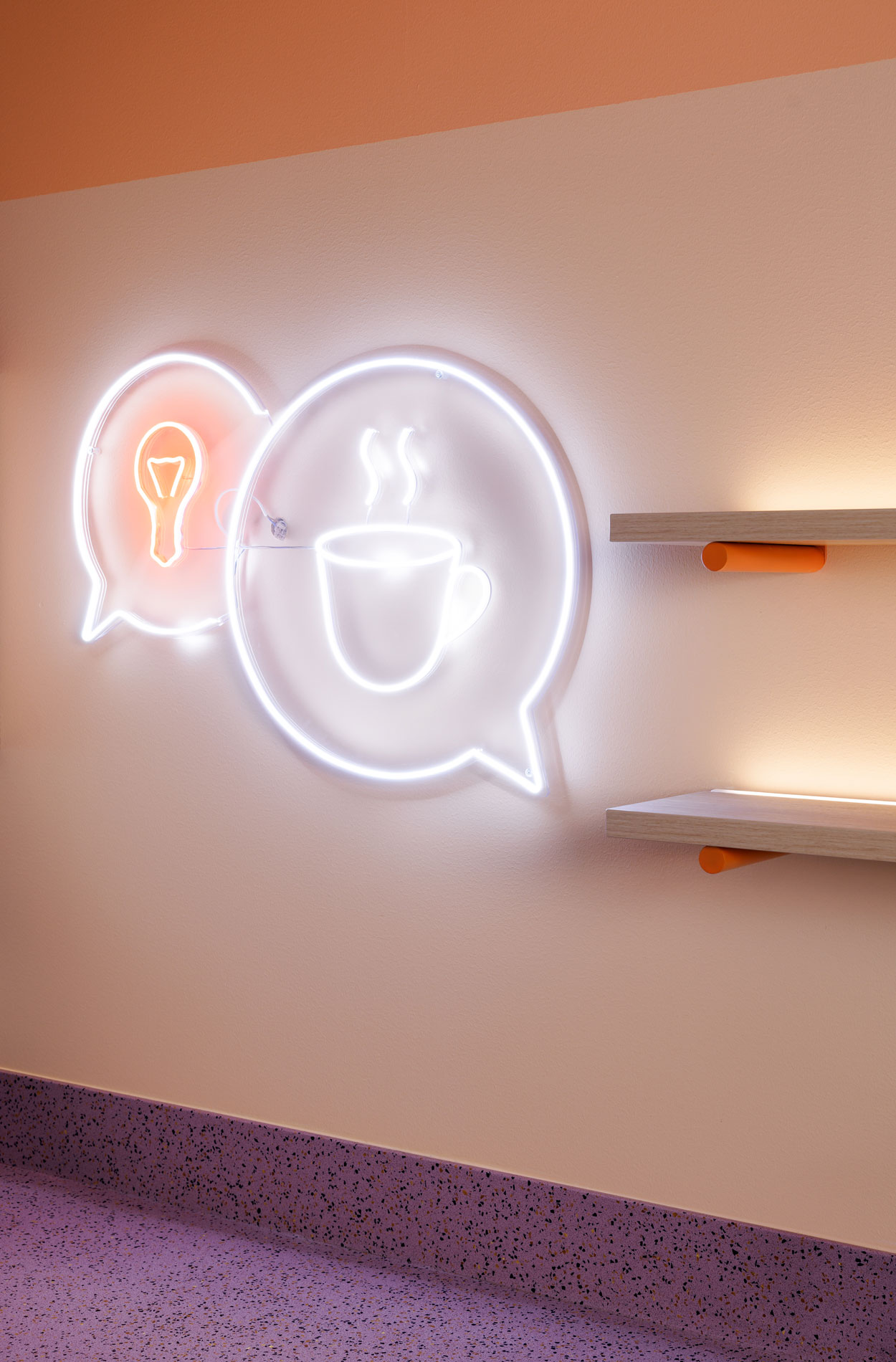
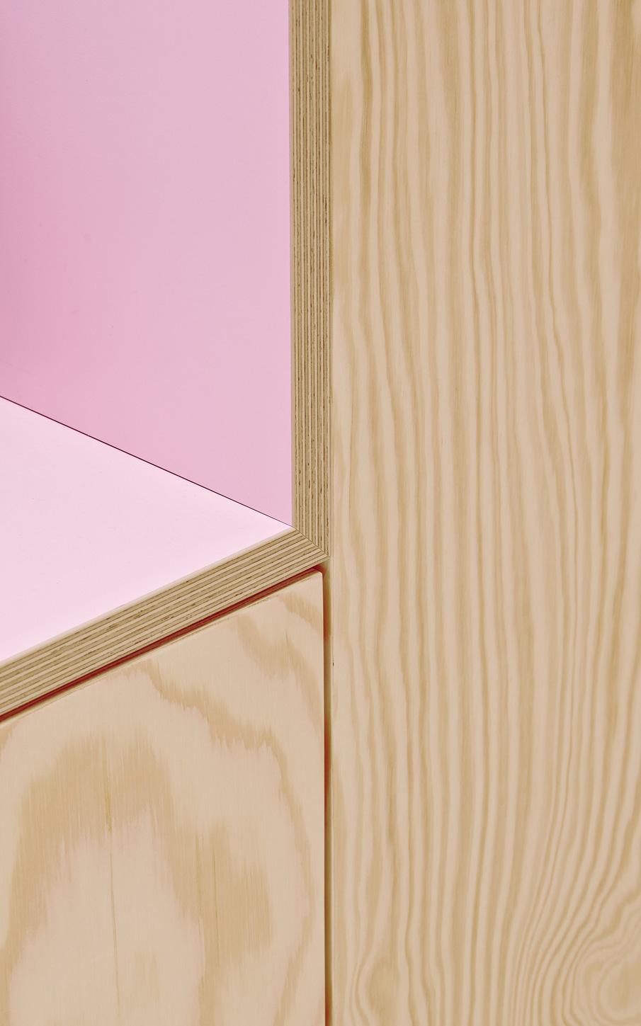
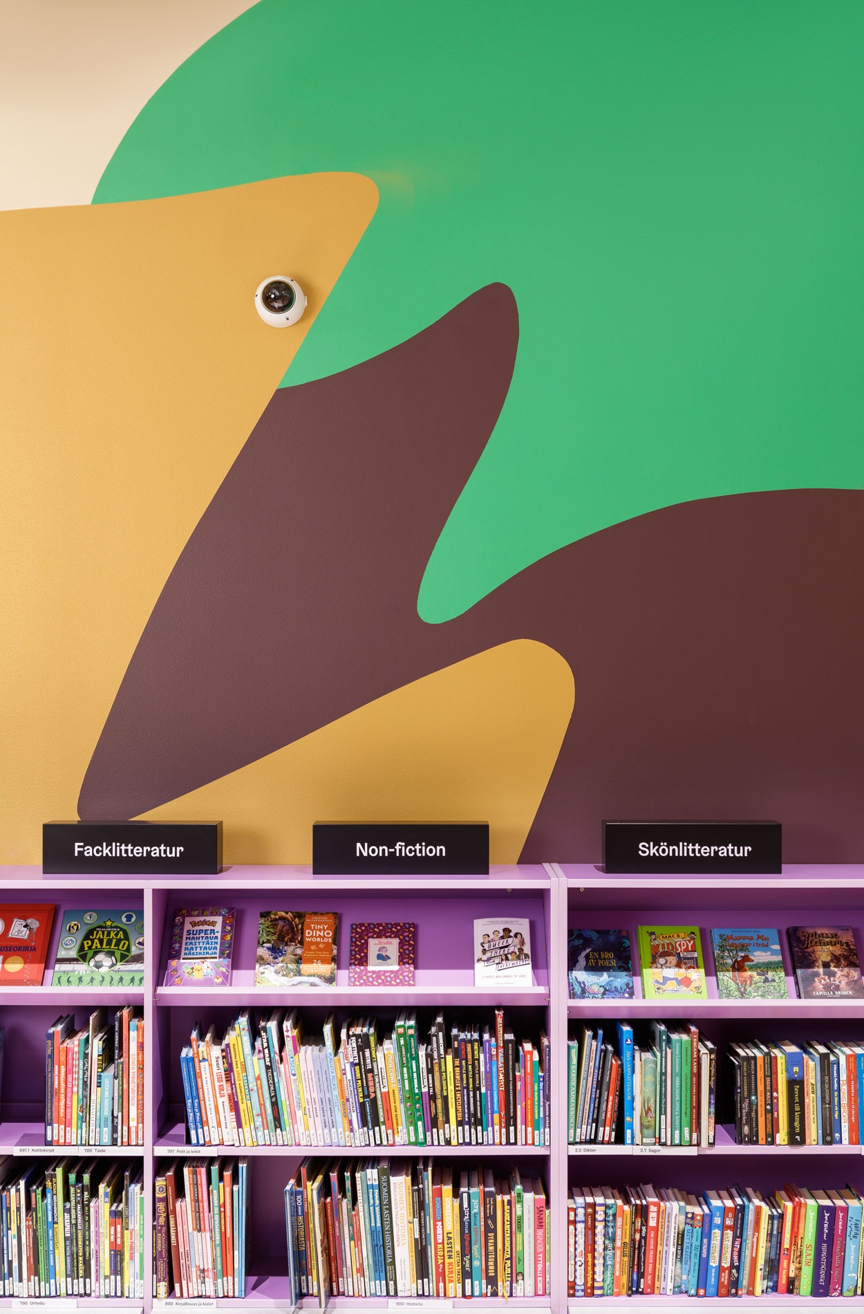
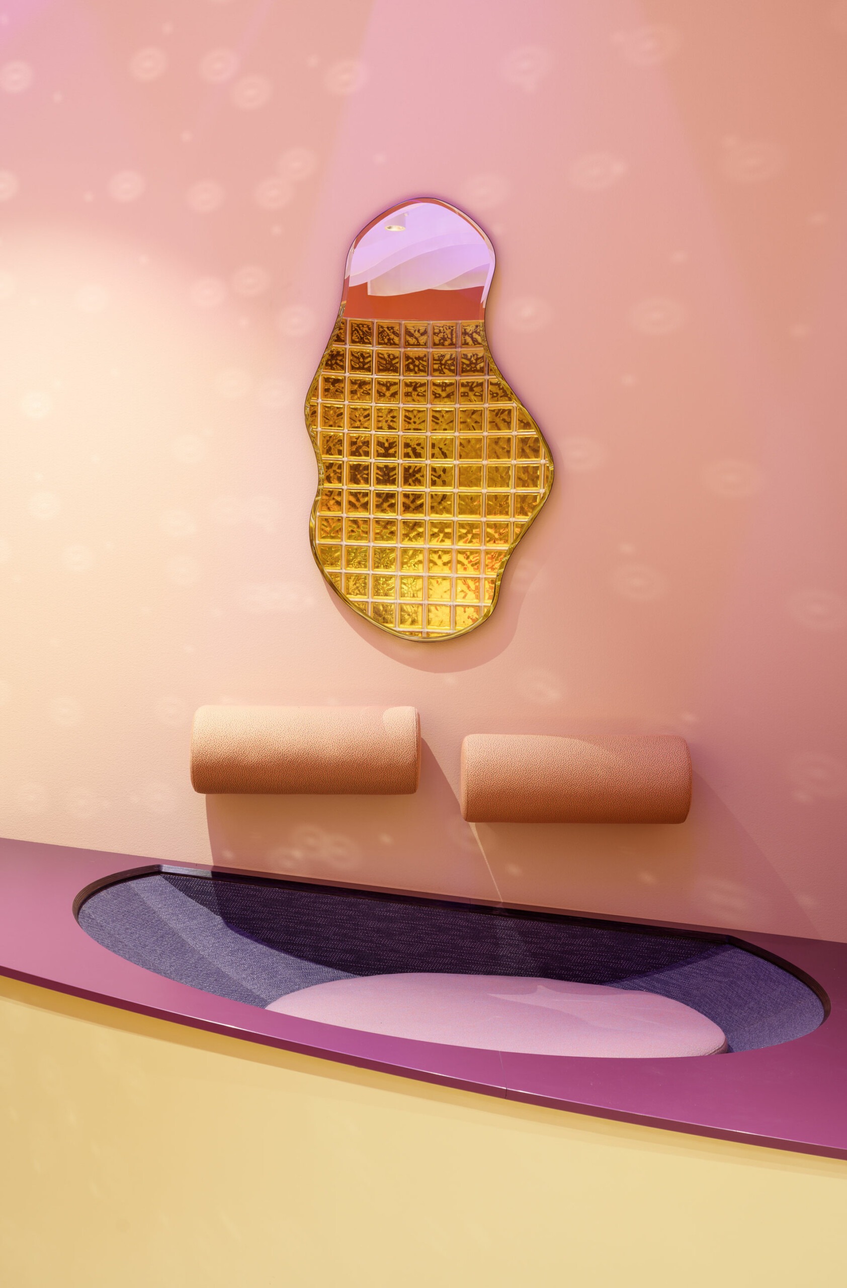
Graphic elements play a crucial role in creating the unexpected atmosphere of the library. For example, the customised illustrations and wallpapers are works of art in themselves, and the illuminated signs are the icing on the cake.
The final result offers positive surprises
Kalasatama Library has been exceptionally well received. It has received a lot of media attention, and 12,056 people visited it during the opening week alone. “Kalasatama library has attracted a lot of positive feedback. It is a great example of realising the goals of Helsinki’s city strategy: the library is located in a growing area and is an inviting place that matches the character of the district. It attracts people to the library and thus helps to make Helsinki the capital of reading and literacy,” Saara sums up.
“We wanted to give each visitor an opportunity to renew themselves and find something new, to learn through education and knowledge. The library makes people stop and think, inviting even adults to let their guard down. This is the path to new discoveries, and people can, for example, borrow a book they would not have borrowed otherwise,” says Sara.
The joy of creating new things was evident even before the opening: the eyes of the library staff sparkled and the partners were also excited about the project. “The story evolved and lived on – everyone understood that we were creating something good and important together. This was a project where everyone worked wholeheartedly,” Johanna concludes.
Would you like to learn more about the library?
You can read more about the project, for example, in the article that was published in Helsingin Sanomat in the opening week (in Finnish).
Photos and video Mikael Pettersson
Get familiar with other similar projects