Exilion

Reborn Valla offers a counterpoint to remote work

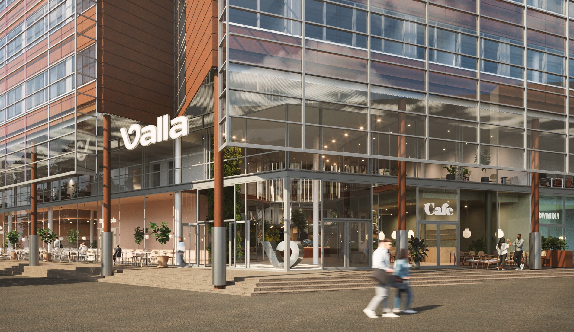
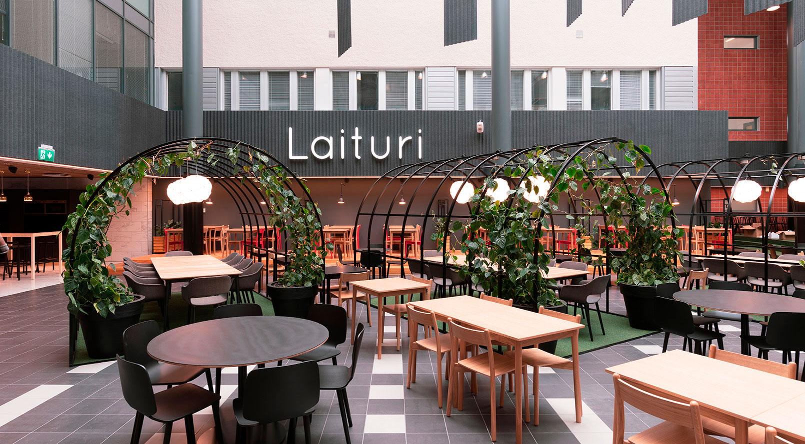
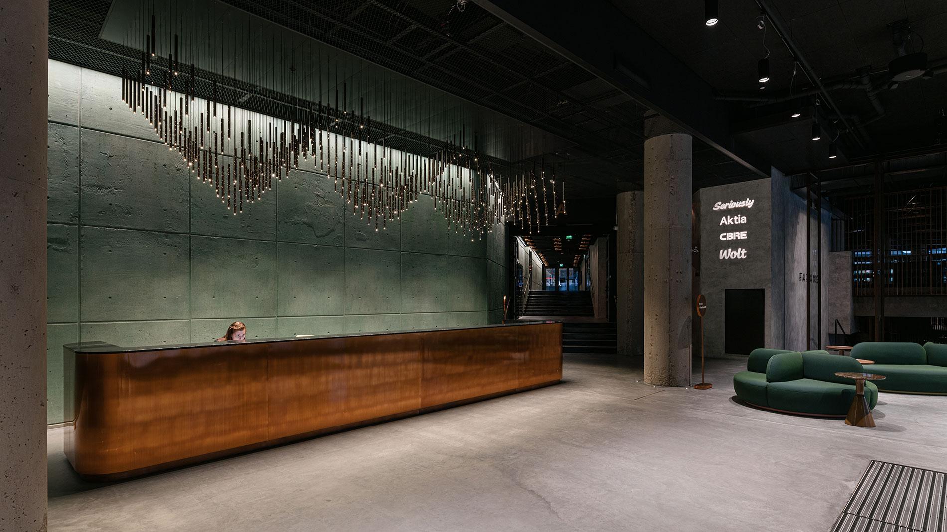
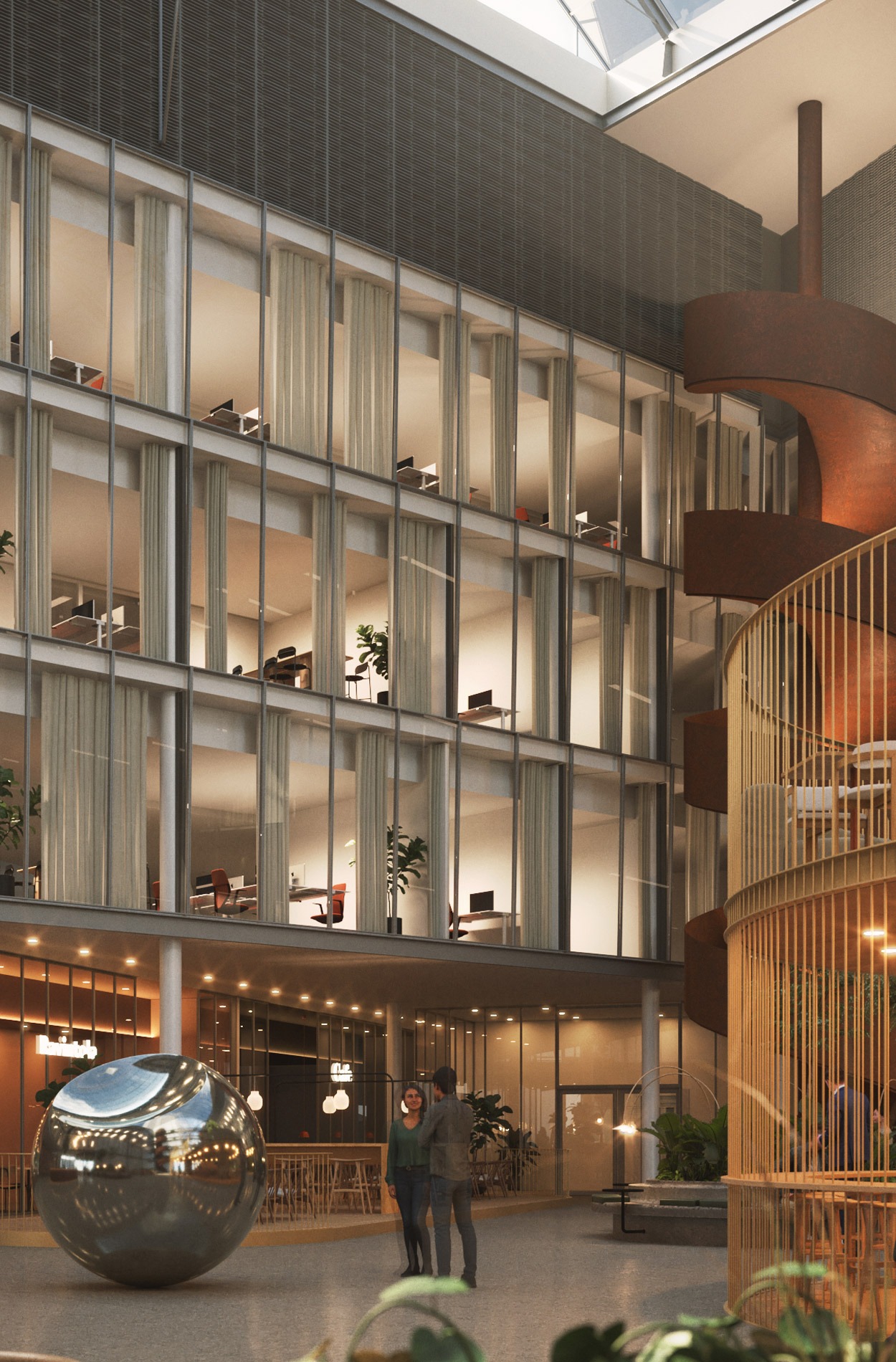
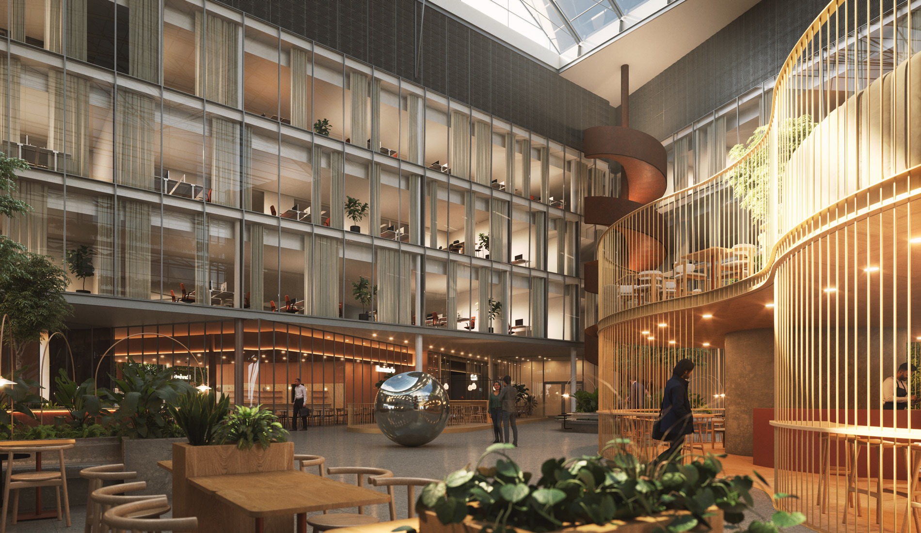
Located in Ruoholahti, Valla, previously Itämerentori 2, is the highest office building in central Helsinki. Its 21,000 m² of space will be remodelled to the needs of knowledge workers. At street level, the Atrium will be Valla’s pulsing heart. It houses a lobby area that does not pale in comparison to any hotel, a conference centre of pure technical perfection and an evergreen art garden. The upper floors of the property and the 70-metre tower are home to office spaces offering the perfect surroundings to concentrate on your work or hold meetings as well as an oasis of calm at the summit.


The real estate development project was carried out in cooperation with Exilion and Werklig, which was responsible for the brand design. We created Valla’s new spatial and service concepts, which feature heavily in Valla’s marketing. The site’s project design, including major structural modifications, will be implemented in 2025 on the basis of the specified concept.

A landmark and an experience for tenants and city dwellers

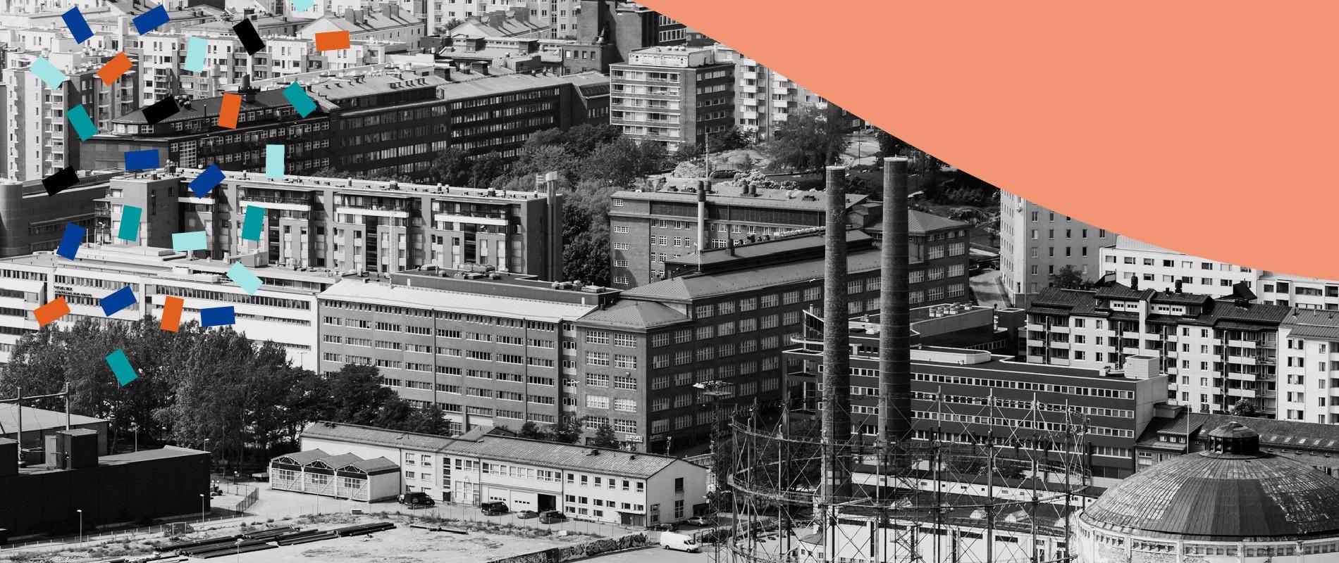
Ever since its completion in 2000, Valla has been a prominent feature in the streetscape of Ruoholahti. With the main tenant upping sticks, the project wanted to highlight the pull factors of the property and streamline the use of the premises. The goal of the project was to turn Valla into an experience hub and a counterpoint to the prevailing culture of remote work. The ambitious project will rejuvenate the streetscape of Ruoholahti and raise the profile of the entire area.

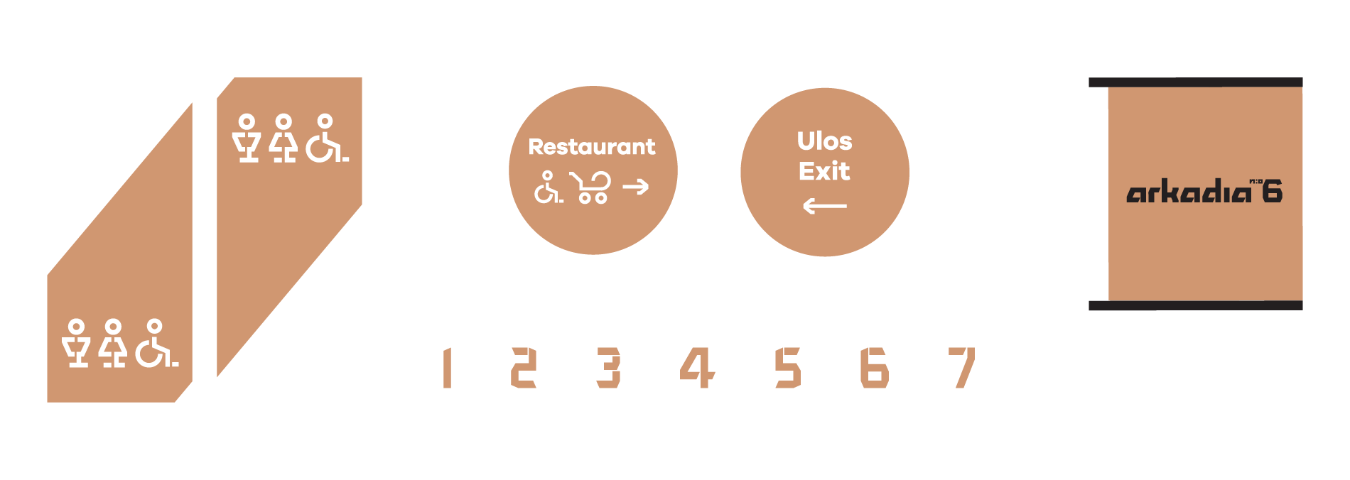
Highlighted by Valla's new concept:

  • Activating residents: A more prominent part of Ruoholahti, the building has a ground floor open to all residents.
  • Rentability of premises: Versatile, high-quality, 24/7 premises, clean-line aesthetic as a backdrop for the diversity of art and nature.
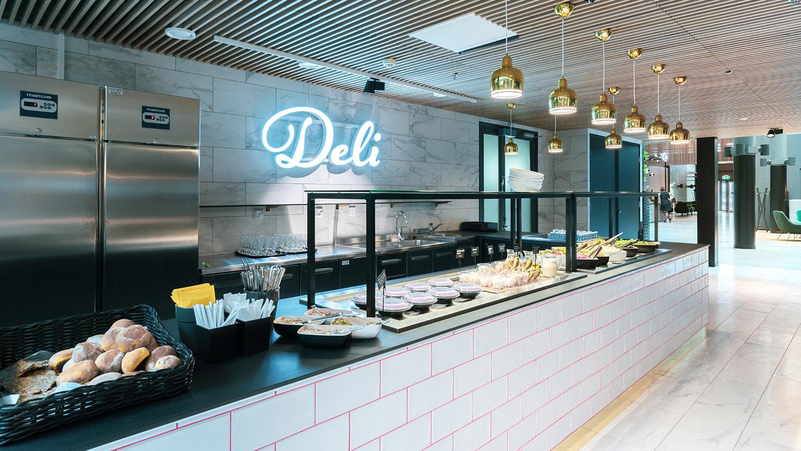
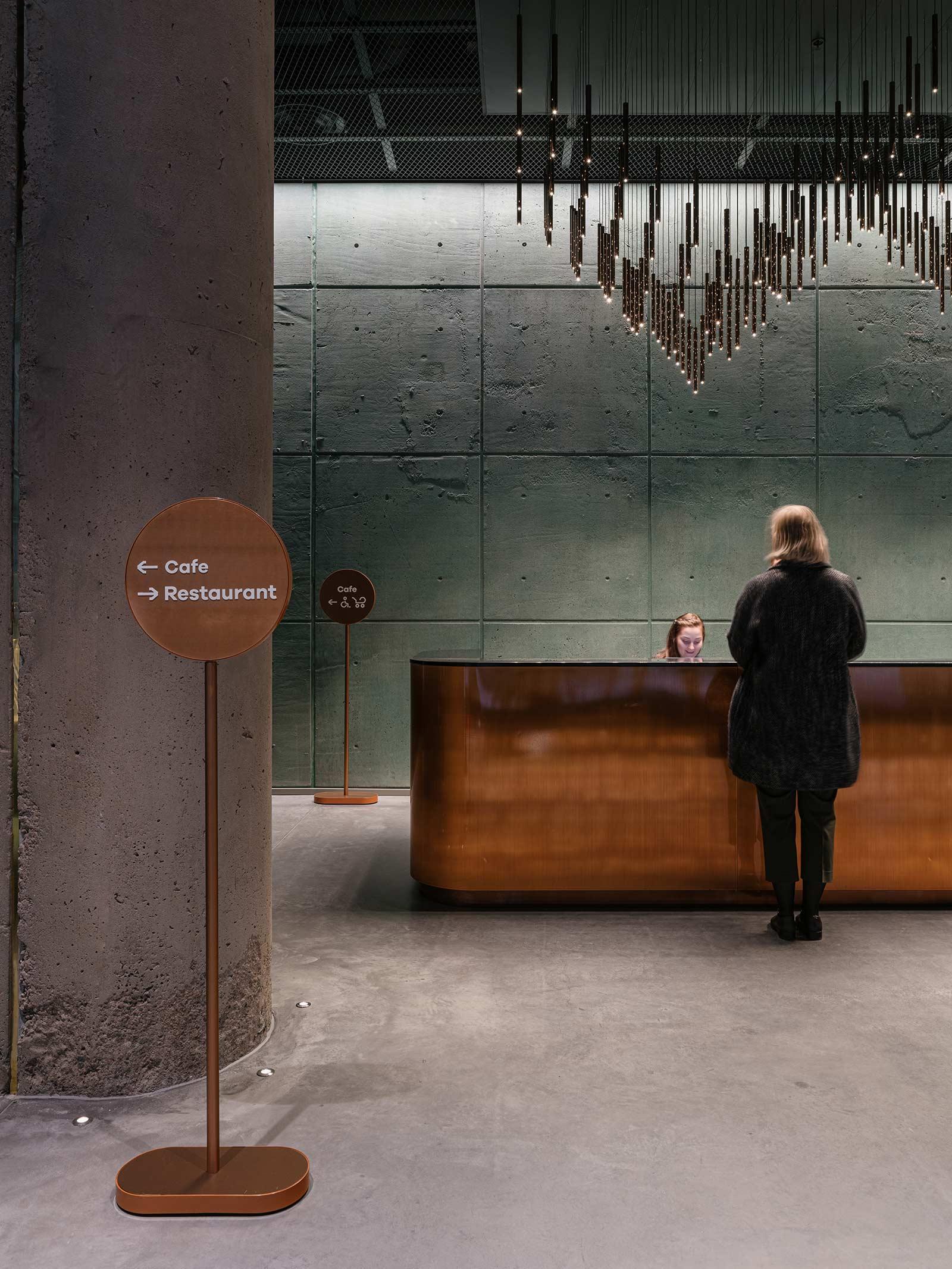
  • Services: Self-managed, high-quality, curated services like in a 5-star hotel.
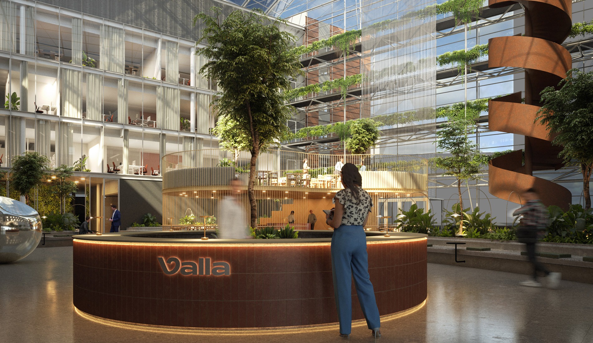
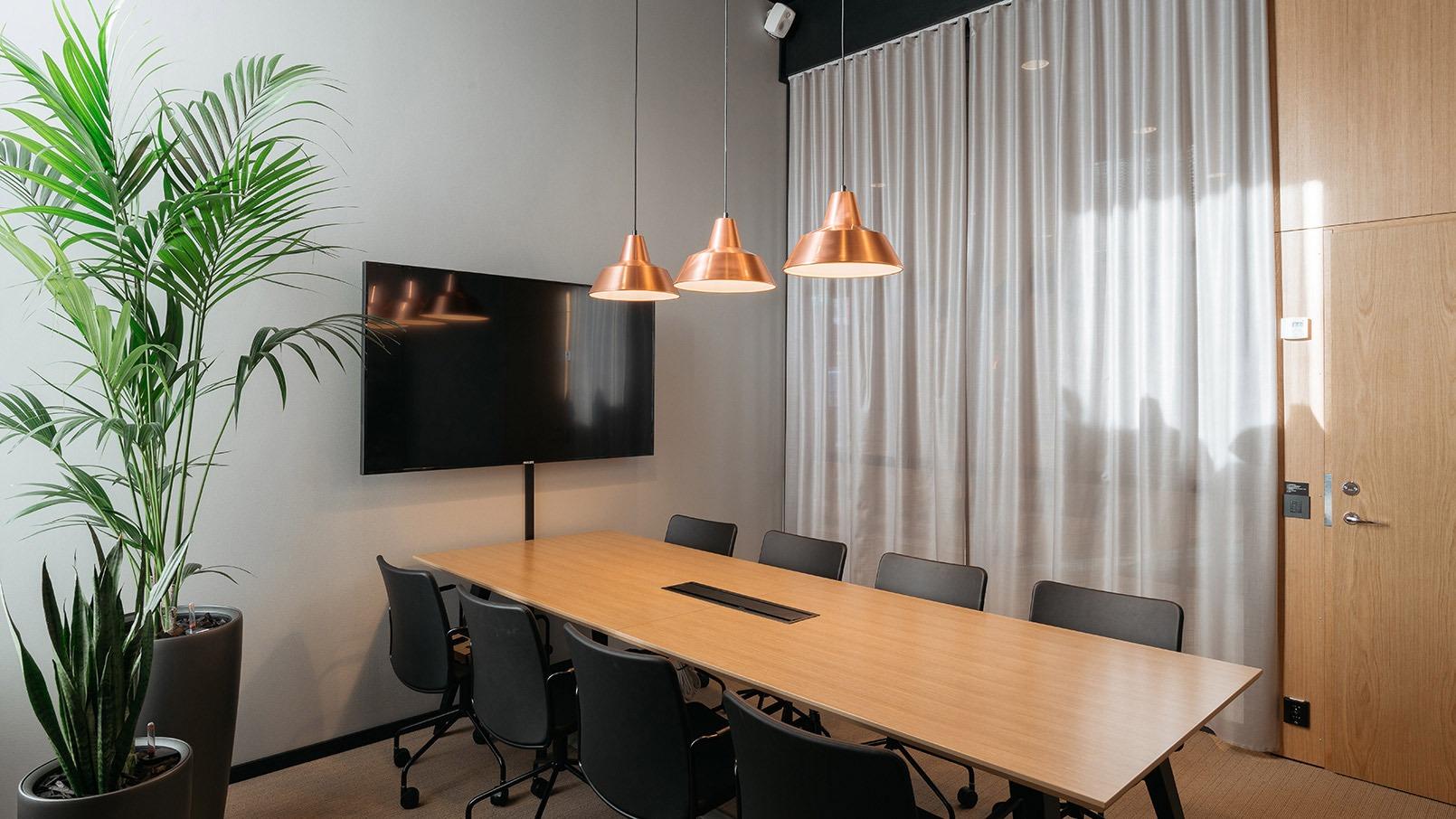
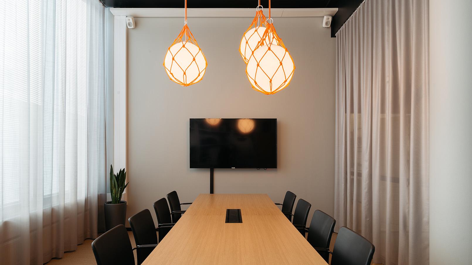
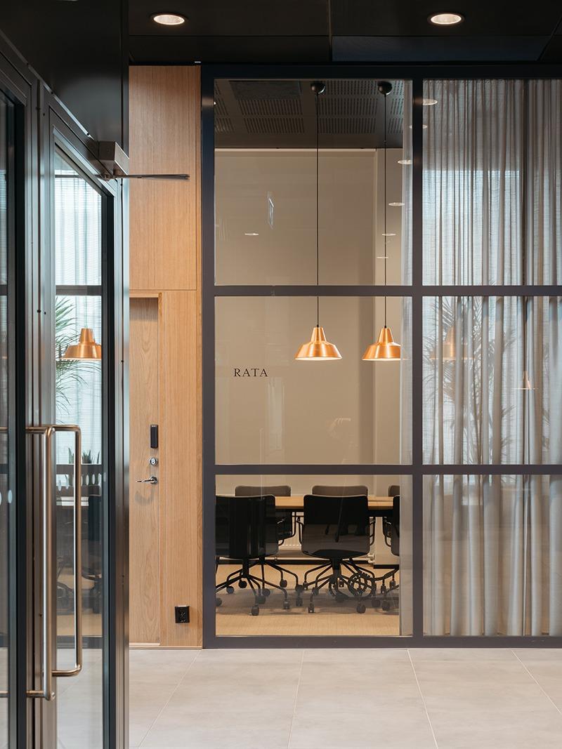
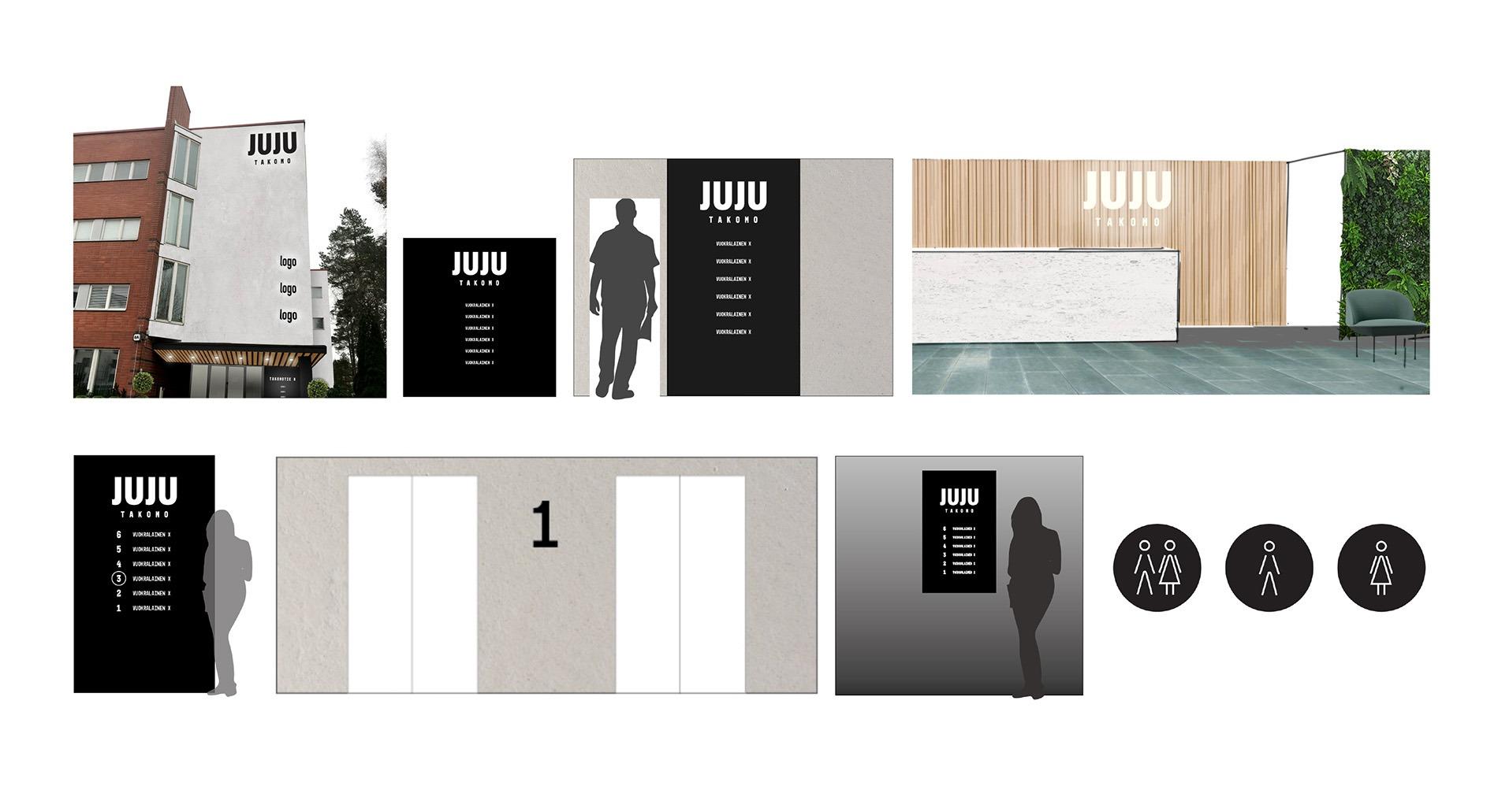
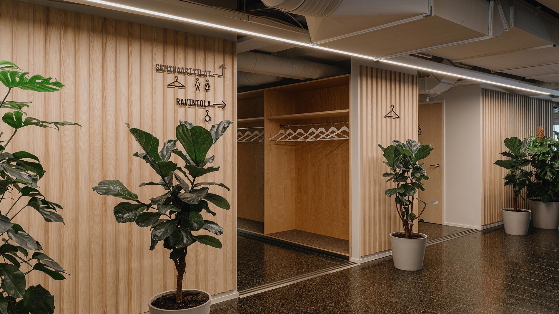
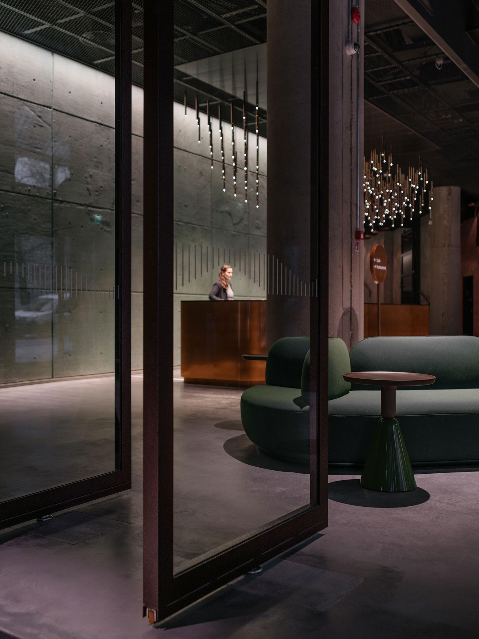
Our concept encapsulates the services and façade concept of Valla as well as the locations of the premises inside the property. We’ve also created tenant templates to support the renting of offices. “The idea was to transform the summit of Valla and the Atrium into destinations that people will travel great distances to experience,” says Heidi Linkka, Design Strategist. For instance, the summit houses a real log sauna and a roof terrace. The property also includes exercise services for knowledge workers as well as a large garage with easy access directly from Länsiväylä. To provide the services at the required level, they’ll be managed by the “Valla Manager”, comparable to a hotel manager.

“For me, we did the right things in the project. It was great that there were several of us carefully considering the future goals and concept of Valla and that we managed to lock them in at once. For us, ideas are not in short supply, but we’d never have been able to come up with such a structured process or design the style of the property on our own,” says Ari Talja, CEO, Exilion, on the importance of the work from the client’s perspective.
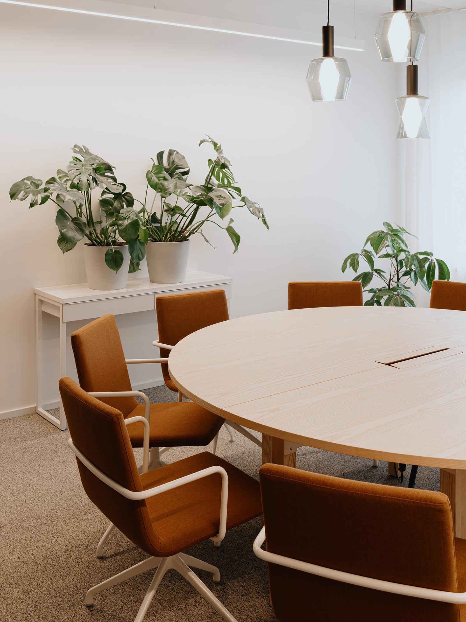
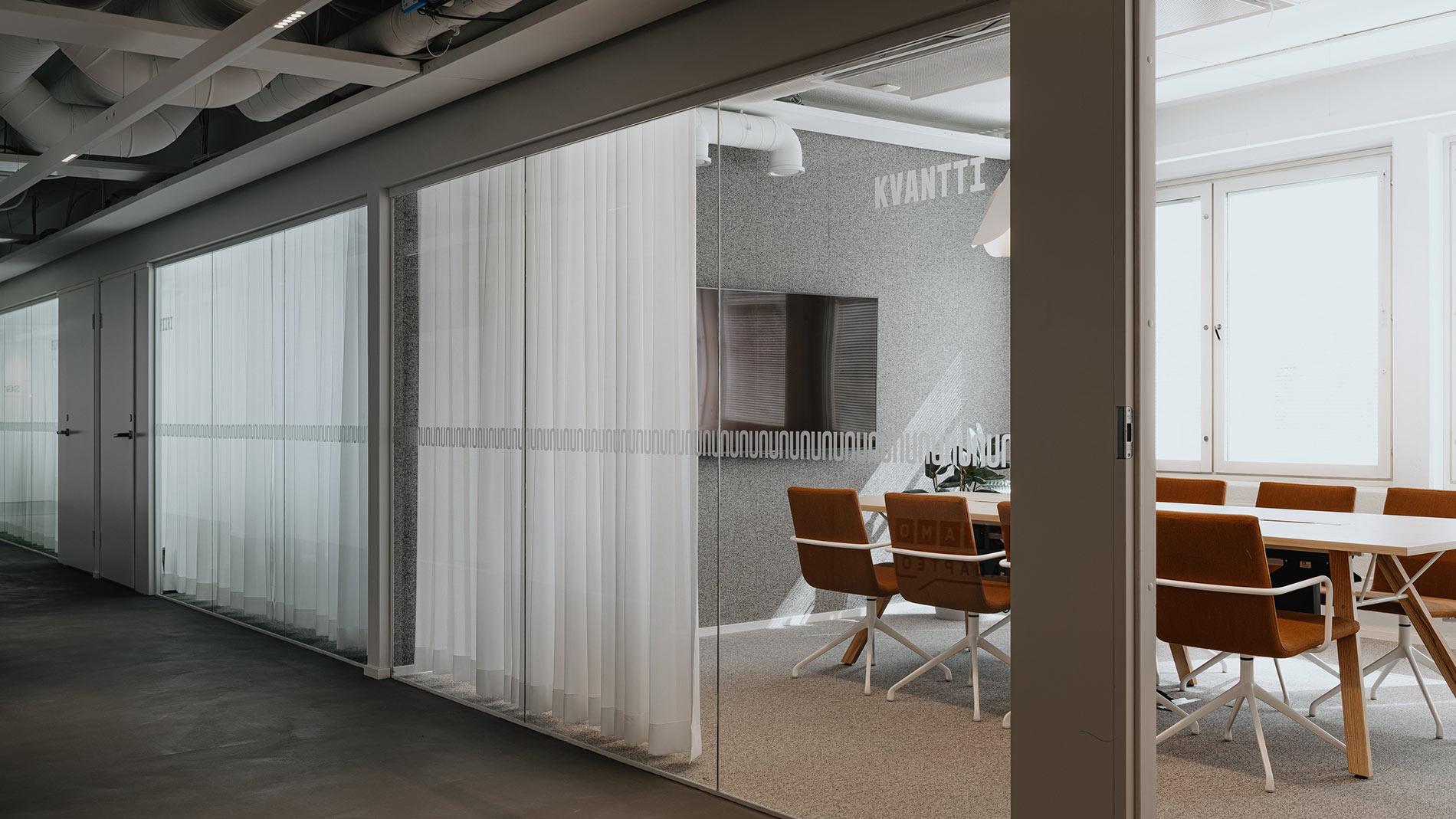
Spatial concept to polish a landmark of its time

So how will Valla look and feel in future? It will be transformed from a static monument to a memorable landmark. What this means in practice in terms of functionality is that, thanks to the incredibly intuitive placement of services from the users’ point of view, users are able to move effortlessly on the premises.

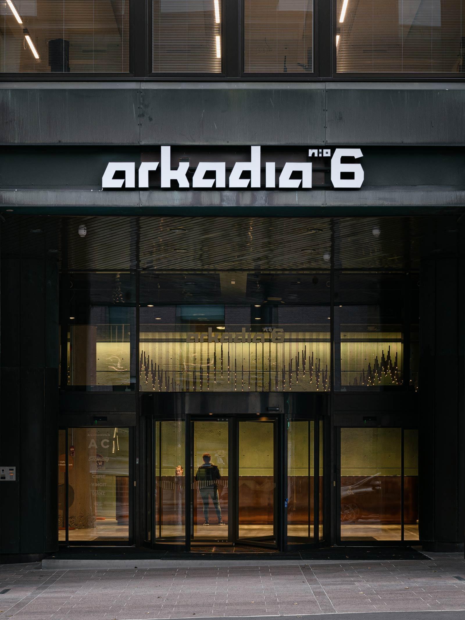
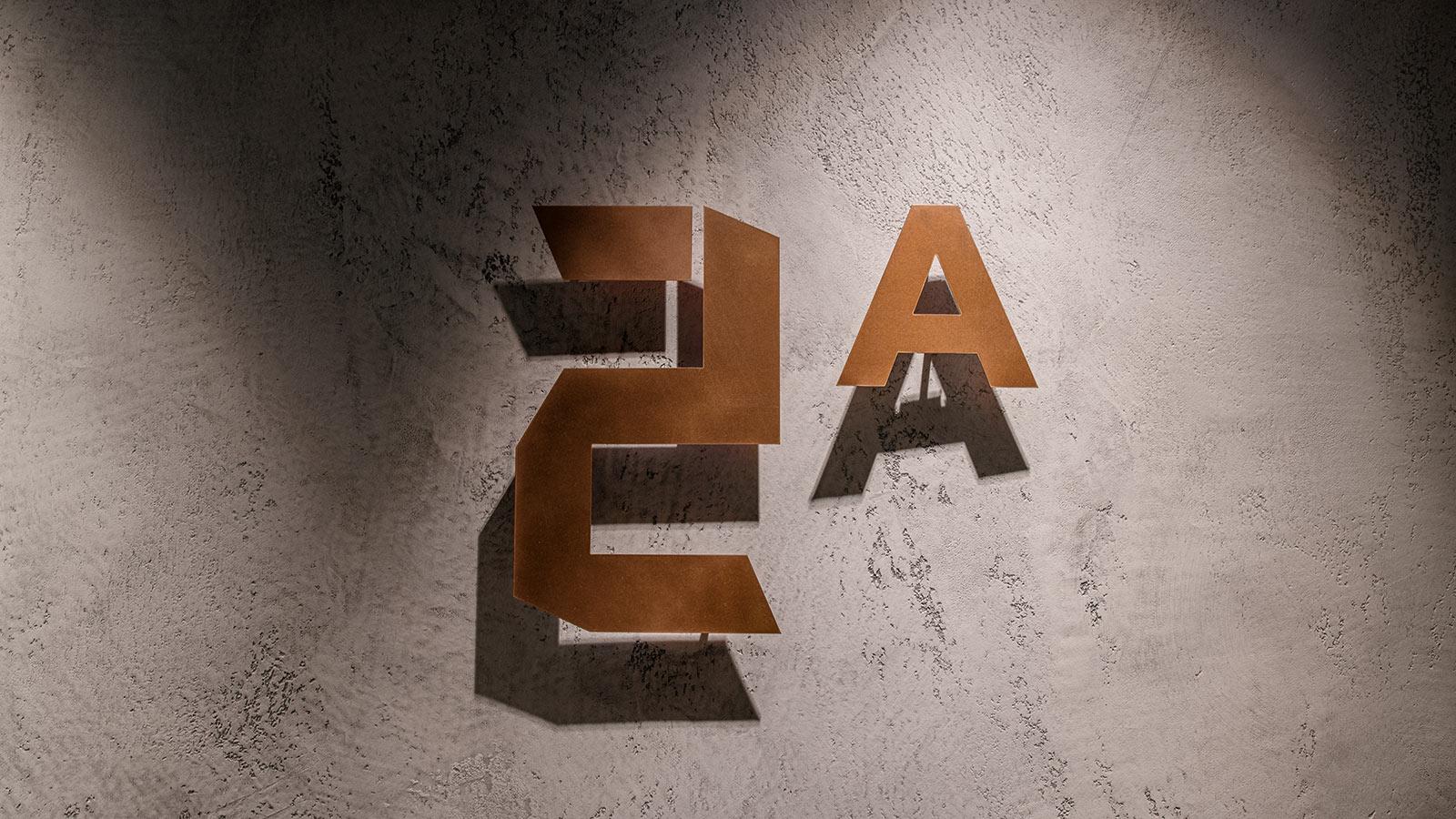
“Valla is easy to find because the new façade, and especially the stand-out entrance, will capture your attention. The new main corner entrance now provides easy access to the verdant service point, where you are met by a real human. After that, the space opens up, offering beautiful vistas of the Atrium and the office spaces on the higher floors,” says Design Strategist Jenni Herkama, describing the serene user experience achieved through spatial design.
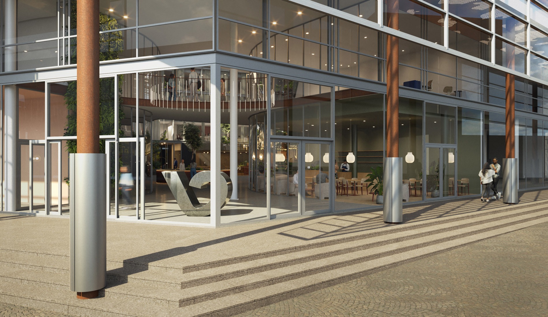
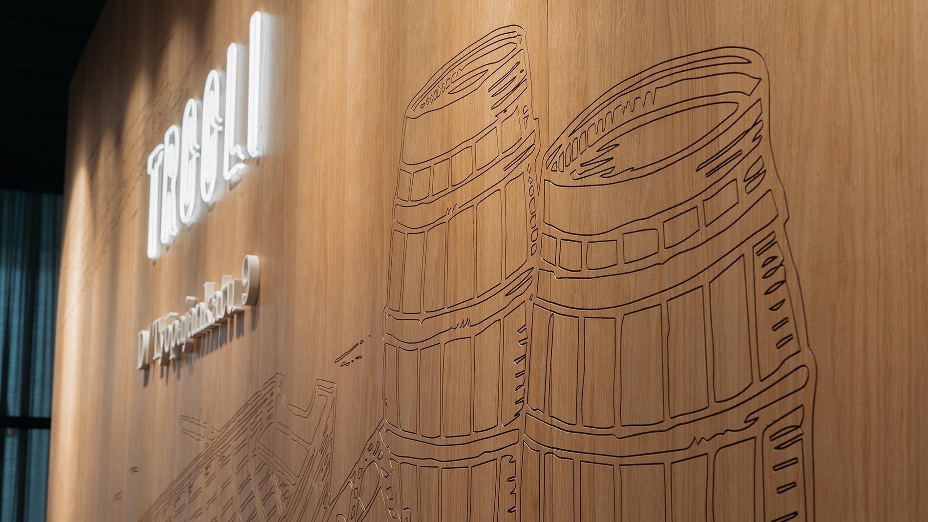
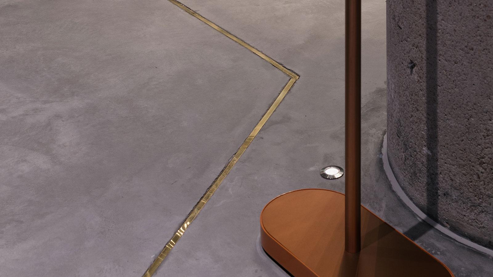
The concept also enabled Valla to be polished into a new sheen in terms of style and ambience. To complement the clean lines and high-grade materials originally designed by architect Pekka Helin, we’ve introduced unforgettable natural and artistic elements, with their roots in the environment of Ruoholahti.

“We were building on top of the existing quality architecture. For example, when designing the facelift of the façade, we took advantage of the property’s beautifully patinated Corten steel surface that was a novelty when the building was constructed. The idea behind the warm and verdant street level is to invigorate the office spaces overlooking the inner courtyard as well as the Ruoholahti streetscape and to make Valla a destination for tenants and residents at large,” says Jenni.

Would you like to learn more?

Read current news in Finnish about Valla. And feel free to get in touch with us – we’re happy to tell you more!

VVT

Functionalist building rises to new glory

Located at Vaasa Market Square, Hallintalo is one of the most famous functionalist buildings in the city. It is the first work of the famous architect Viljo Revell from 1939. The building has been a prominent feature of the Vaasa cityscape for decades, and it was renovated respecting the layers of its rich history. The illuminated facade logo, the large wall clock that was inspired by Hercule Poirot and the wave-patterned flags that serve as reference to the nearby sea ensure that the building can be seen from afar. Indoors, the renovated lobbies and stairwells combine features typical of functionalism: simplicity, airiness and circular forms.

Bygga – more attractive than ever

VVT Kiinteistösijoitus acquired Hallintalo, a building comprised of commercial premises and office space, in 2016. The aim of the project was to raise Hallintalo, or as it is nowadays called, Bygga, to new glory and ensure its attractiveness also on the contemporary real estate market. “The surfaces of this property, which was built in the 1930s, needed updating to improve its rentability. The aim was to honour the existing functionalist elements with a modern twist,” says Jere Fredriksson from VVT Kiinteistösijoitus. “The building has a strong history, and it has been important for the city’s residents in many ways. In order to maintain and renew the value of the centrally located property, some branding work was required,” says Johanna Happonen, Lead Designer for the project.

The design of the property’s own brand was guided by the following themes, which were defined together with the VVT employees:

  • renewable, contemporary icon
  • visible and present
  • known landmark
  • style conscious
  • meeting place
  • Swedish-speaking Finns

Rune & Berg Design was responsible for the property’s branding, which included the conceptualisation of graphic and spatial elements for the facade, lobbies and stairwells, as well as the planning of their implementation. In addition, we summarised the interior design concept into a concept manual and a brochure that the customer can use when renting the property.  “The project and the process went well, we could find a shared understanding easily and the customer’s wishes were well respected. The good thing was that instead of just talking about physical space, we discussed the overall brand. You were a “one stop shop” that provided everything we needed,” Jere says, describing the contents and smoothness of the project.

Harmonious experience outdoors and indoors

The creation of the brand began with the history of the building, its architecture and its relationship with the environment. As the building is such a fine example of functionalism and has a central location in Vaasa, the entire property follows the principles of functionalism. “In terms of form, the entire look and feel is functional, right down to the smallest details. We sought inspiration not only from Revell’s other work but also, for example, from the early functionalist visual elements of the original Hercule Poirot opening credits,” says Riikka Kuukka, AD.

The facade’s simple but easily visible “Bygga” logo was paired with wave-like patterns that refer to the location’s proximity to the sea and the circular forms typical of functionalism. There is also a famous clock outside the property, which the local residents use for checking the time when meeting someone on the market square or waiting for the bus. “The capitalised name “Bygga” is perfect for Vaasa and the property, it feels as if it has always been there. Many have asked whether we have renovated the entire facade, although we have only changed the lights and the logo,” Jere says, describing reactions to the renovated property.

The interiors are also designed in the functionalist style. The wave-like decals and the customised stone floor of the entrance hall welcome visitors. The stairwells and the interior wayfinding system were also renewed in line with the interior design concept.  “The property is a nice combination of the graphic look, the property brand and the spatial implementation. It has a coherent story that starts with the architecture and functionalism, respecting history,” Johanna says, describing the successful experience.

The renovated property has attracted interest

The end result is a harmonious property that is also easy to market to potential tenants, thanks to the digital brochure and conceptual presentation. The brochure provides general information about the property and presents the renewed brand, while the conceptual presentation illustrates the materials and furniture available for boutique offices in different price ranges. “We created a coherent story for the property, allowing the spatial and graphic materials to support each other,” says Noora Malmström, Graphic Designer for the project.

The owner of the property, VVT, is satisfied with the result, and the renovated property has not gone unnoticed on the business premises market in Vaasa: “The result is a success – it respects history in a fresh and interesting way. It is like a whole new property. Interest in it has already soared,” Jere concludes happily.

Hattutehdas

A look and feel that matches the huge potential of the property

Hattutehdas is a quaint former factory building in Sörnäinen, Helsinki. During its history of almost 90 years, it has served as a hat factory and a hub for coffee roasteries and packaging facilities between 1938 and 1970. The complex has been extended three times, offering ample space and character, particularly thanks to its new memorable identity. The new name, Hattutehdas, the fresh and joyful visual look and the bowler hat logo make the property stand apart from the other buildings in the area. The new entrance area, lobbies and showroom help potential tenants understand what this historical but technically fully modern property is capable of. The clear wayfinding system complements the new Hattutehdas look and feel and helps the tenants navigate the large property.

Design drivers of the property design:

  • industrial, current
  • recognisable
  • individual
  • cheerful
  • insightful

Rune & Berg Design was responsible for the graphic look of the space and the facelift of the entrances and lobbies. We also designed a website and a digital brochure with content that match the new look. The new wayfinding concept that was also created by Rune & Berg Design promotes the usability of the building.

Inspiring look brings more recognition

Hattutehdas is located in an intensely developing area in the corner of Vilhonvuorenkatu and Sörnäisten rantatie. We wanted to freshen up the identity of the property to make it stand out among the highly competitive office market of central Helsinki. The aim was to make Hattutehdas more recognisable and attractive, which will increase the occupancy rate of vacant premises.

We've kept it under our hat long enough – new look and spaces at Hattutehdas

The new Hattutehdas identity is more memorable and recognisable than ever. The new look reflects the lively atmosphere, contemporary opportunities and unique environment of the building. It is characterised by a cheerful colour palette of peach, teal and brick, happy urban imagery and modern graphics. The individual and cheerful look is paired with facts and information on the website, the brochure and other marketing material for a balanced end result.

The renewal also included upgrading the entrances and lobbies and designing a showroom that illustrates the rental offering. The atmosphere of the entrances and lobbies was upgraded to match the new identity of the property by renewing the floor, wall and suspended ceiling materials, lightning and signs. We proposed modern canopies and Hattutehdas logos for the facade to make the property recognisable from a distance.

The showroom was built in one of the vacant premises. It helps potential tenants to see what the rentable space could look like when finished. The space has a furnished lounge and break area that are perfect for an introduction of available spaces after a rout around the property. In the showroom, the possible locations of the kitchen, work area and negotiation rooms are illustrated with the help of tape on the floor, and the showroom has a modelling image of a kitchen.

The new name of the property that was inspired by its history and the striking website and brochure make Hattutehdas memorable and unique. The entrance lobby that received a facelift and the purpose-made showroom make it easier to illustrate the opportunities of the building for potential tenants.

Would you like to learn more about Hattutehdas?

Download the brochure (in Finnish).

Get familiar with other similar projects

Interested? Contact us!

Trooli

Presentable office space for tenants at Trooli

Trooli is a four-building office block located in Kalasatama, Helsinki, right next to the Teurastamo venue and Redi shopping centre. The inner yard has parking spaces, a terrace and passageways to the different buildings. The trendy, red-brick office block is a perfect match in the developing neighbourhood that, in the near future, will offer housing and services to up to 25,000 people. Trooli is located at the intersection of a developing, vibrant business district by the sea and the historic neighbourhood of Tukkutori – hence its name Trooli (Finnish for “trawl”). To make Trooli easy to find, the modern logo and signage are visible from a distance. When visitors enter the space, they first see the premium lobby and the meeting and office spaces that make subtle references to the artisanal history of the area.

Trooli – where the big fish swim

The roots of this modernised office block date back to the 19th century. Back then, the area around Trooli was located at the edge of the city, making it ideal for sites with a high fire risk, such as factories and workshops. In the 20th century, the area developed into a busy port for large steamships and small wooden boats. The office block was built in the early 2000s.

The renewal covered the property at Lautatarhankatu 10, where the lease of the main tenant was about to expire. The building needed a new purpose. During the project, the previously single-tenant property was converted into an attractive, vibrant multi-user venue. Rune & Berg was responsible for renewing the lobby and the meeting and office spaces, and for designing a new visual look for Trooli. The project included both spatial and graphic design.

The following design drivers guided the process:

  • vibrant multi-user building
  • attractive visual look that stands out
  • modernised office space

A welcoming office where traditional craft elements meet modern premises

The new identity and visual concept of the building make the building recognisable and leave a positive impression on the companies and their visitors. The renewal covered the design of the lobby, meeting and office spaces, and the visual look and signage.

The entrance lobby is a prestigious, welcoming and appealing meeting place where the tenant companies can receive their guests with pride. Stepping into Trooli, the visitor gets the impression of a classy hotel or a restaurant rather than that of an office building. The same, warm atmosphere is present in the office and meeting rooms.

The objective in designing the visual appearance of Trooli was to make the block stand out as a high-quality, trendy business venue. The visuals are a combination of traditional crafts elements, classic quality and fresh trends. All the graphic elements, from old photographs to signs and brochures, reflect the block’s rich and eventful history. As a unique detail, there is a hand-drawn, engraved wooden piece of art behind the reception desk with boats, barrels and nets that reflect the history of the area as a port.

The one-of-a-kind, easy-to-approach appearance combined with modern office premises makes the building more recognisable and helps the owner achieve their goal of a profitable multi-user building. New tenants at Trooli include the co-working provider UMA Workspace.

Would you like to learn more about Trooli?

Juju Business Campus

New lease of life for the business campus of five properties

With Juju, you get what you want according to Conficap’s service attitude. The five-property business campus offers endless opportunities: the right services and facilities for your business, and a community in which you can succeed, meet and have fun together. The red-brick tones of the facade and the rounded lines of the logo are repeated in the interior design. The atmosphere is inspired by, among other things, the freshness of the forest floor, the warmth of wood and the peace and harmony of soft materials. The operating models and interior and lighting choices of the campus support Finnishness and ecology; for example, the intelligent lighting is also energy efficient. The signage in the premises makes it possible to move around Juju with ease.

Juju – spaces with something about them

Juju is a 45,000 square metre business campus owned by the Finnish family business Conficap and located in Pitäjänmäki, Helsinki. The campus consists of a total of five office buildings with facilities and services for companies of all sizes. The surrounding residential and business area is currently developing into a cozy city boulevard with tree-lined streets and tram lines. The wish was for Juju to be part of this development. The aim of the real estate development project was to increase the desirability of the property and develop an overall concept and service offering that meets the needs of its customers.

The project design drivers were:

  • modernity
  • sharing economy
  • communality
  • ecology

Rune & Berg Design was responsible for the user-oriented development of the property concept, the interior design of the spaces in the various properties and Juju’s graphic look. The areas to be renewed were defined on the basis of user feedback in cooperation with Conficap. The lobbies and stairwells, meeting rooms, restaurant hall, social facilities and signage were all renewed. In addition, we produced a brochure to support the marketing of the leased premises.

User-oriented concept - modern flexible spaces and shared services

Conficap’s values ​​are conveyed in the premises and in the concept: at the core of the Finnish family business are ethics, ecology and the attitude that “everything is service, everything is possible”. The property concept was developed in cooperation with not only Conficap but also the tenants. The project included observations of the site from both the outside and inside, Juju’s role in mirroring the development and services of the surrounding area and interviews with current and potential tenants. These focused on finding out what expectations tenants have when renting business premises and what is good and what needs development in Juju’s properties.

During the project, we defined the necessary and value-added services for tenants and determined the preconditions necessary for the operation of attractive services. The core service is the rental of business premises. In addition, Juju offers, among others, lobby and restaurant services, conference centre and seminar spaces, sauna facilities for rent, as well as a gym, guided exercise and massage to support well-being at work. Tenants also have the opportunity to take advantage of a shared car service, laundry services, the Kamu kindergarten and courtyards between the properties.

Want to read more about our real estate development projects?

Learn more, for example, about how we helped transform Farmi in Tampere from an empty office property to a seedbed for business and growth.

Farmi

From an empty office property to a seedbed for business and growth

From your very first encounter with Farmi, you will want to smile and unleash your creativity. The atmosphere is not unnecessarily serious: playful graphics, rustic tones and sprawling greenery distinguish Farmi from the traditional business park environment. Farmi is vibrant and full of energy. However, there’s plenty of space to get the job done quite efficiently – with over 18,000 square metres to choose from. From Info you can head to the COW Working cafe or to the upper modernised work levels. During the working day, you can stop by the nature-inspired atmosphere of Laituri or spend the whole day in the diverse restaurant world, where you can taste meatballs, vegetable lasagne or more modern BBQ delicacies. After the working day, you can also relax in the sauna on the 5th floor.

Farmi is the ideal growth platform for companies and new innovations

Originally built in the 1990s, the former “Hermian Bitti” is located in Hervanta, Tampere. There is more to the location than meets the eye, with Tampere University of Technology and VTT Technical Research Center right next door. Despite the great location, the long-term tenant was vacating the premises and the building needed a new focus to stand out in the market. The goal was to develop a modern and inspiring work environment full of life and suitable for companies of all sizes.

The following were defined as the design drivers:

  • Market distinctiveness
  • Emphasis on strengths
  • Easily understood material to support rentals

In order to create a distinctive concept, we studied the competitive field of business parks in Finland and abroad. We paid careful attention to the characteristics and strengths of the property. After a background study and workshops with the client, we defined the main idea for ​​the property as creating an ideal space in which companies and new innovations can grow. This is how it got its name Farmi.

Farmi offers a space where ICT companies, companies utilising their technologies and students in the field can gather and meet. The environment supports synergies and the emergence of innovations, which create a unique reason to come to Farmi. Rune & Berg Design was responsible for designing the new rental-promoting business park concept as well as the graphic look and facilities.

Lively and active property where you can also find laboratory facilities

Premises alone are not enough – real estate also needs to stand out in the market and be remembered. The concept for Farmi was built not only from a market and property perspective, but also from a rental perspective. The aim was to create a developing, energetic and innovative concept. Development and innovation are supported by, among other things, laboratory facilities suitable for electronics testing, which are not found in every property.

In addition to the unique location, laboratory facilities and modern work environment, attractive opportunities were developed not only for spending time during the working day, but also afterwards. A key element in this was the diverse and attractive restaurant world, which also draws in customers from other properties in the area, enabling various encounters and appointments. In addition, the car park, for example, can be utilised for various festivals, food events, urban farming, sports and street art together with students and the rest of the surrounding community.

In addition to the concept idea and the completed premises, a brochure and sketches were produced to support the rental of the property, which help to outline the possibilities of a living property. The bold renewal was worthwhile: from the premises previously used by Microsoft has emerged a truly vibrant and distinctive business park.

Do you want to get acquainted with similar real estate renovations?

Read, for example, about the comprehensive renewal of Arkadia n:o 6, located in the heart of Helsinki.

Arkadia n:o 6

A timeless and memorable five-star property that is full of life

Arkadia n:o 6 is a property that simply takes your breath away. The rugged architecture, the finished facade and inviting lobby with its impressive lighting attract attention from afar. The first impression is of a five-star hotel: dimmed lighting, brass details and an on-site lobby service create a high-quality atmosphere. In this space, covering nearly 24,000 square metres on eight floors, you’ll never get lost: all entrances are manned by a professional lobby service, either in person or virtually. Highly visible signage makes it easy to move around. An easily visible elevator lobby opens up from around one corner, where the classic rugged atmosphere continues. Regardless of which floor you find yourself on, Arkadia n:o 6 is the best place for business.

Owned by the real estate and management company Sponda and located in the heart of Helsinki next to Narinkkatori square in Kamppi, Arkadia n:o 6 grabs your attention thanks to its impressive lobby and renewed facade proudly displaying the Arkadia n:o 6 logo. Originally designed by Einari Teräsvirta and completed in 1977, the property was renovated with users as the focus. The exterior and interior guidance of the property was clarified and harmonised, and the visual appearance of the property underwent a transformation. The facade visibility, the main lobby and elevator halls, as well as the toilets and the restaurant were modernised. At the same time, the tenants’ own office spaces were renewed to better meet their needs. The comprehensive renewal project attracted considerable attention already from the start, and since then the premises have been fully leased.

From an old loading dock to a stylish meeting place

The direction of the renewal of Arkadia n:o 6 was determined in cooperation with Sponda and Tengbom Architects, based on Gensler’s spatial strategy guidelines. Rune & Berg’s role was above all to define and bring the design vision and the desired customer experience to the space through interior design choices.

The following were selected as design drivers:

  • Easily accessible
  • Distinguishable
  • Memorable
  • A timeless classic
  • 5 star quality

The goal was to turn the property into a stylish meeting place that serves the diverse needs of its users to meet and work: business by day, wine & dine by night. An inviting square was created from the lobby where employees, customers and residents of the city gather to meet. The former loading dock was transformed into an elegant lobby space, which is easy to find whether you walk or travel by bicycle, car or public transport. Typically, the materials used in the facade, such as concrete and brass, recall the history of the space. The lighting, which can be modified according to the time of day, the seasons and use situation, gives the space a pleasant atmosphere.

Thoughtful user experience with respect for architecture

The ruggedly elegant atmosphere of the lobby continues throughout the property. It is easy to move around thanks to the unified signage and carefully considered functionality. The main lobby provides access to a street-level café and restaurant, which was not previously directly accessible. If desired, the almost five-metre doors connecting the different spaces can be opened, turning the lobby and restaurant into one large space that can be used by tenant companies to host large parties, for example. This is an impressive experience as the large, open space recalls the lobby’s past as an outdoor space and creates the impression of the movement of air and wind in the square.

Thanks to the well-thought-out signage, it is easy to find the user or space you are looking for. The logos for all tenants are visible on the facade and they also catch the eye as soon as you enter the lobby. The logos are projected onto the wall in the main and elevator lobbies with gobo lights, which are easy to update if needed. Copper signs guide you to the various spaces, such as parking garages, storage and warehousing spaces, restaurants, cafes and shared meeting rooms. The typographical language of the logo is repeated in the typography – making it easier to understand the spaces that belong to the property. The five-star user experience is crowned by the facilities in the property and the surrounding area, such as shower and dressing facilities, electric car charging, the Farang restaurant and the diverse culture of the local area.

Want to learn more about Arkadia n:o 6?

Read about the renewal project (in Finnish), for example, in Projektiuutiset or on the website of Architects Tengbom, the main designer of the project.