A look and feel that matches the huge potential of the property
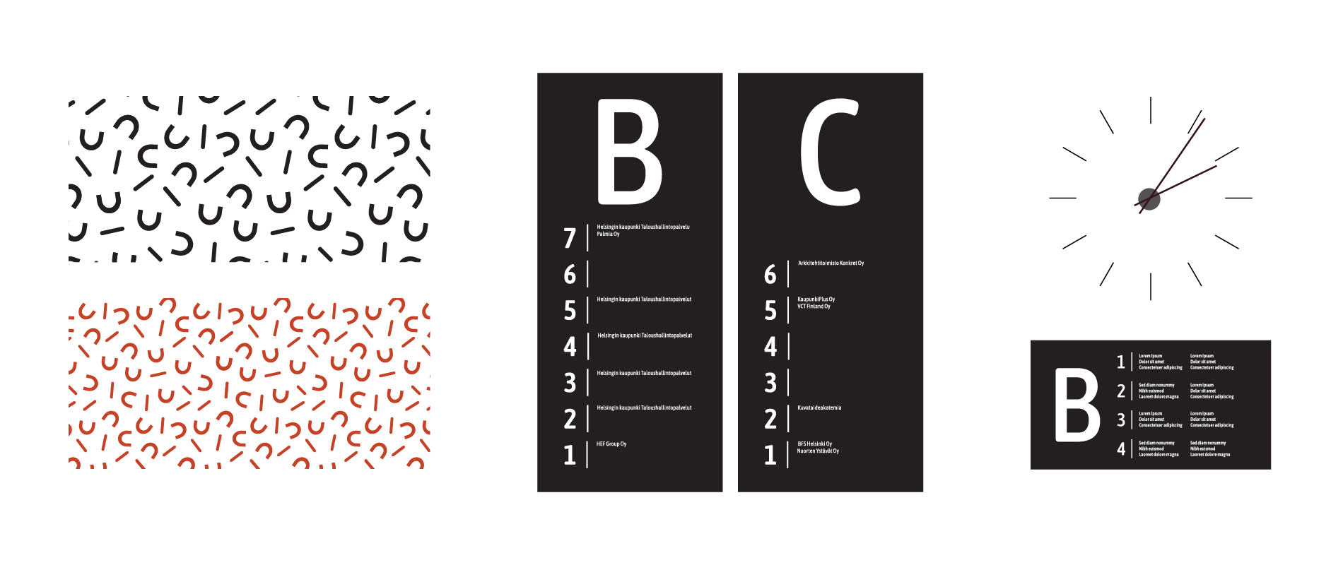
Hattutehdas is a quaint former factory building in Sörnäinen, Helsinki. During its history of almost 90 years, it has served as a hat factory and a hub for coffee roasteries and packaging facilities between 1938 and 1970. The complex has been extended three times, offering ample space and character, particularly thanks to its new memorable identity. The new name, Hattutehdas, the fresh and joyful visual look and the bowler hat logo make the property stand apart from the other buildings in the area. The new entrance area, lobbies and showroom help potential tenants understand what this historical but technically fully modern property is capable of. The clear wayfinding system complements the new Hattutehdas look and feel and helps the tenants navigate the large property.
Design drivers of the property design:
- industrial, current
- recognisable
- individual
- cheerful
- insightful
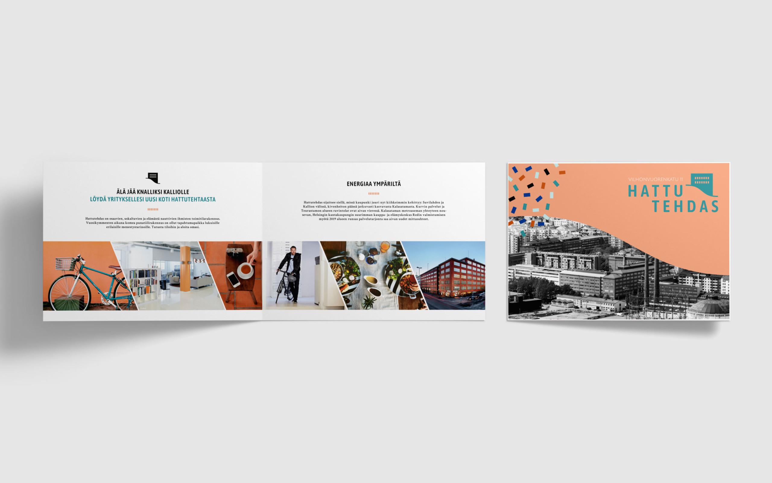
Rune & Berg Design was responsible for the graphic look of the space and the facelift of the entrances and lobbies. We also designed a website and a digital brochure with content that match the new look. The new wayfinding concept that was also created by Rune & Berg Design promotes the usability of the building.
Inspiring look brings more recognition
Hattutehdas is located in an intensely developing area in the corner of Vilhonvuorenkatu and Sörnäisten rantatie. We wanted to freshen up the identity of the property to make it stand out among the highly competitive office market of central Helsinki. The aim was to make Hattutehdas more recognisable and attractive, which will increase the occupancy rate of vacant premises.
We've kept it under our hat long enough – new look and spaces at Hattutehdas
The new Hattutehdas identity is more memorable and recognisable than ever. The new look reflects the lively atmosphere, contemporary opportunities and unique environment of the building. It is characterised by a cheerful colour palette of peach, teal and brick, happy urban imagery and modern graphics. The individual and cheerful look is paired with facts and information on the website, the brochure and other marketing material for a balanced end result.
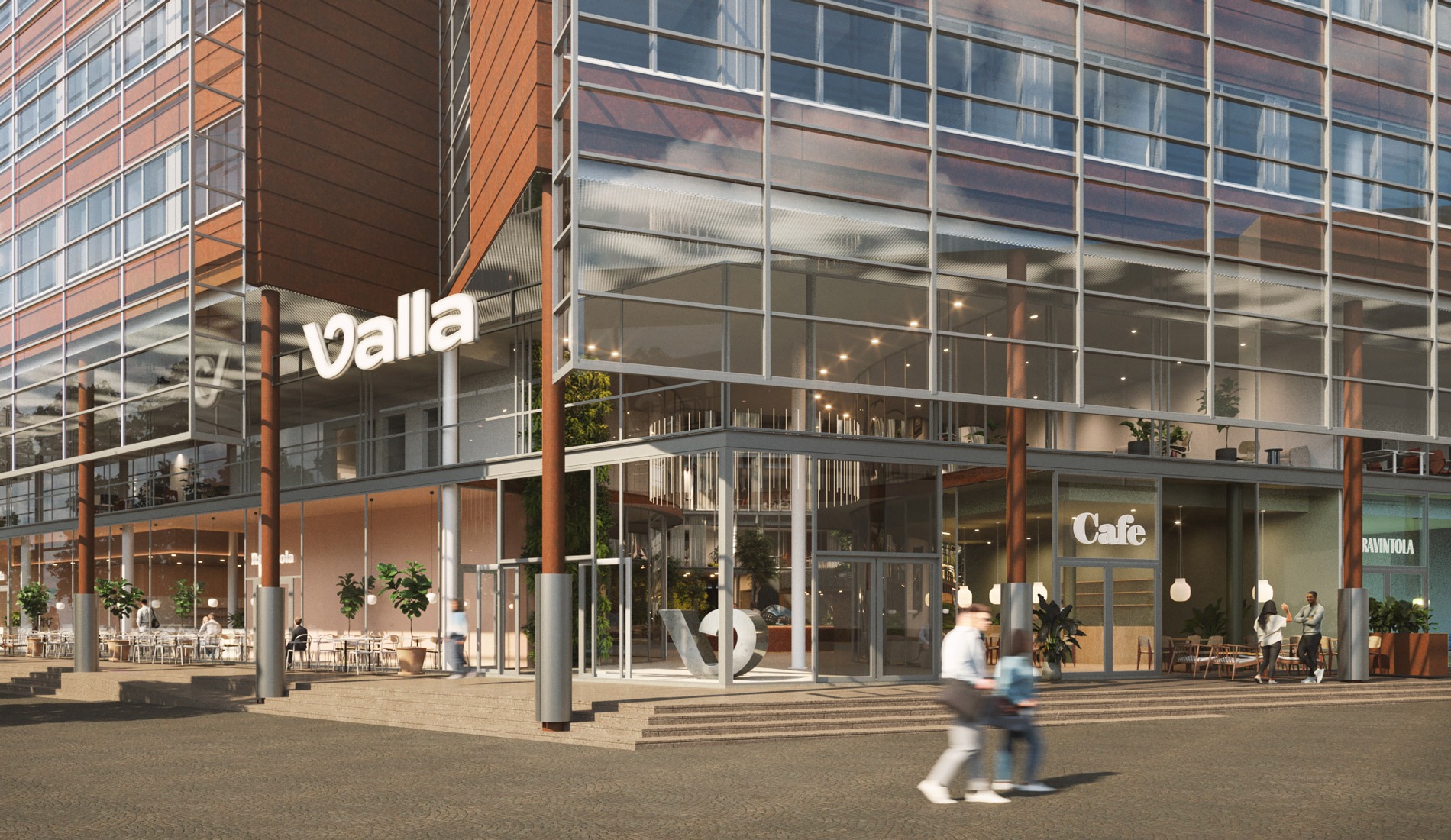
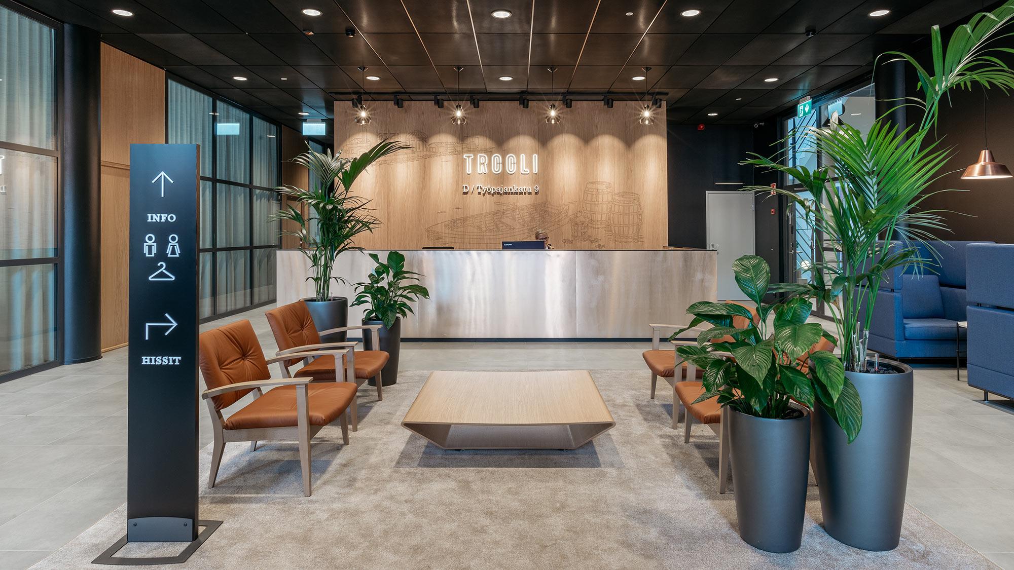
The renewal also included upgrading the entrances and lobbies and designing a showroom that illustrates the rental offering. The atmosphere of the entrances and lobbies was upgraded to match the new identity of the property by renewing the floor, wall and suspended ceiling materials, lightning and signs. We proposed modern canopies and Hattutehdas logos for the facade to make the property recognisable from a distance.
The showroom was built in one of the vacant premises. It helps potential tenants to see what the rentable space could look like when finished. The space has a furnished lounge and break area that are perfect for an introduction of available spaces after a rout around the property. In the showroom, the possible locations of the kitchen, work area and negotiation rooms are illustrated with the help of tape on the floor, and the showroom has a modelling image of a kitchen.
The new name of the property that was inspired by its history and the striking website and brochure make Hattutehdas memorable and unique. The entrance lobby that received a facelift and the purpose-made showroom make it easier to illustrate the opportunities of the building for potential tenants.
Would you like to learn more about Hattutehdas?
Download the brochure (in Finnish).
