Renewed and expanded headquarters brings Masino employees together
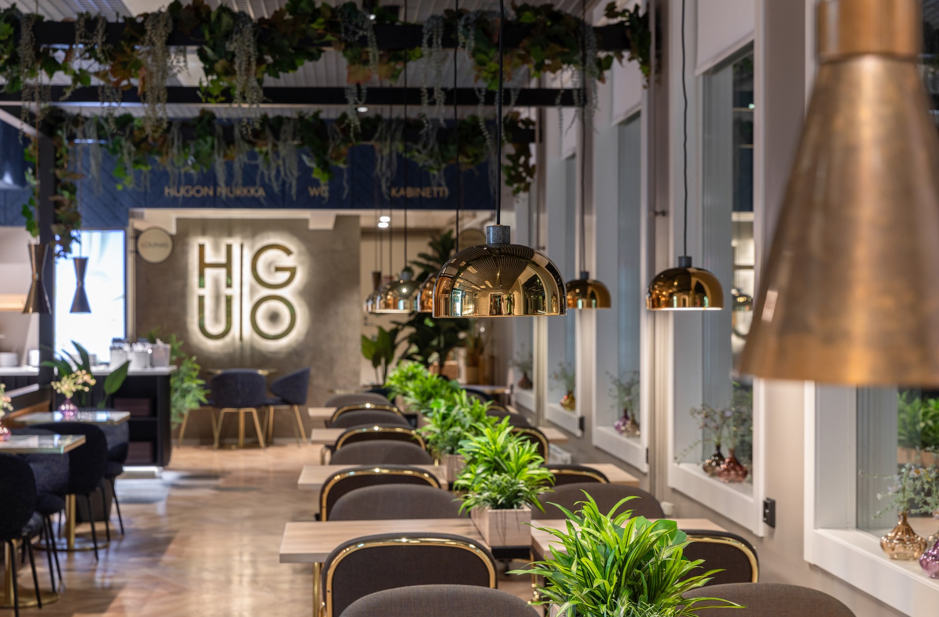
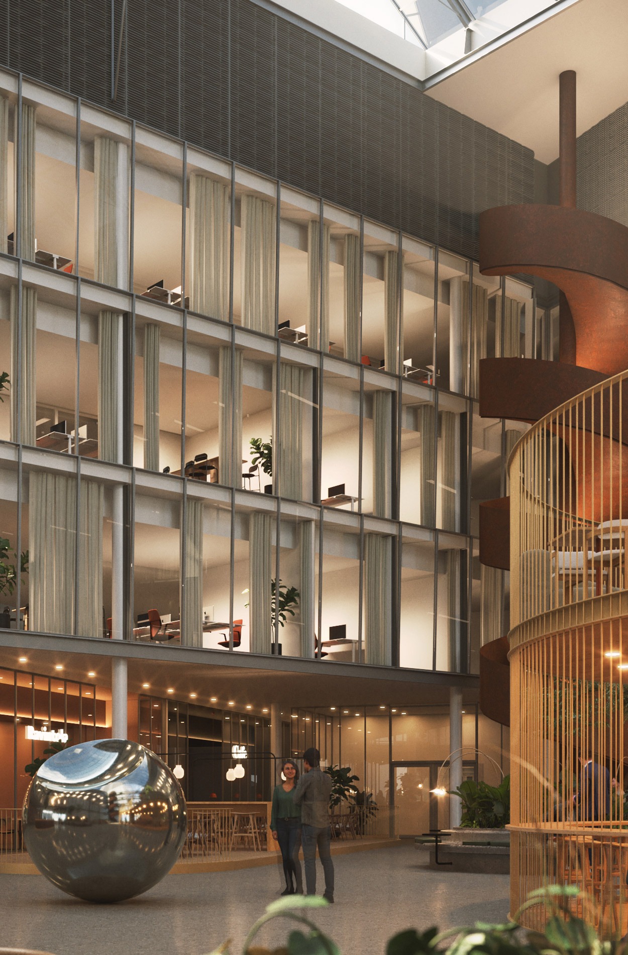
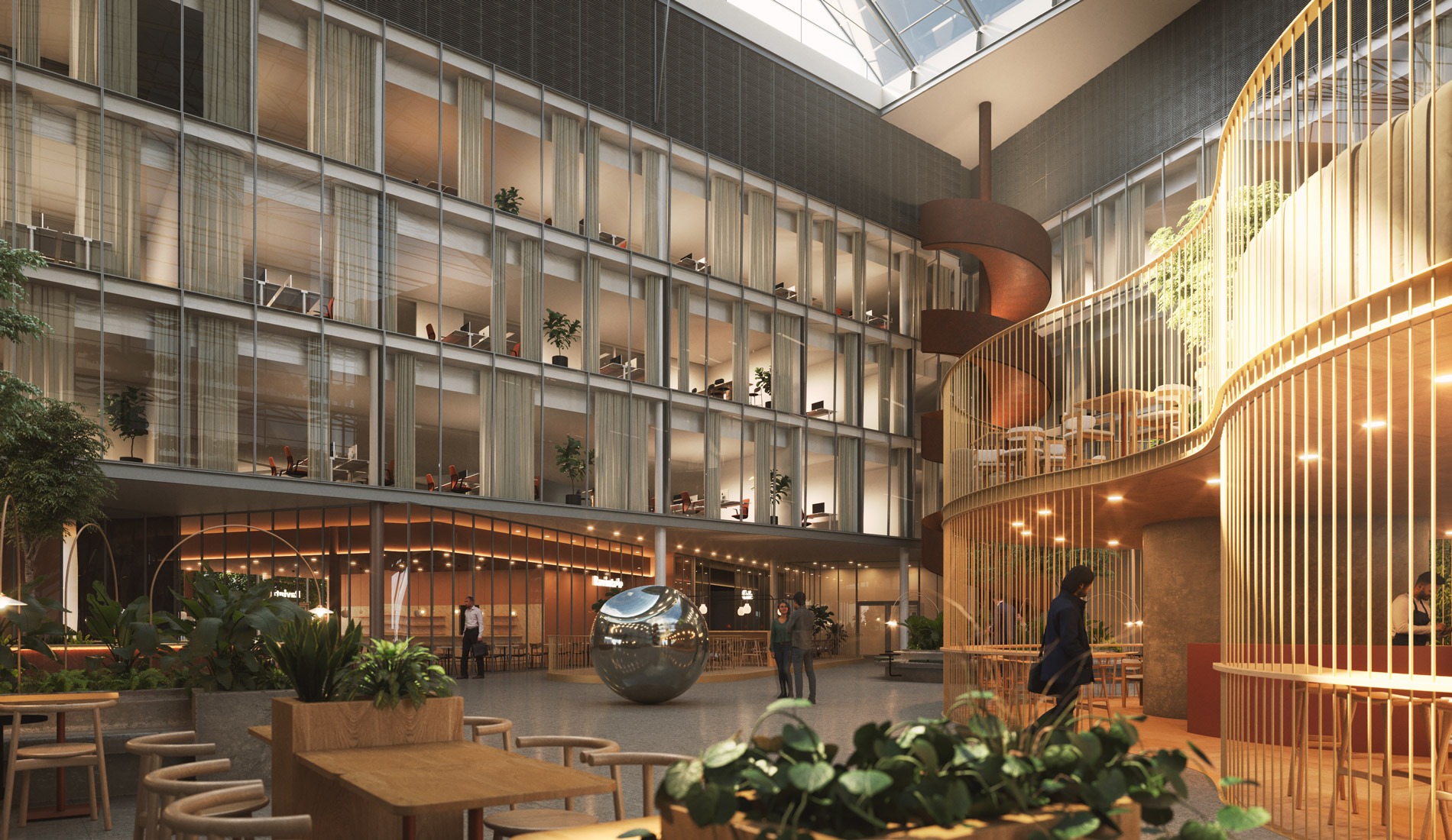
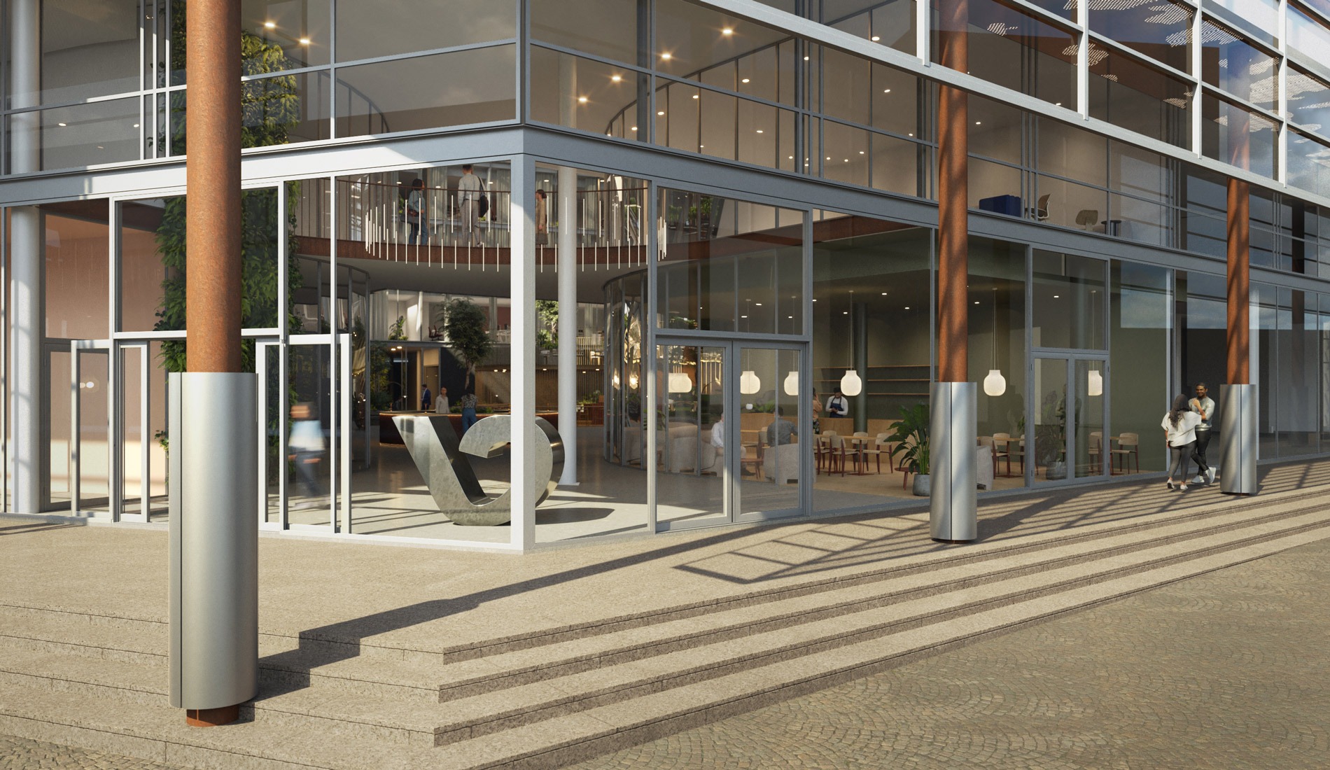
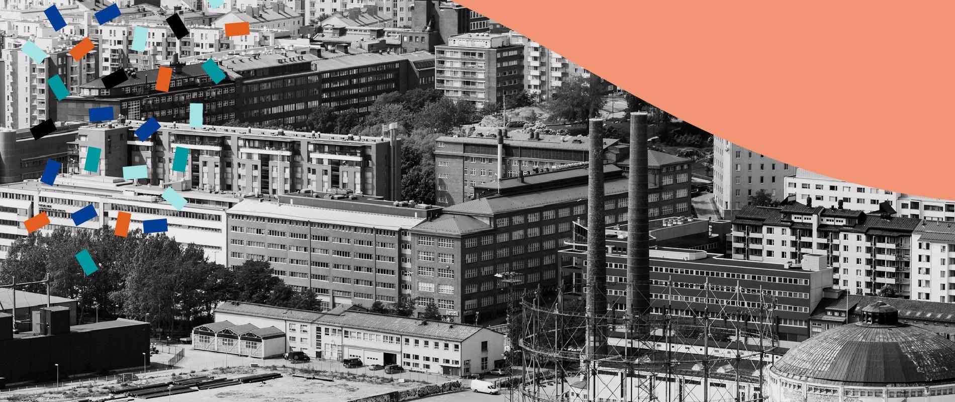
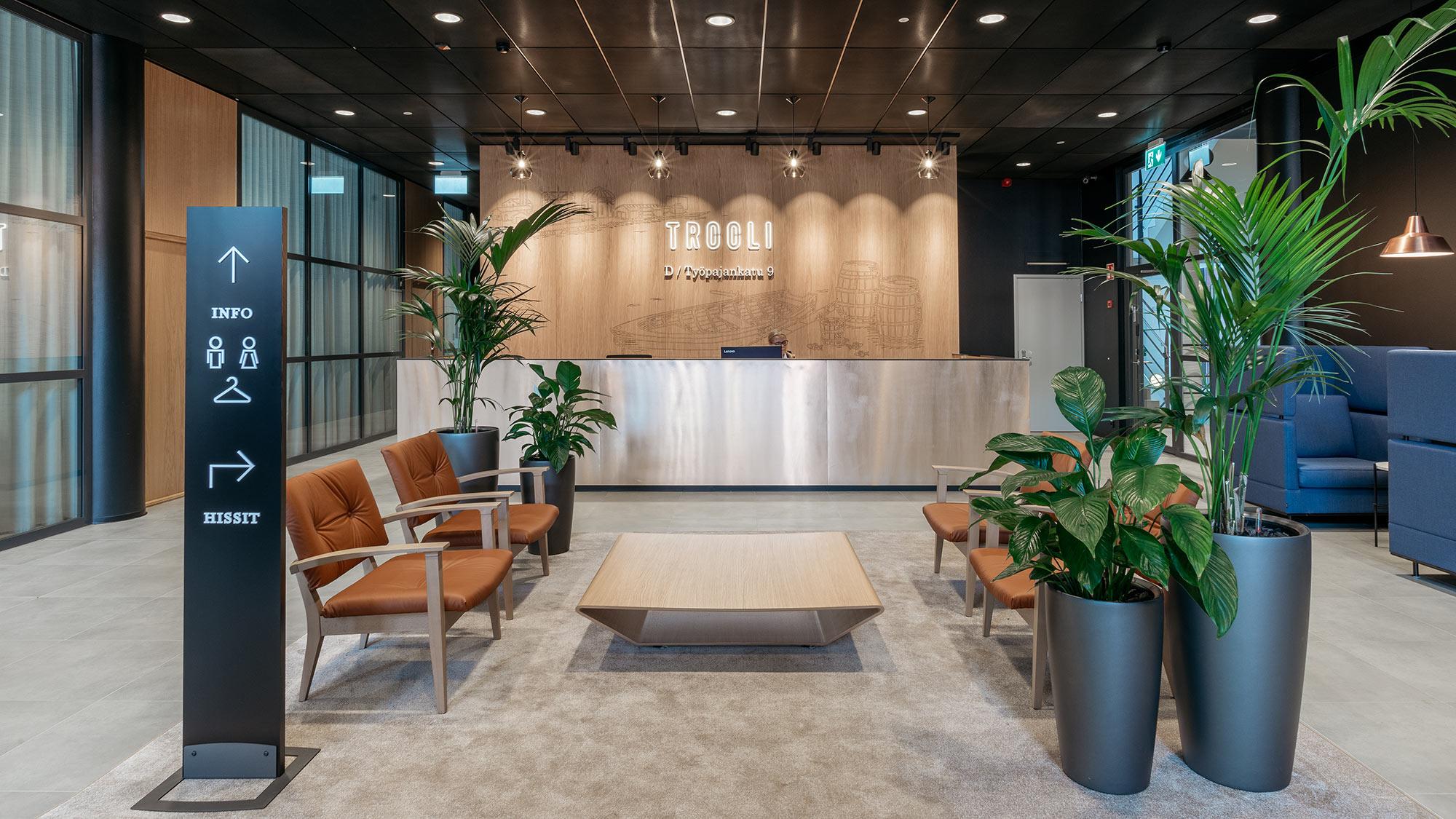
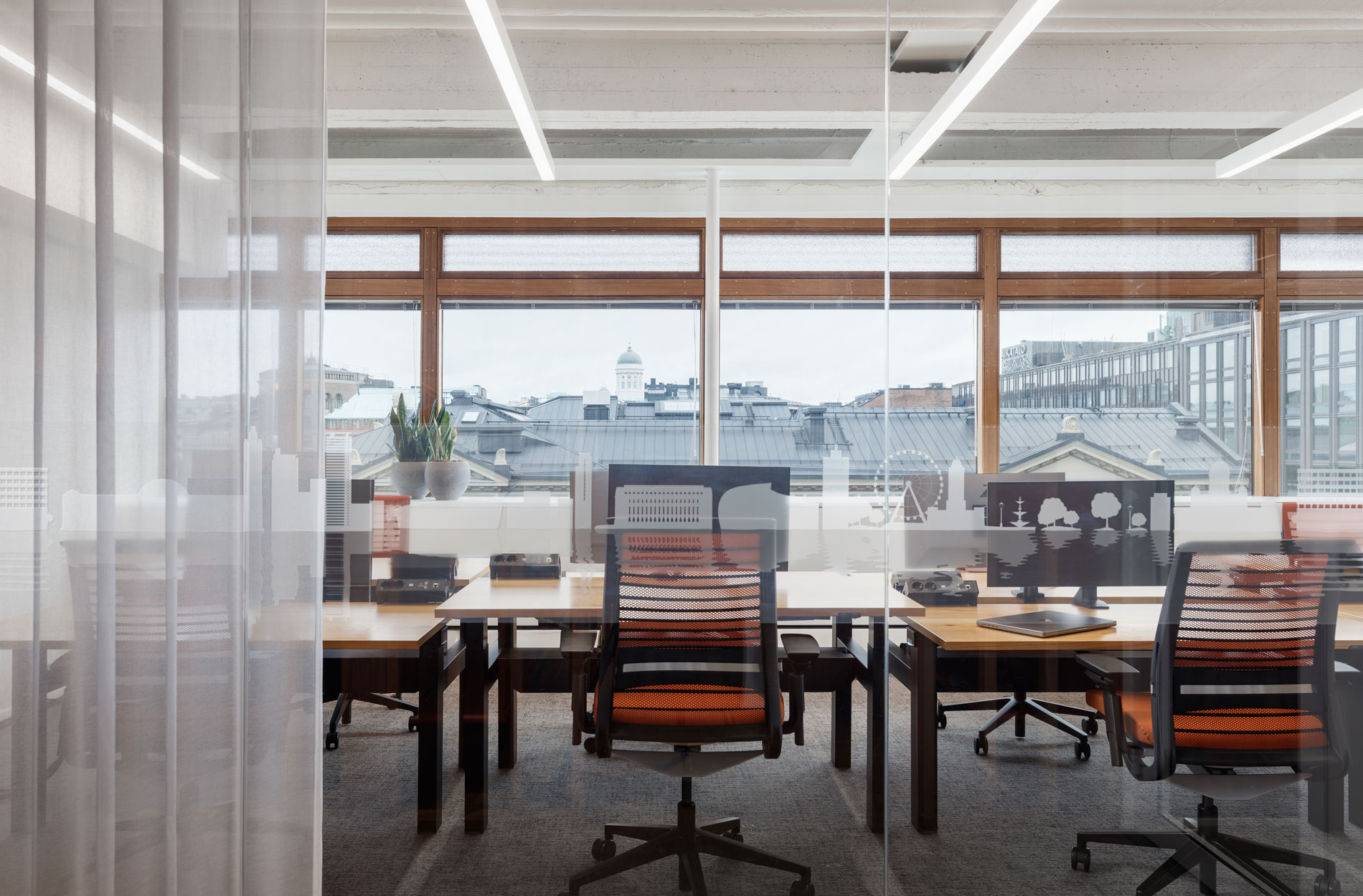
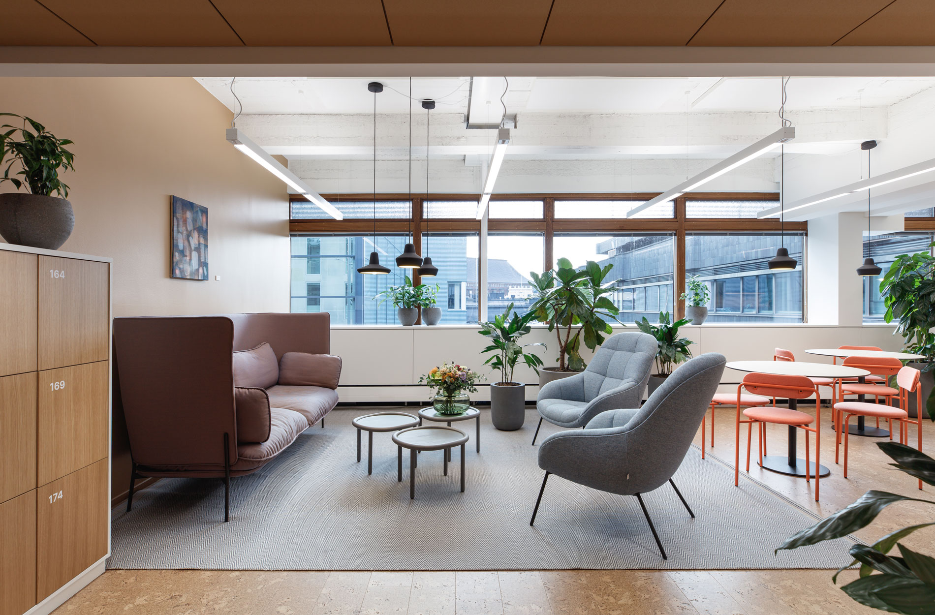
Masino Group, a group of companies specialising in products and services for industry and construction, renewed its headquarters in Vantaa, welcoming approximately 100 employees in the Helsinki Metropolitan Area under the same roof. The office and production premises have a stunning glass facade that makes them stand out from the hustle and bustle of Ring Road III, and they were fully renewed and expanded in connection with the renovation.
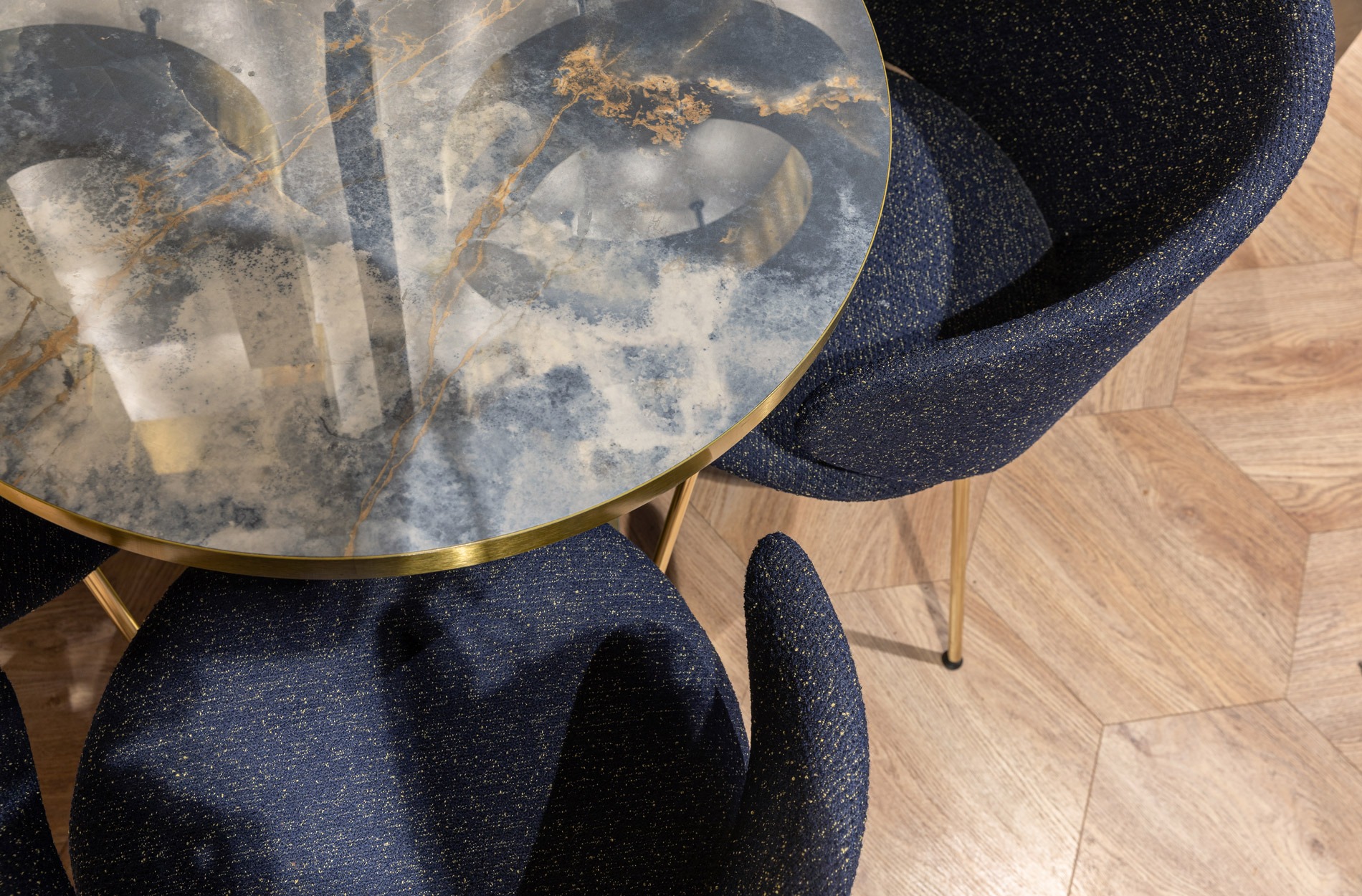
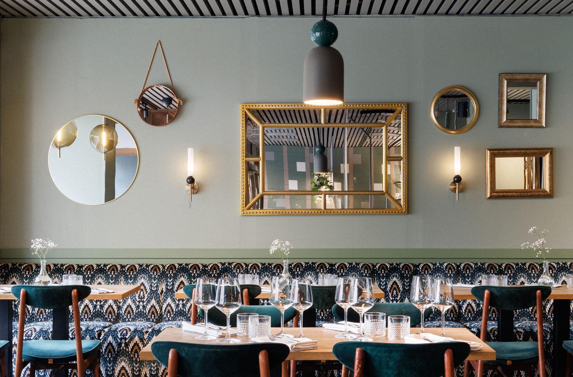
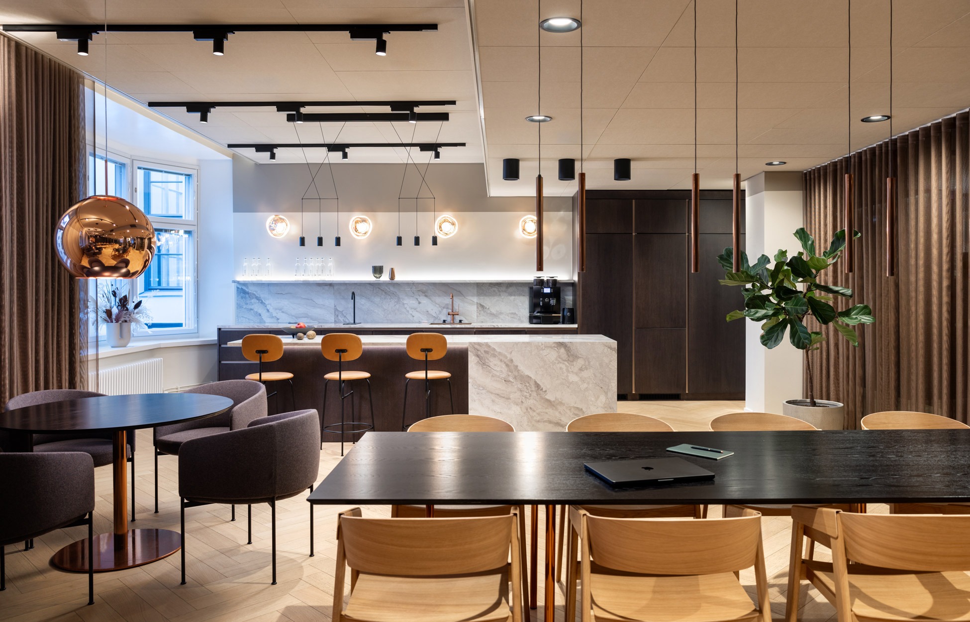
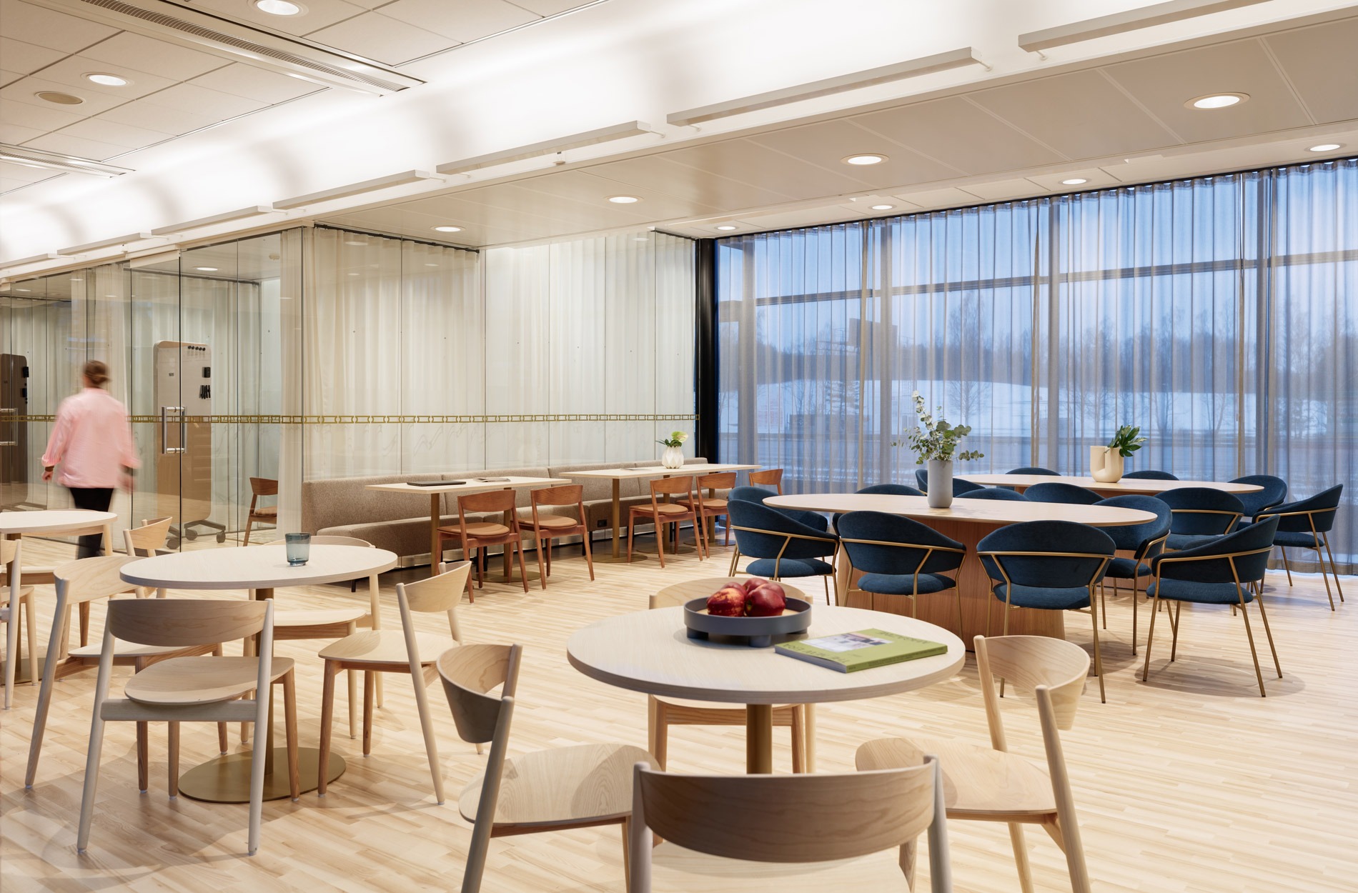
We were responsible for the work environment strategy and concept of the approximately 1,000 square metre office space, interior architectural design, graphic look, and change support. This was a large and significant project, especially regarding business and personnel well-being.
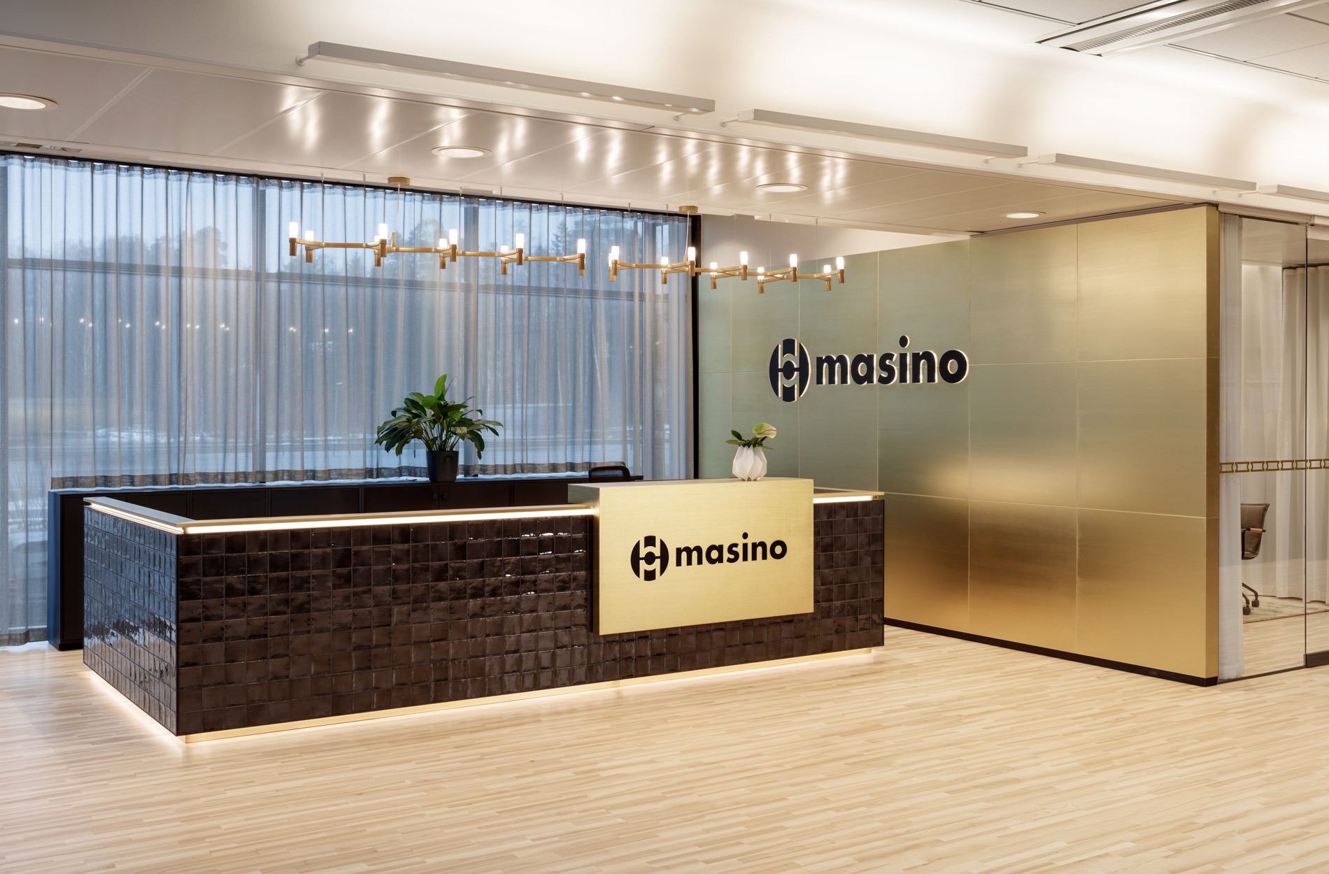
“The premises and the property services ensure the well-being of our employees and support our corporate culture. On the other hand, they also play an essential role for the employer image in recruitment. Presentable premises can also promote business, when clients and suppliers see that our physical premises are in excellent condition,” says Mikko Pietarinen, CEO of Masino Group.
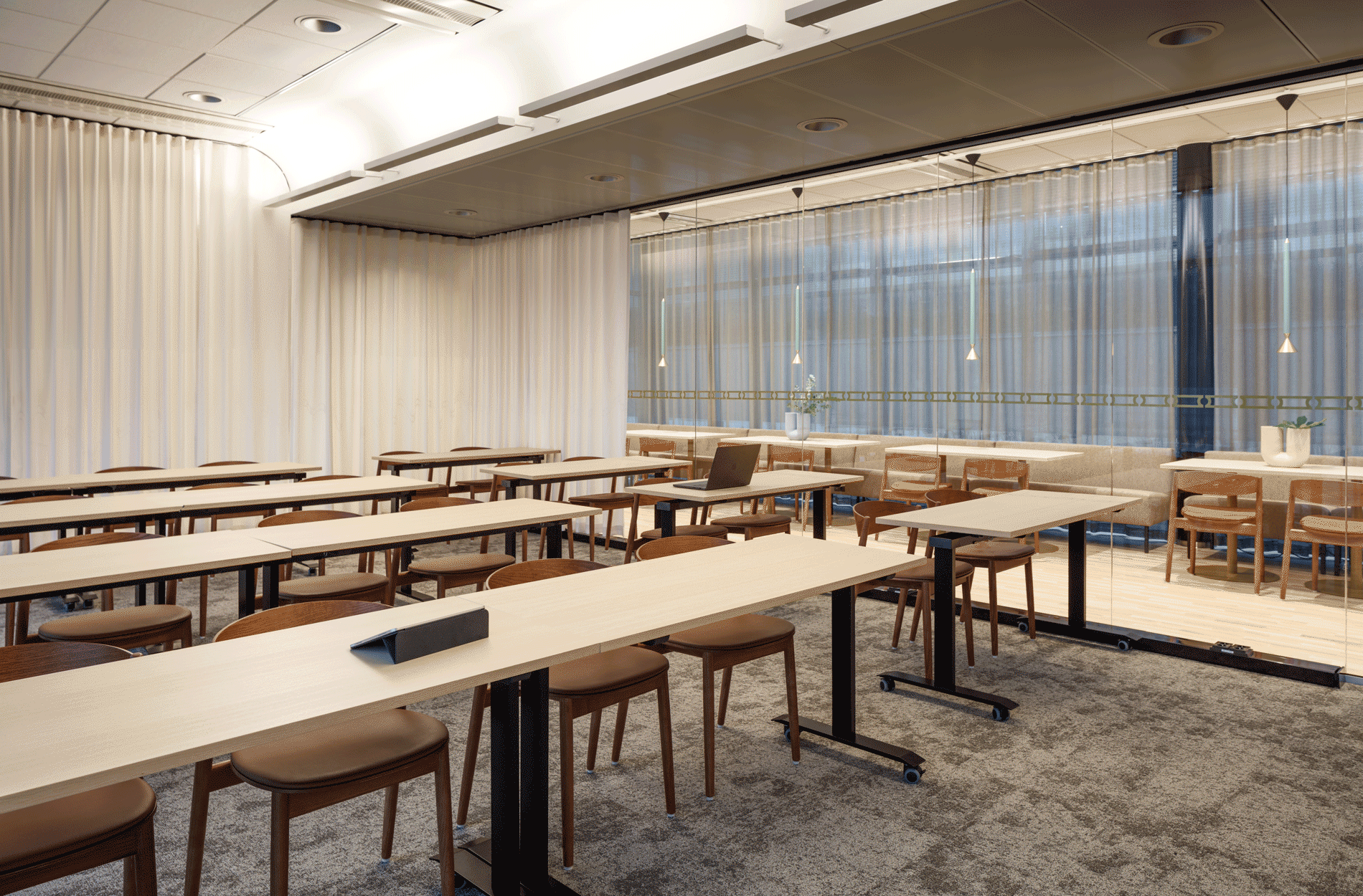
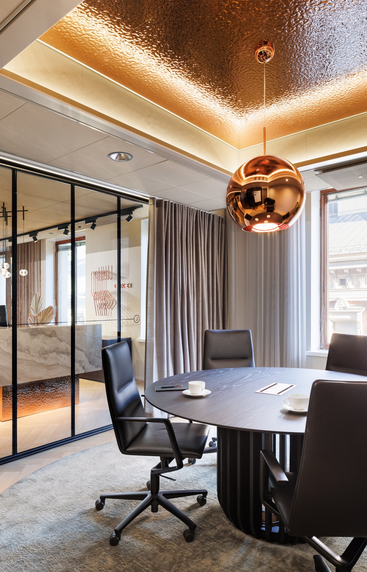
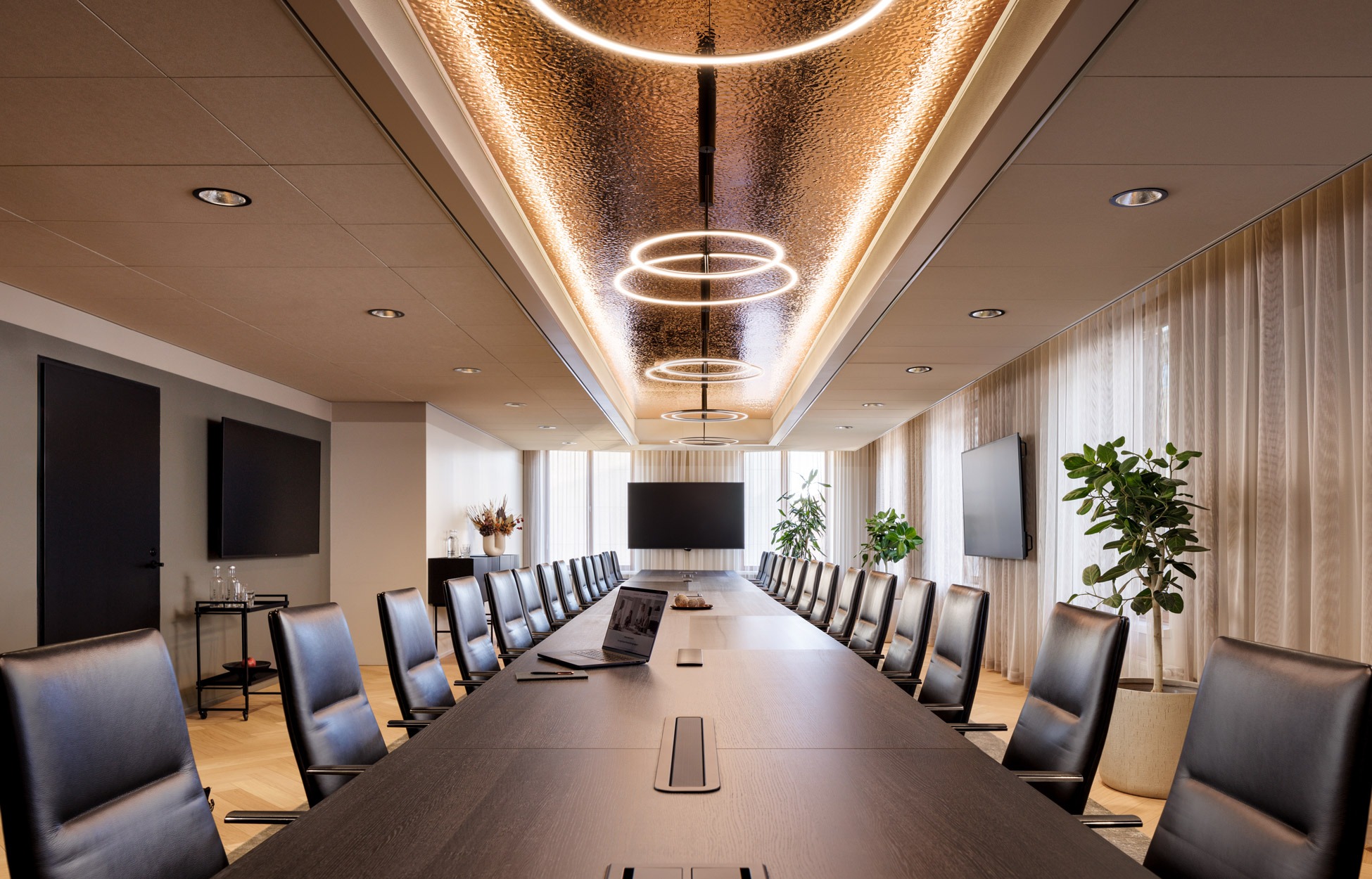
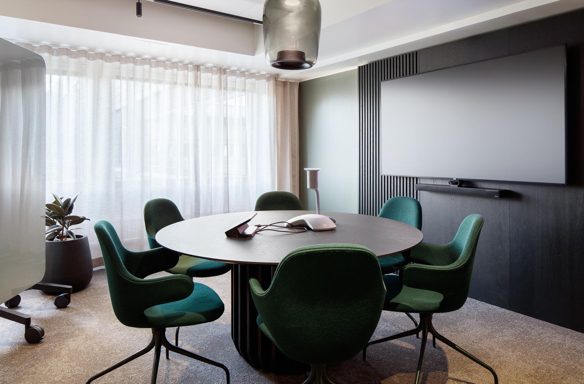
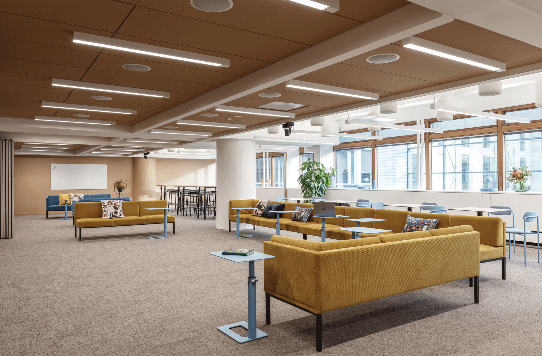
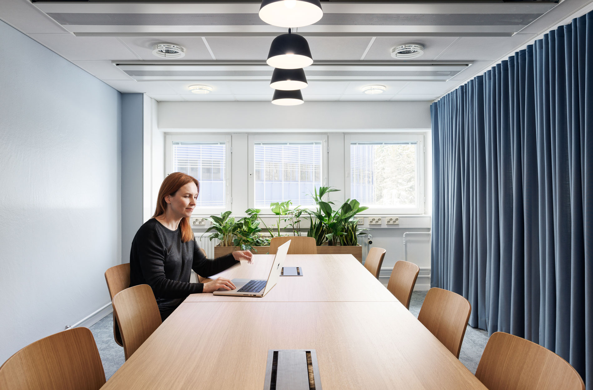
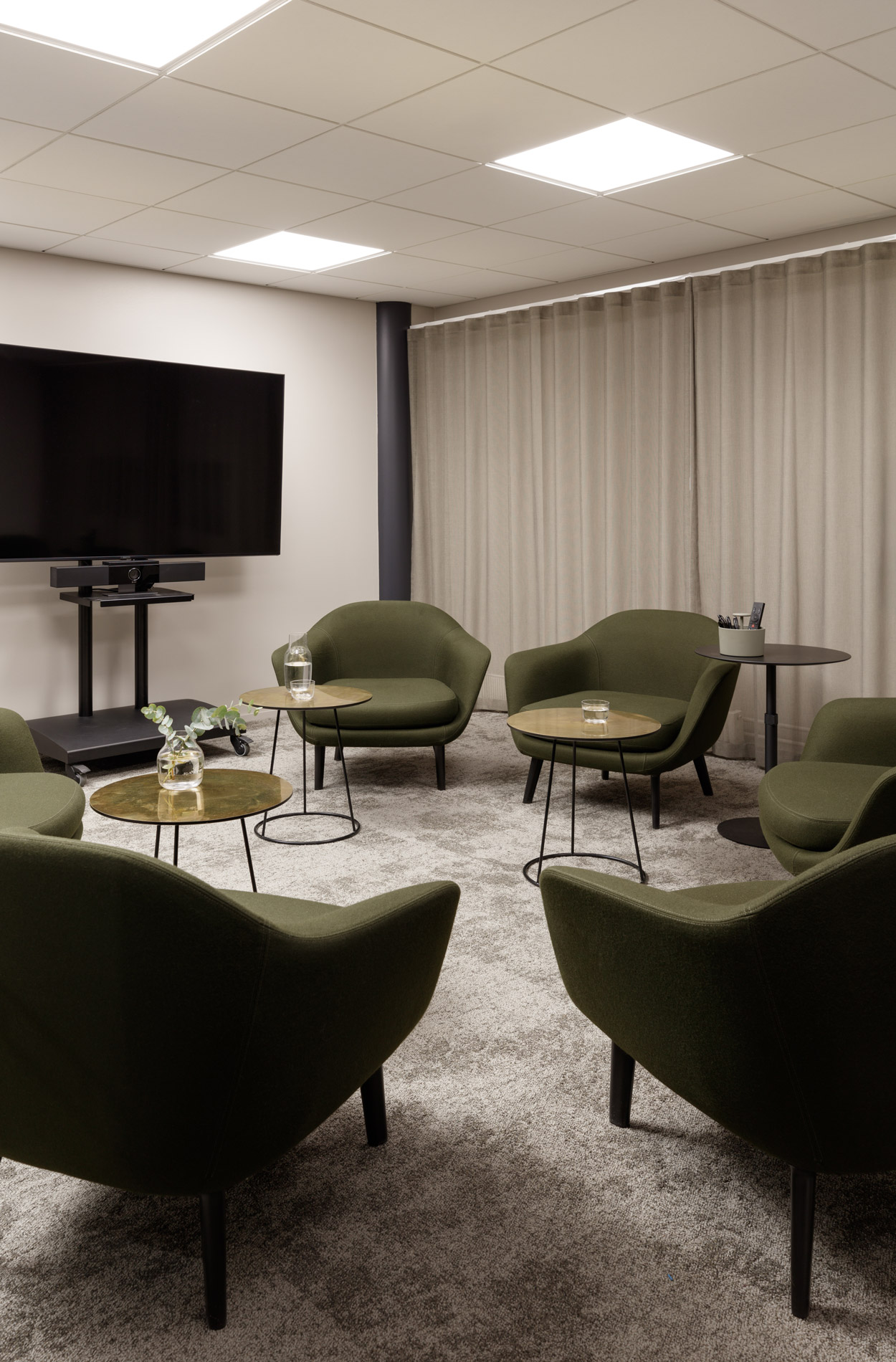
The furnishings of the multi-purpose space were designed to be convertible so that it can be used for training, workshops and board and steering group meetings alike.
Renewing working spaces and methods in connection with the renovation
Masino Group’s updated headquarters also changed the ways of working. The headquarters were fully renewed using various survey methods and fields of expertise. The project began with the definition of strategic targets, implemented through observations, interviews with key personnel and the Sentio Insight survey among the subsidiaries working in Vantaa.
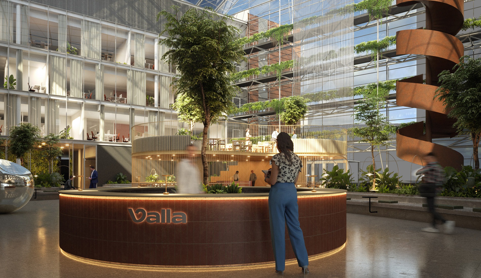
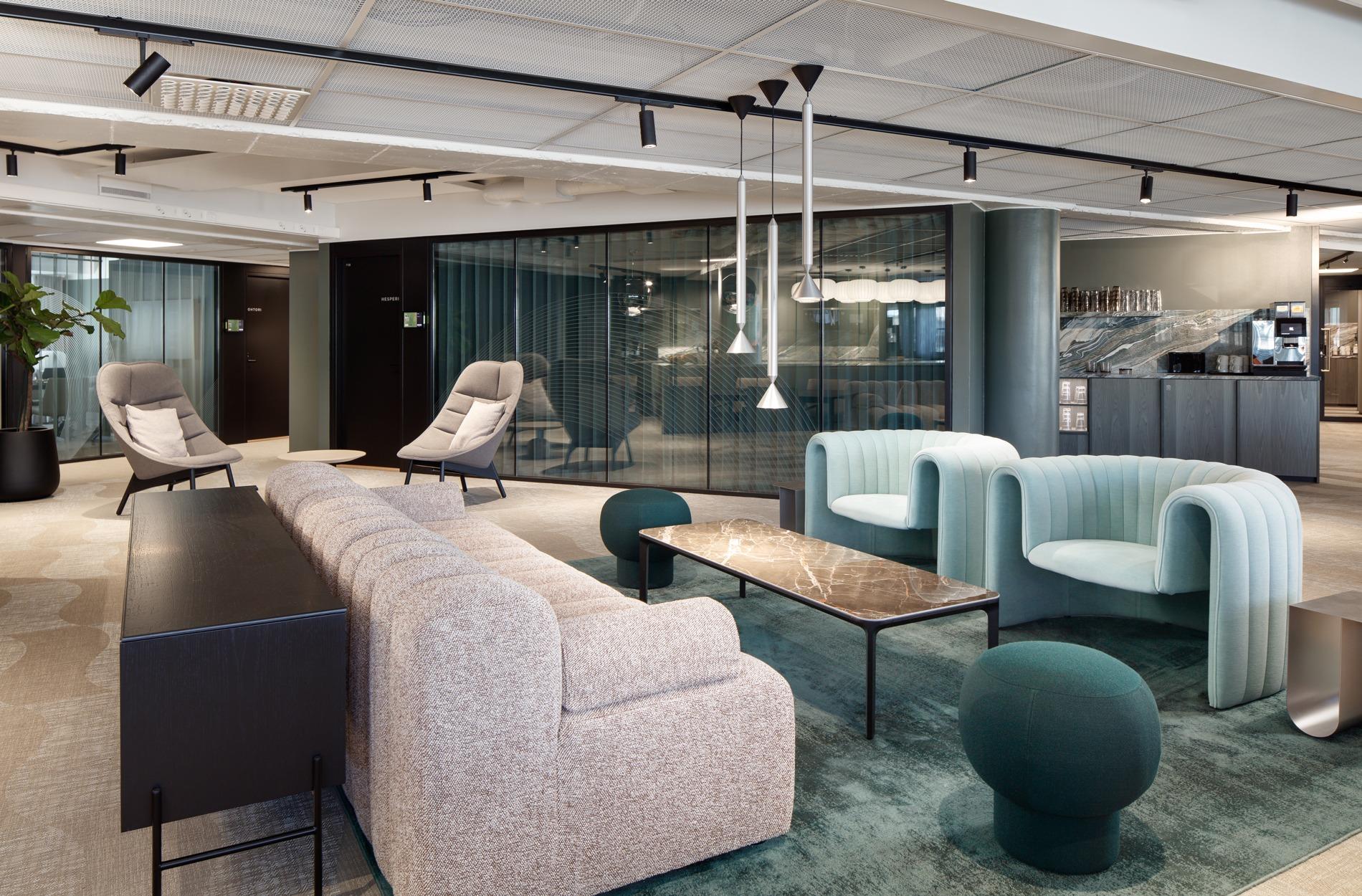
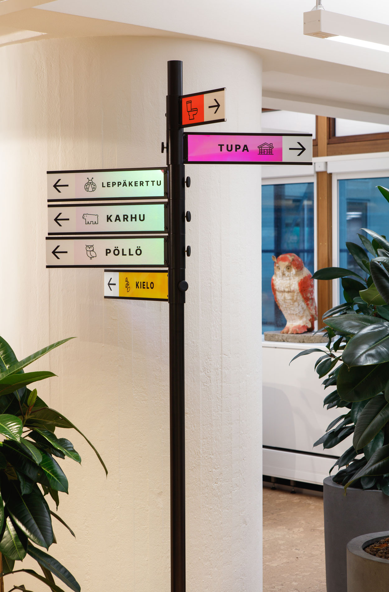
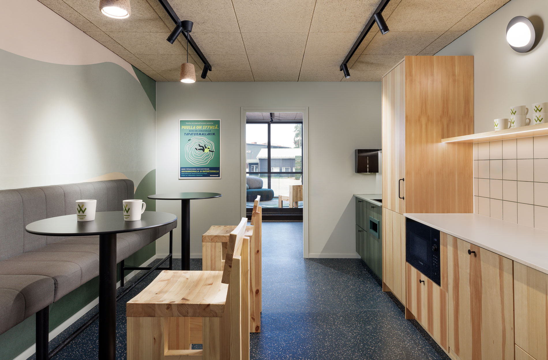
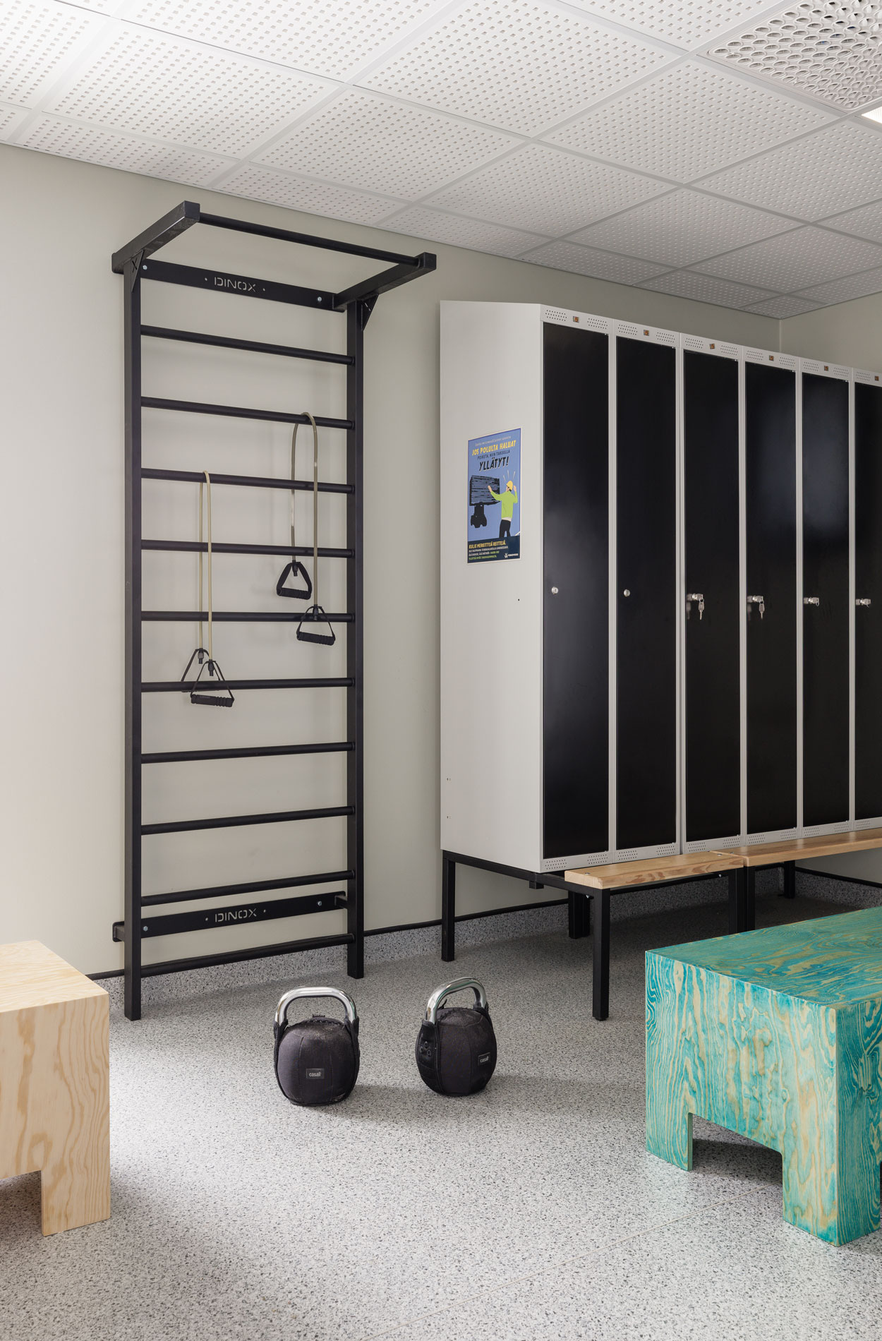
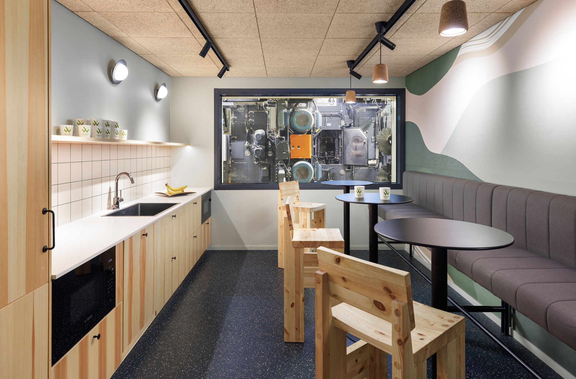
The key goal was to improve the comfort and attractiveness of the office and to strengthen the sense of community and commitment through spatial solutions: “Masino’s subsidiaries have shared partners and clients, and the renewed office enables them to harmonise their activities and utilise synergies. Now, the services at the headquarters, such as the gym, restaurant and HR, are also accessible to everyone,” explains Riina Ruska, Lead Designer for the project.
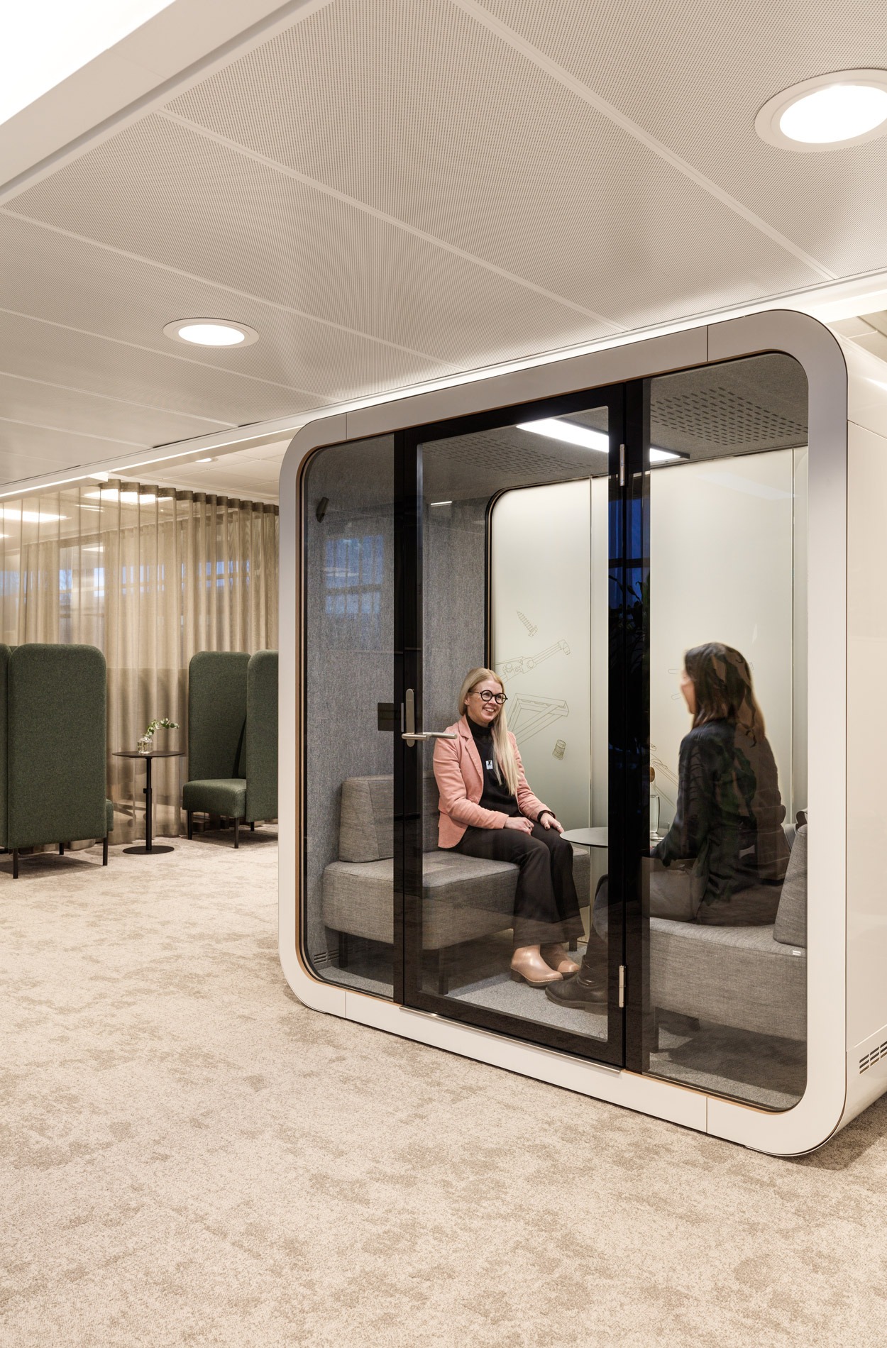
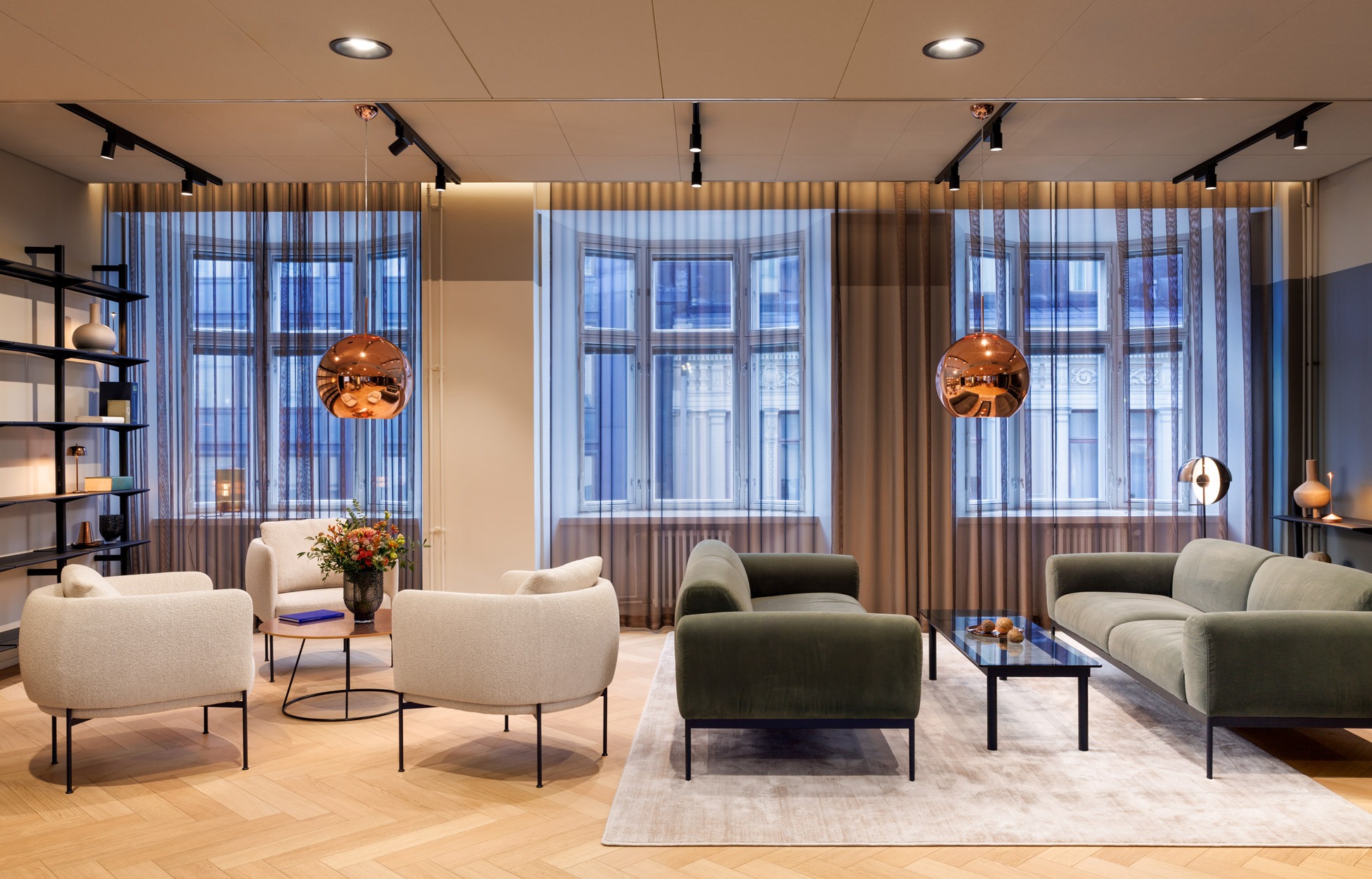
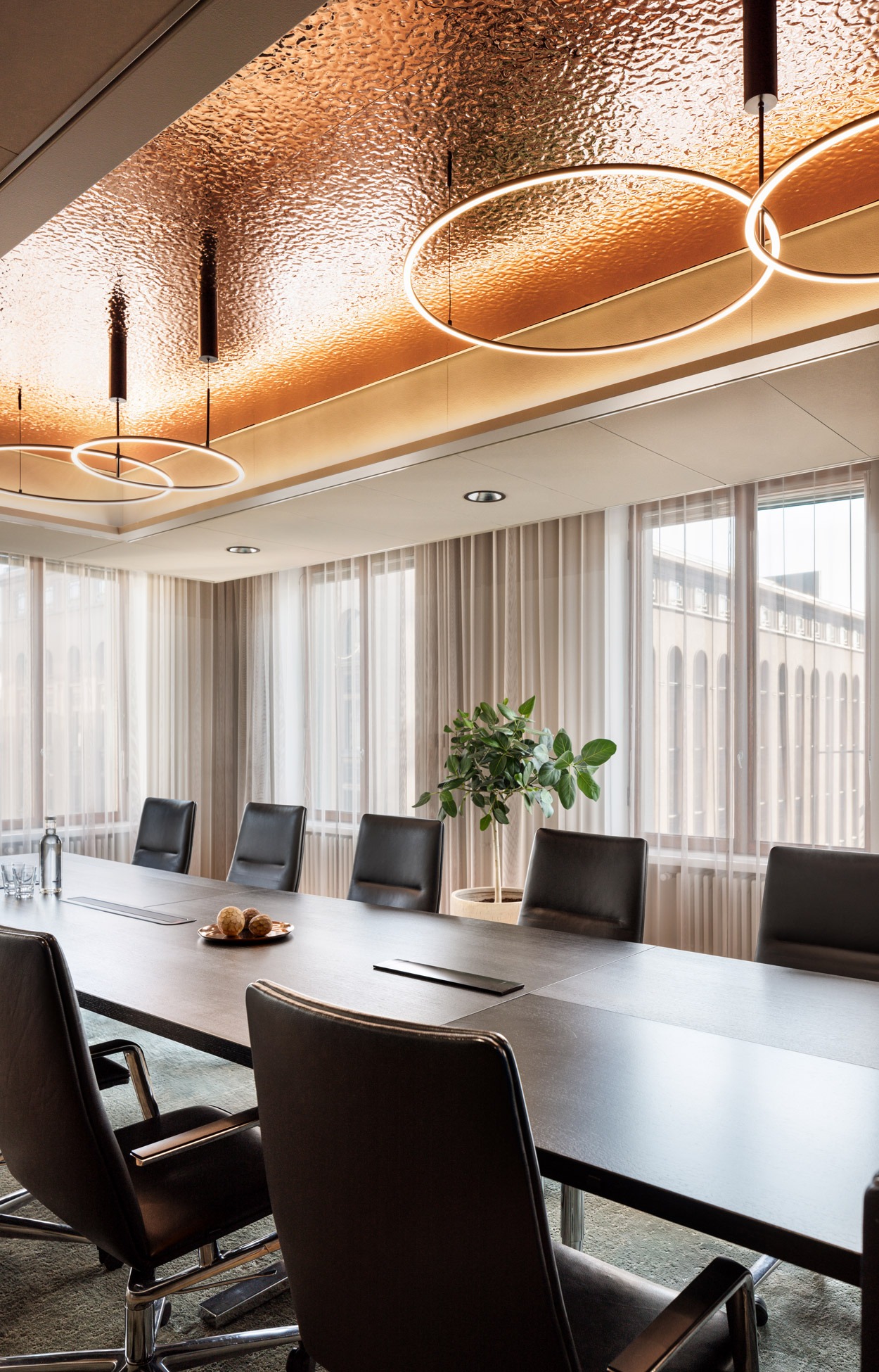
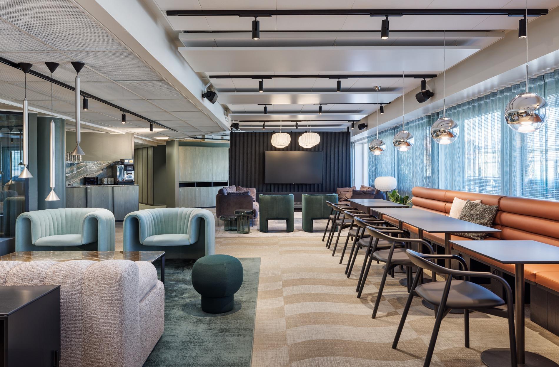
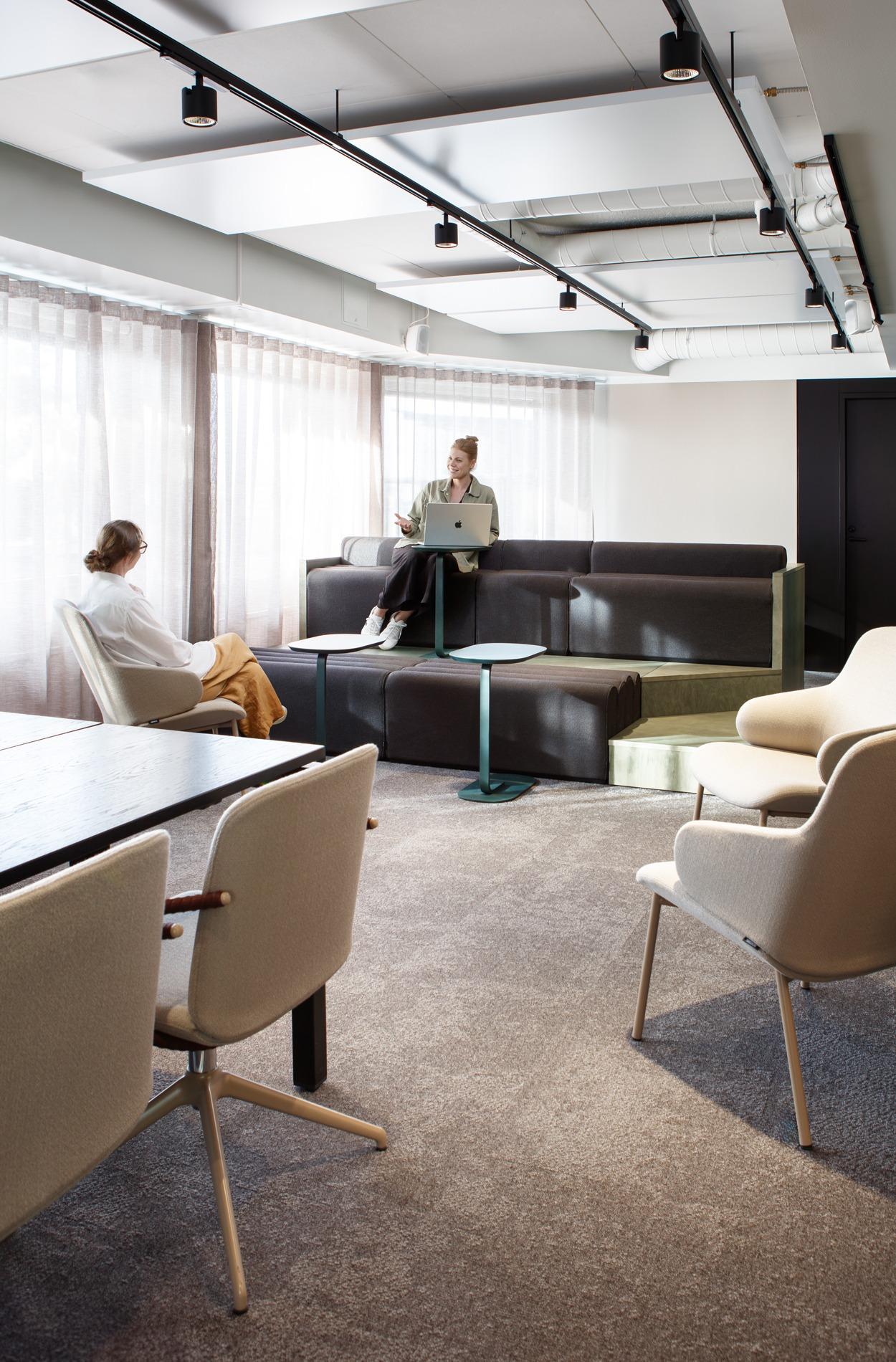
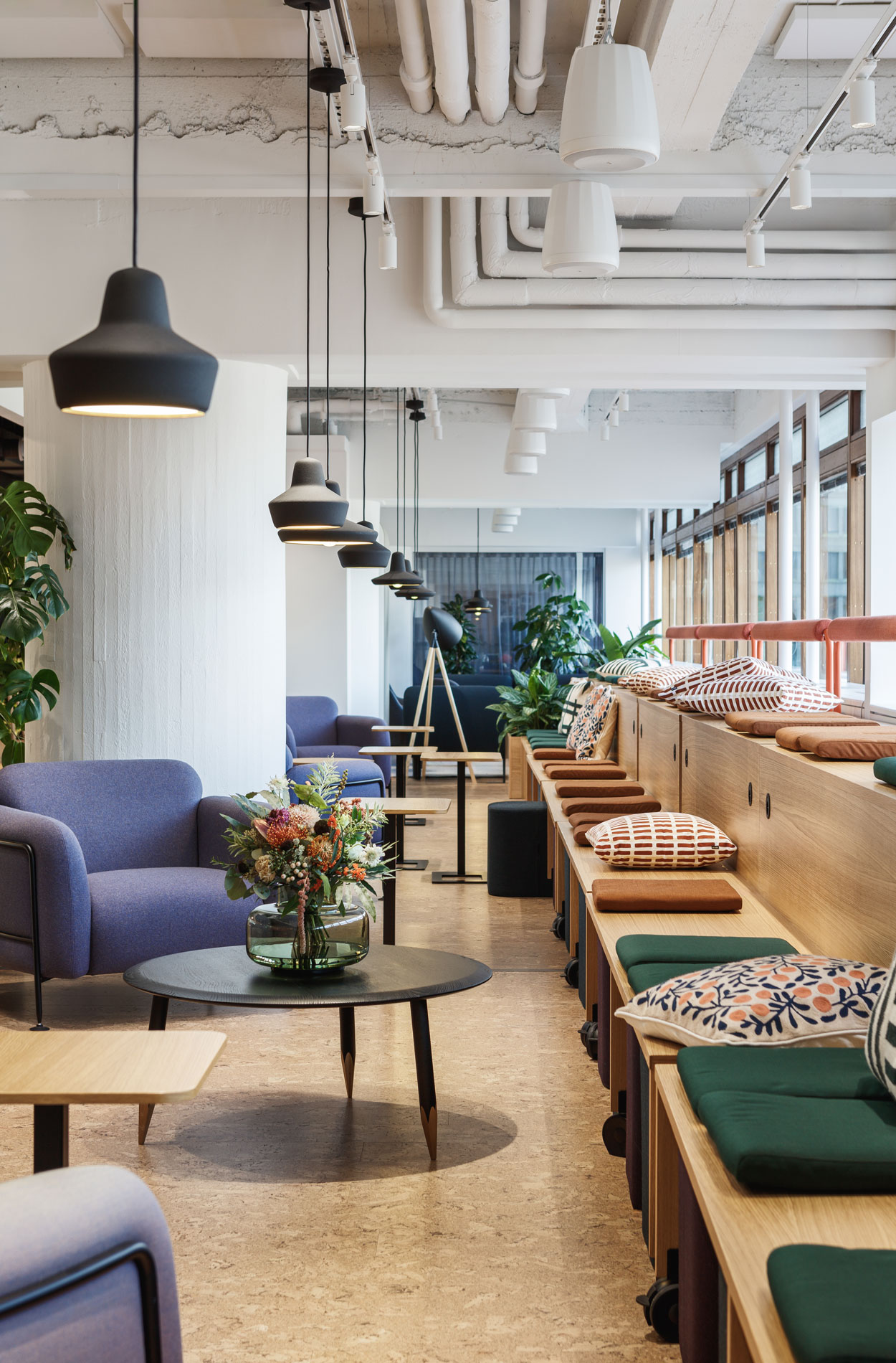
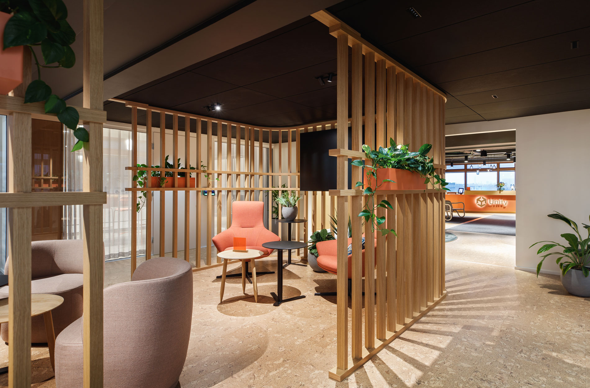
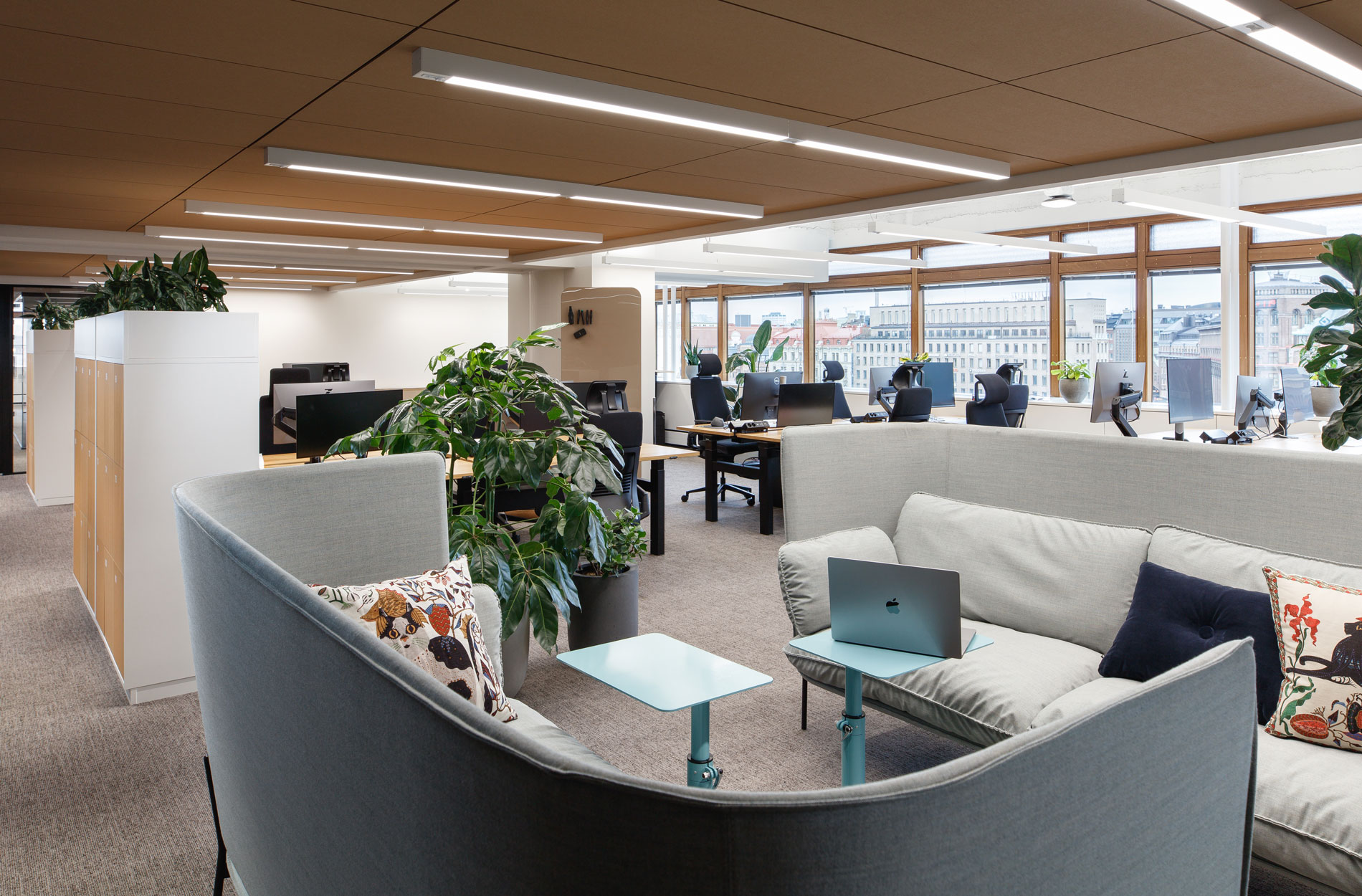
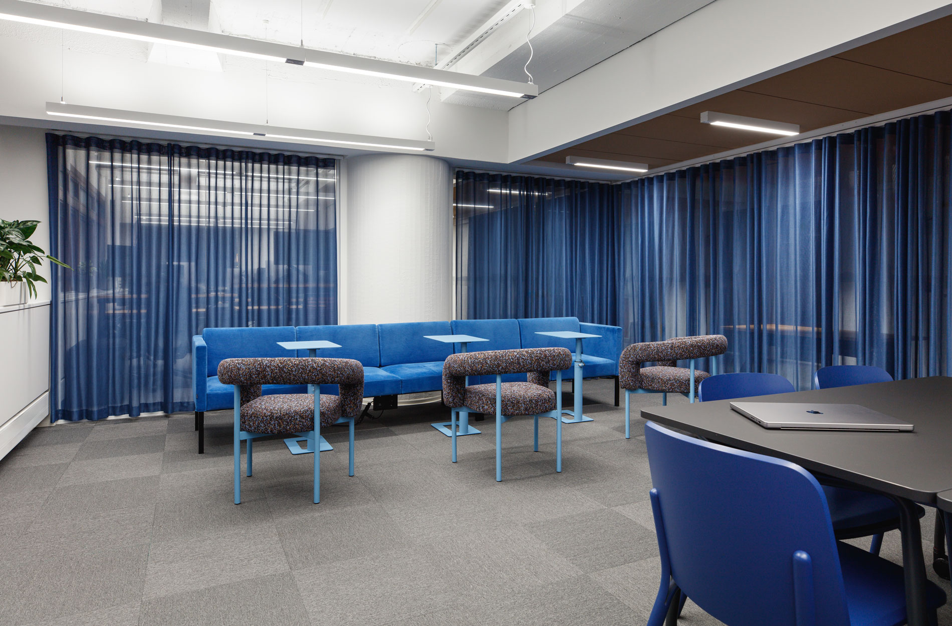
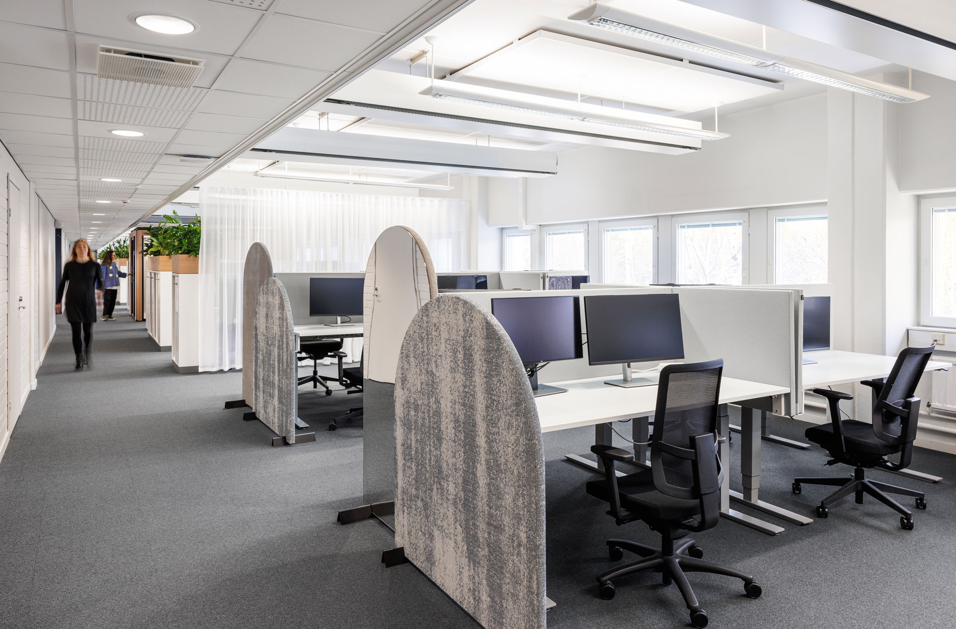
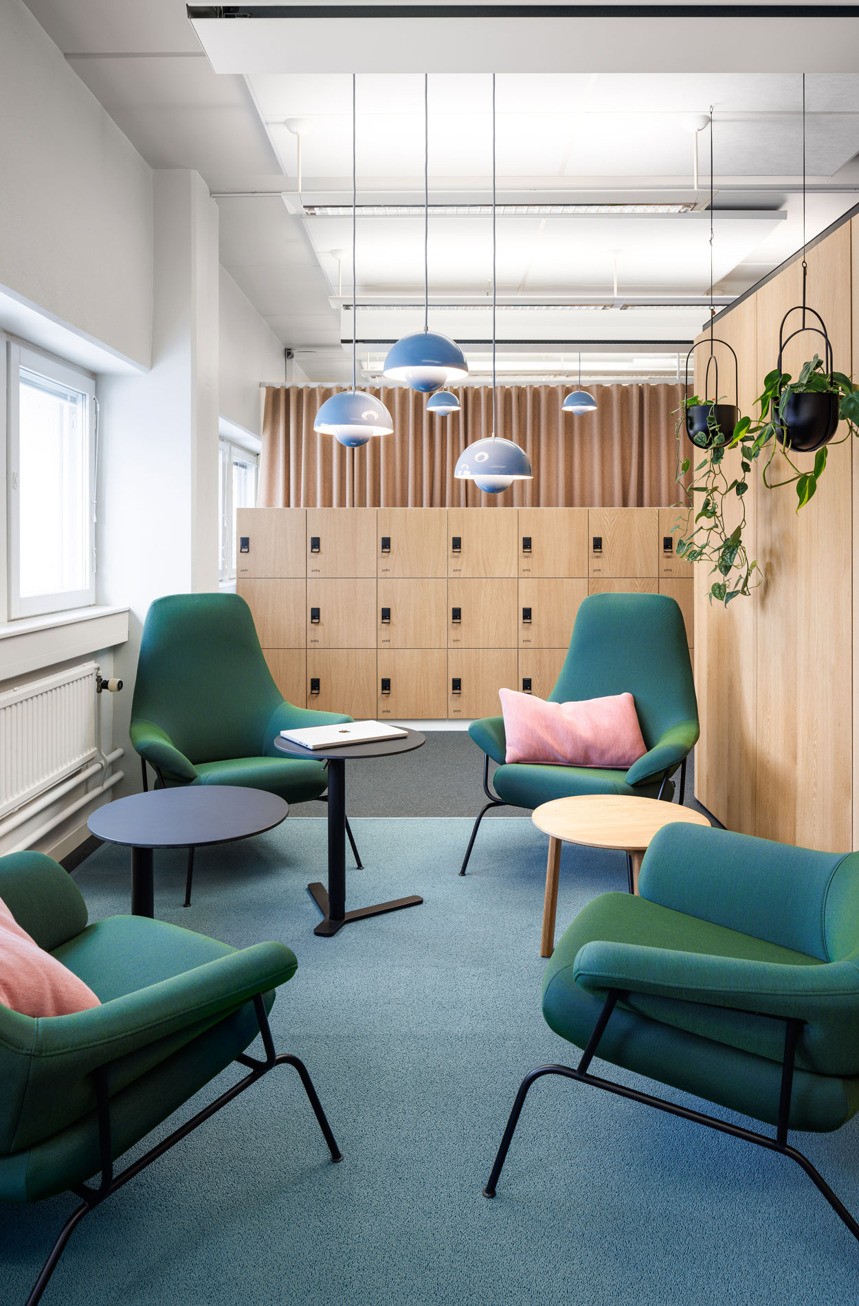
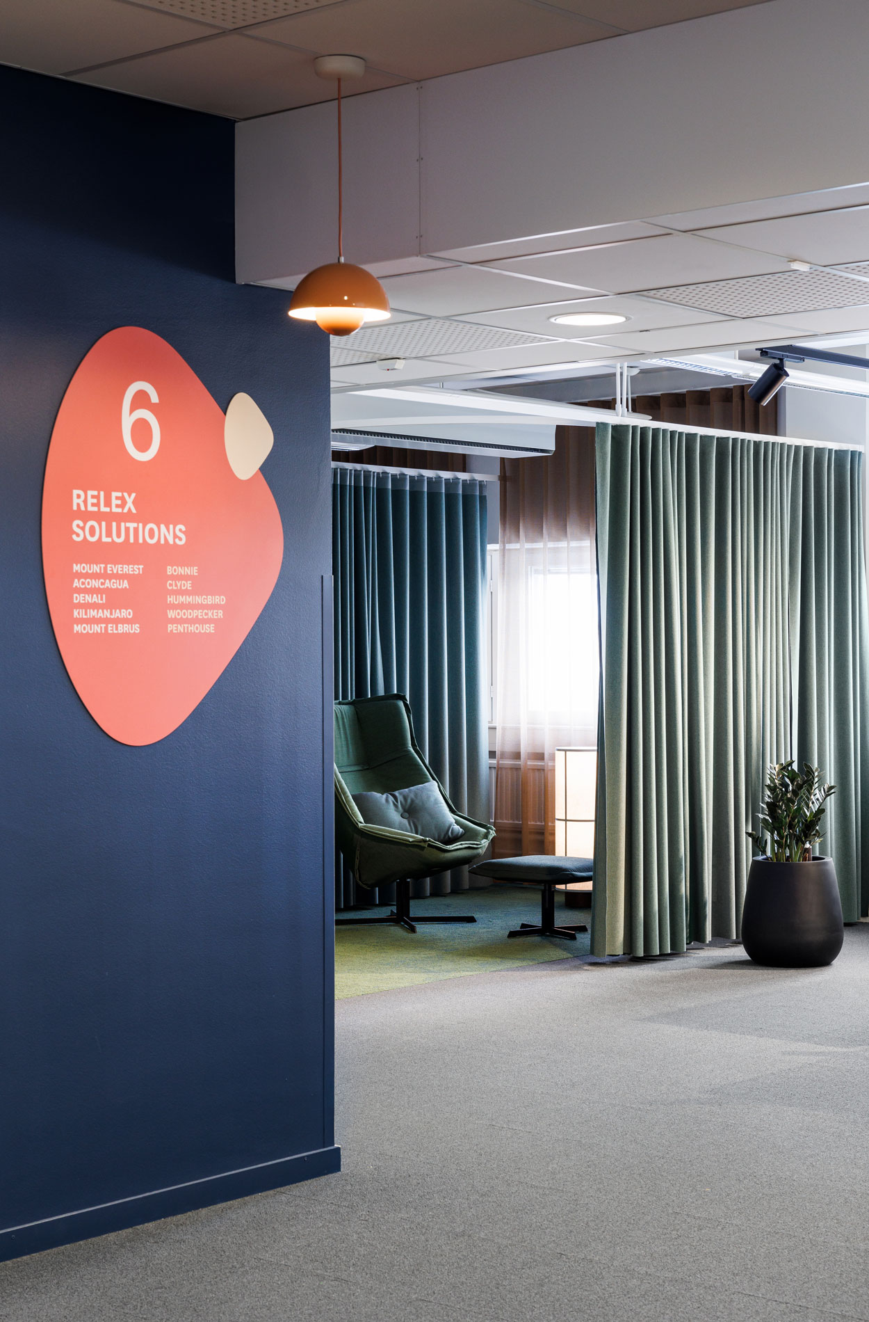
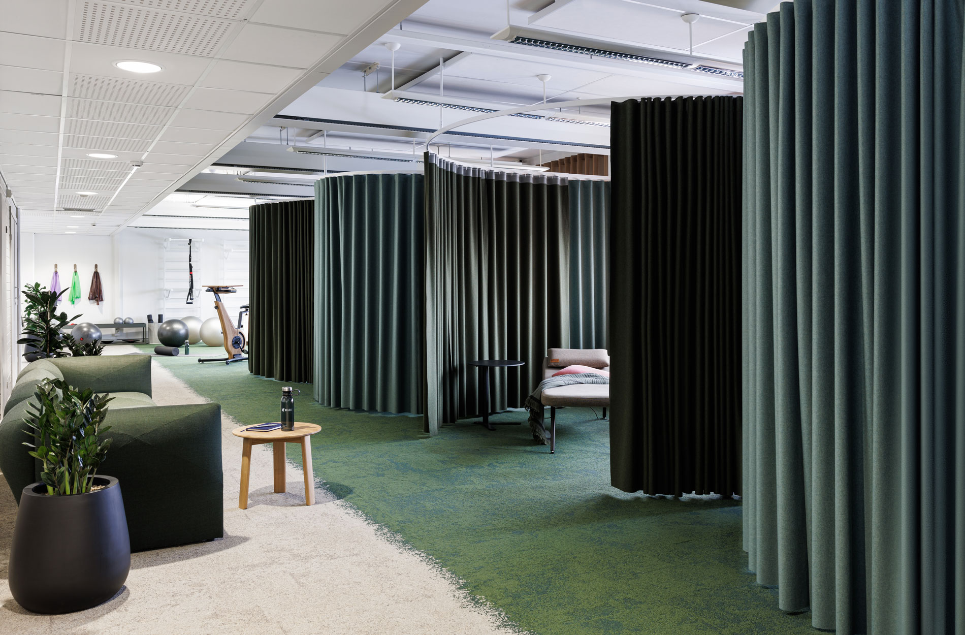
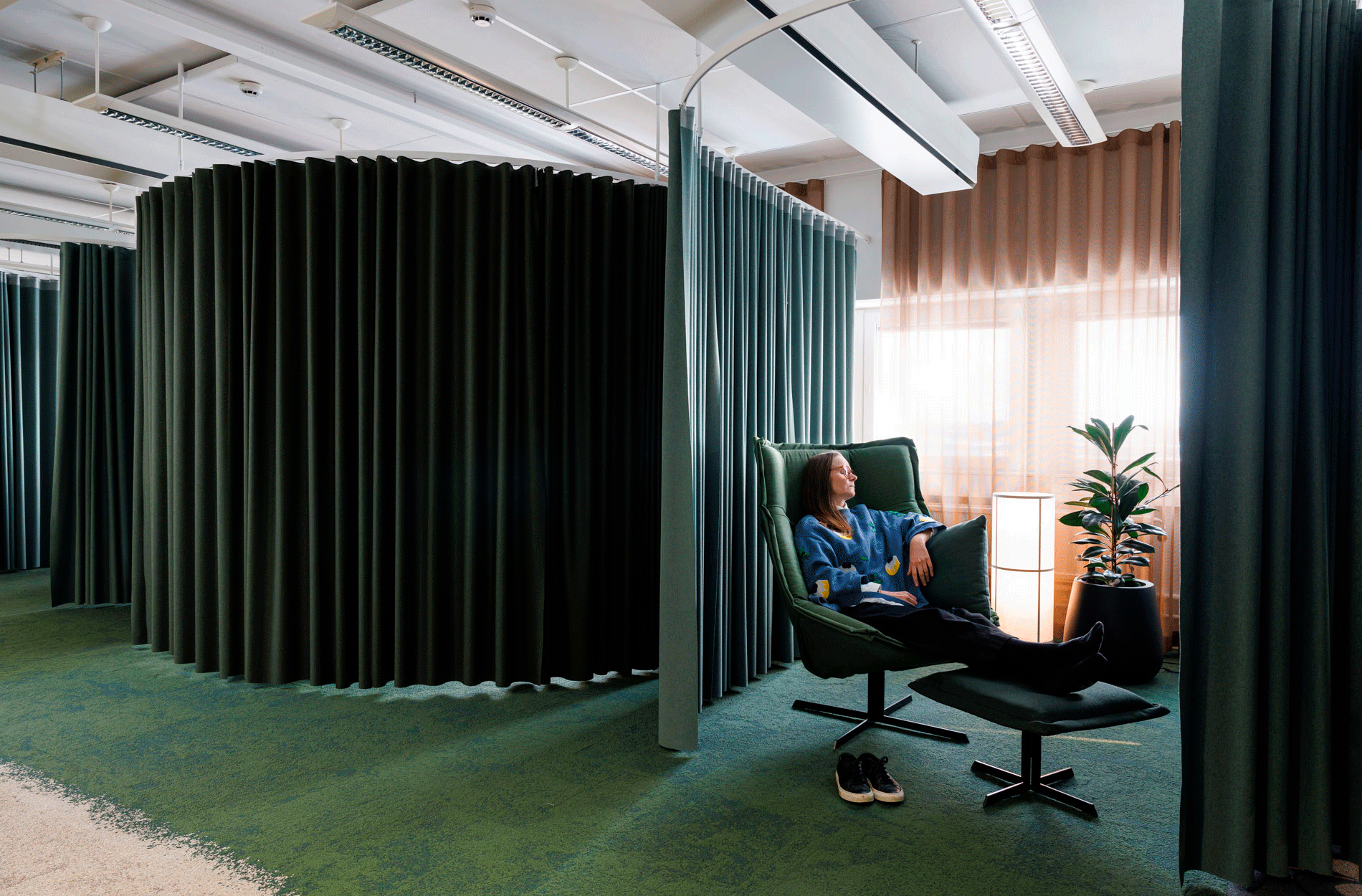
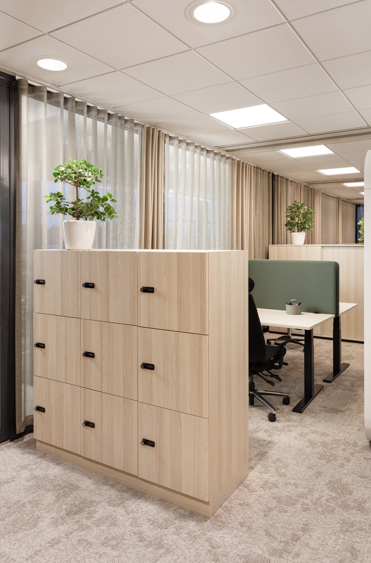
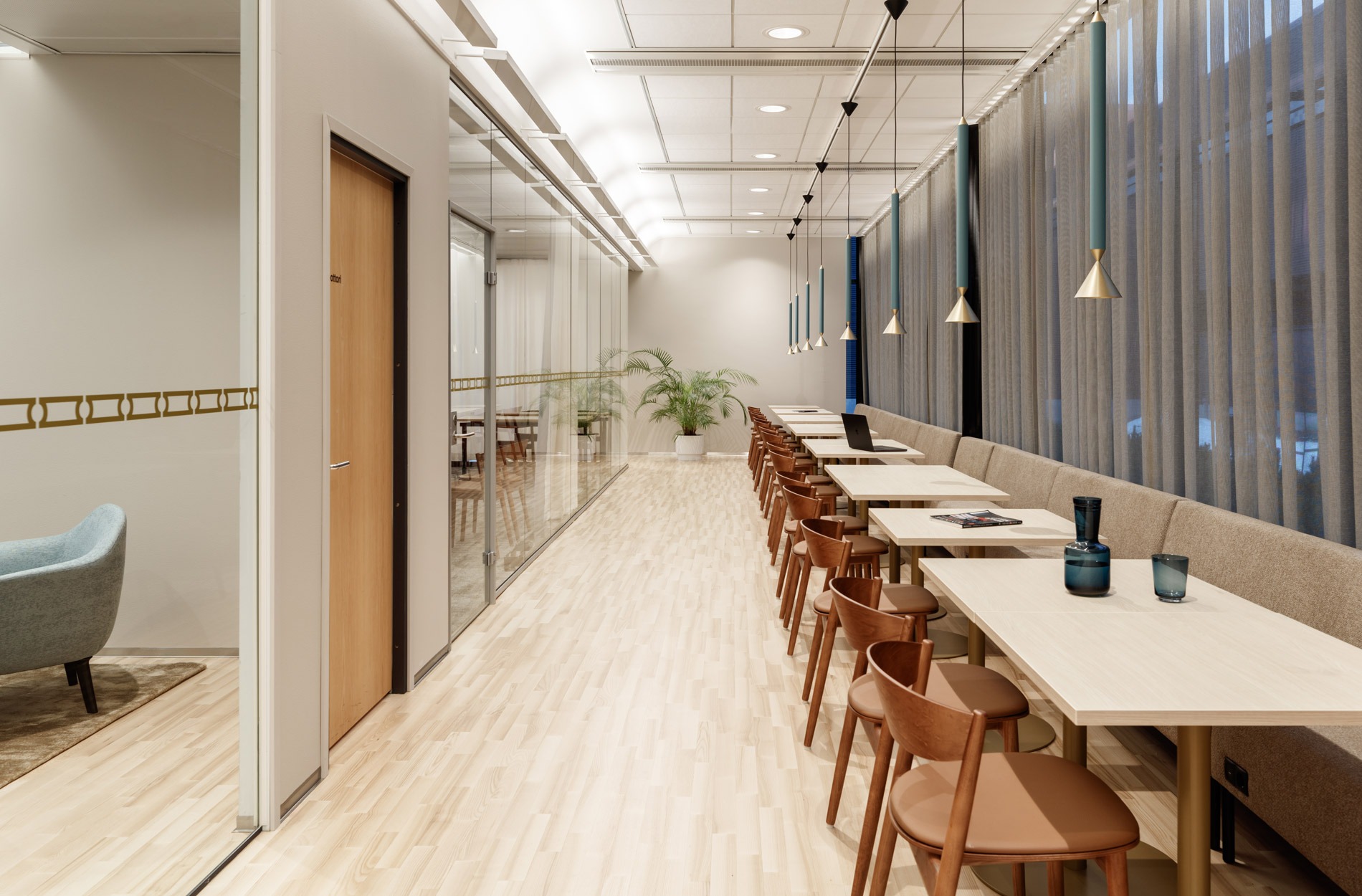
The renewed office has soundproof workspaces, suitable for focused individual work and meetings with colleagues.
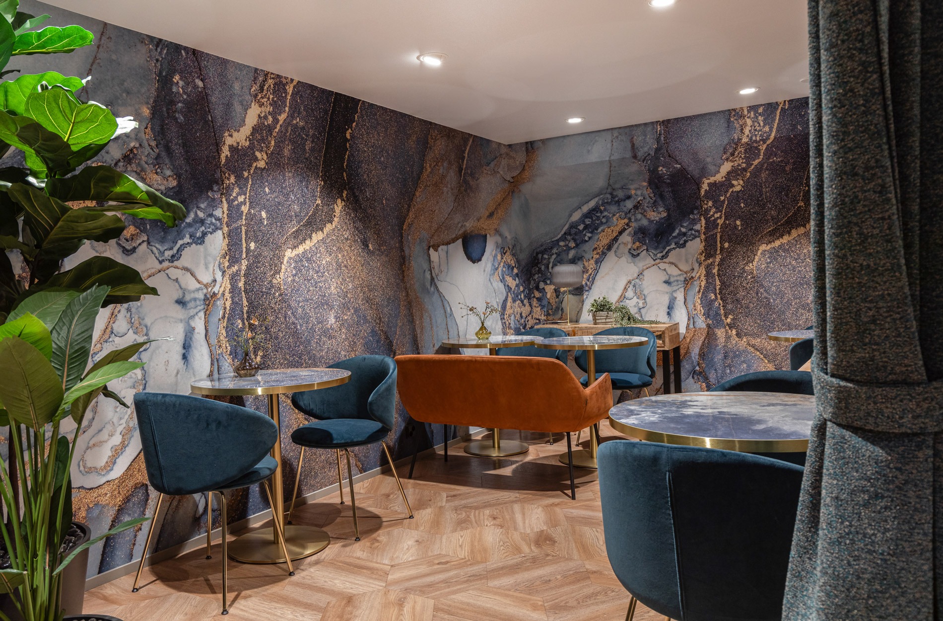
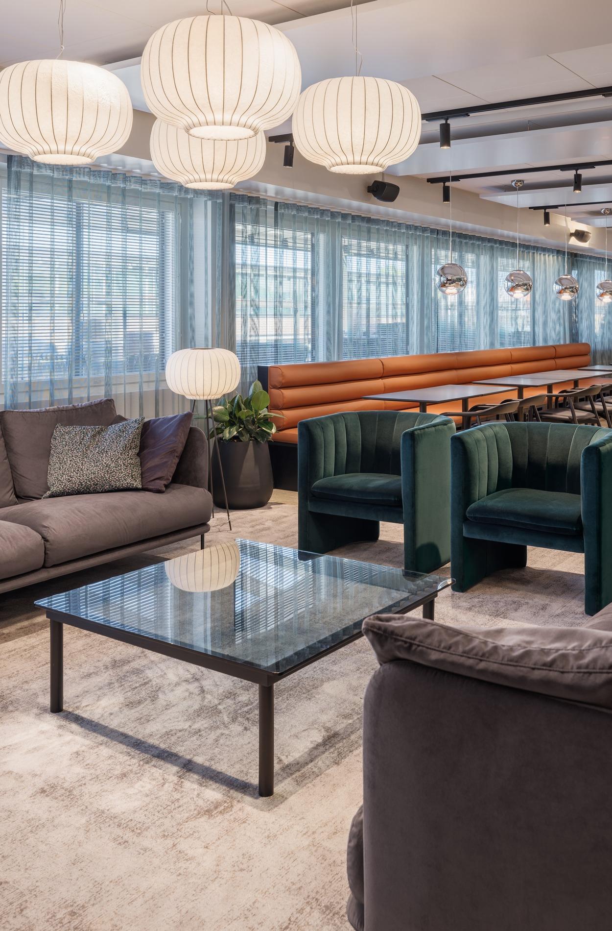
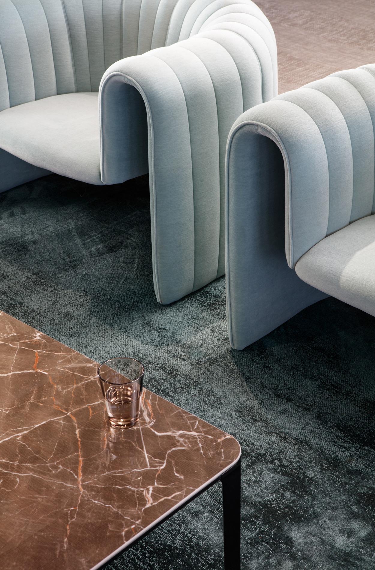
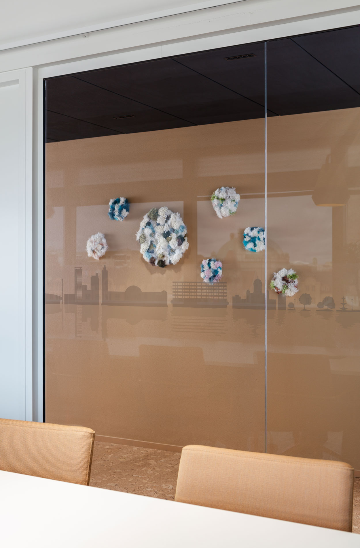
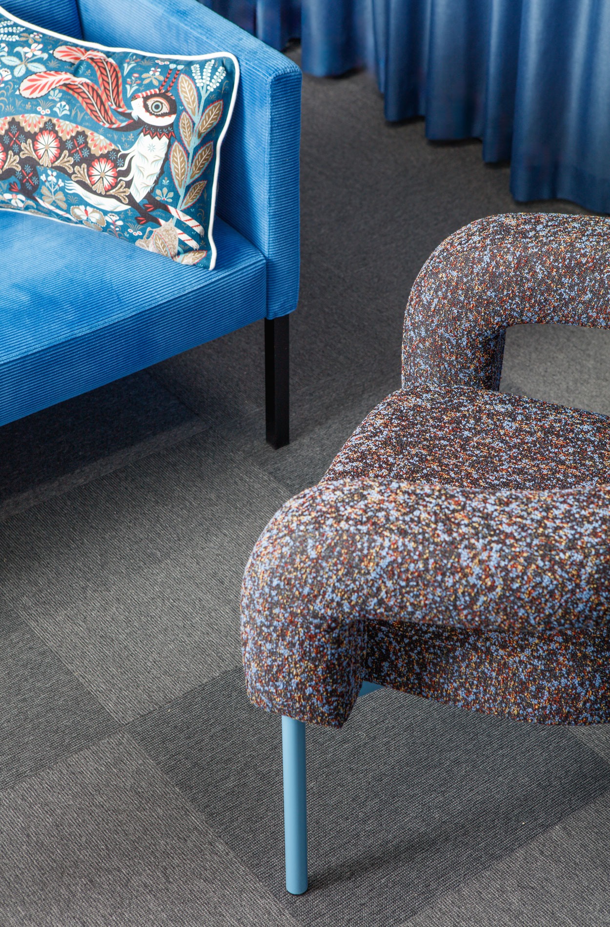
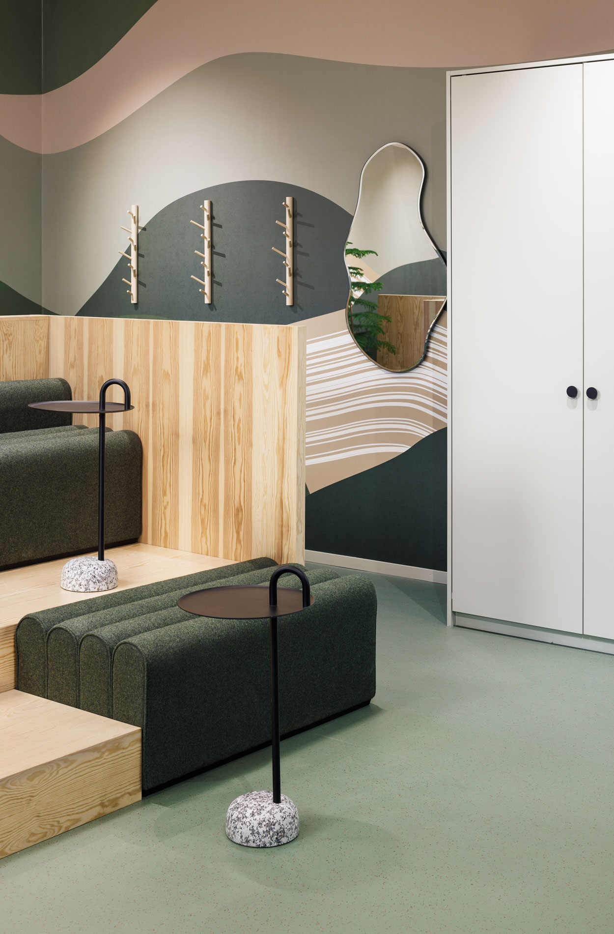
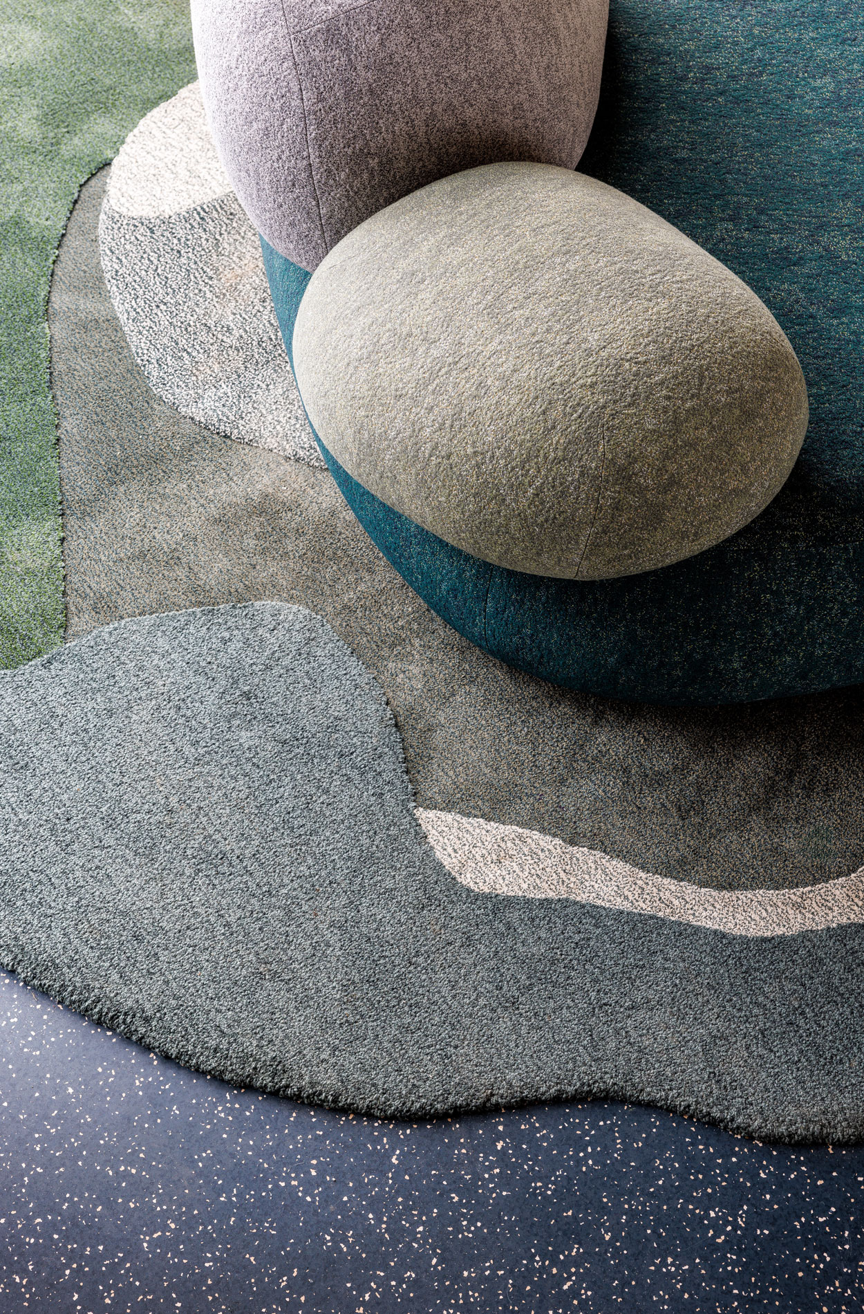
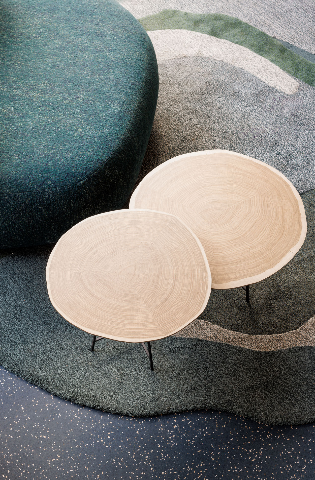
Curtains and carpeting enhance the acoustics and comfort of the premises.
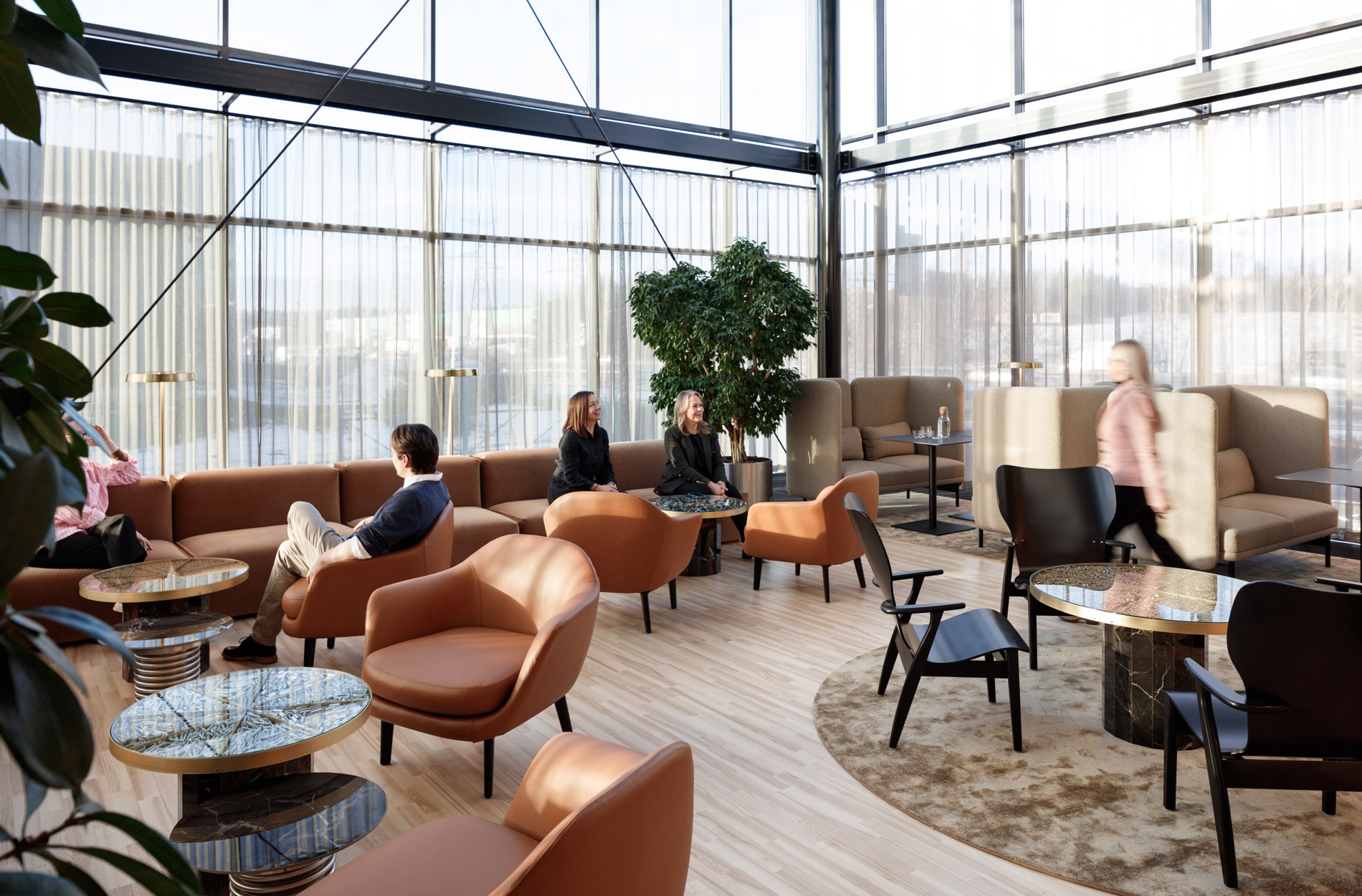
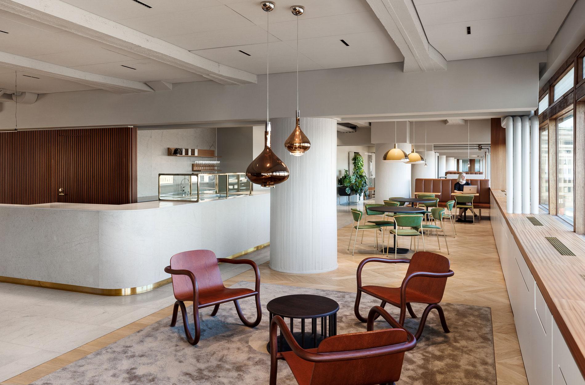
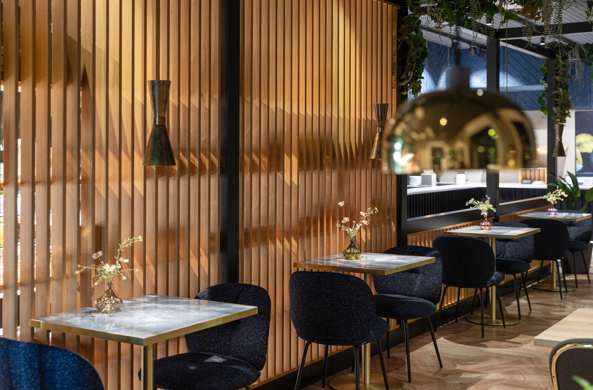
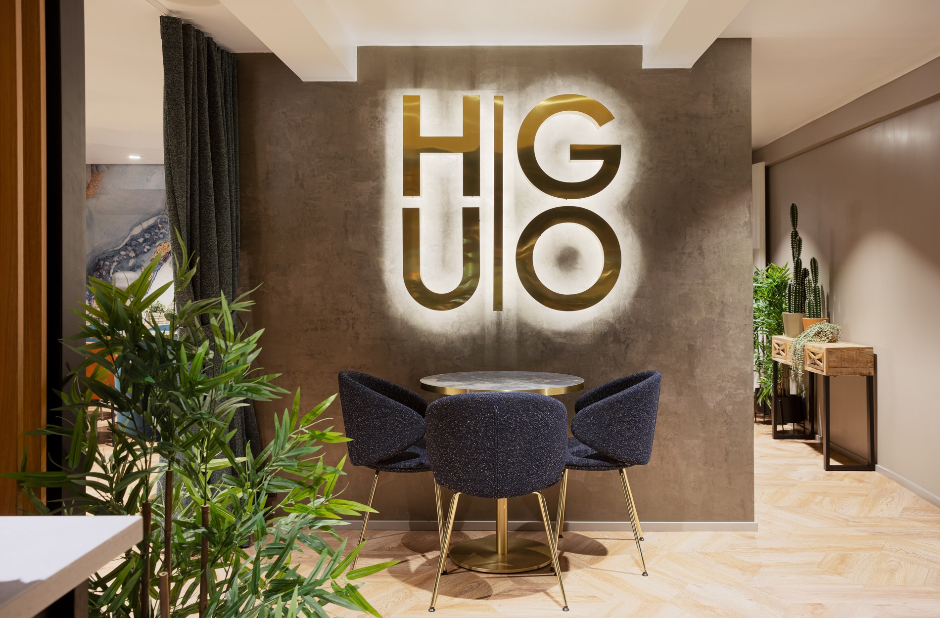
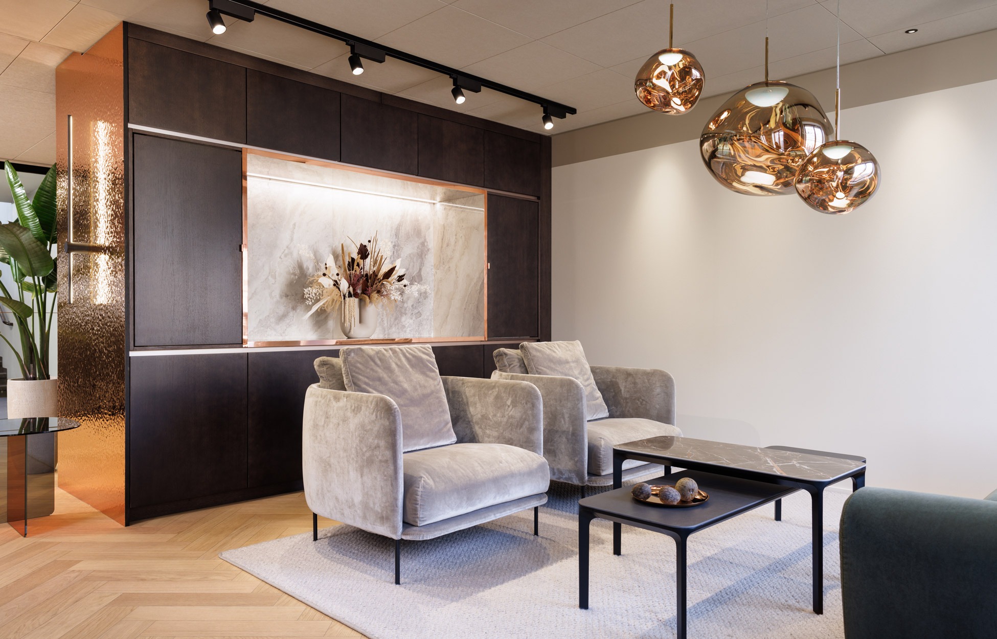
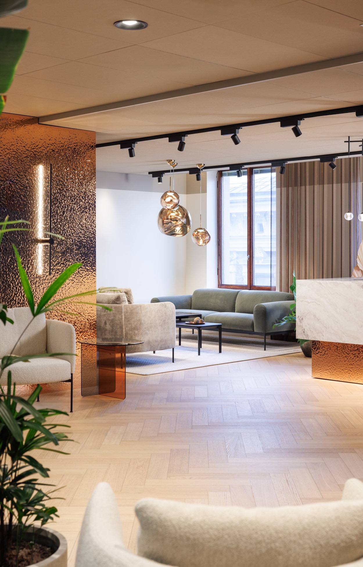
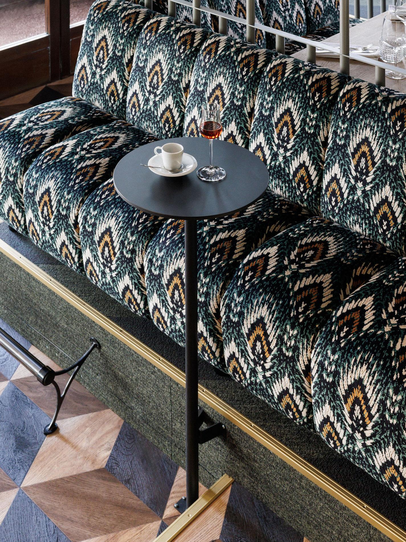
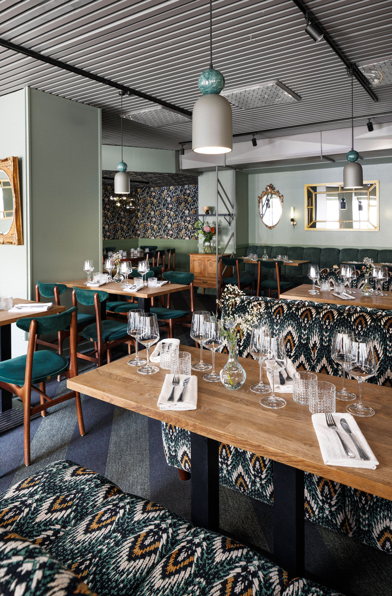
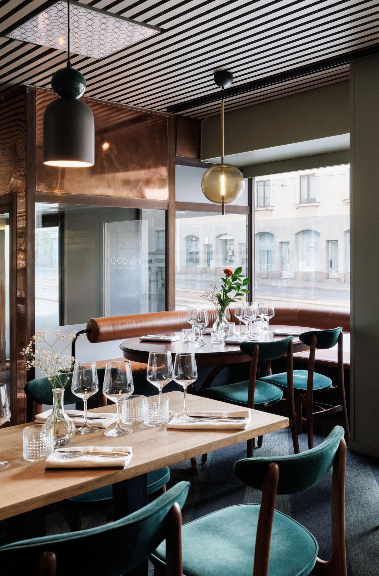
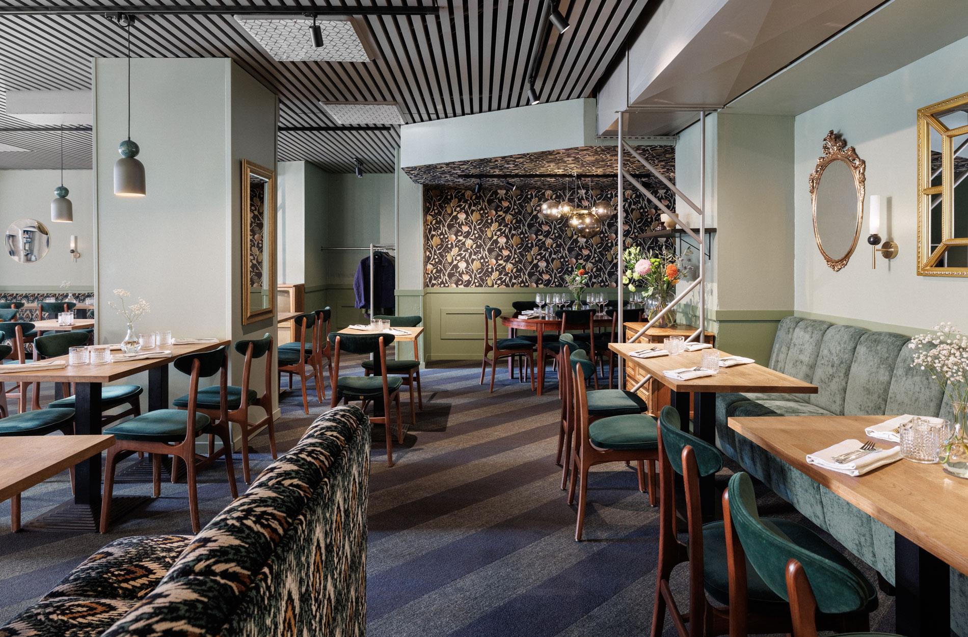
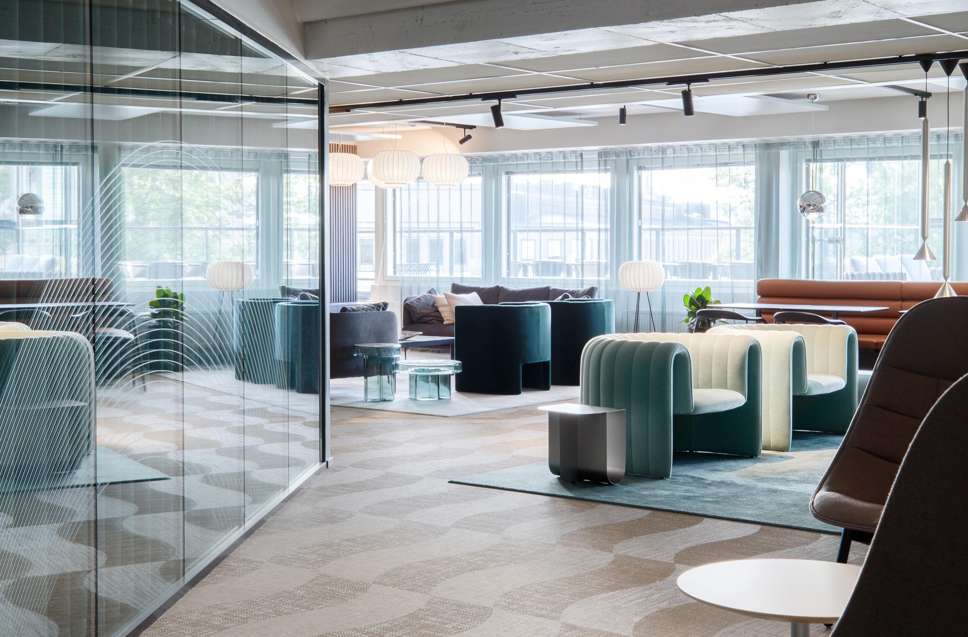
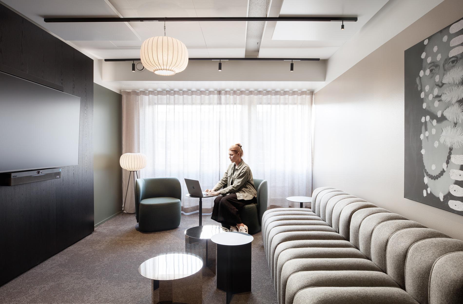
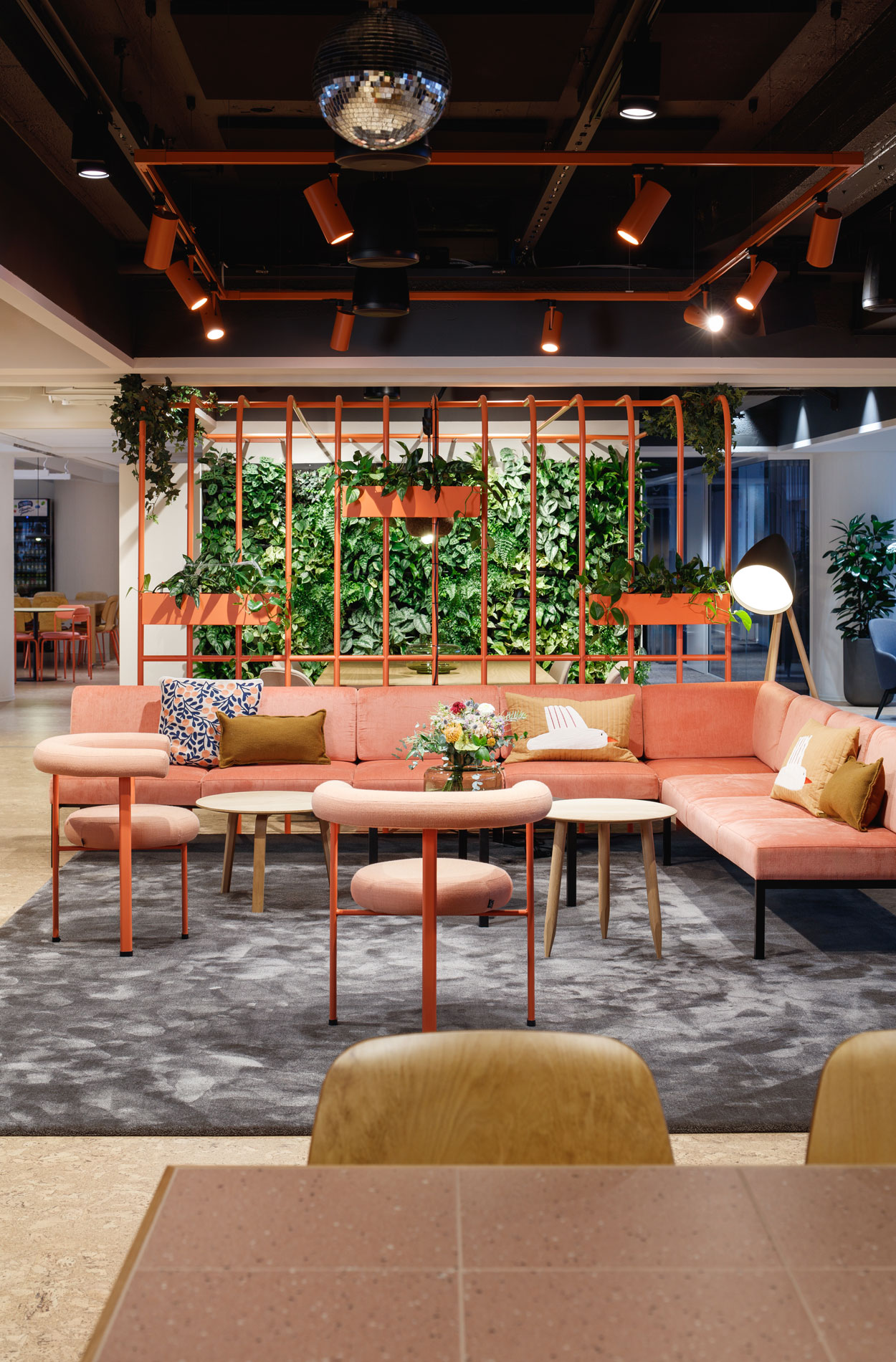
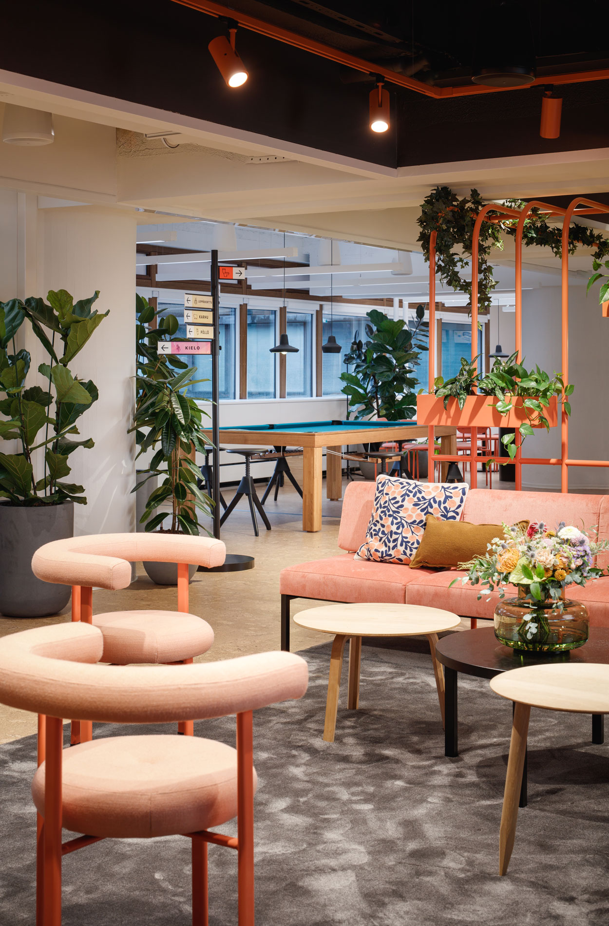
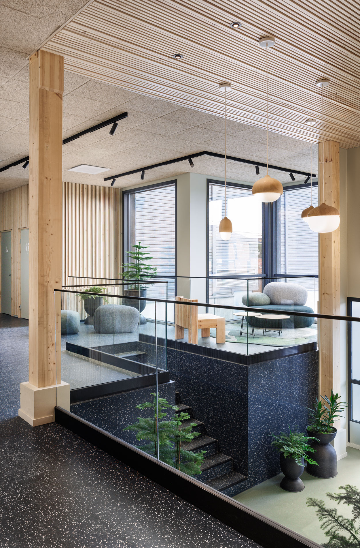
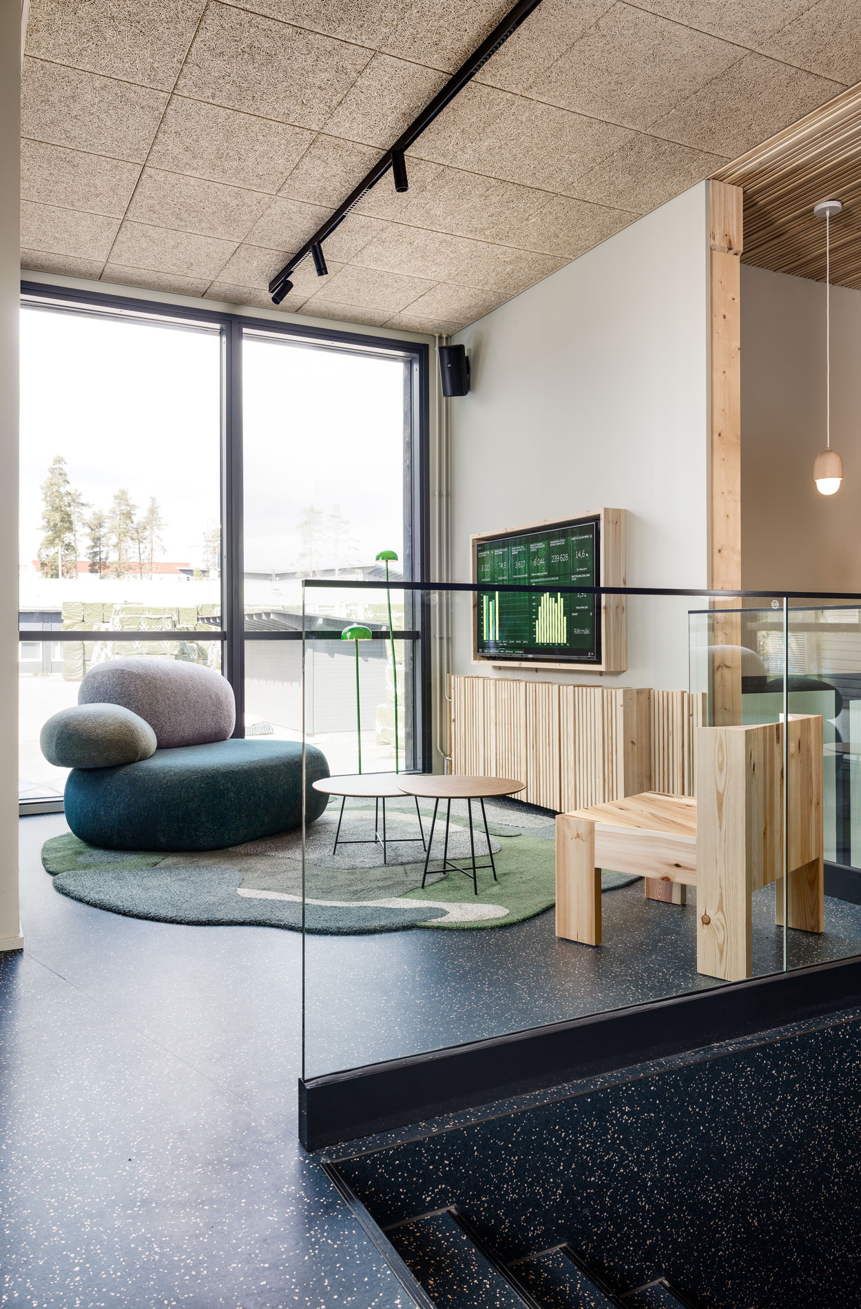
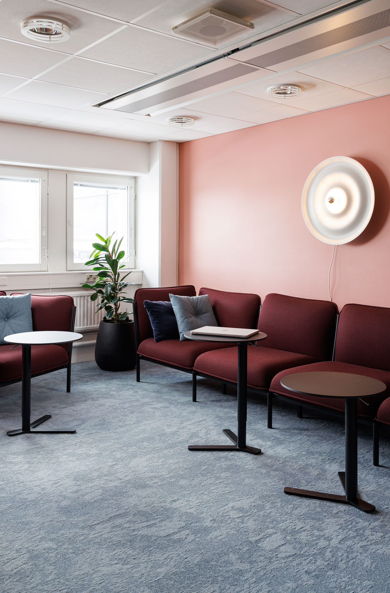
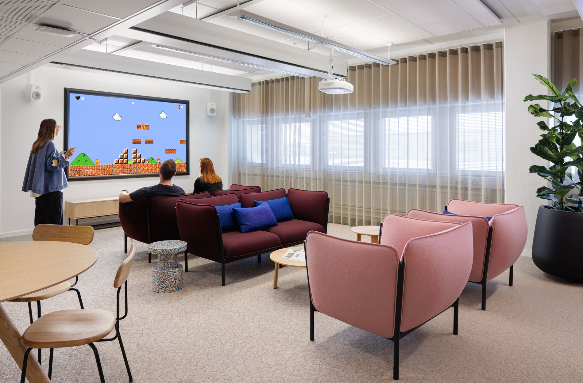
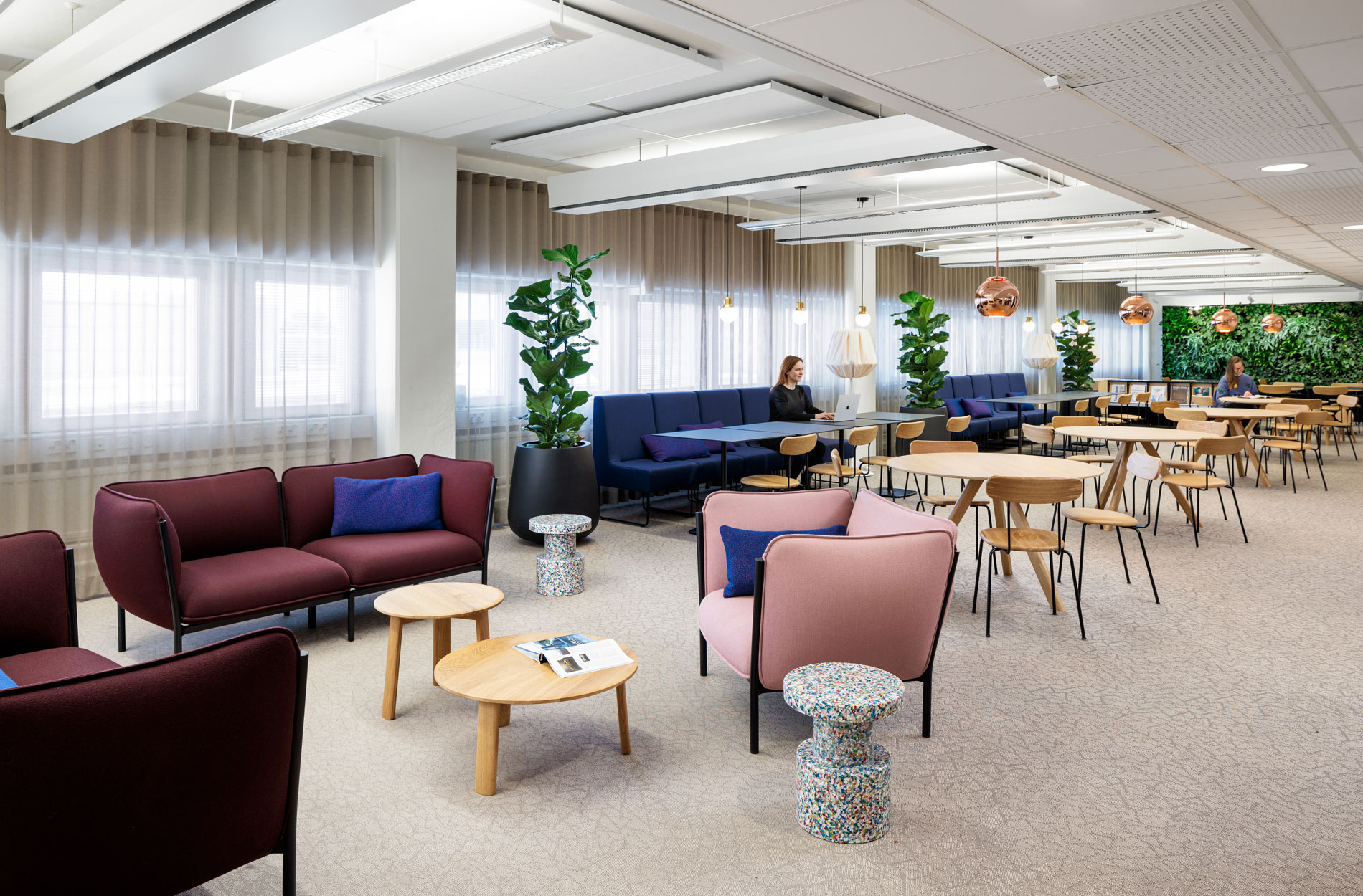
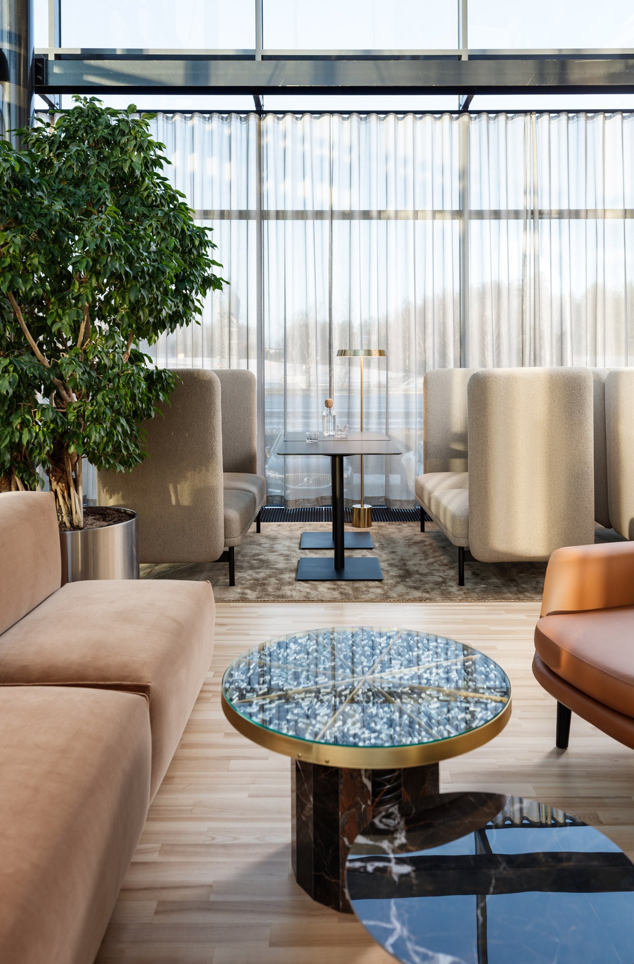
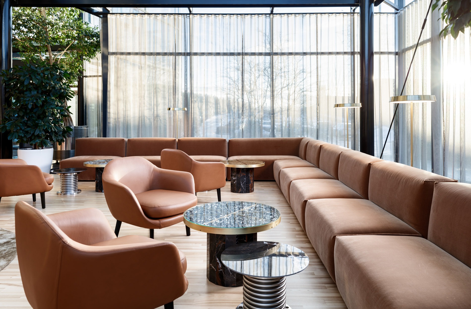
The lounge on the first floor serves as an extension of the restaurant as well as a break and meeting space.
The design was guided by the following design drivers that were specified with the Masino team:
- Quality: improving the style, comfort and appeal of the office
- Encounters: creating office spaces that promote encounters, cooperation and a sense of community
- Supporting growth: designing an open, comfortable and adaptable office
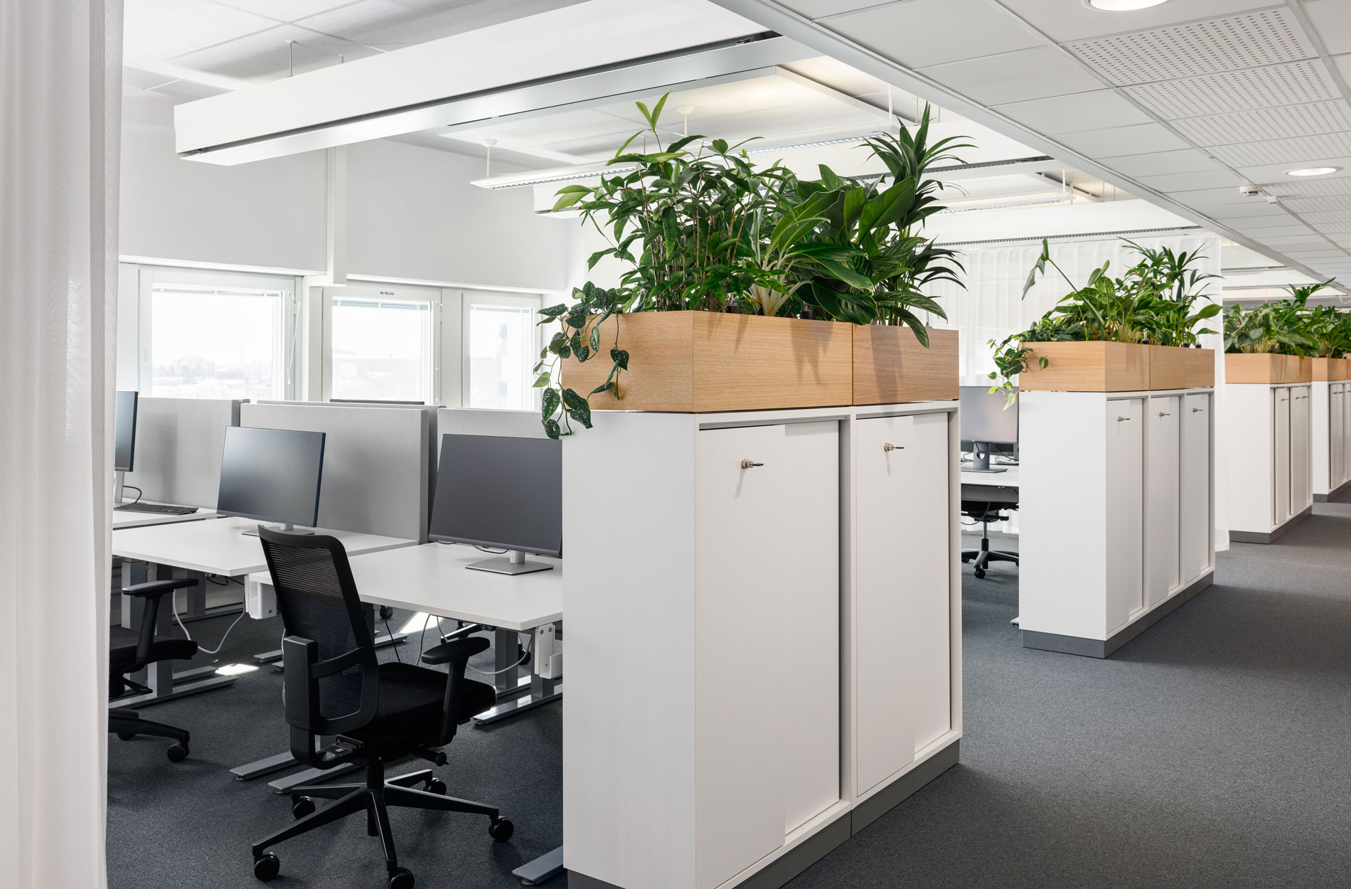
After setting the strategic target, the work environment was developed in cooperation, including the creation of the office’s spatial types and operating models through a sprint of three workshops. The primary areas of improvement identified in the workshop were the shortage of meeting rooms and the lack of calm, sensory ergonomic working spaces. After the renewal, Masino employees will still have their dedicated workstations, but there will be more shared spaces: different types of meeting and project rooms in the office, as well as spaces suitable for retreat and quiet work.
“I particularly remember the beautiful outcome of the project and the many workshops that supported it. Involving the personnel with the help of service design methods was essential,” says Tiina Salo, HR Manager.
"The Sentio Insight measurement provided us with valuable data on how the premises are used and how people would like to use them in the future. Employees could make themselves heard, and we gained insights into how the premises should be designed"
Mikko Pietarinen, CEO, Masino Group
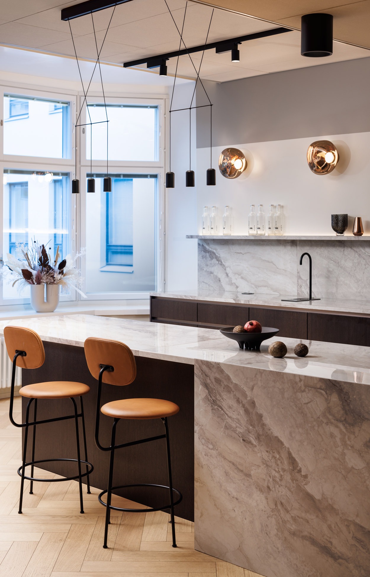
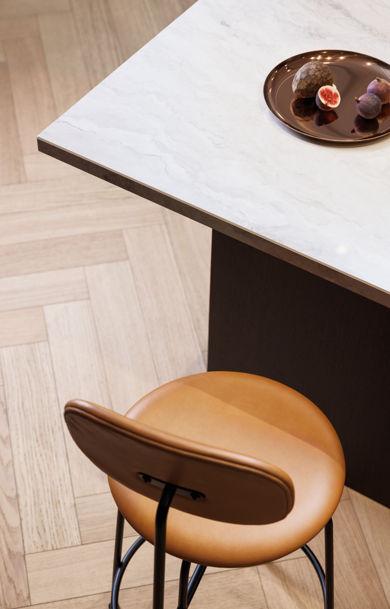
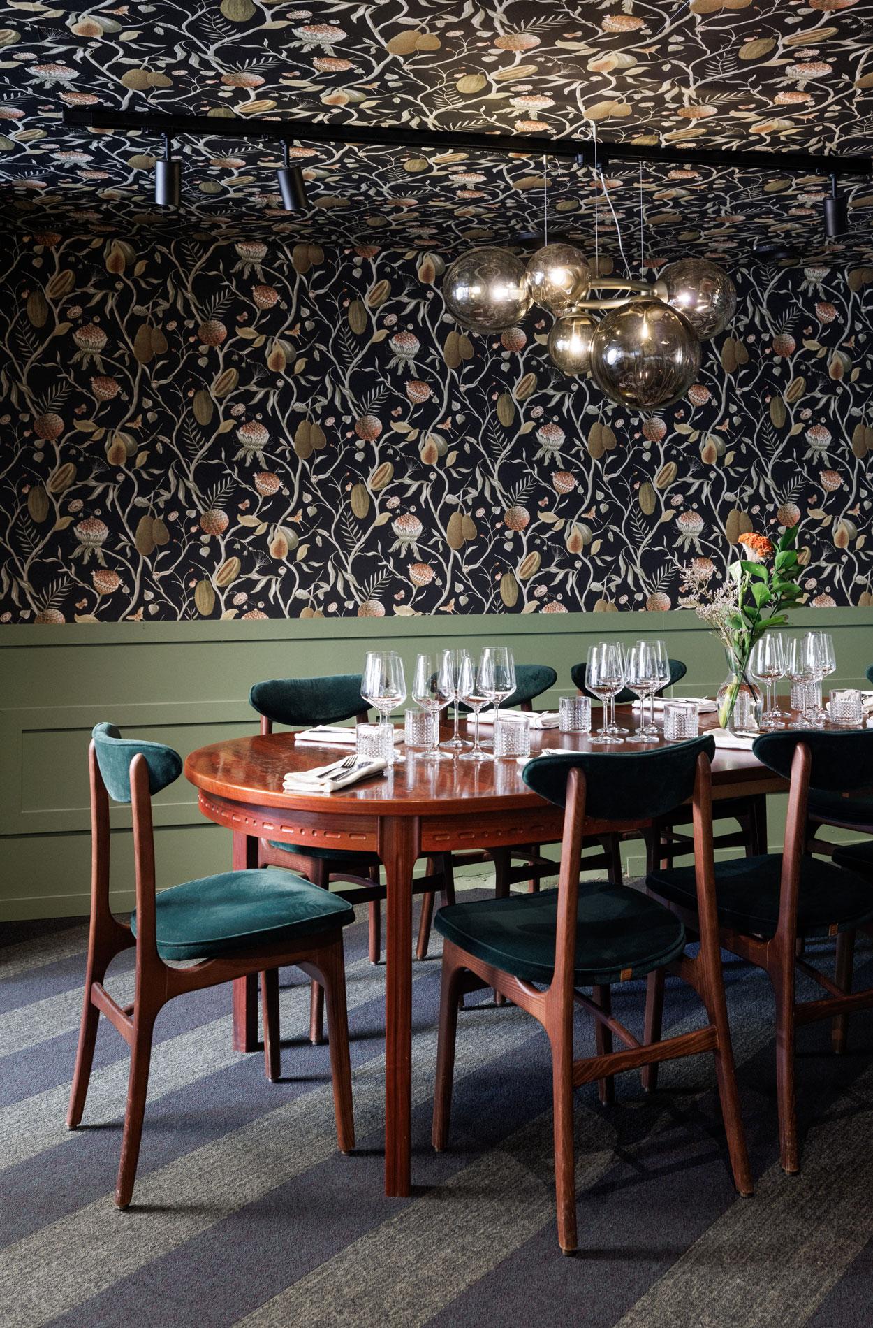
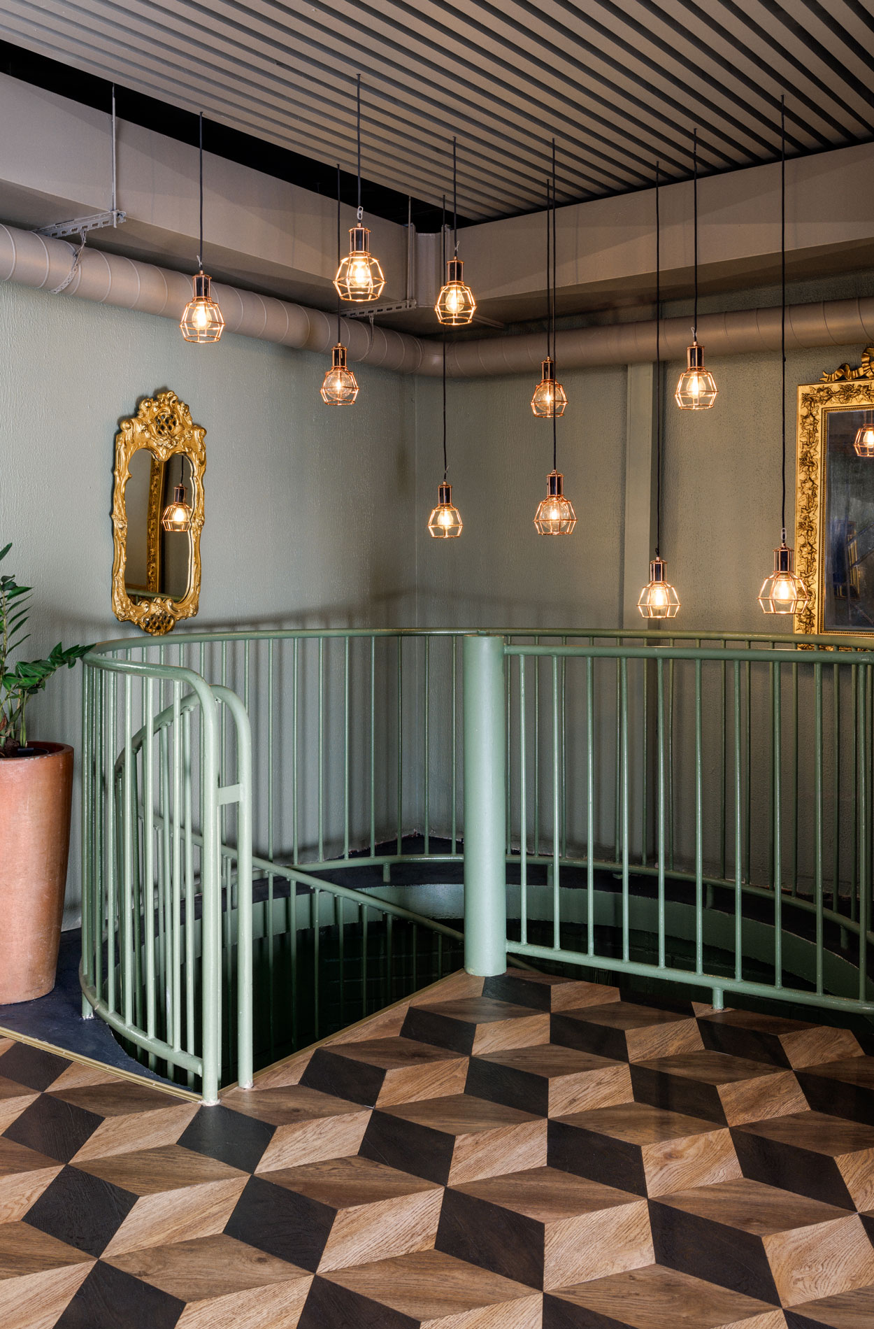
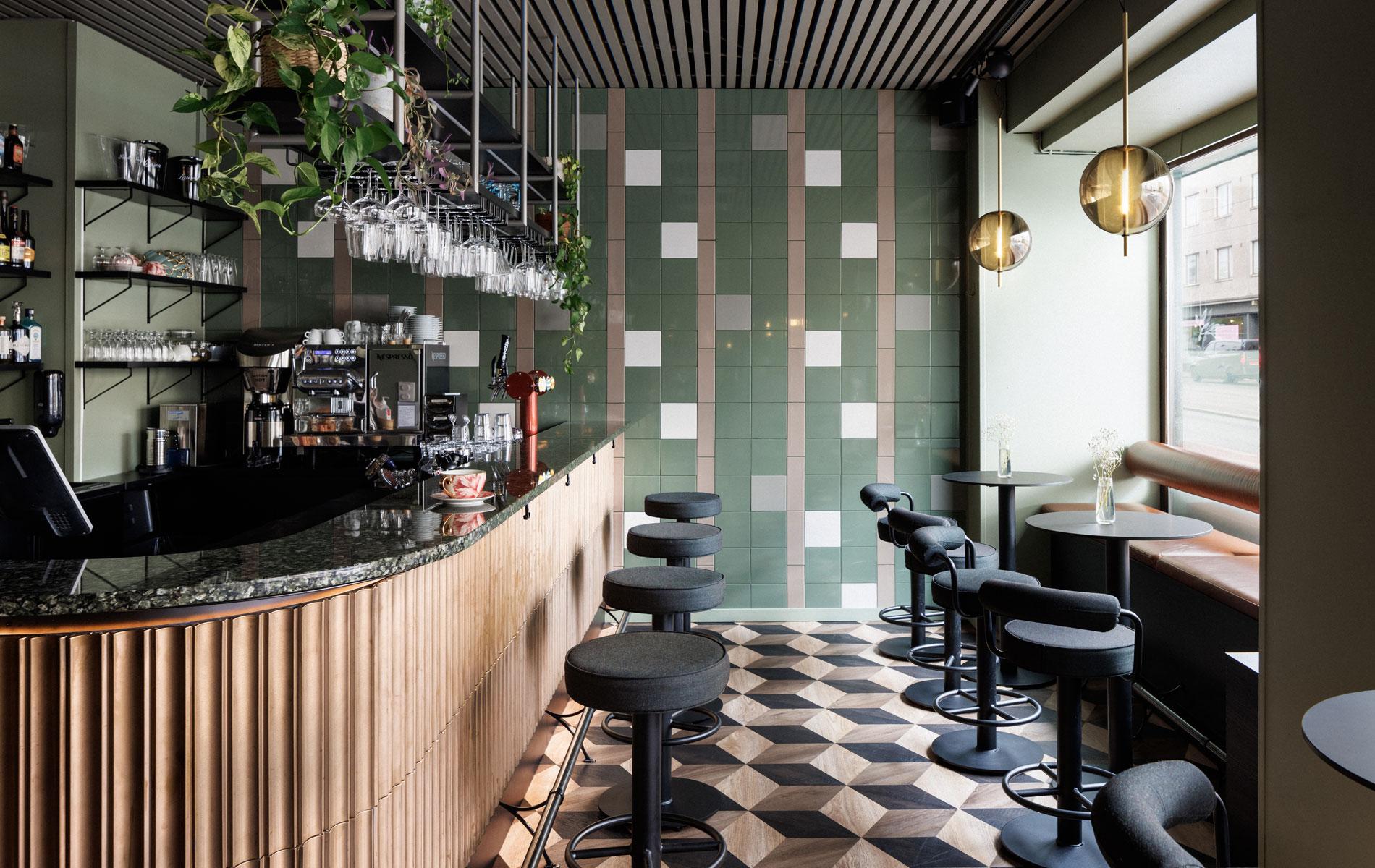
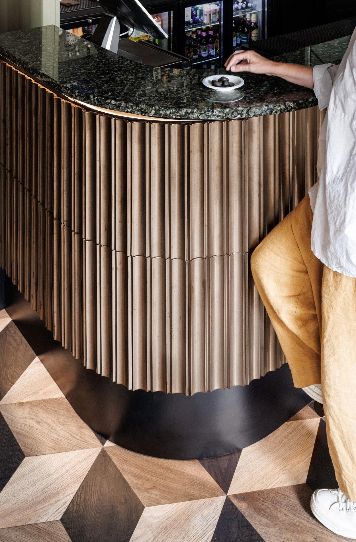
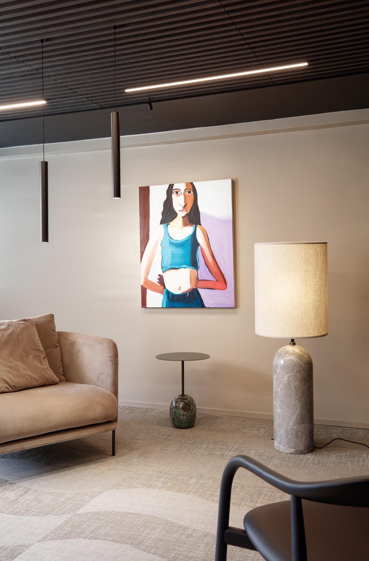
Space that exudes quality and warmth and will last for the next 20 years
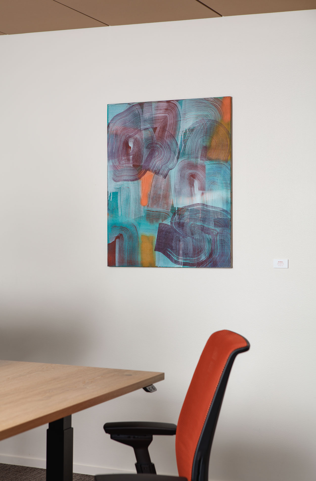
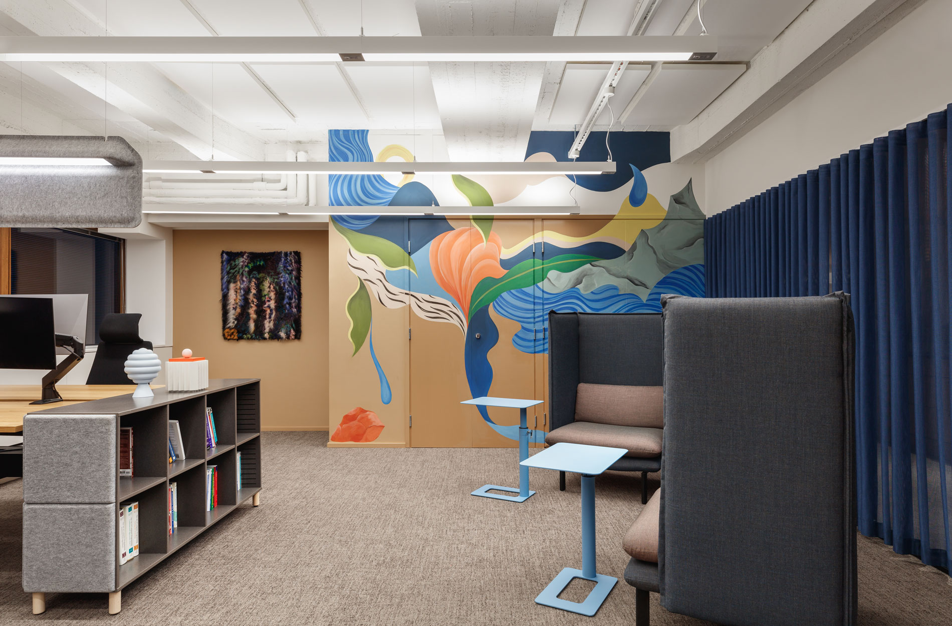
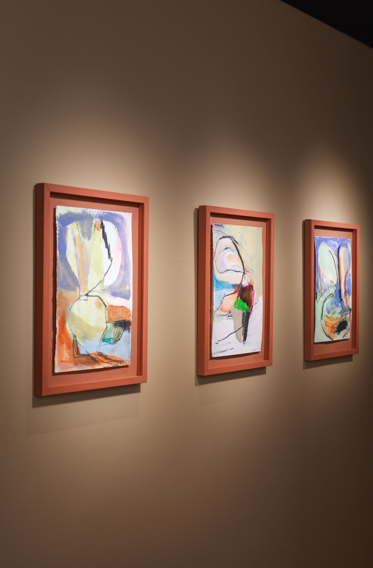
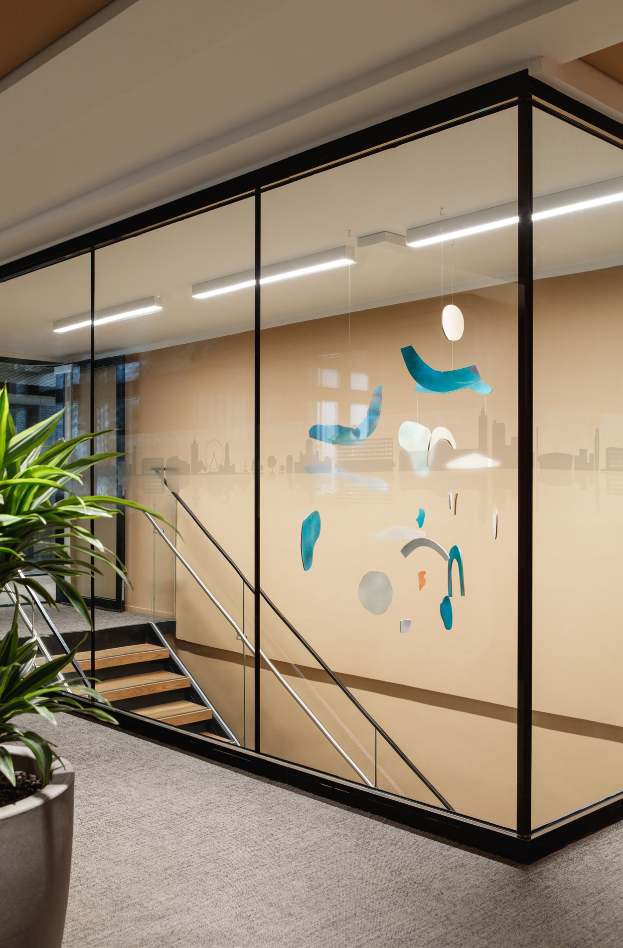
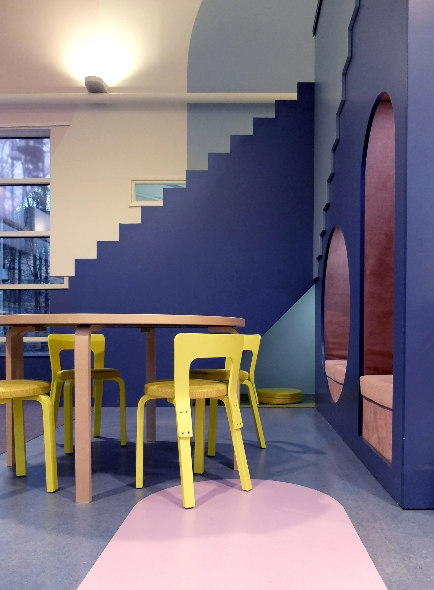
In addition to the functional changes, the visual look and feel of the office was also updated for added quality. Since the quality of the property was high to begin with, we only changed what needed to be changed, such as the building technology.
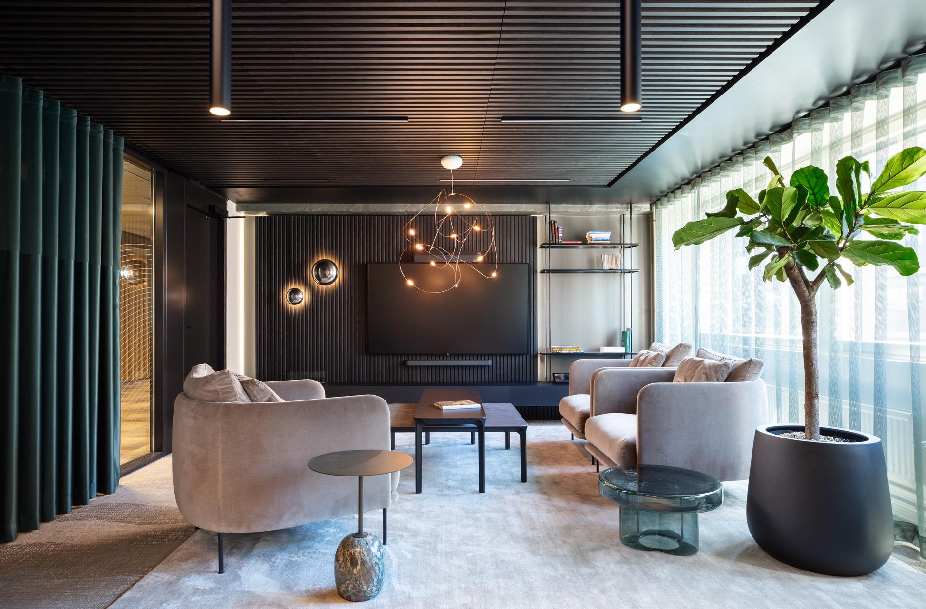
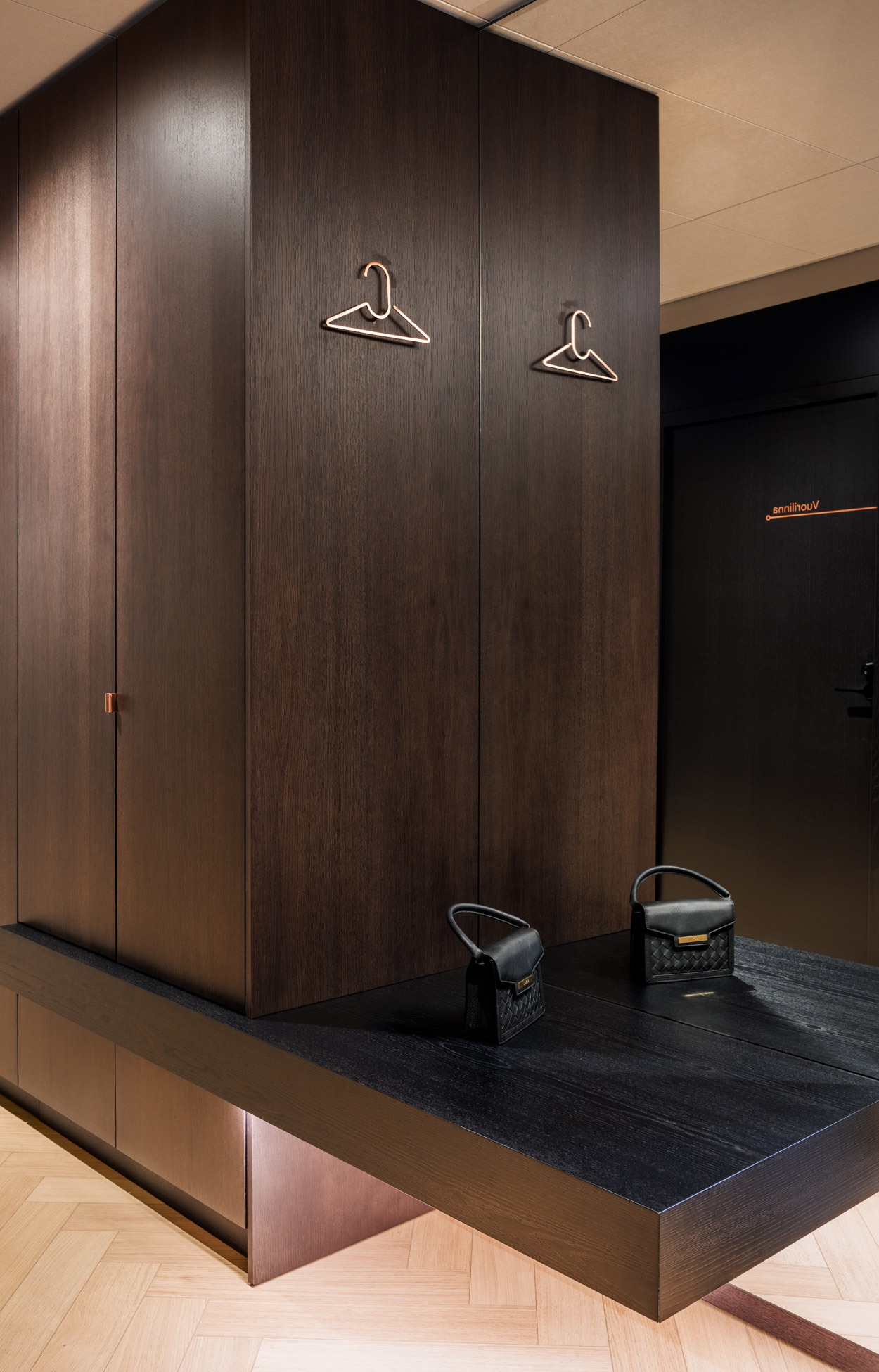
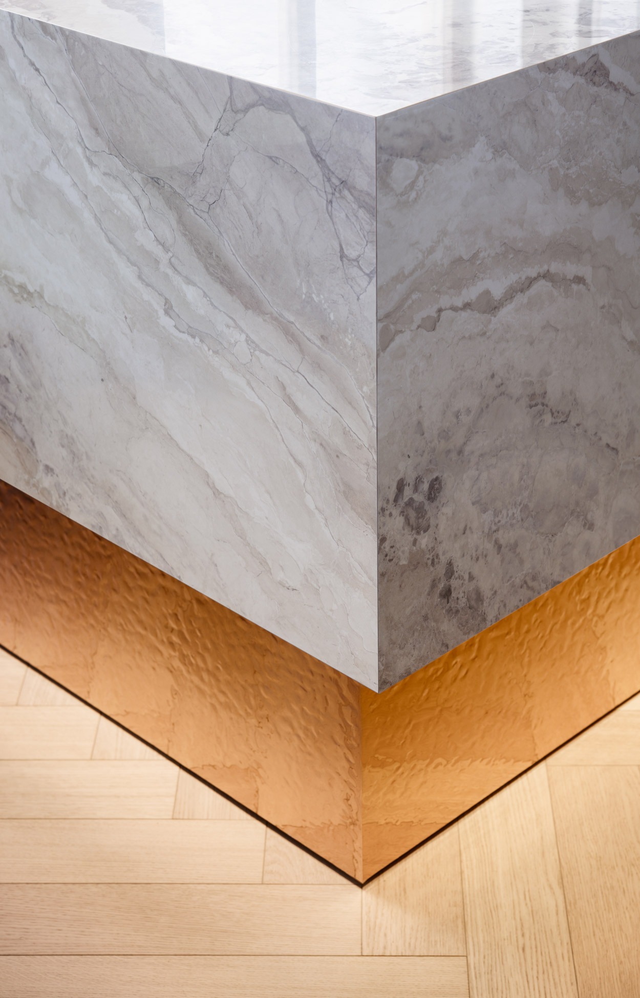
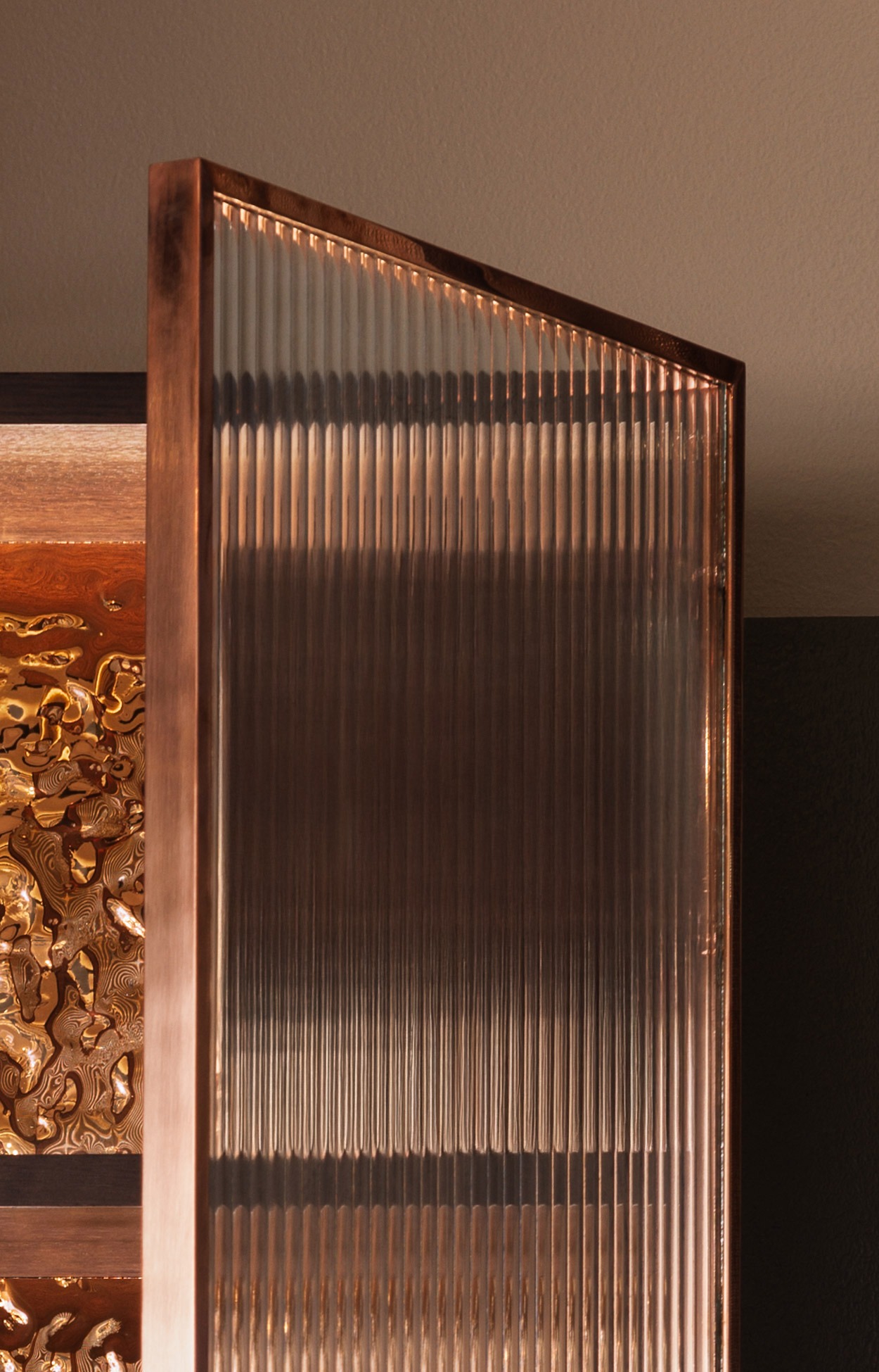
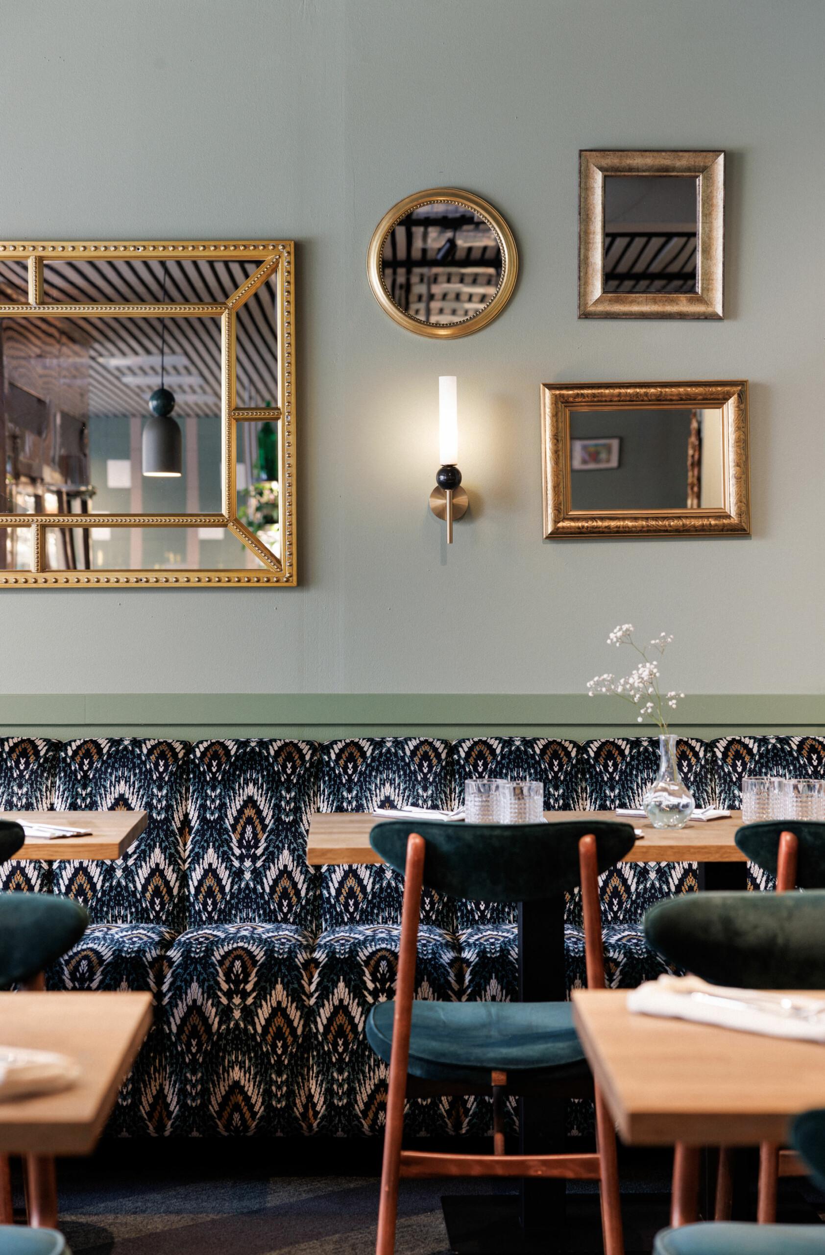
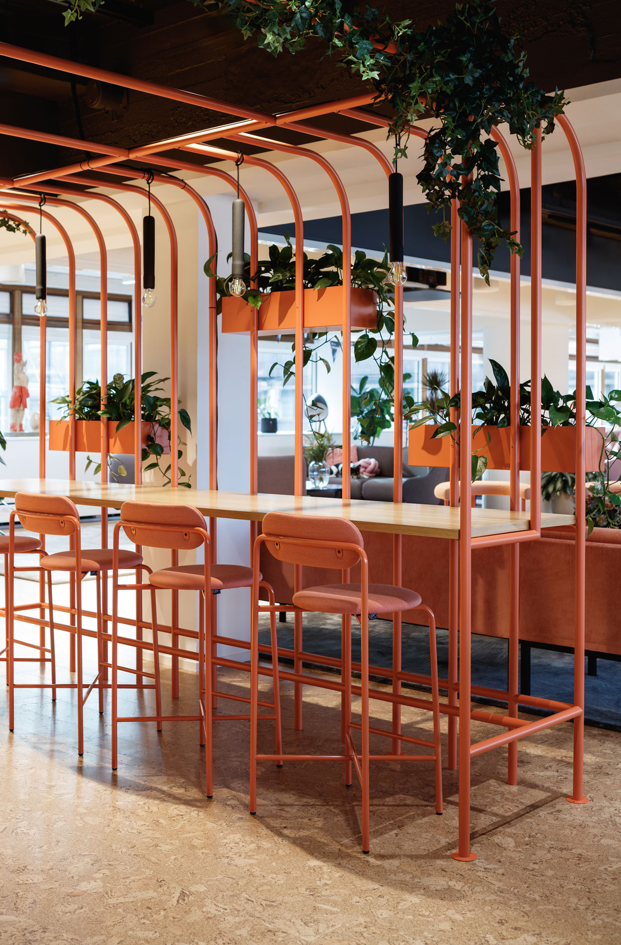
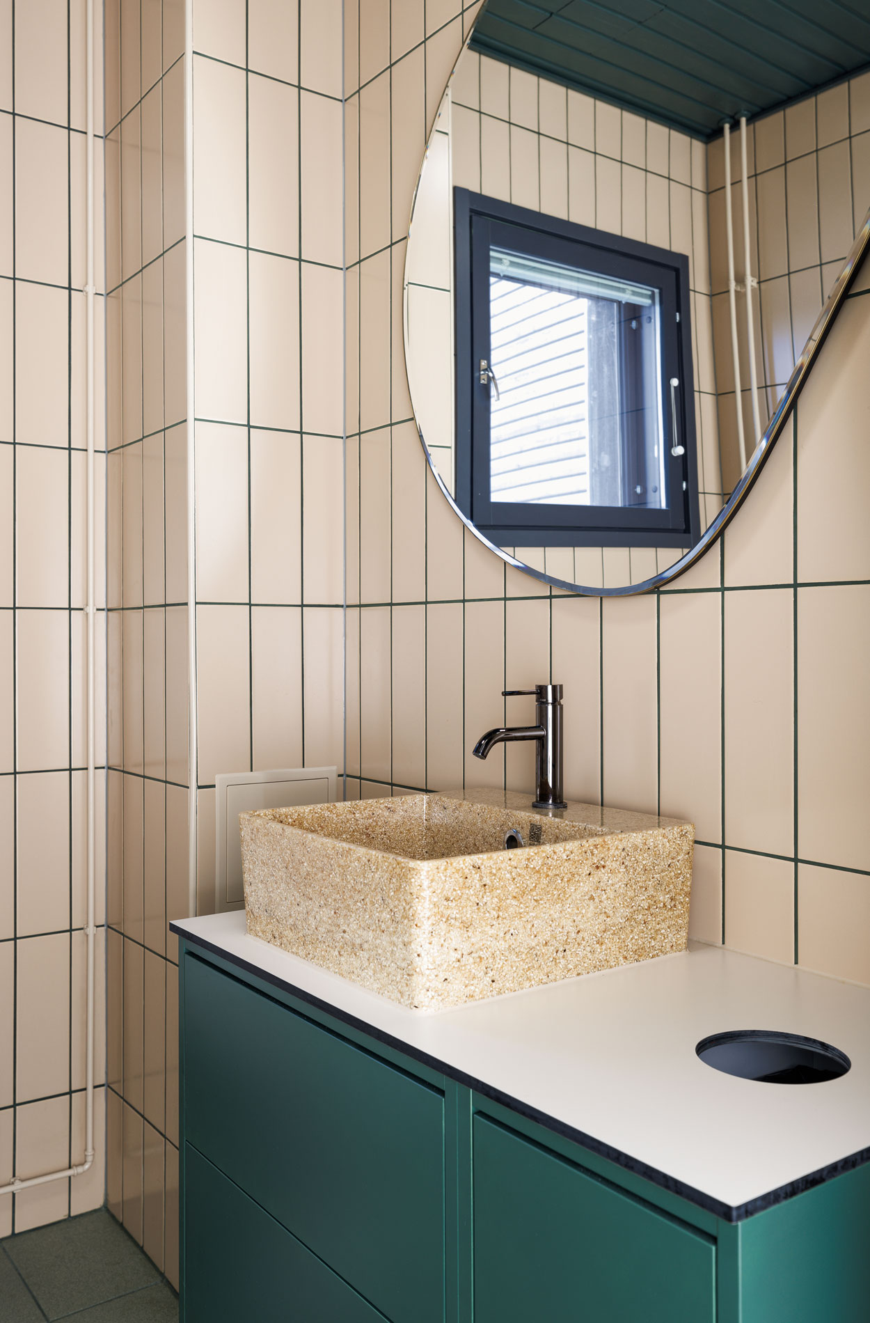
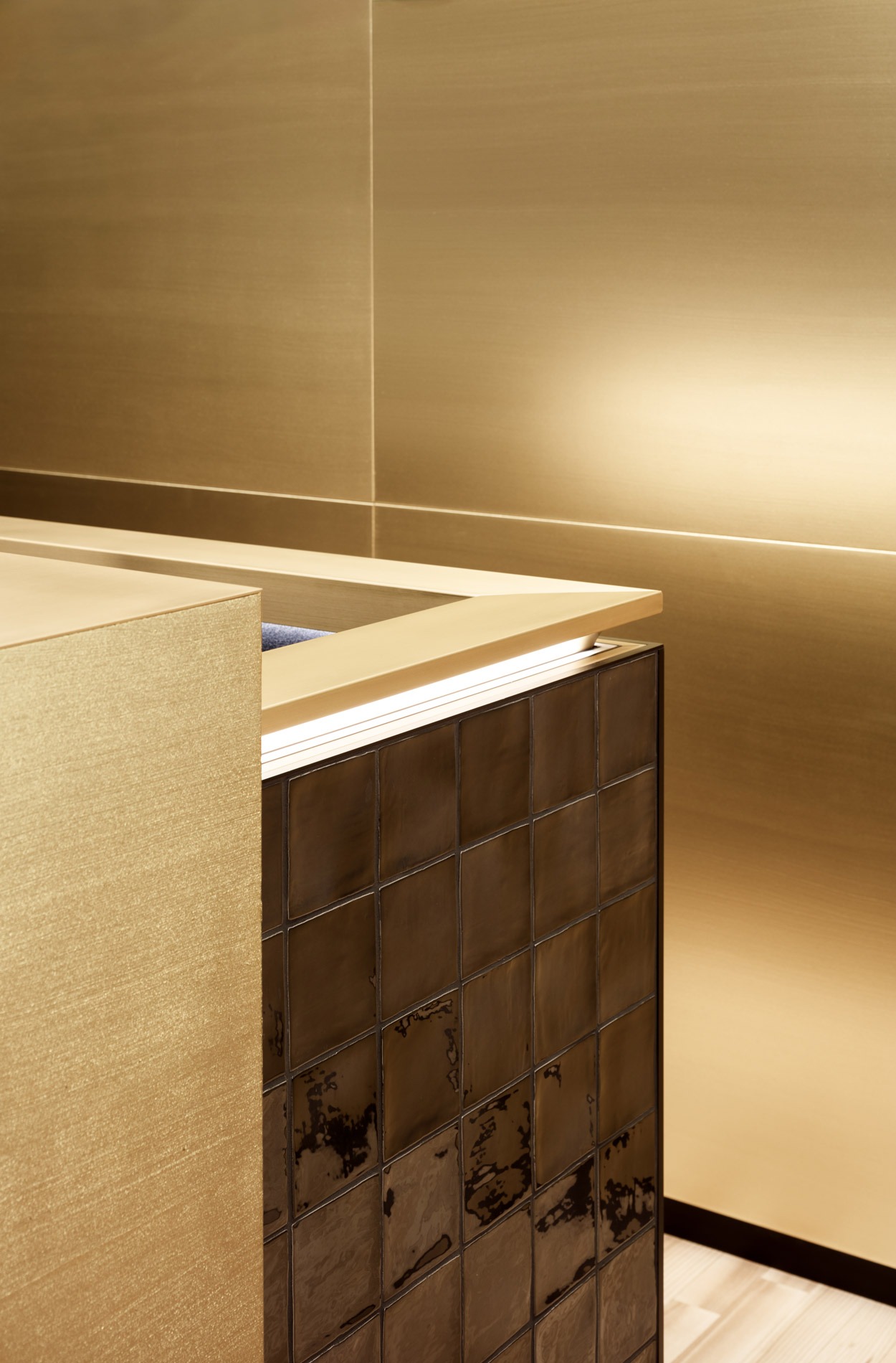
“People are Masino’s most important asset, and we wanted the property to reflect this visually. In practice, this means offering the same high-quality experience on all floors. We also softened the visuals a little by adding terracotta, forest green and gold alongside the steel facade, black and grey,” says Riina.
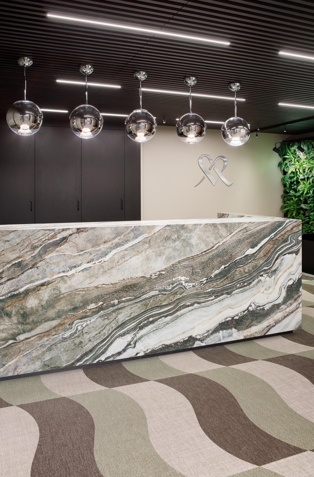
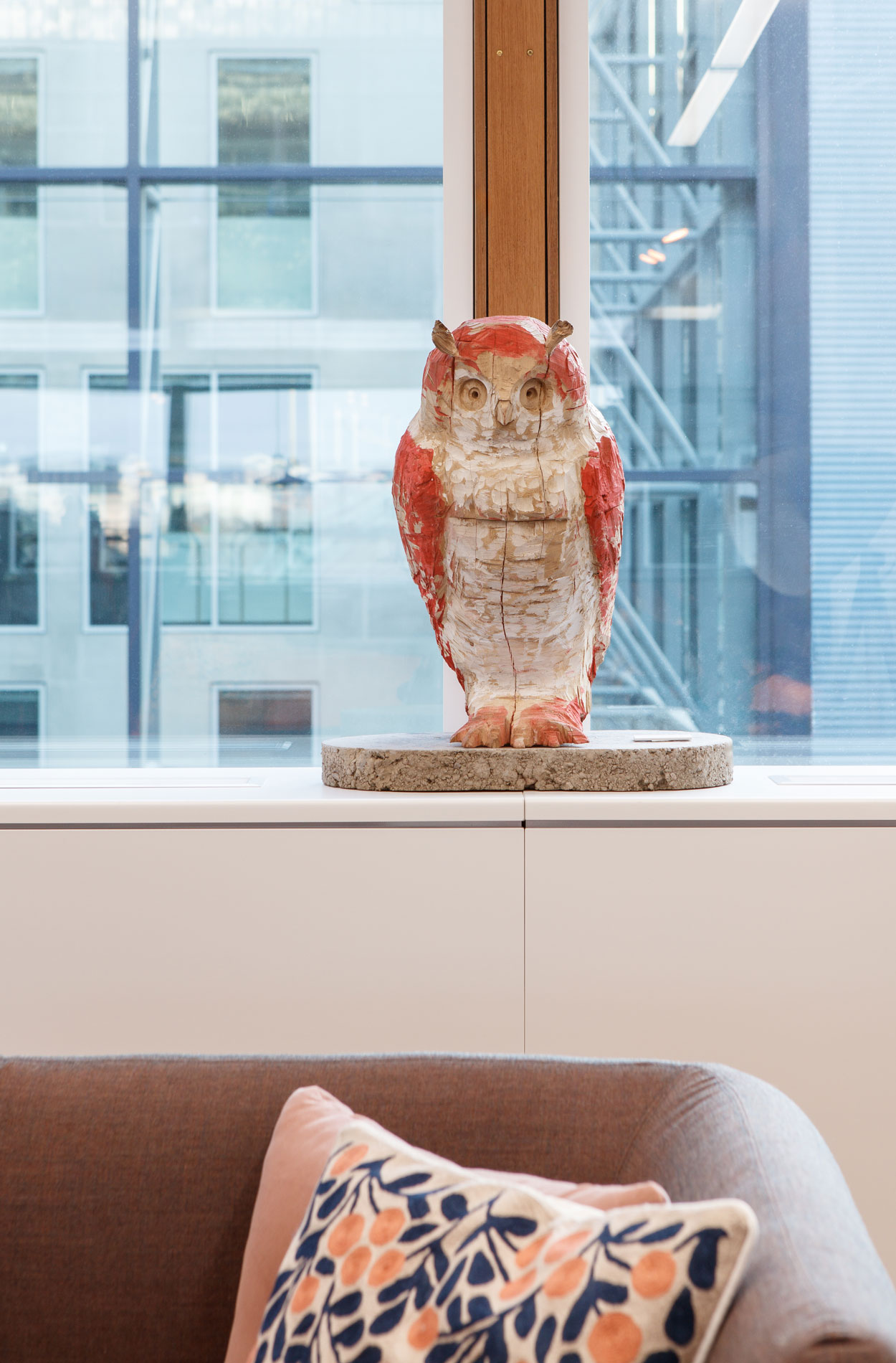
“The overall look and feel, warmth and experience were taken to a whole new level. The brand image was strengthened further and even the smallest details convey openness, quality and longevity in a way that suits us,” says Mikko happily.
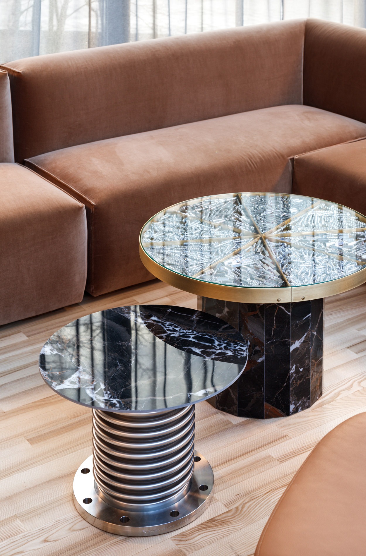
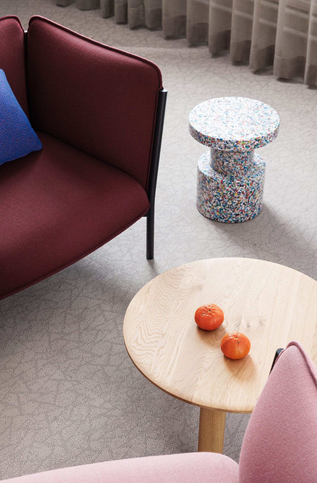
Masino’s products, such as fasteners and extension joints, have been incorporated into the lounge furniture next to the entrance. This gives visitors a concrete example of Masino’s products.
The new premises have been well received, both by the employees and visitors. We supported the organisation through the change by, for example, holding five interactive information sessions for the personnel.
“This has been a huge and complex change, and well-executed internal communication played a major role in its success. The renewed office is cosy, inviting and soft, but at the same time stylish and professional,” says Jatta Pyhäjoki, Marketing Director.
“According to the employee satisfaction survey conducted after the renovation, the overall score for working conditions has improved. Therefore, we can confidently say that the work environment has changed for the better,” Mikko concludes happily.
Photos and video Mikael Pettersson
Would you like to learn more?
Let’s talk! We offer everything from strategy to design and vision to implementation.
Learn more about the Sentio Insight work environment measurement or Masino’s article about the project.
Get familiar with other similar projects