An office for financial experts,
down to the last detail
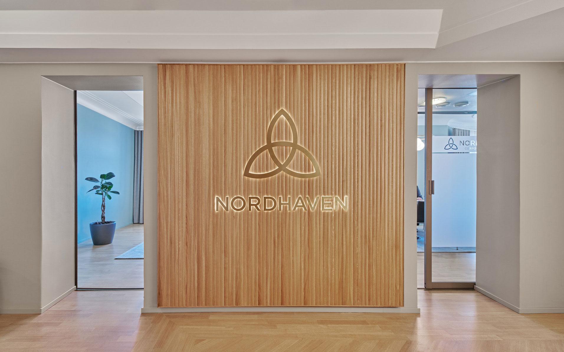
Financial advisor company Nordhaven’s office, located in one of Eteläranta’s historical high-value properties, has been renewed. The new office combines timeless tones, classic materials and inventive functional solutions. The customer experience is also more cohesive than ever: the calm and stylish lobby and its logo wall welcome visitors, the new kitchen is great for coffee breaks and display art serves as a natural conversation starter. The visually calm spaces have been designed down to the last detail, evoking a feeling of trust and reliability for clients and peace of mind for employees.
Sensible and impressive spaces
for a high-value property
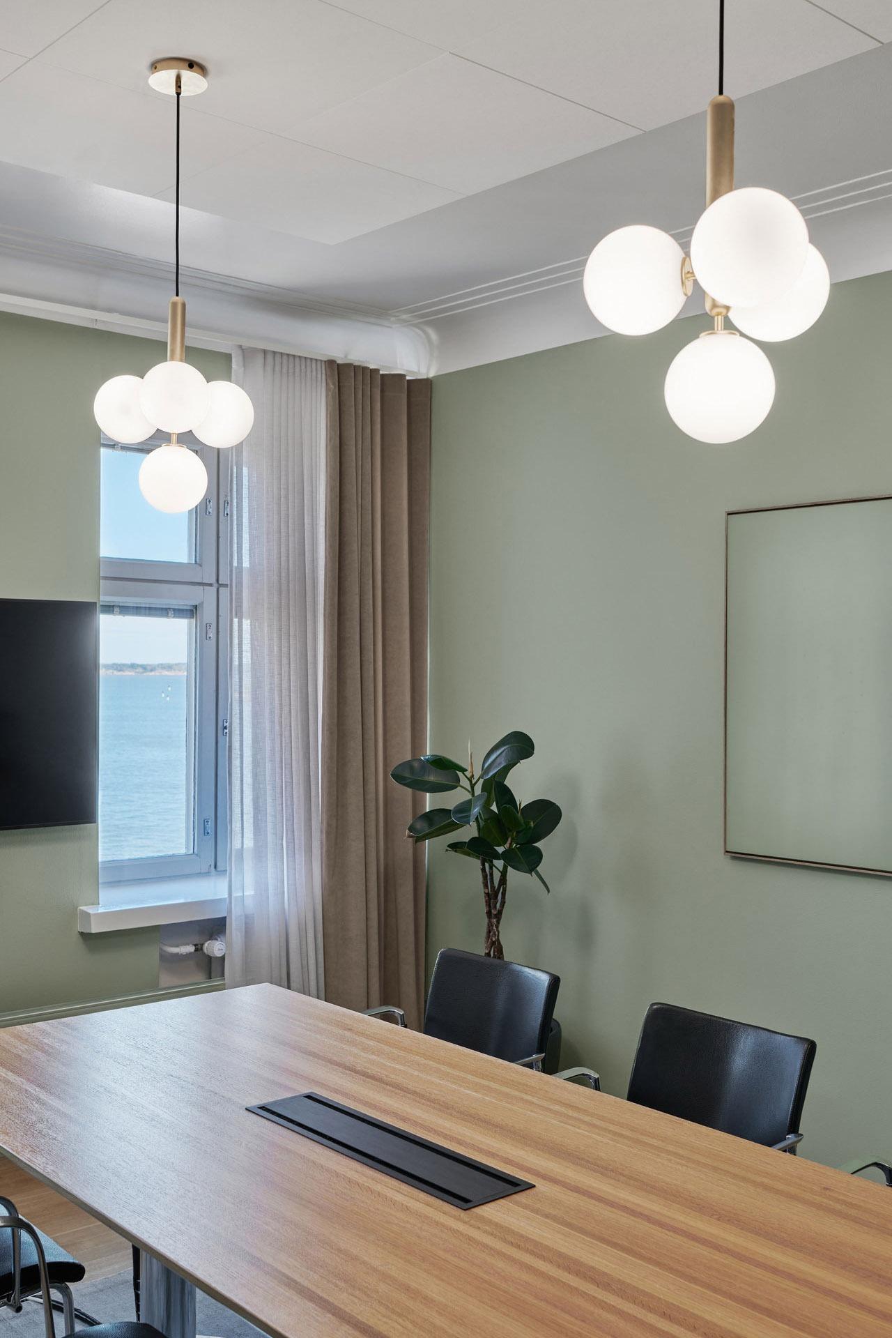
The approximately 20 Nordhaven employees in Finland work at a renaissance-style stone castle in Kaartinkaupunki. The location has a beautiful view to the sea over the South Harbour. The interior’s features and atmosphere were previously not in line with the quality and reliability of Nordhaven’s services. “The project’s aim was to renew the spaces to correspond to Nordhaven’s characteristics and product, their brand image. They have a certain level of quality in everything they do, and we wanted to make that visible here”, says Riina Ruska, the project’s Lead Designer regarding the design work.
The spaces were designed according to
the following design drivers:
- Nordhaven’s reliability and displaying their strong experience in the field
- accounting for factors related to the customer experience from the moment of entry
- improving functionality with inventive methods
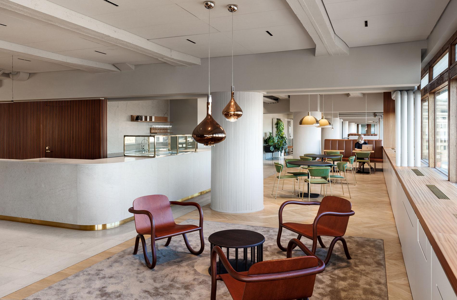
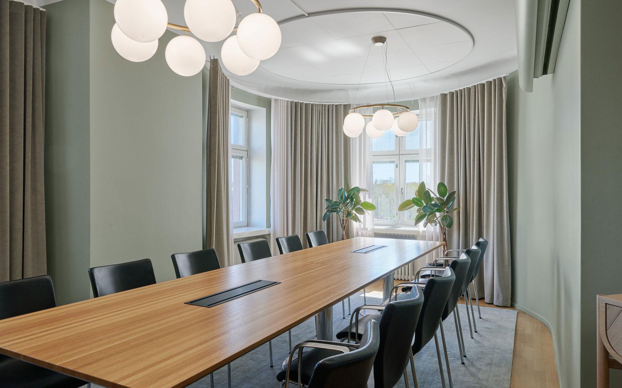
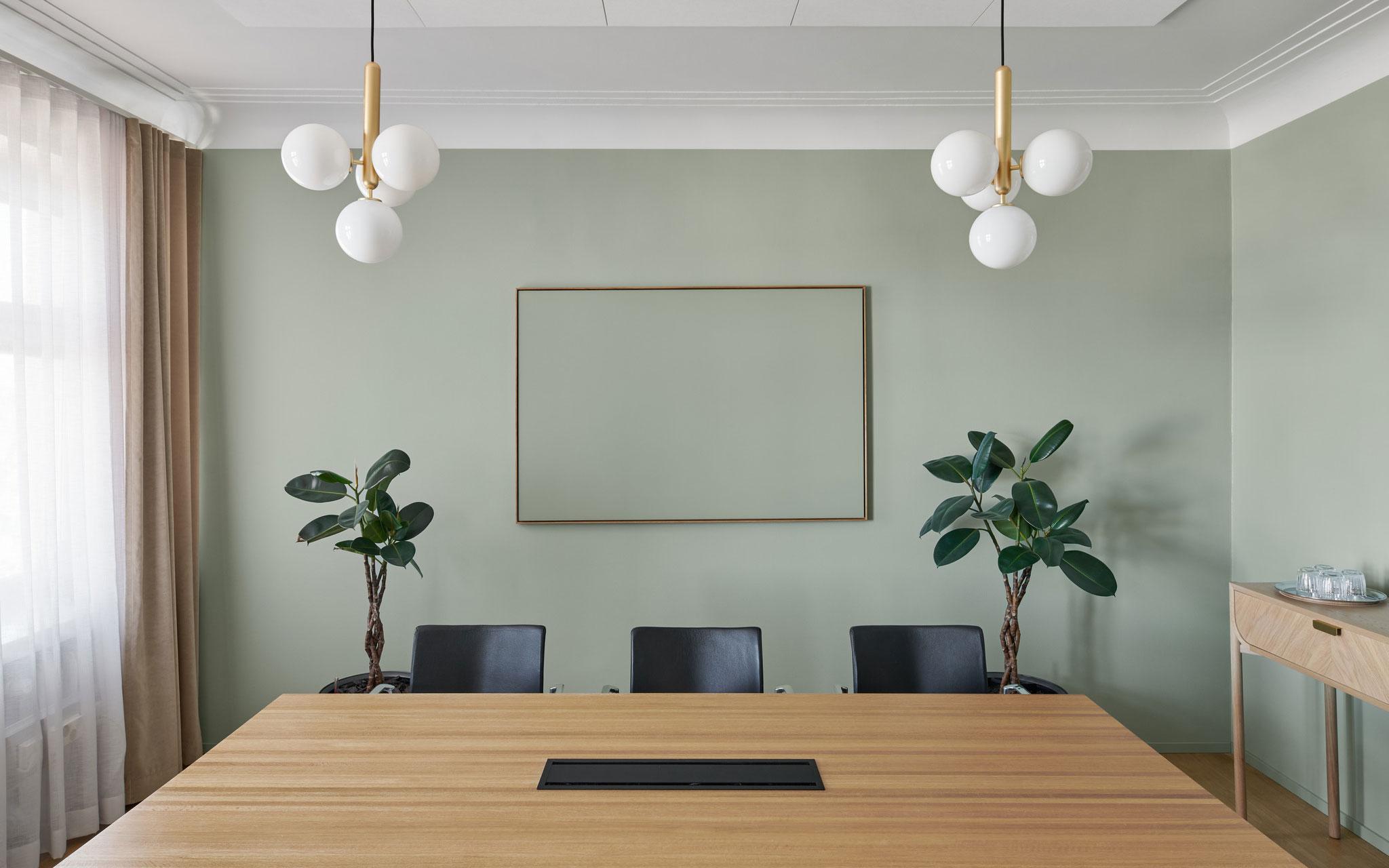
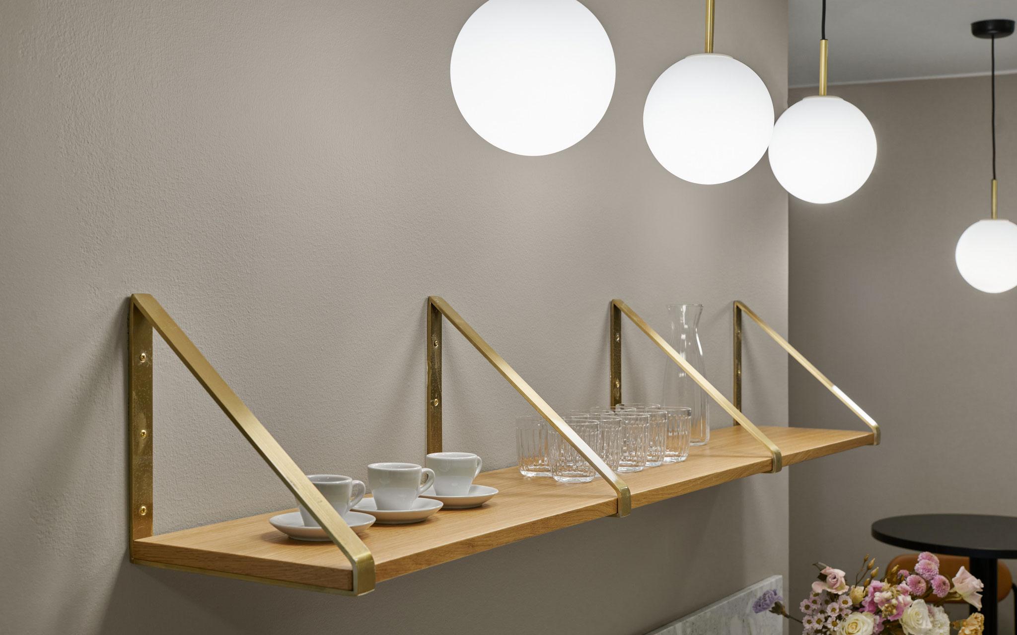
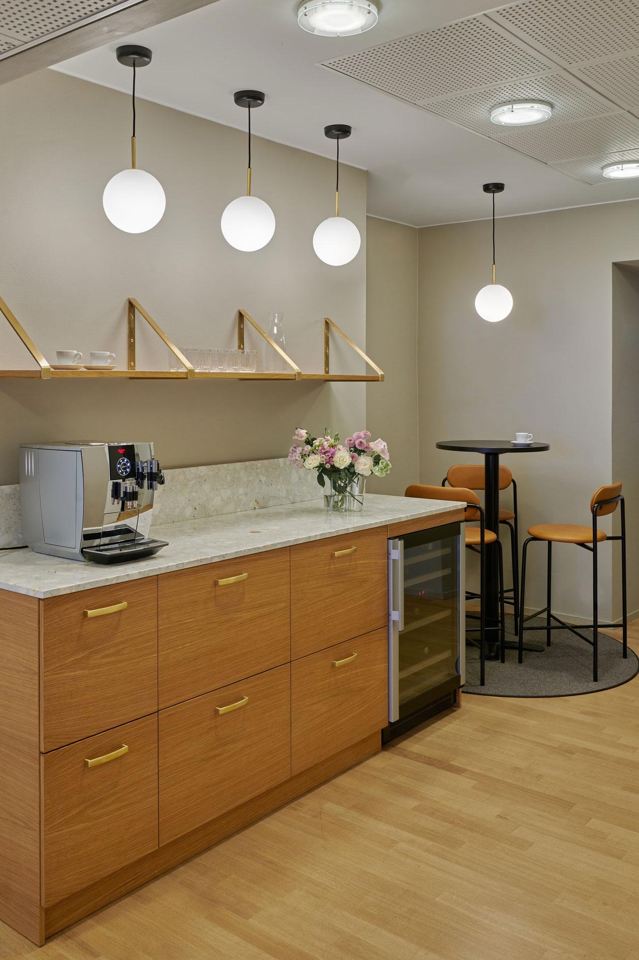
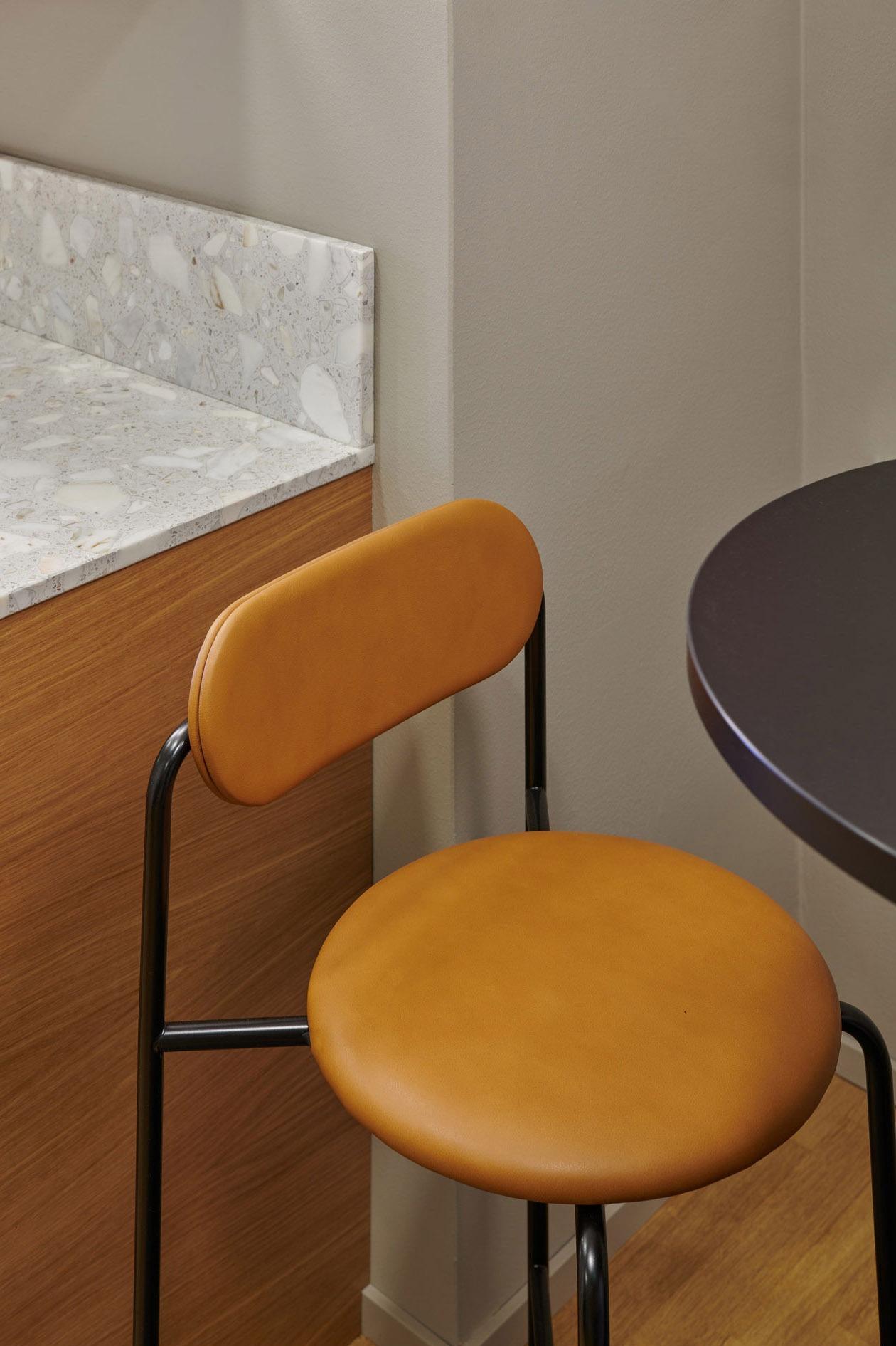
Nordhaven’s office spaces saw a change over a 240-square-metre area, which included the lobby, hallways, client consultation spaces, workspaces and a kitchen. Rune & Berg Design was responsible for the interior architecture design of the project. “The most important thing was that the spaces are in line with their intended purpose. For example, we installed new lighting in the meeting room which used to be a workspace, and the walls were removed from the kitchen, making space for a service point”, says Riina.
Small changes for a more atmospheric experience
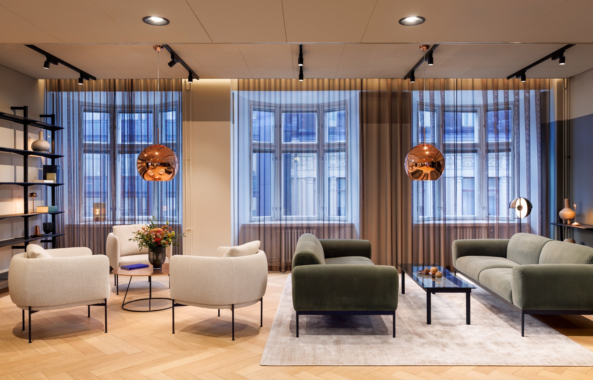
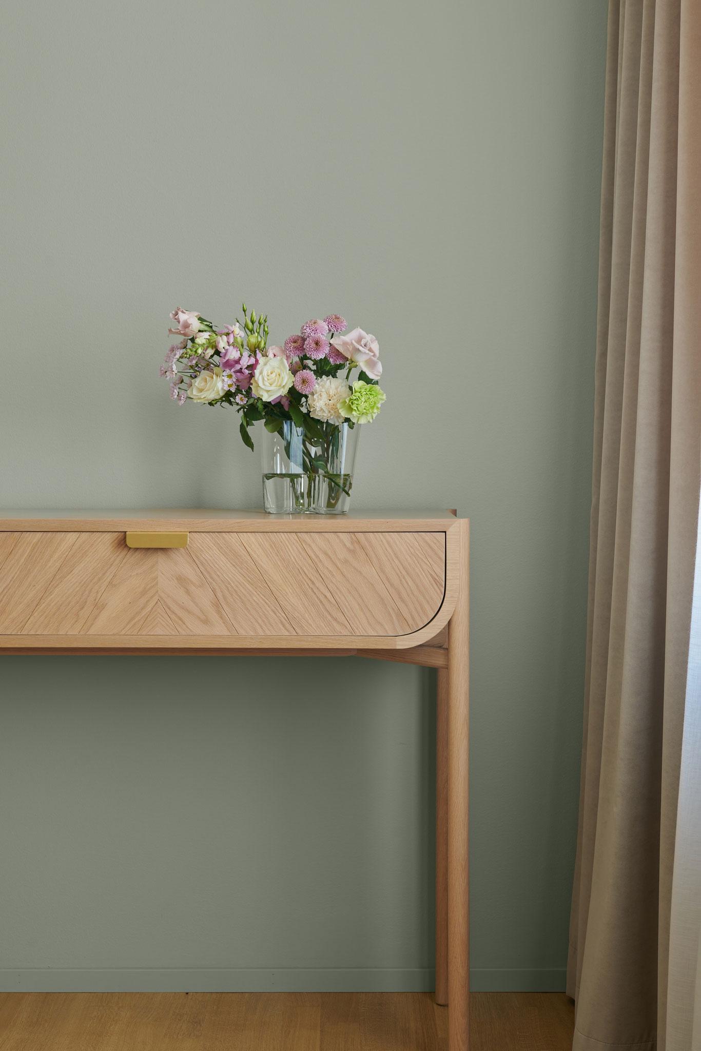
The changes to Nordhaven’s spaces were large, even though there were no structural changes besides removing the kitchen wall. “During photographing, we heard a person who had previously visited the space spontaneously exclaim ‘Wow, vad har hänt’ (Wow, what’s happened?)”, Riina says, smiling. The much more atmospheric office was created by adding colour, softness and quality to surfaces and furnishing. Detail work also played a key part in the look: the consistent round design of light fixtures makes the office even more cohesive, for example.
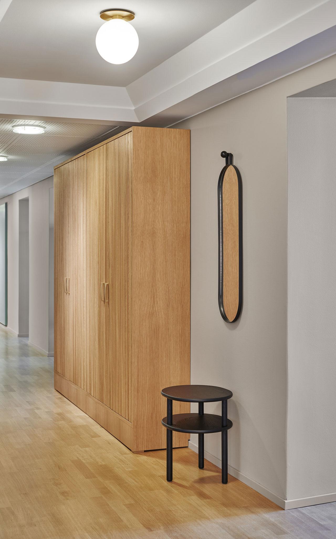
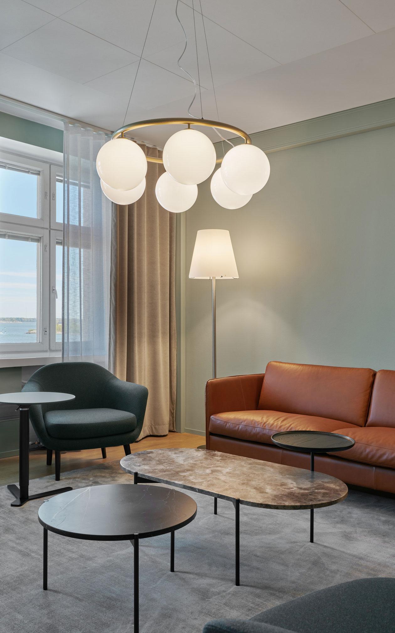
When the spaces were renewed, special attention was paid to the customer and employee experience. A brass logo wall was added to the entryway, and the hallways were paced with rail lighting and oaken finger panels. The meeting rooms were toned with mint green walls, more acoustic surfaces and soft textiles to lighten the atmosphere. A suggestion was made to pair the workspace for analysts and individual workspaces with a one-person Teams space that is suited for hybrid work. The curated art from the Rikhardinkatu art lending services puts the finishing touches on a high-class experience.
Would you like to learn more about similar projects?
Read about Rettig Group’s renewed head office.
Get familiar with other similar projects
