The renovated Cafe Hugo exudes warmth and quality
Named after its founders, Hilkka and Hugo “Hute” Villgren, Cafe Hugo is a family-owned cafe that was originally established in the 1960s. At the cafe, you can enjoy lunch and bakery products as well as pick up products ordered from the online store. The goal of the renovation was to improve the functionality and atmosphere of the 100-seat lunch restaurant and cafe, and to increase the number of customers. It was also important to complete the renovation within one week to minimise the time during which the cafe was closed.
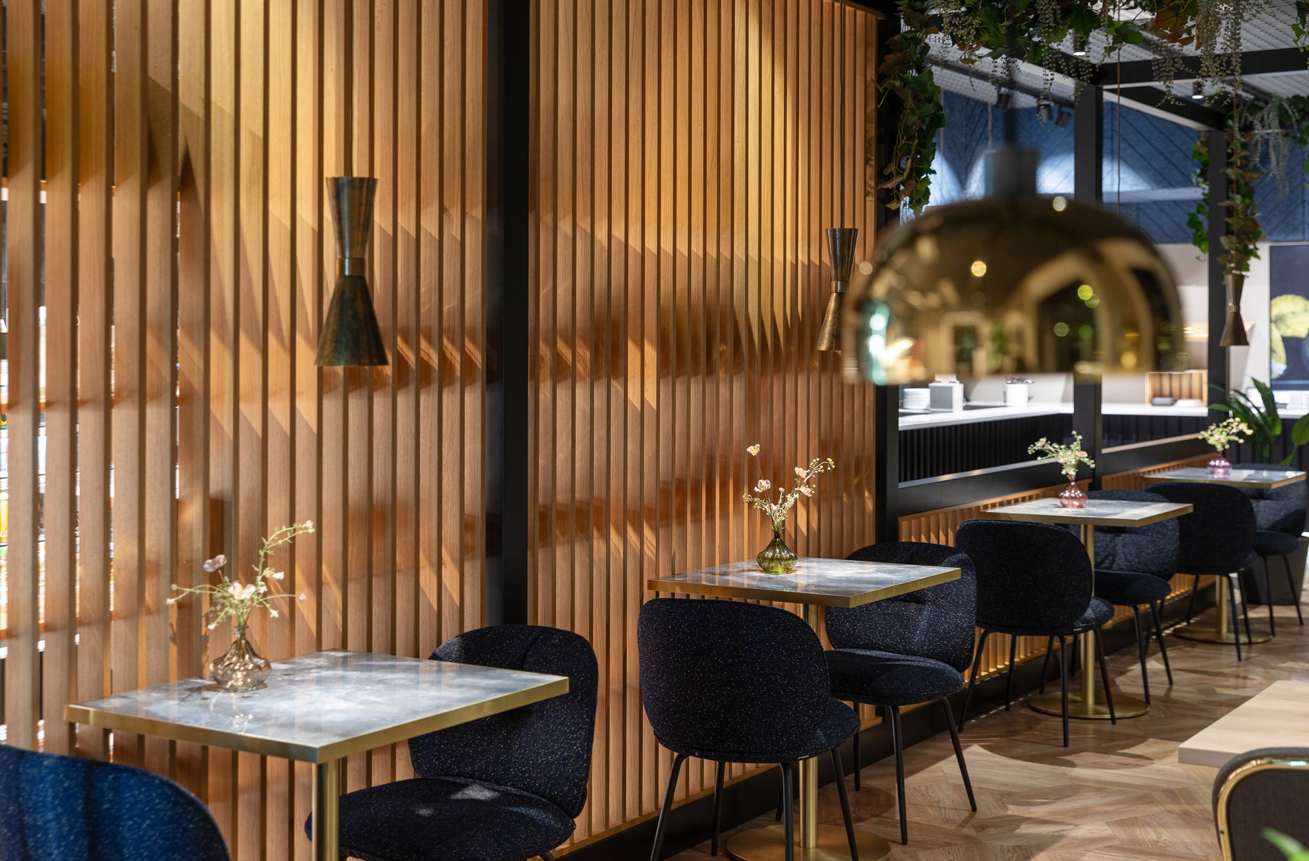
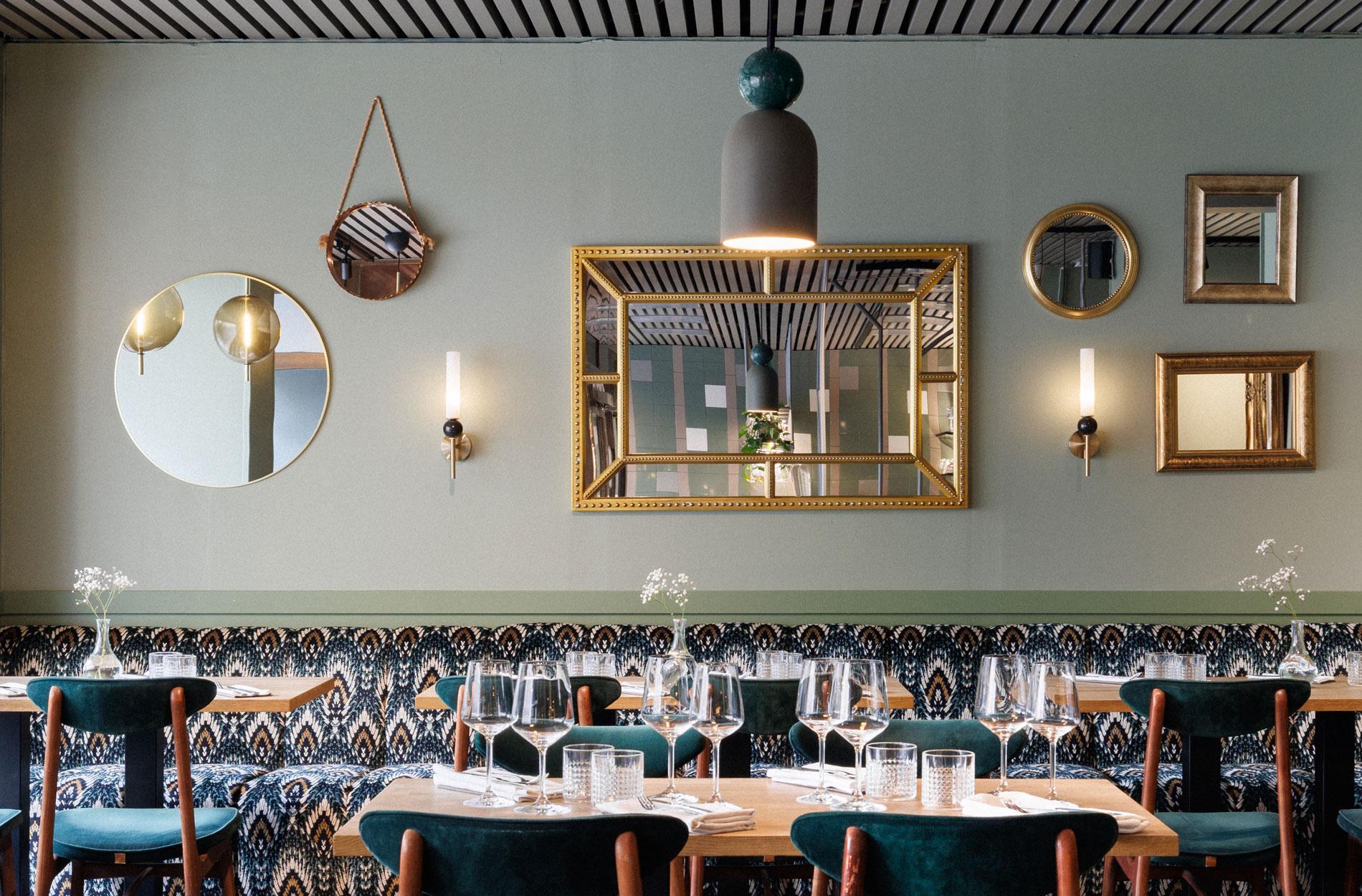
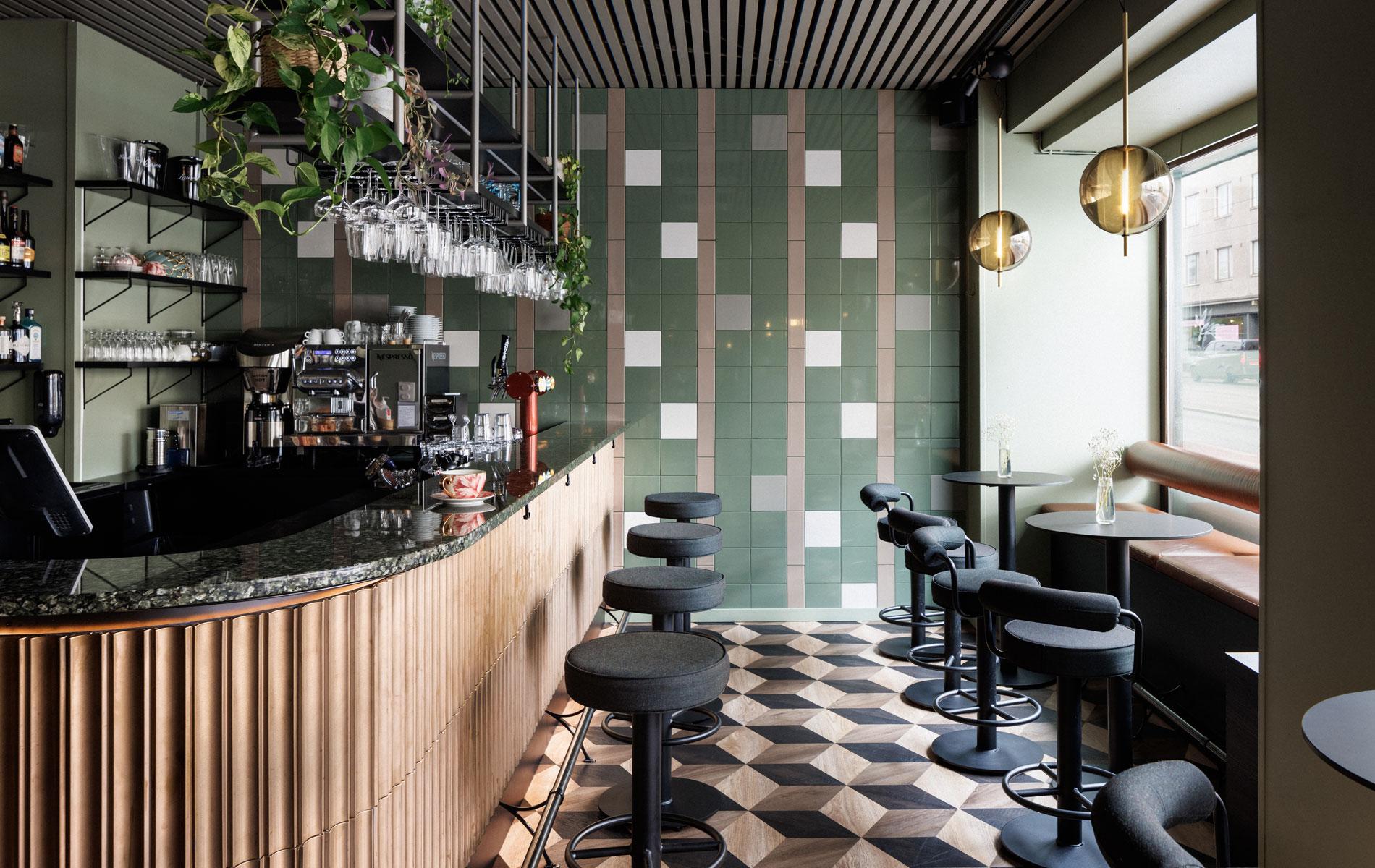
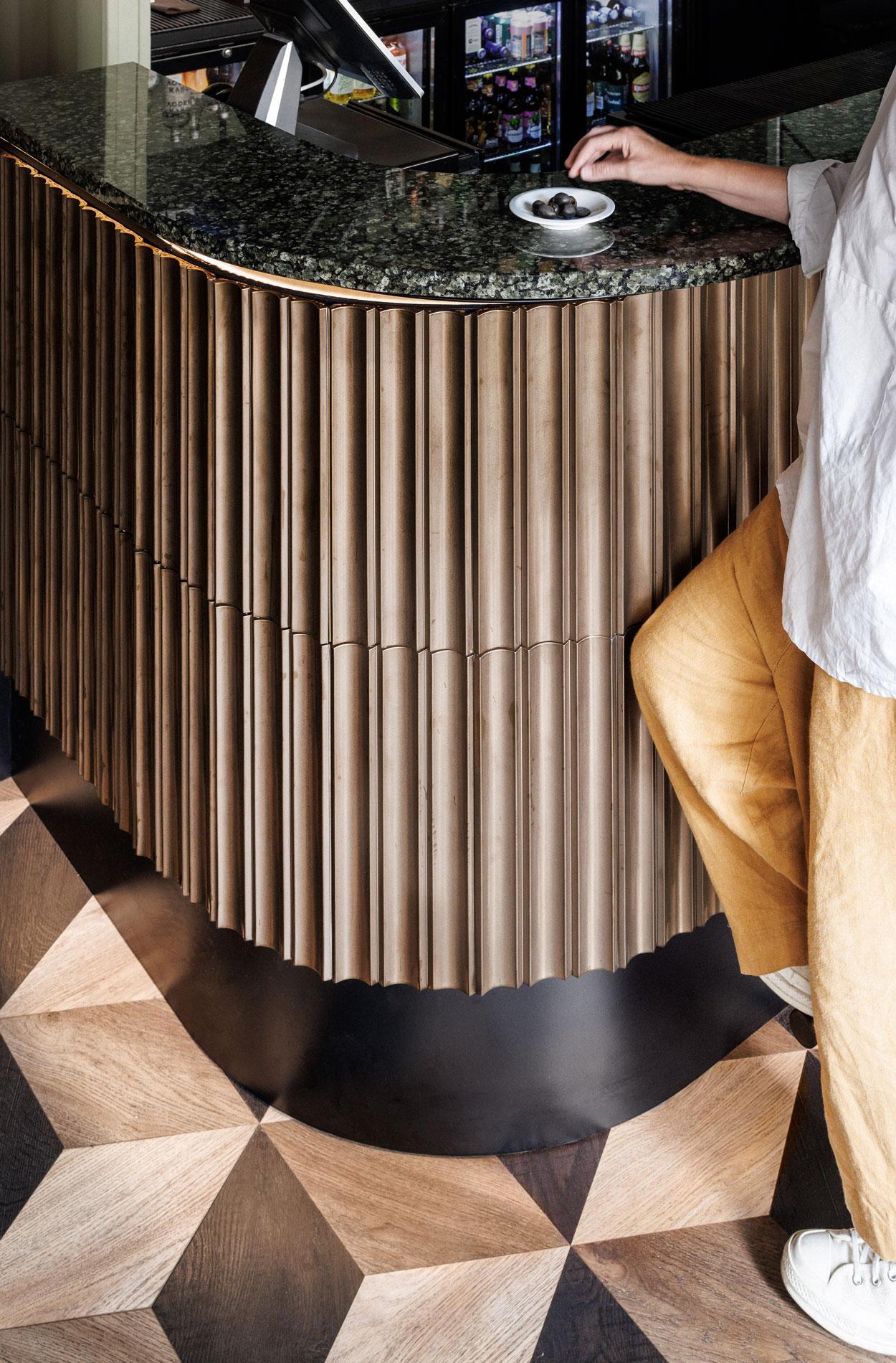
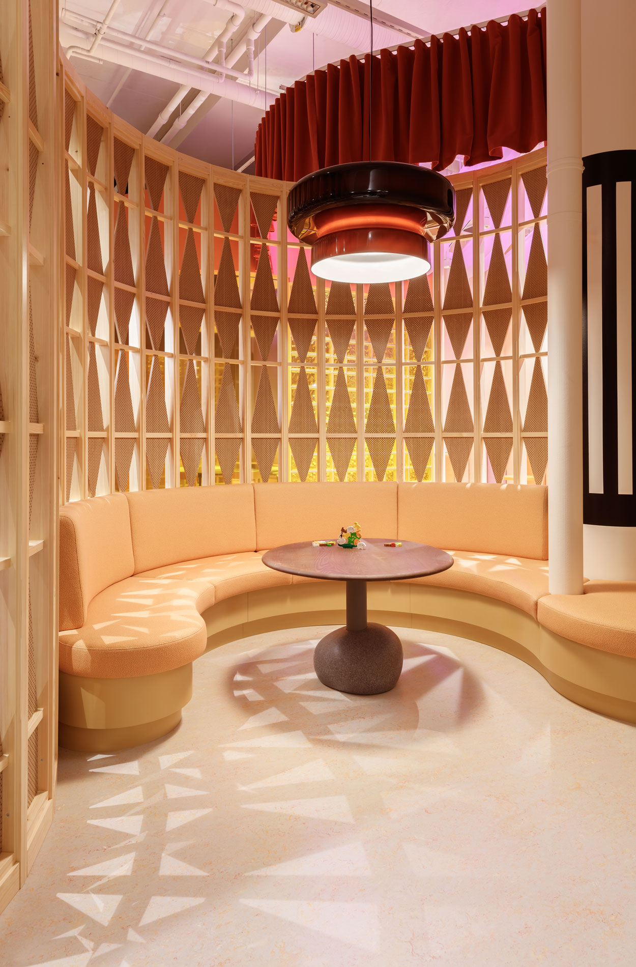
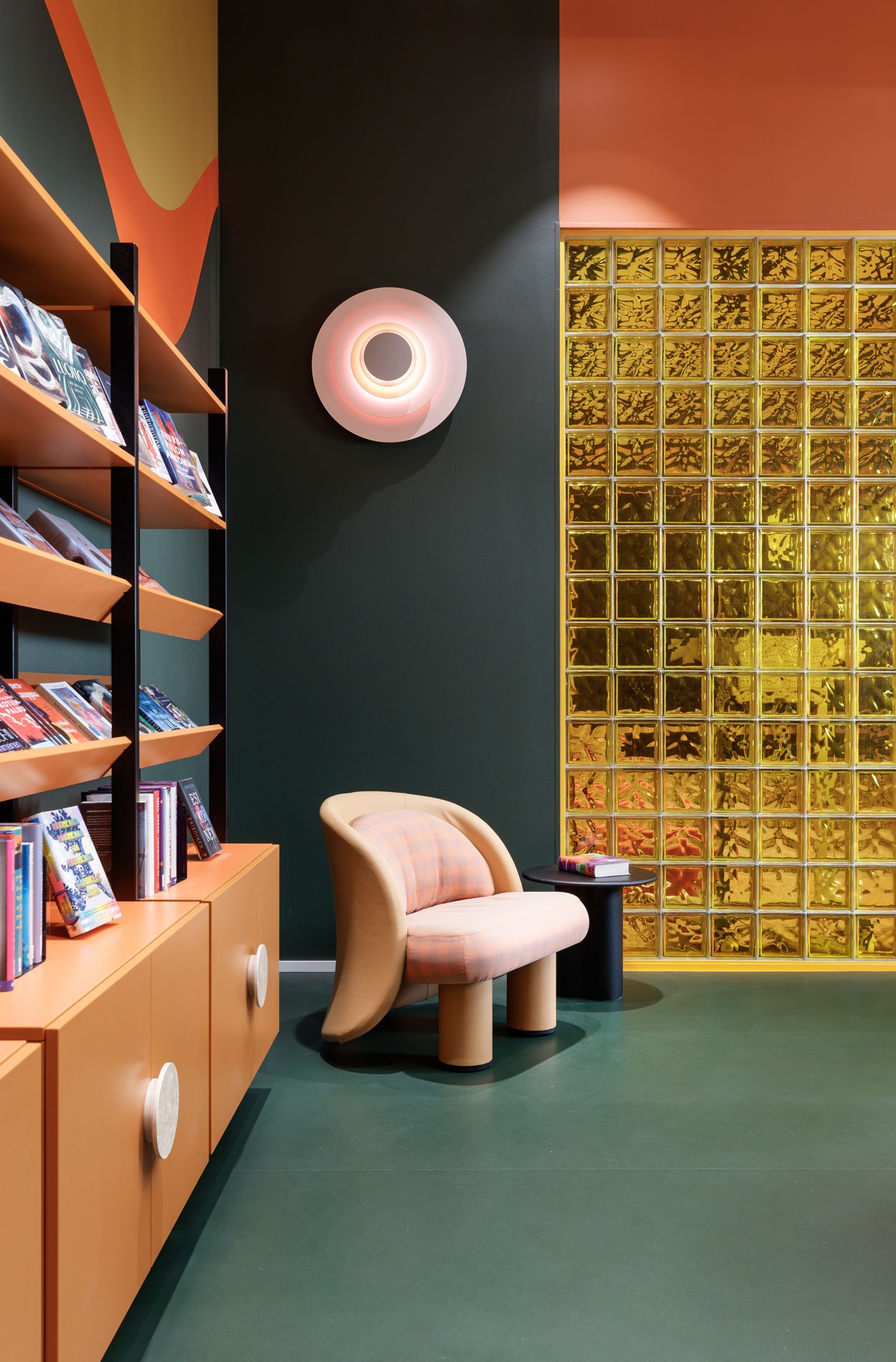
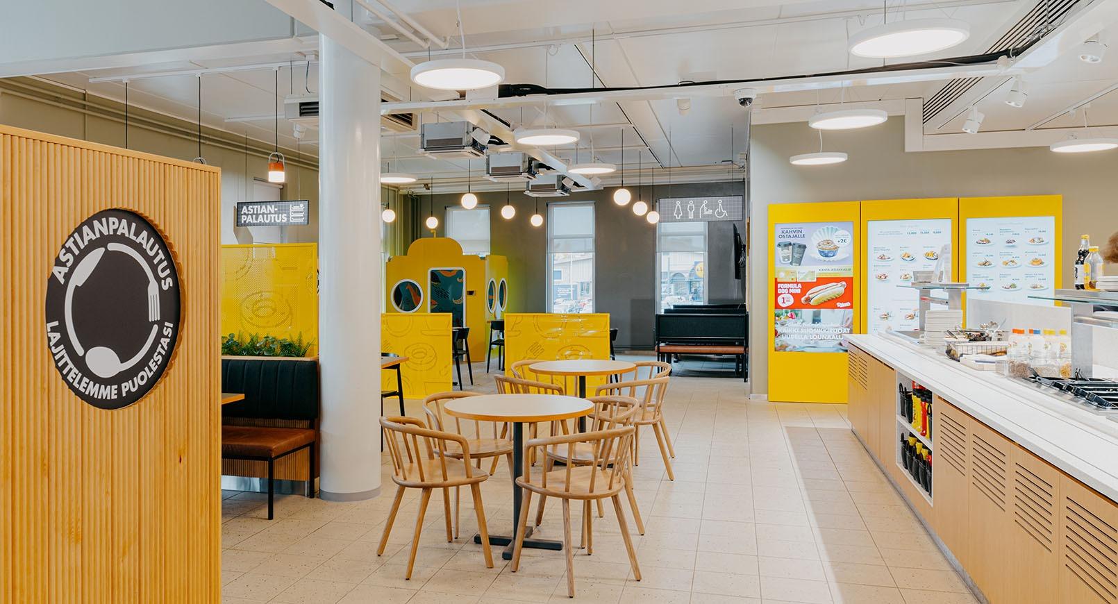
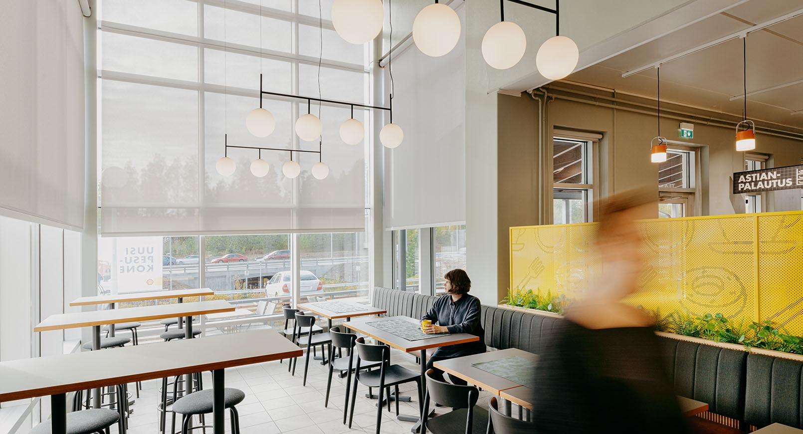
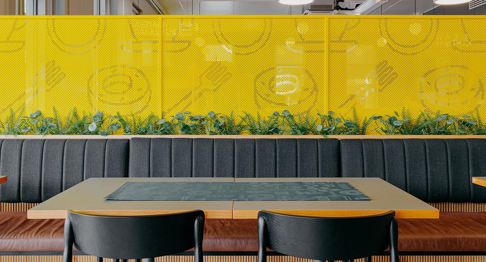
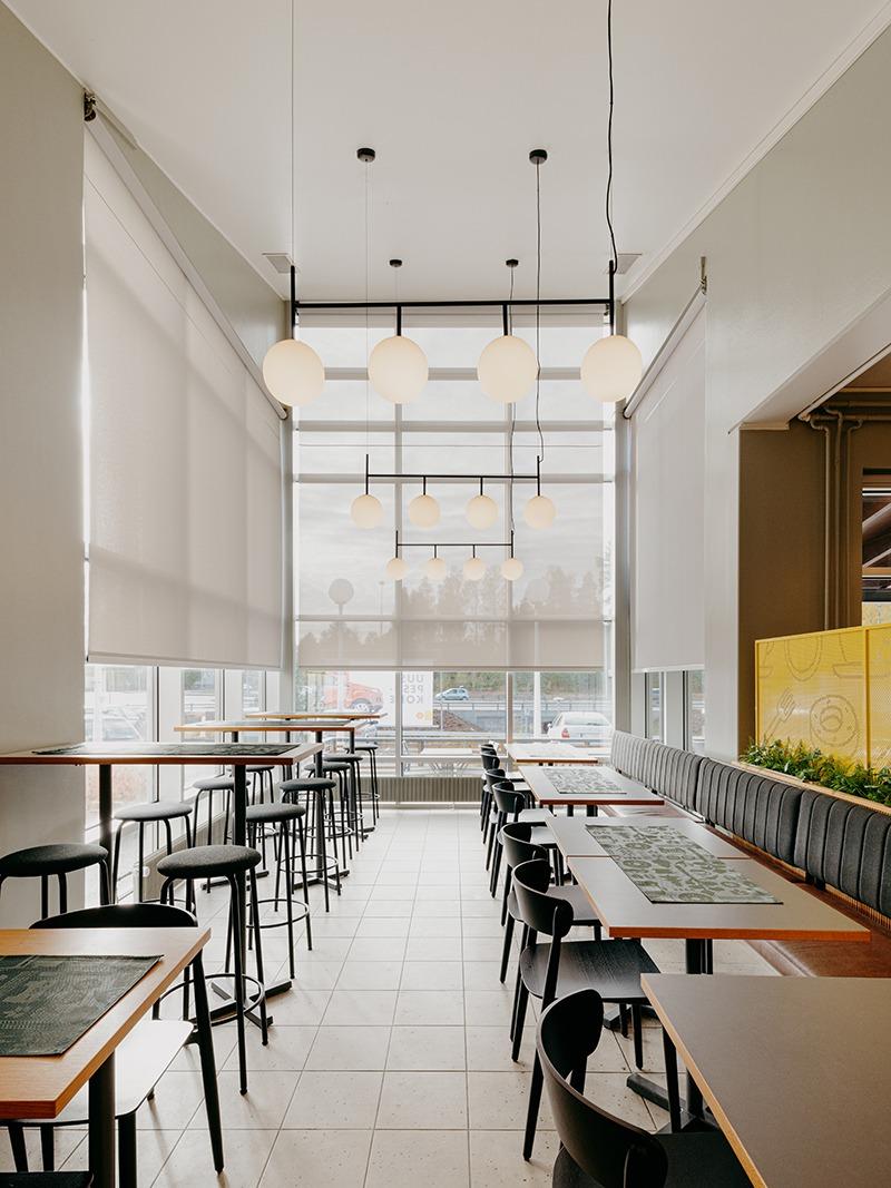
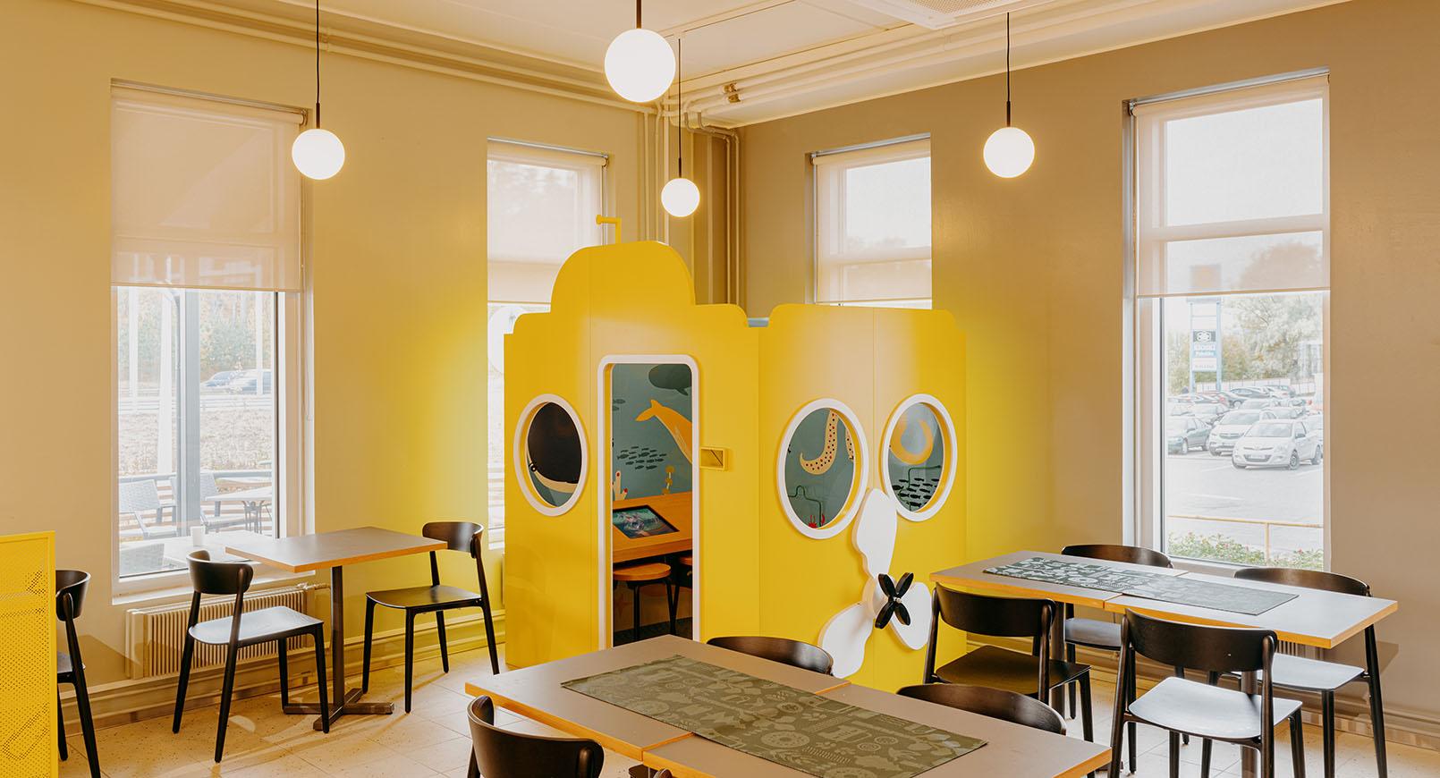
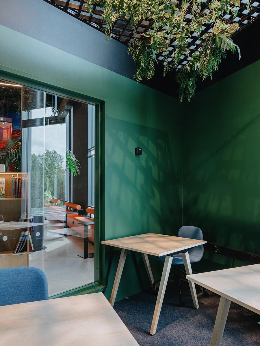
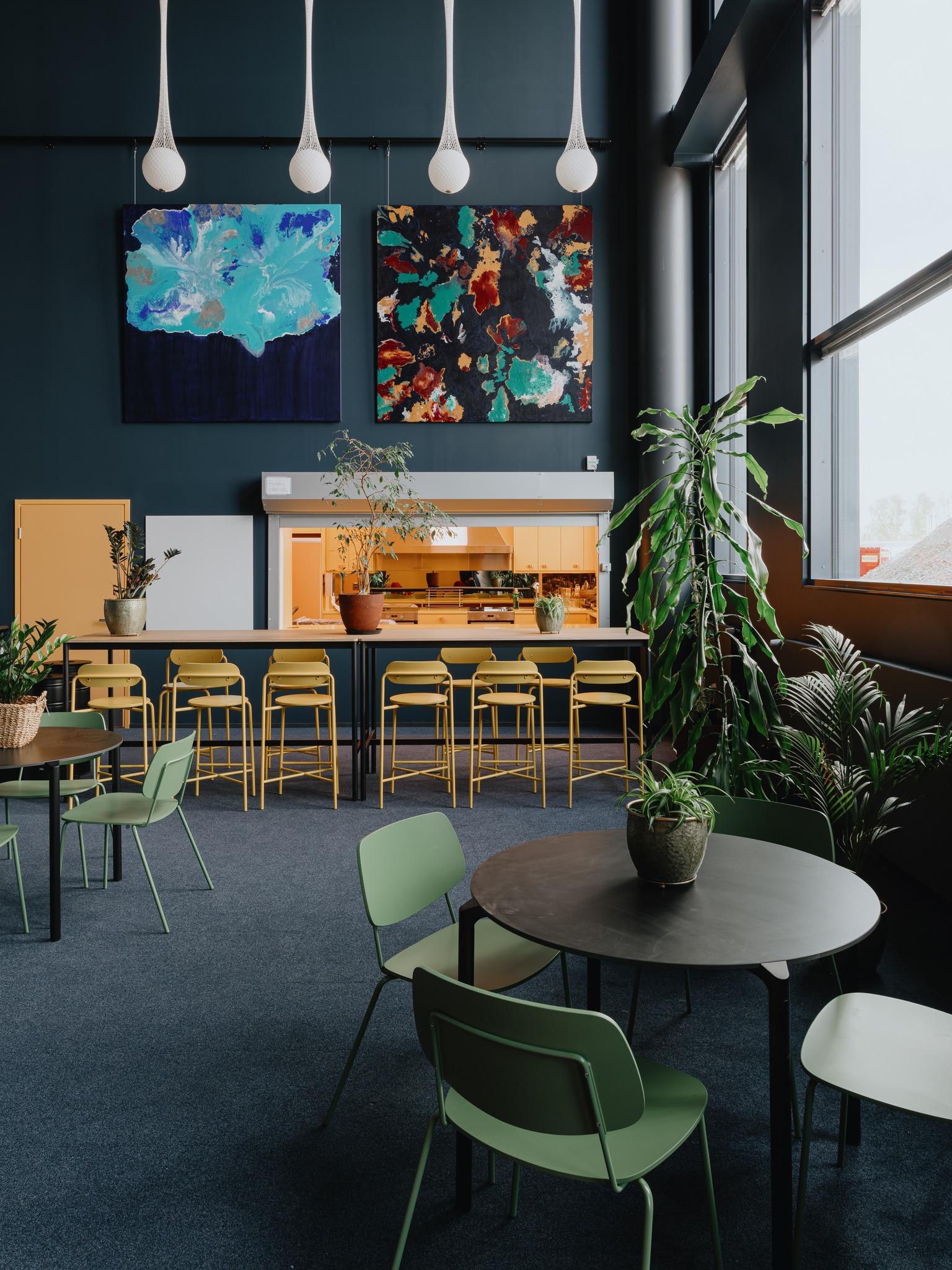
A pergola that acts as a divider, pendant lights, plants and a touch of gold create a warm and cosy look.
The high-quality revamp was completed in just one week
We were responsible for Cafe Hugo’s interior design and graphic identity, as well as the coordination of implementation. The renovation was carried out in close cooperation with the cafe owners and the partners Restatop, RT-Interiors and Decco. “The process went smoothly. We knew by what time we had to make the decisions. There was a real sense of getting things done!” says Reko Rajapuro, Marketing Manager.
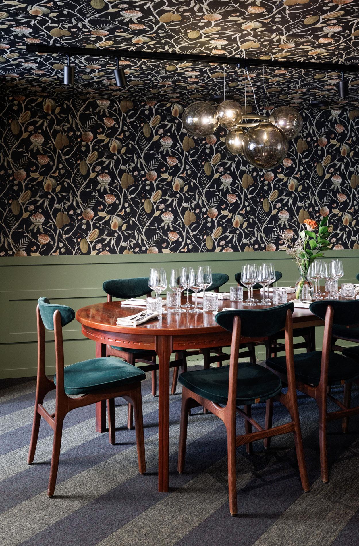
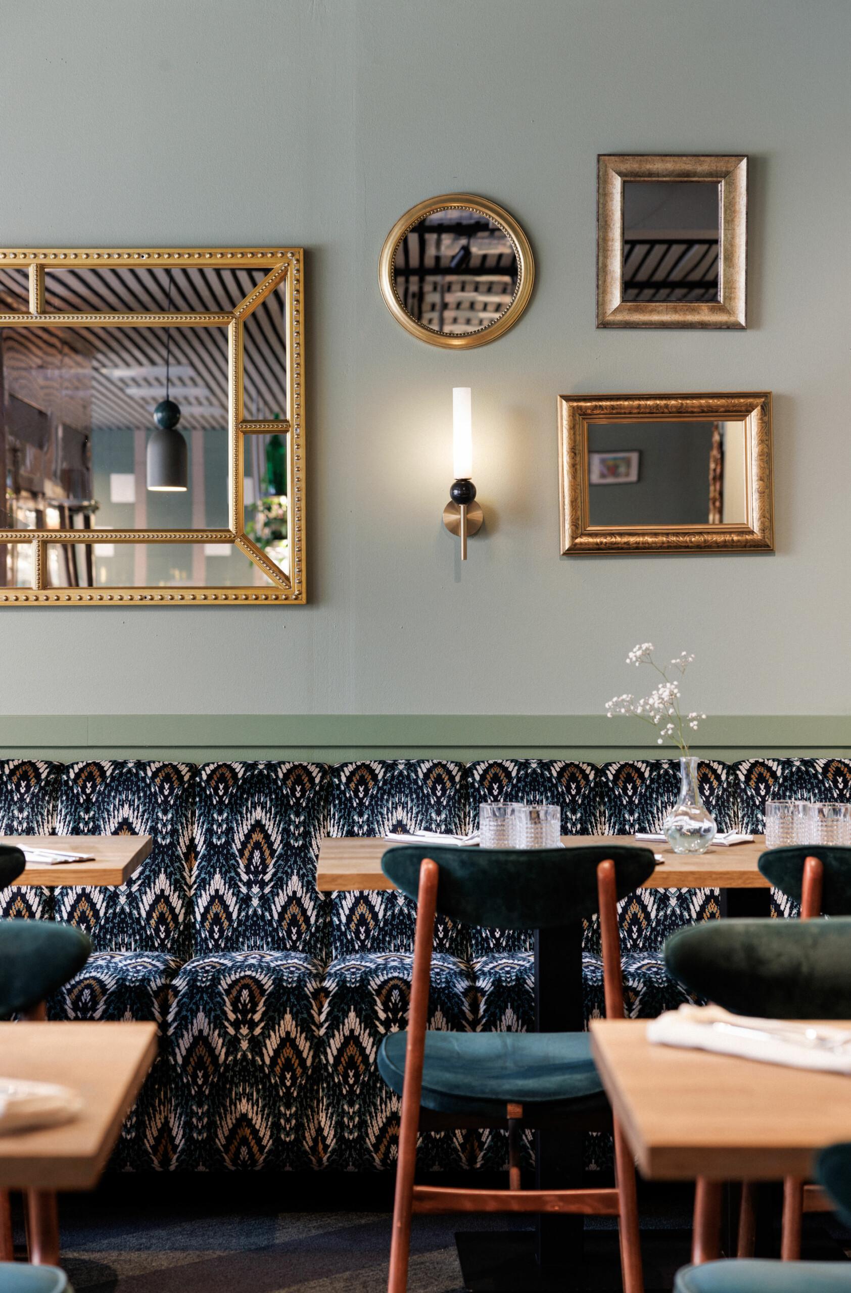
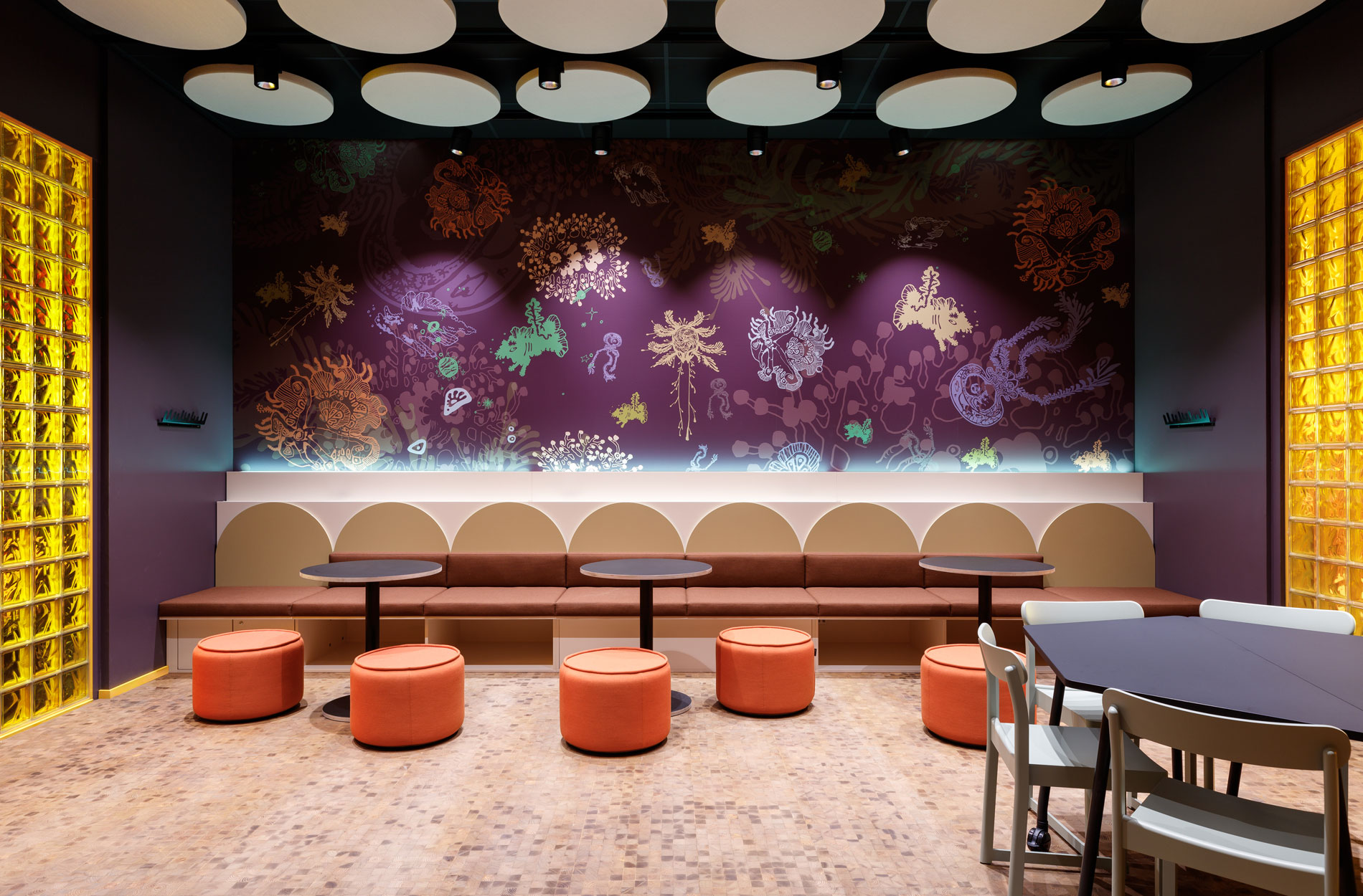
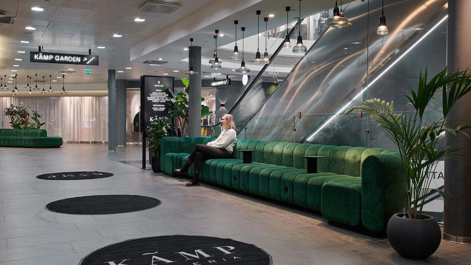
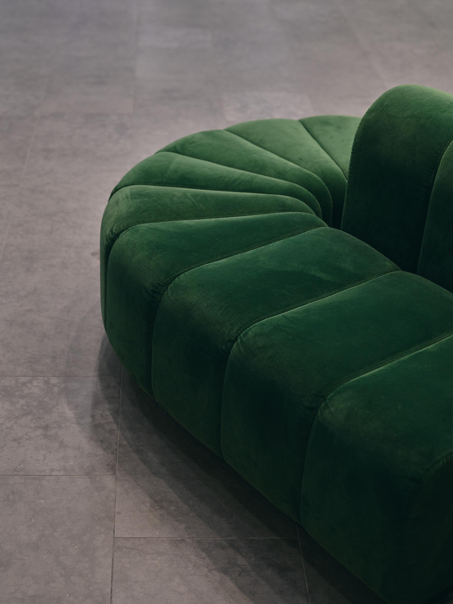
The four-person seating group is also suitable for two solo customers, thanks to the green dividing element.
The focus areas of the design were:
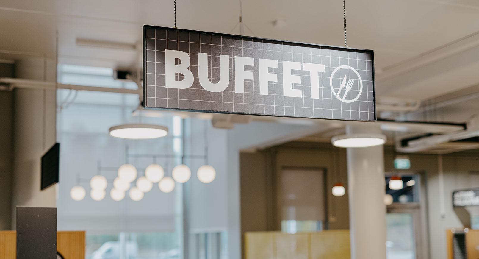
- Functionality: smoother customer flow and product display
- Atmosphere: warm and cosy look, different from large cafe chains
- Implementation: availability of materials and furniture, cooperation between different actors
The interior design choices, which were made on a tight schedule, turned out to be very good choices and the owners were happy with the result: “We got a clear, original and distinctive look for Cafe Hugo. The whole design was carefully thought out and the brand colours were incorporated nicely into the space. We’re really pleased that we also had the courage to make bold choices,” says Riina Rajapuro, who is happy with the renovation.
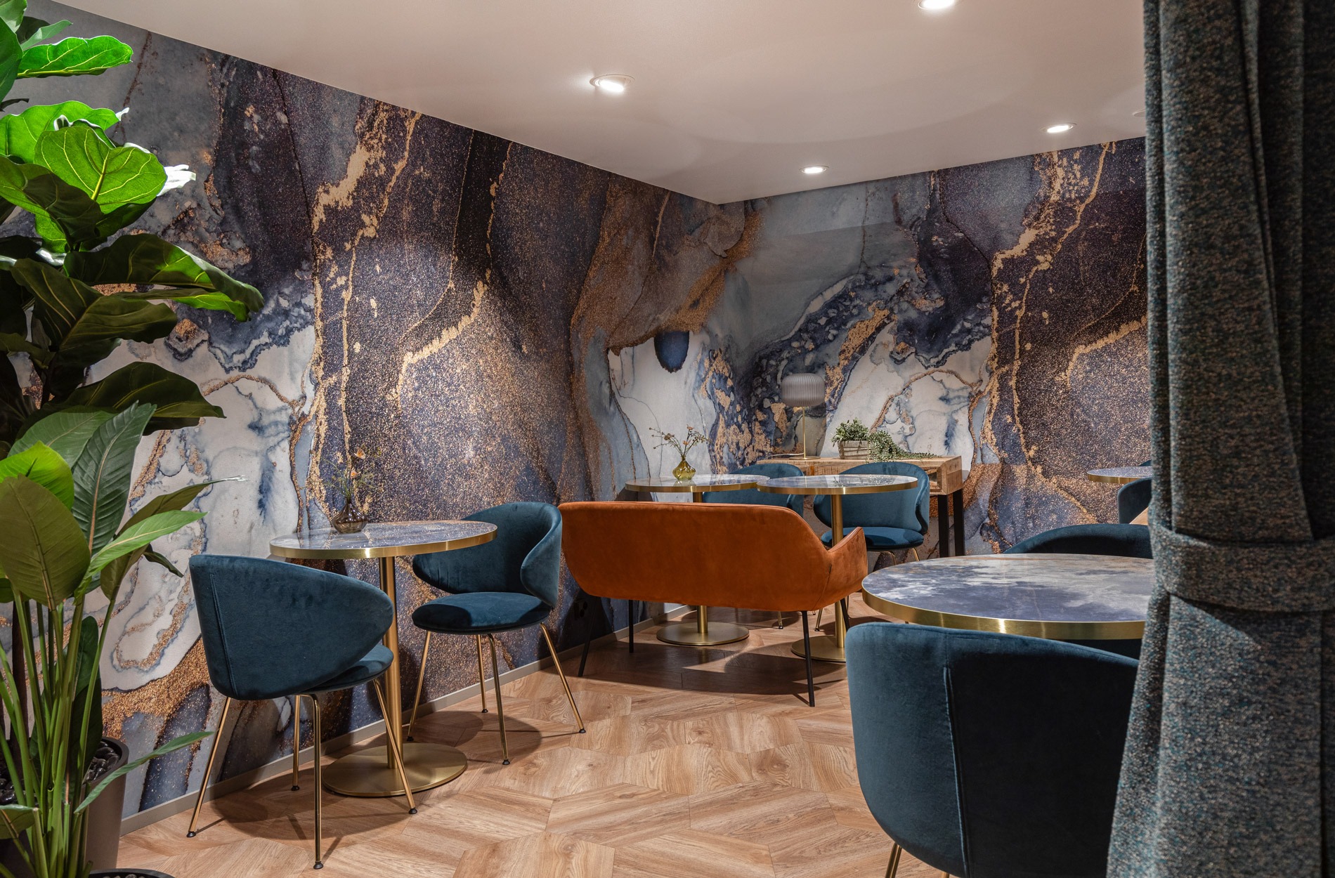
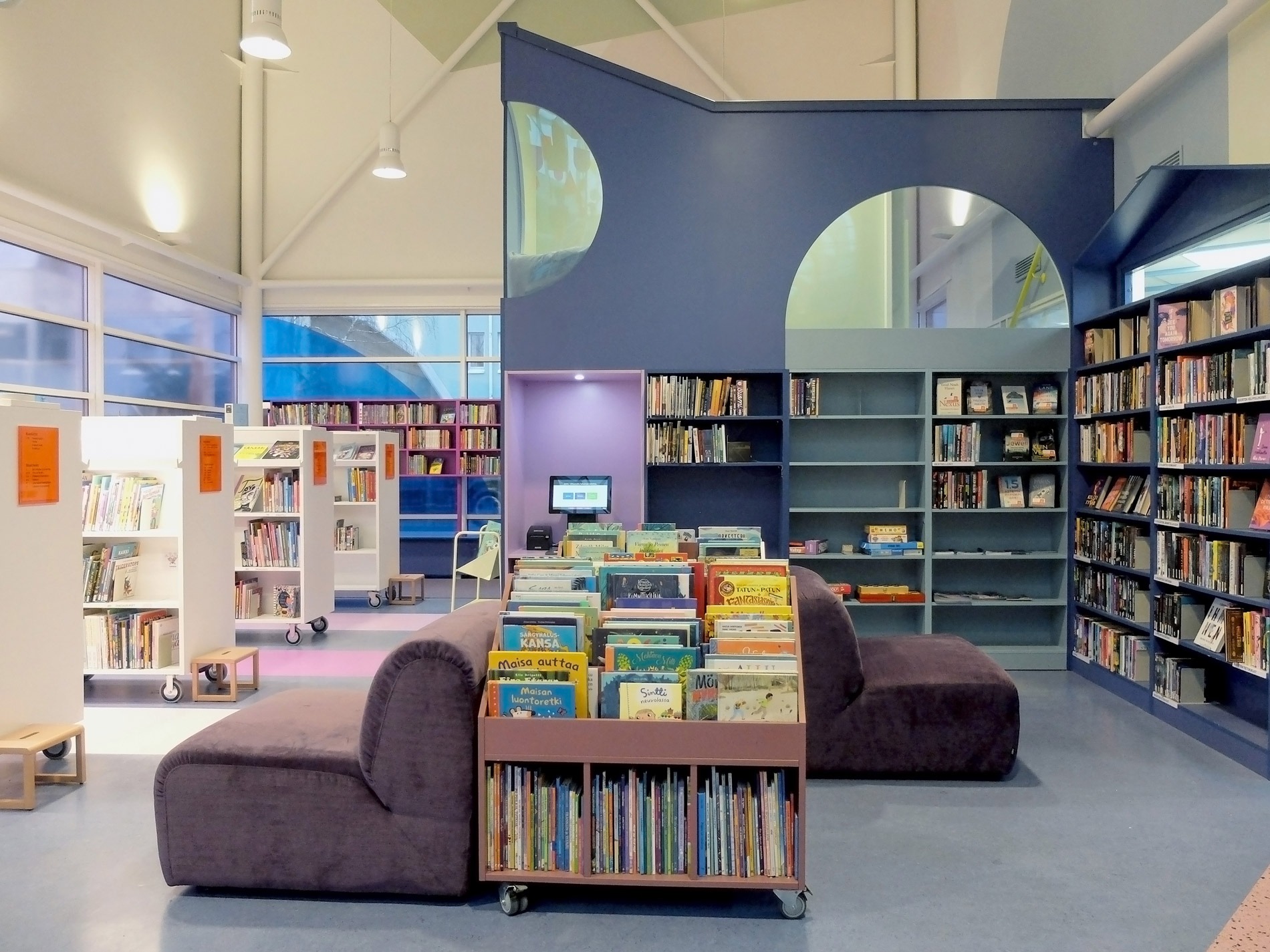
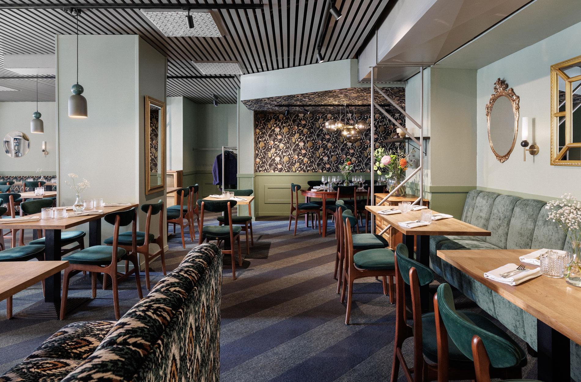
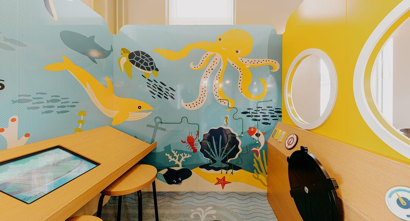
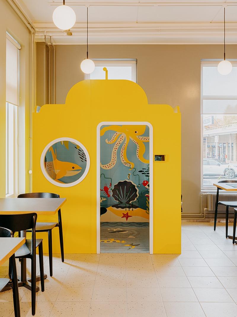
The cosy "Hugo's Corner" can be separated from the rest of the cafe area with curtains, making it suitable also for larger groups.
Spatial changes make the salespersons' work smoother and the customers happy
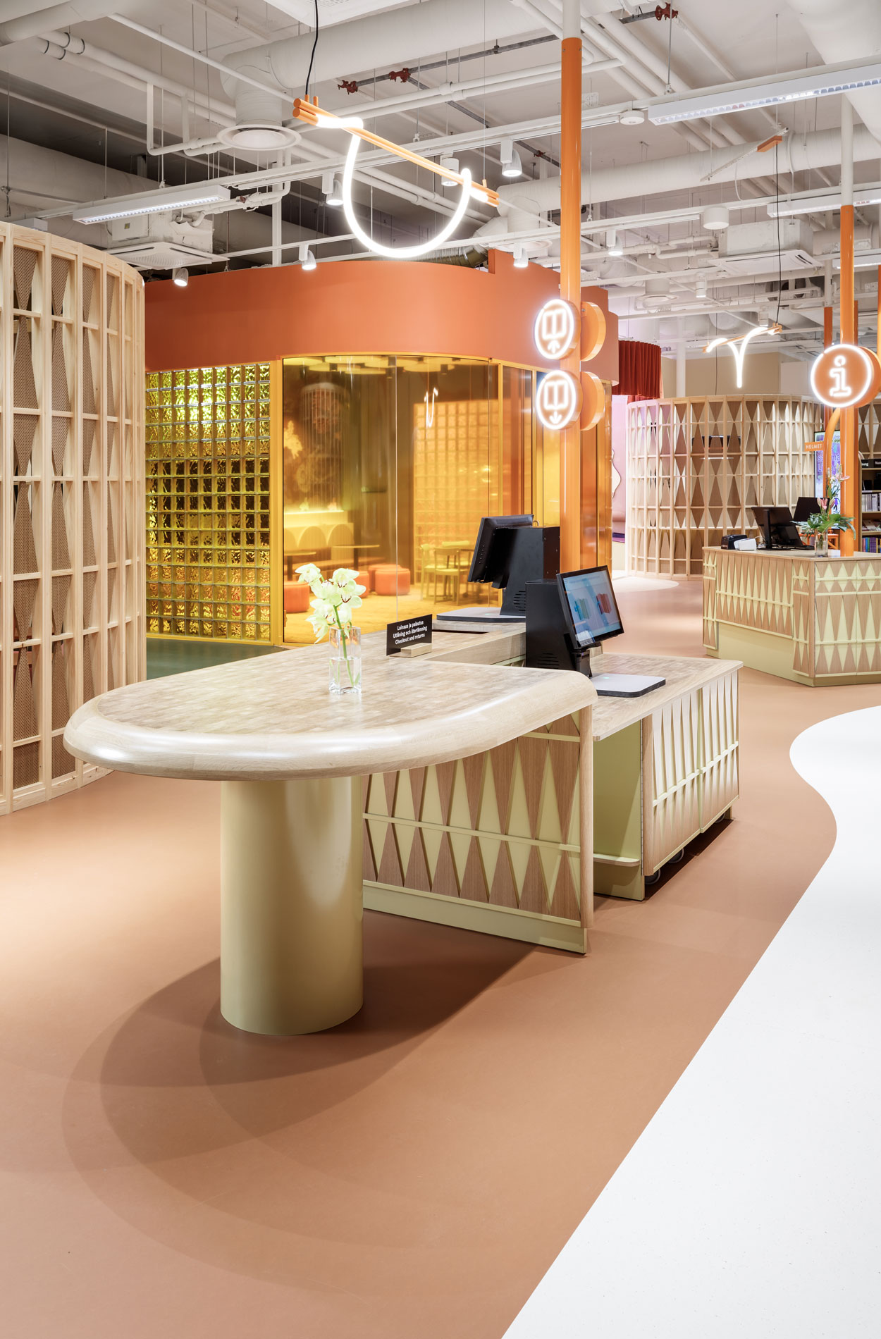
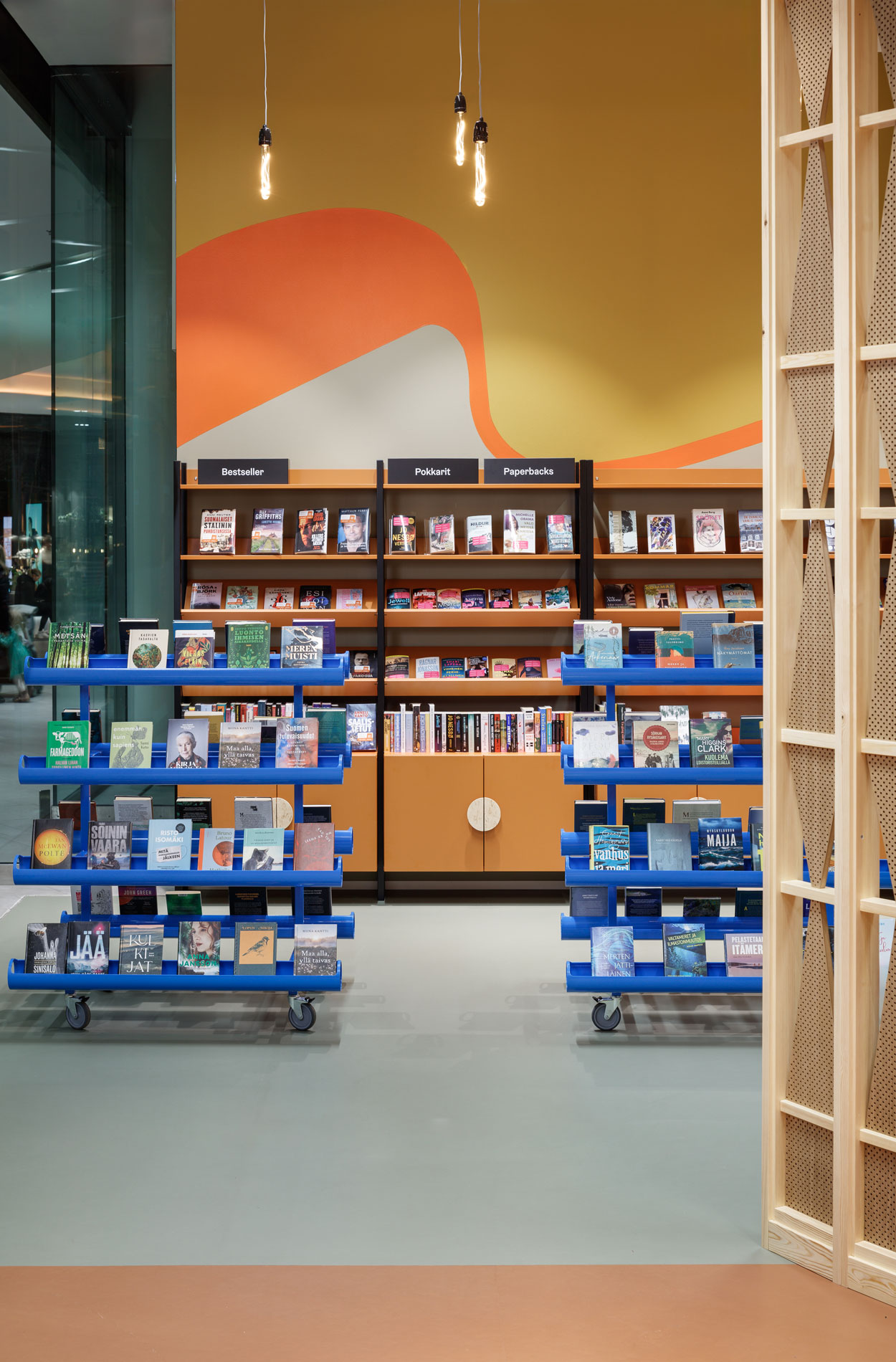
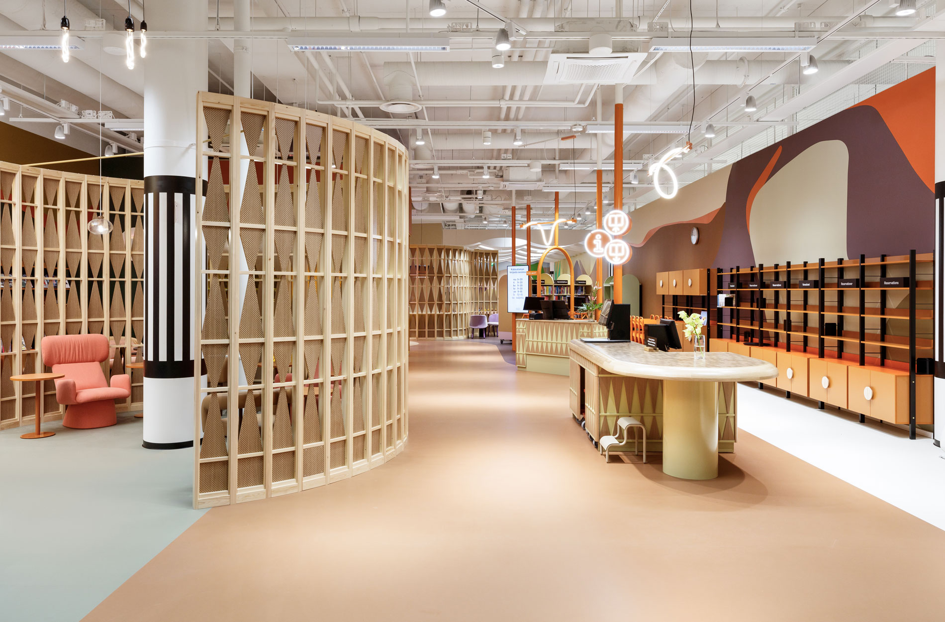
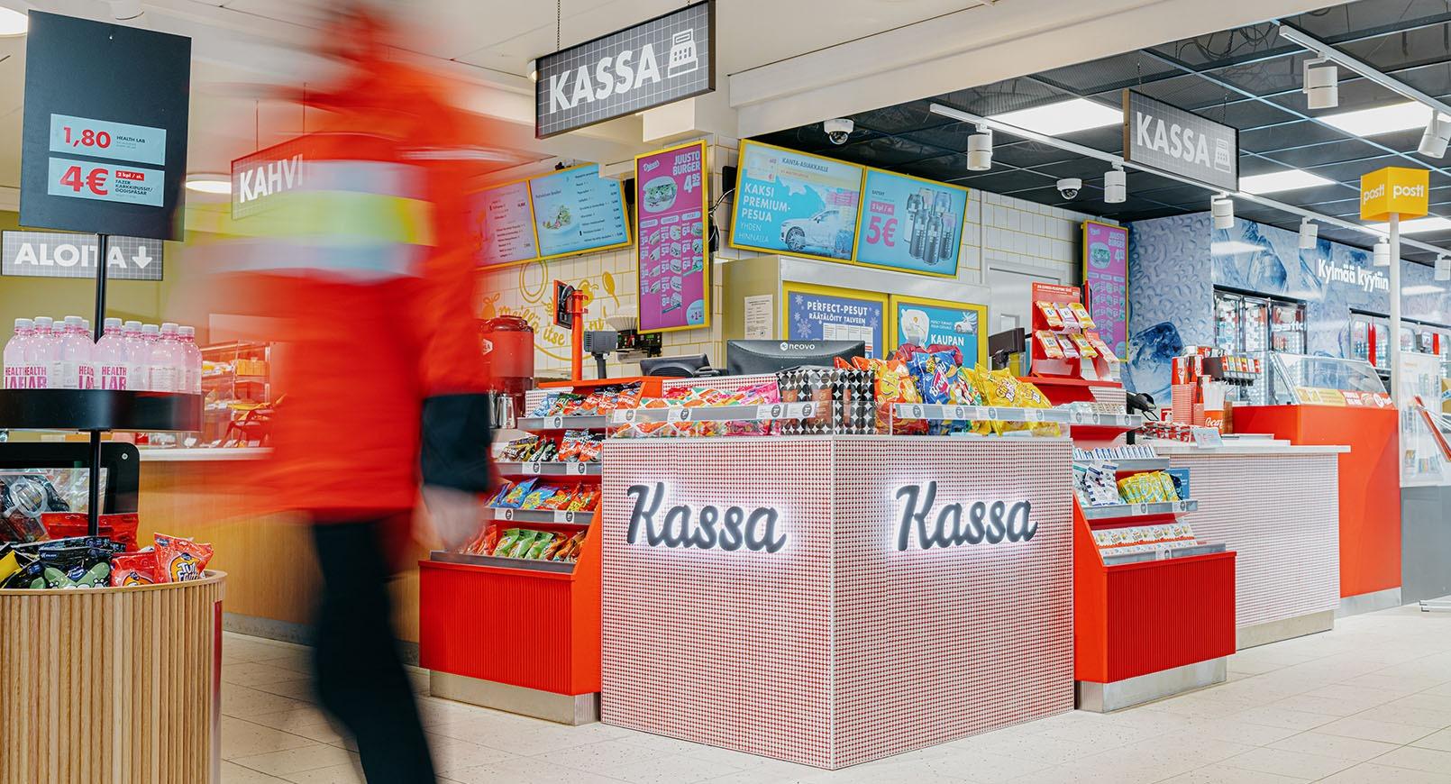
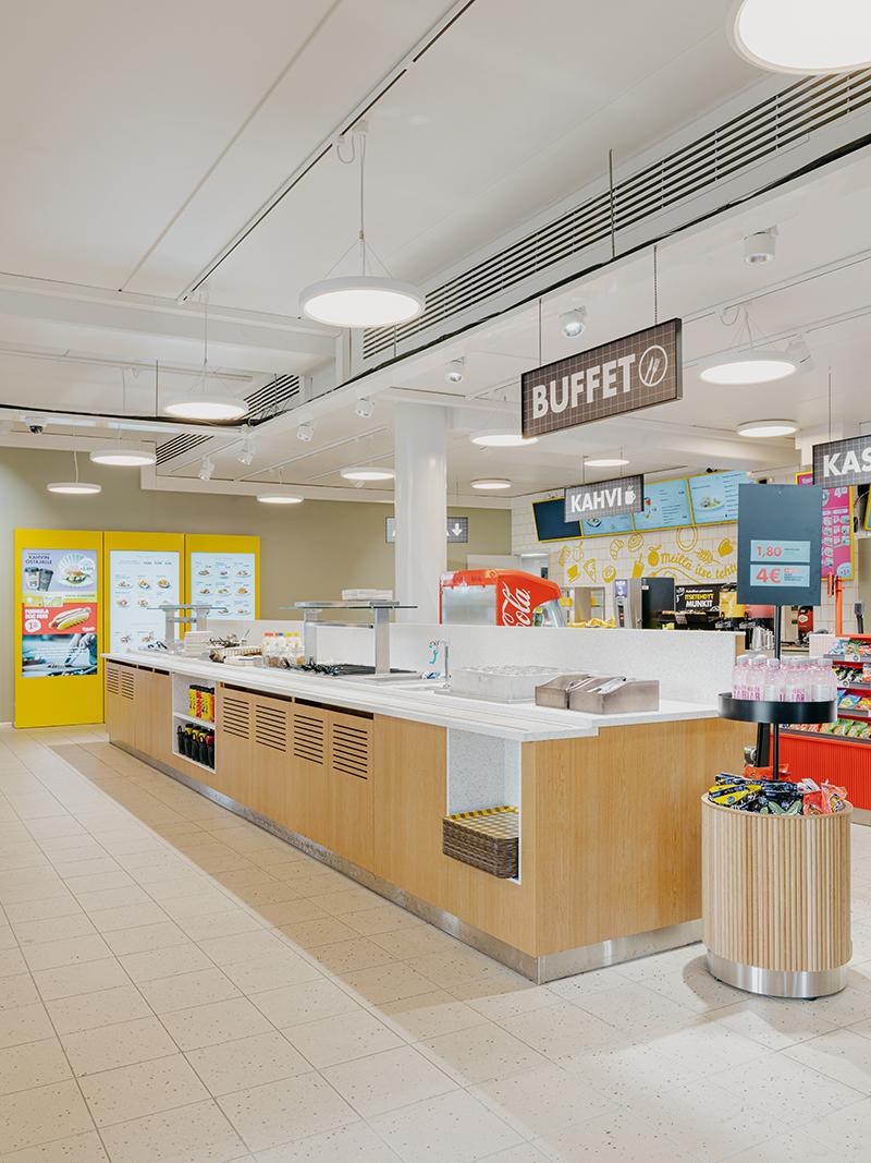
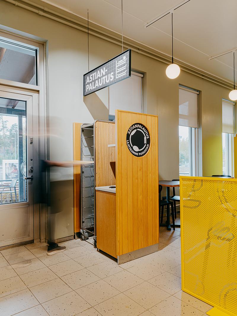
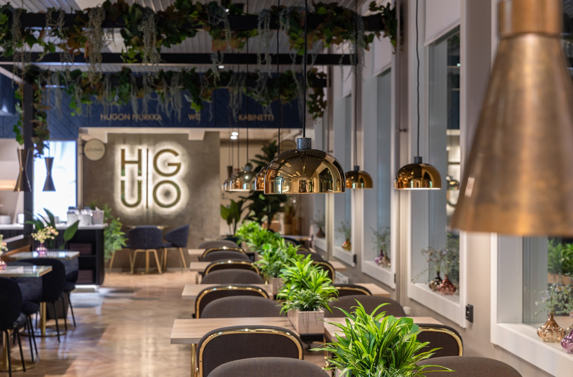
The biggest changes in terms of the use of the space were the combining of the lunch and cafe counters into a single counter and the addition of a pergola that separates the cafe area as well as a display area.
“Functionality was the top priority. However, we made a change to use a single counter for queuing so that the lunch and cafe queues start at opposite ends of the counter. The pergola, on the other hand, separates the cafe area from the queuing area and thus contributes to a calmer experience for customers. We also added spaces for displaying products on the other side of the pergola and at the entrance,” says Aino Keto, Design Lead, explaining the design principles.
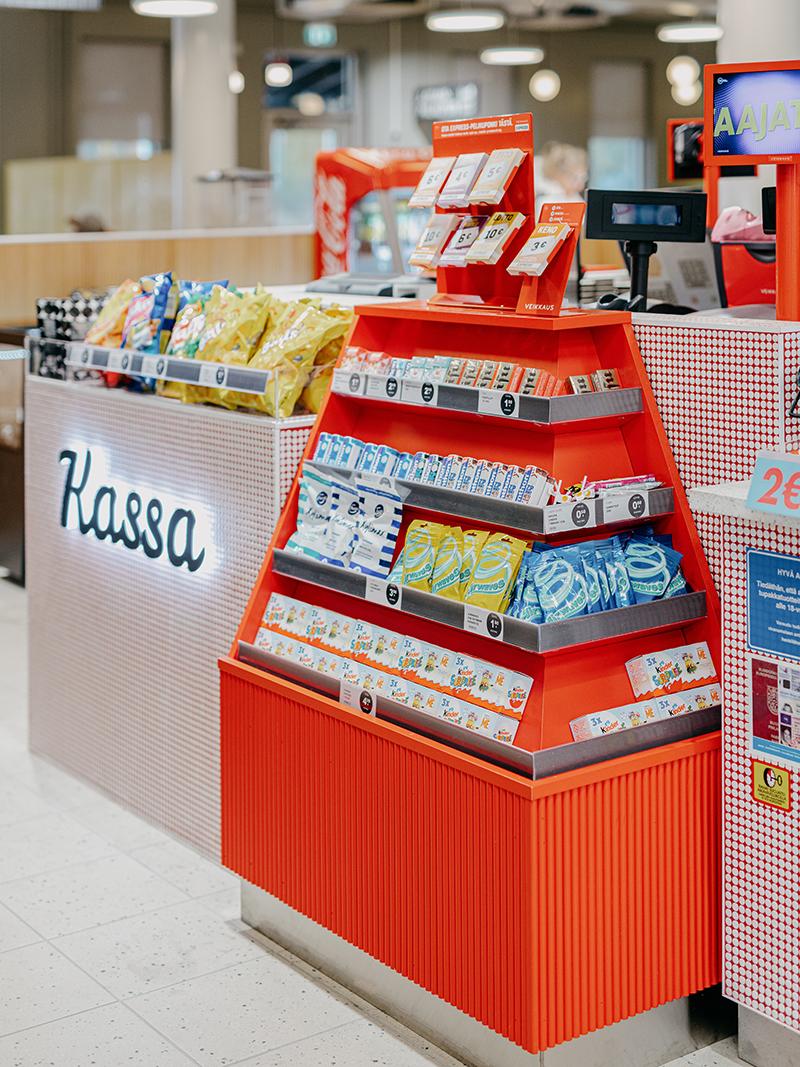
“The shop is quite busy, but it feels peaceful because the renovated shop is so functional. Now, all checkouts are equal and we can highlight our seasonal products even better,” Reko says.
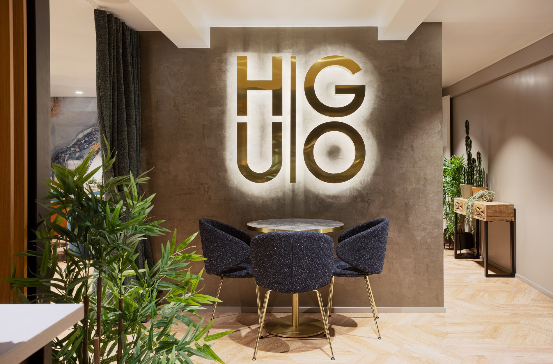
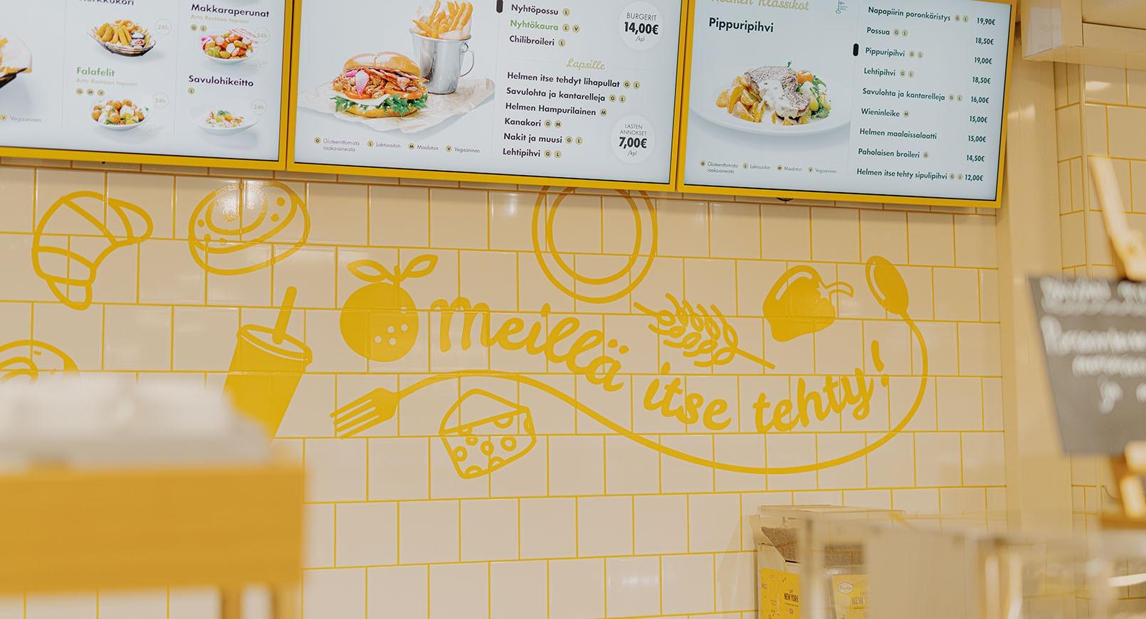
A photograph-worthy logo wall that attracts attention as soon as you enter was designed for the cafe.
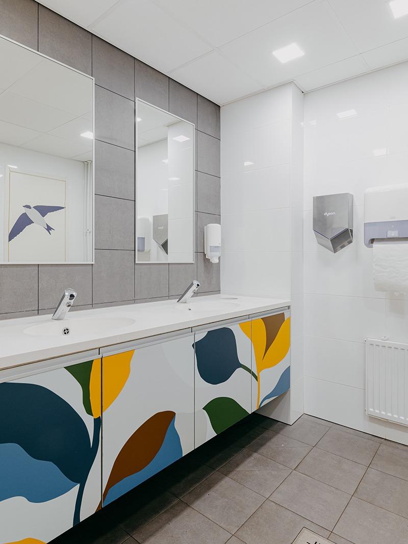
As Cafe Hugo is visited by approximately 500 customers a day, all the new surfaces and furniture were selected with durability and easy cleaning in mind. The project also made a lot of use of things that were already in place; for example, the suspended ceiling and the related general lighting were retained. A key idea was to make the existing look a natural part of the new look on a tight schedule.
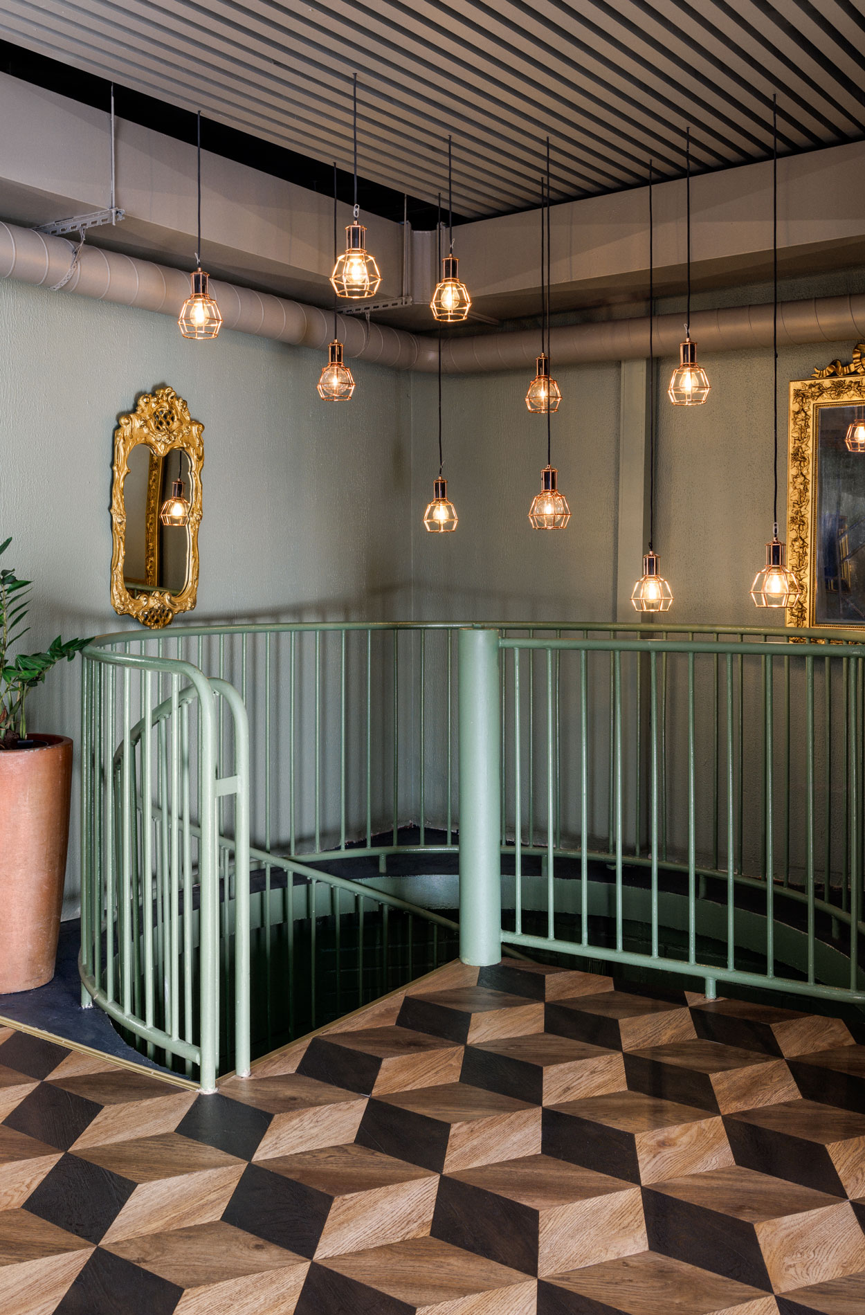
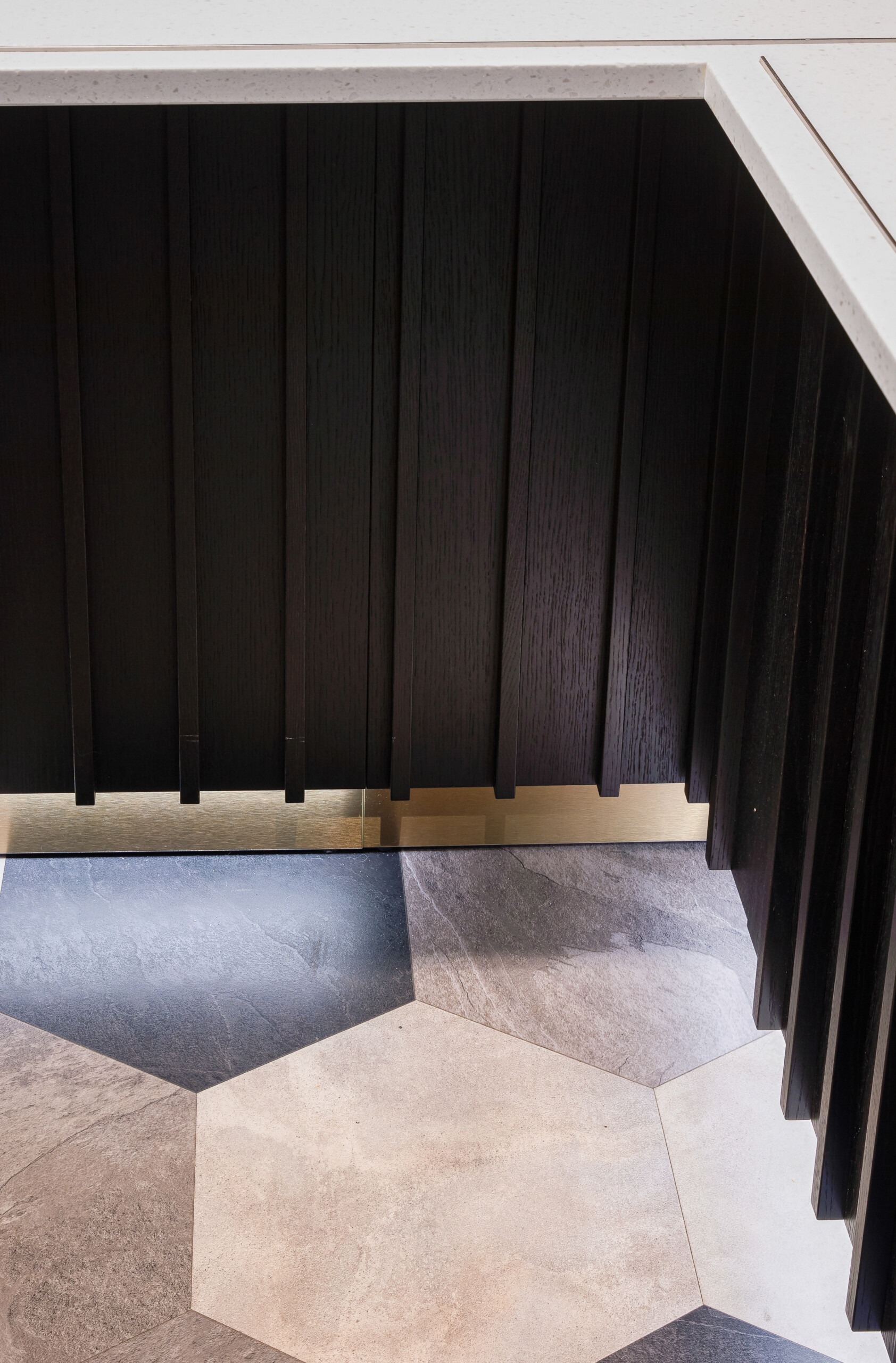
The owners are particularly pleased with the bold flooring. “The floor was in poor condition, but it was not possible to dismantle it in a week, so we decided to install adaptable and mud-resistant vinyl tiles on top of the existing floor. The floor also acts as a guiding element, as the way in which the vinyl is laid and the tone are different in the service and cafe areas,” Aino says.
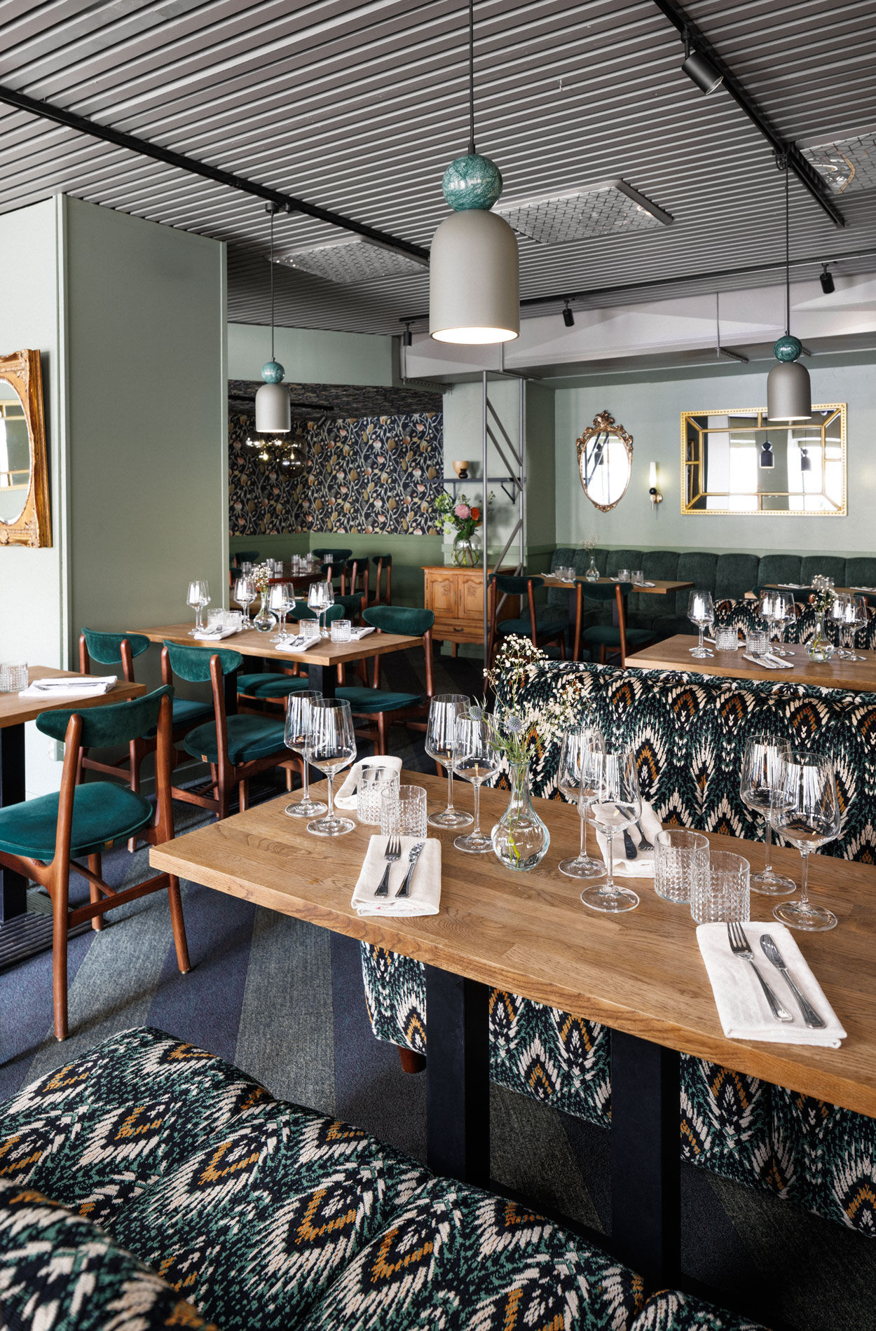
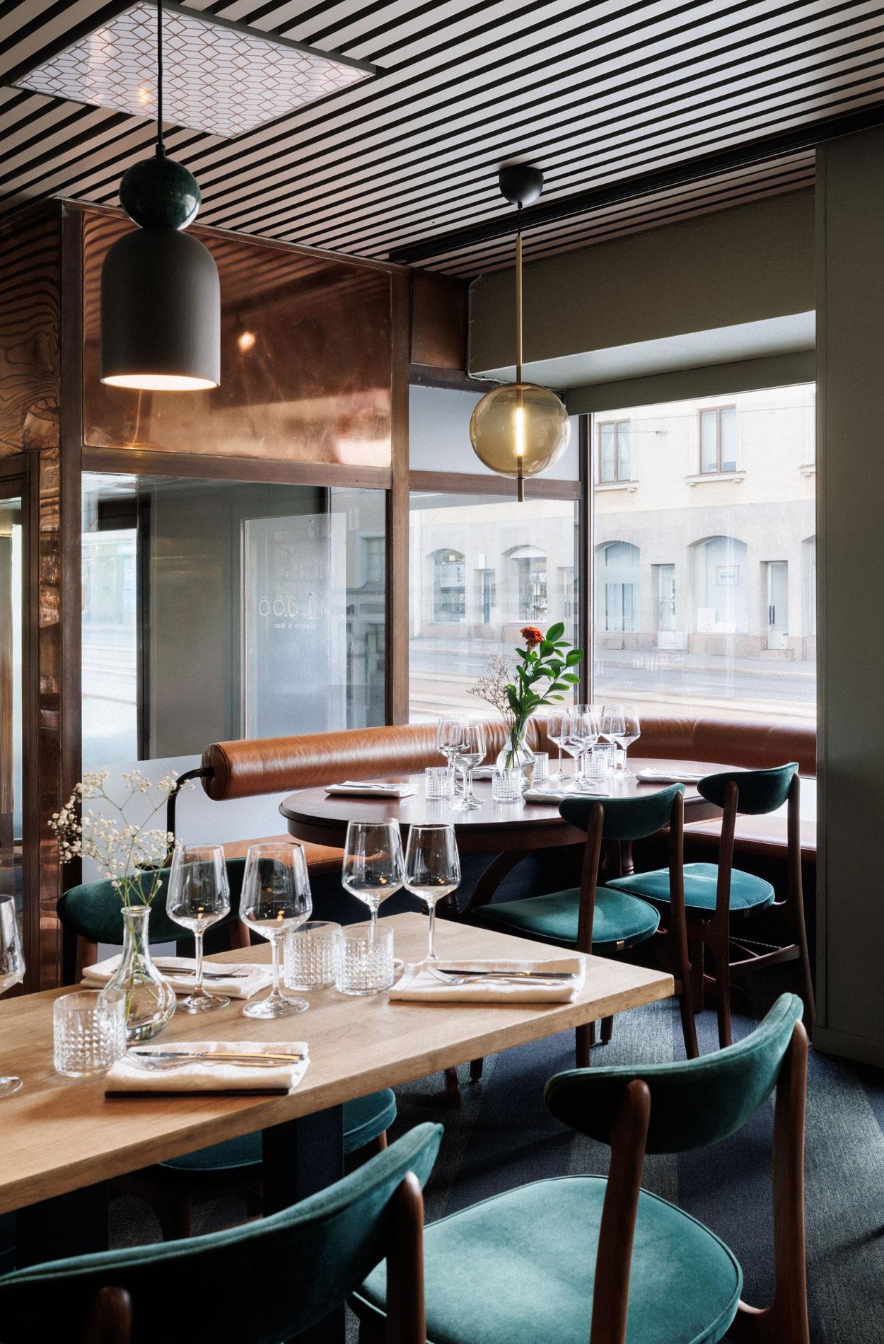
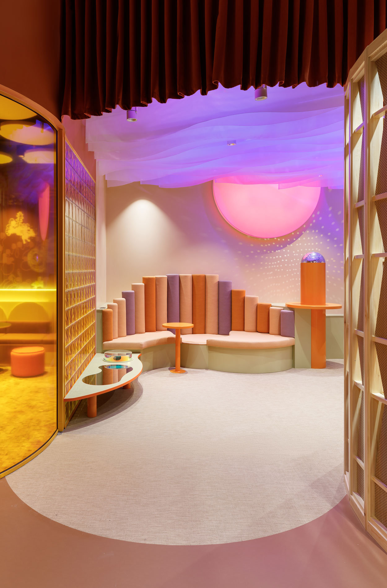
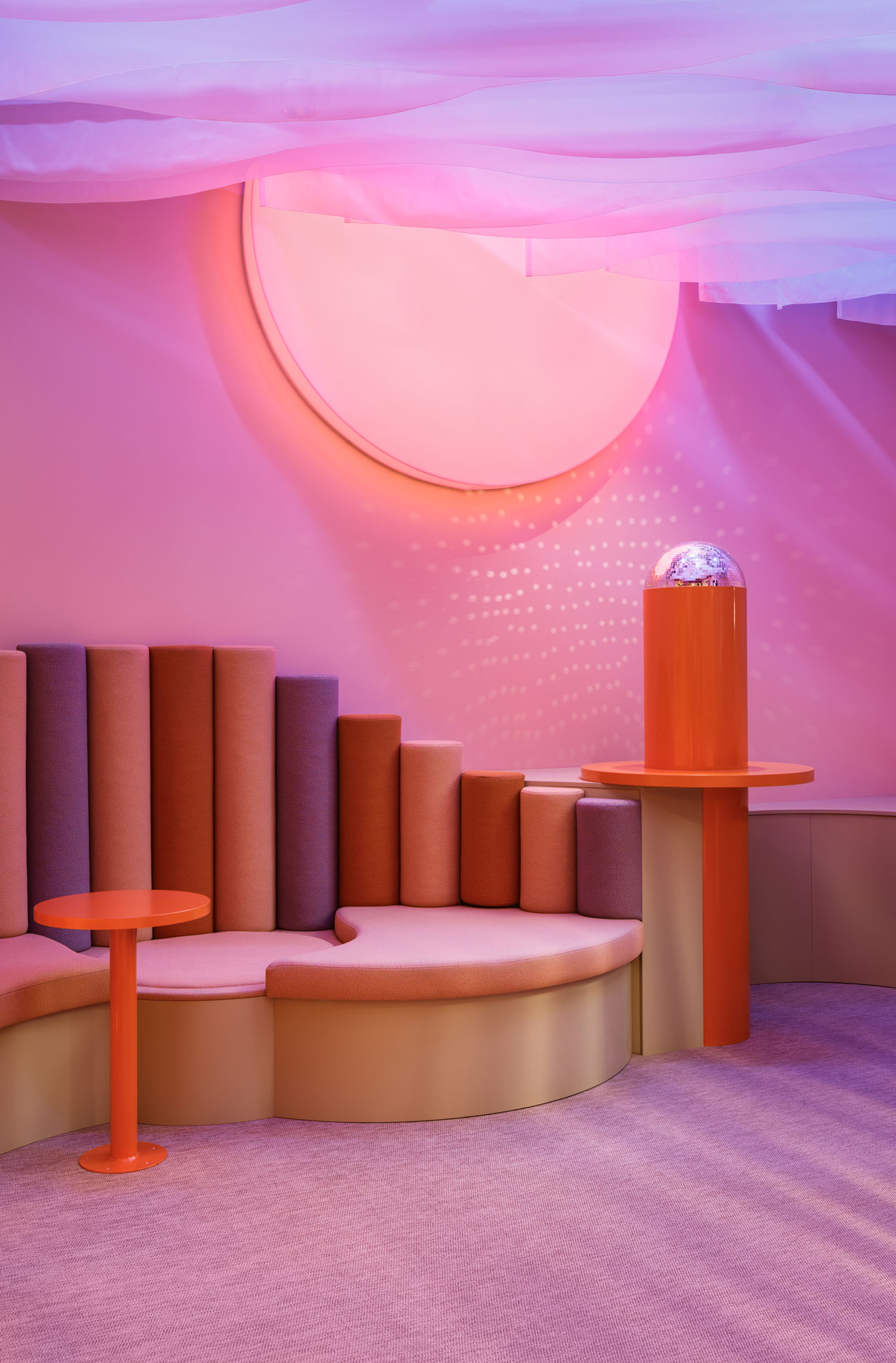
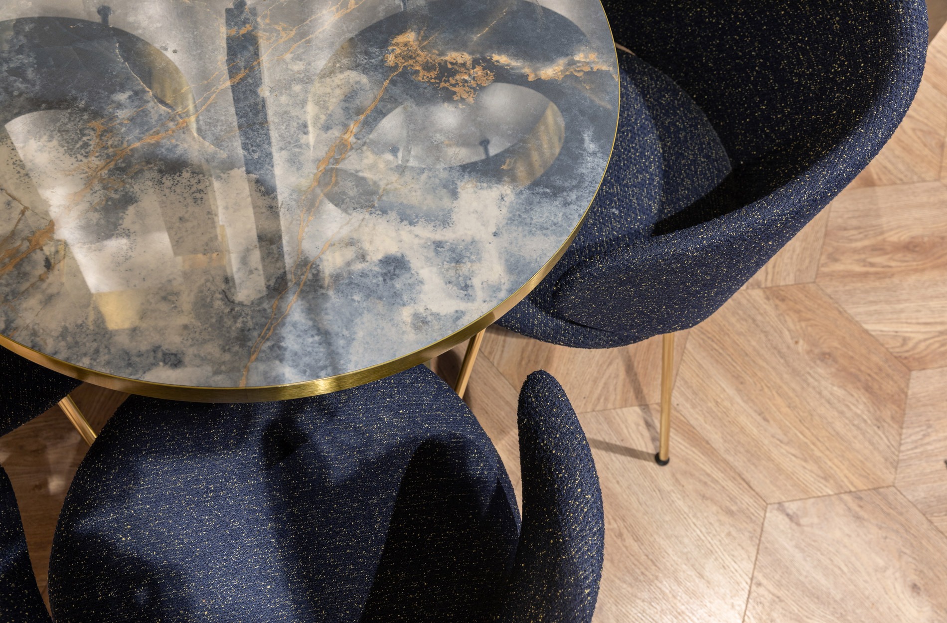
“On the other hand, we aimed for variety in the furniture, which creates a cosy atmosphere. The cafe has seating groups of different types, sizes and looks, so you can choose the one that suits you best,” Aino adds.
As Cafe Hugo is visited by approximately 500 customers a day, all the new surfaces and furniture were selected with durability and easy cleaning in mind.
All in all, the renovation has been well received by customers, staff and the owners, and it has increased the number of visitors to the cafe: “We are super happy that we carried out such a comprehensive revamp. People in Klaukkala’s groups and elsewhere have told us that this is exactly how a high-quality renovation is carried out,” Riina says.
Photos Maria Putaansuu
Would you like to learn more?
Let’s talk! We offer everything from strategy to design and vision to implementation.
You can also read an article by the furniture supplier Restatop about the renovation of Hugo (in Finnish).
Get familiar with other similar projects