Triotto - A versatile
property concept
to support renting
- SCOPE
- Avanto Property Team
- Helsinki
- Real estate
- 6500 m²
- Insight
- Co-development
- Concept development
- Spatial design
- Graphic design
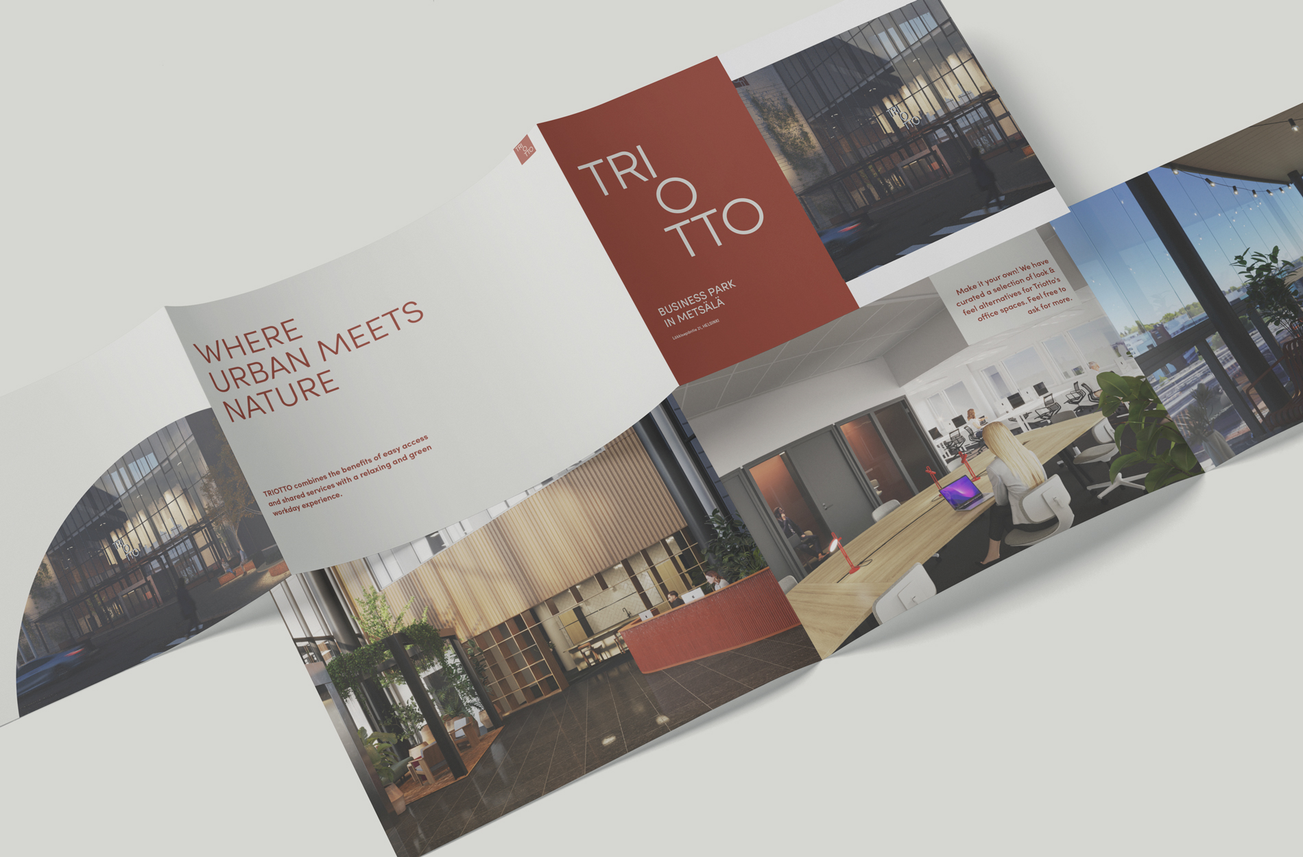
Located next to Käpylä train station, Triotto was renovated into an attractive mixed-use property. We were responsible for the commercial concept, visual identity and spatial concept for the office property, and for the design of the marketing material. The project was carried out together with Avanto Property Team, which manages the property, and the German real estate investor SICORE Real Assets GmbH. The inspiration for the new concept was to merge the property’s postmodern architecture into the green atmosphere of the Puu-Käpylä neighbourhood.
Turning an empty
property into
a vibrant
business village.
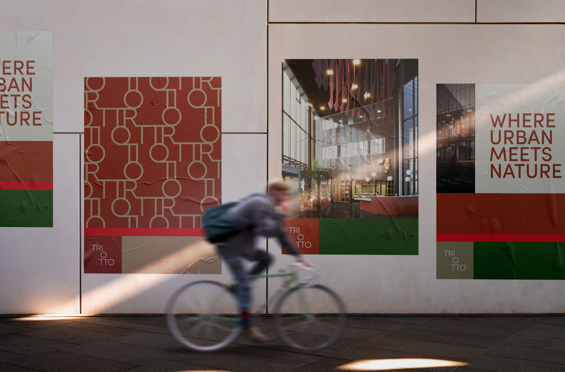
With the help of examples, we illustrated how Triotto’s new identity can be visible not only in the property’s logo, but also on posters that promote renting, for example.
Dive in – read the full project story
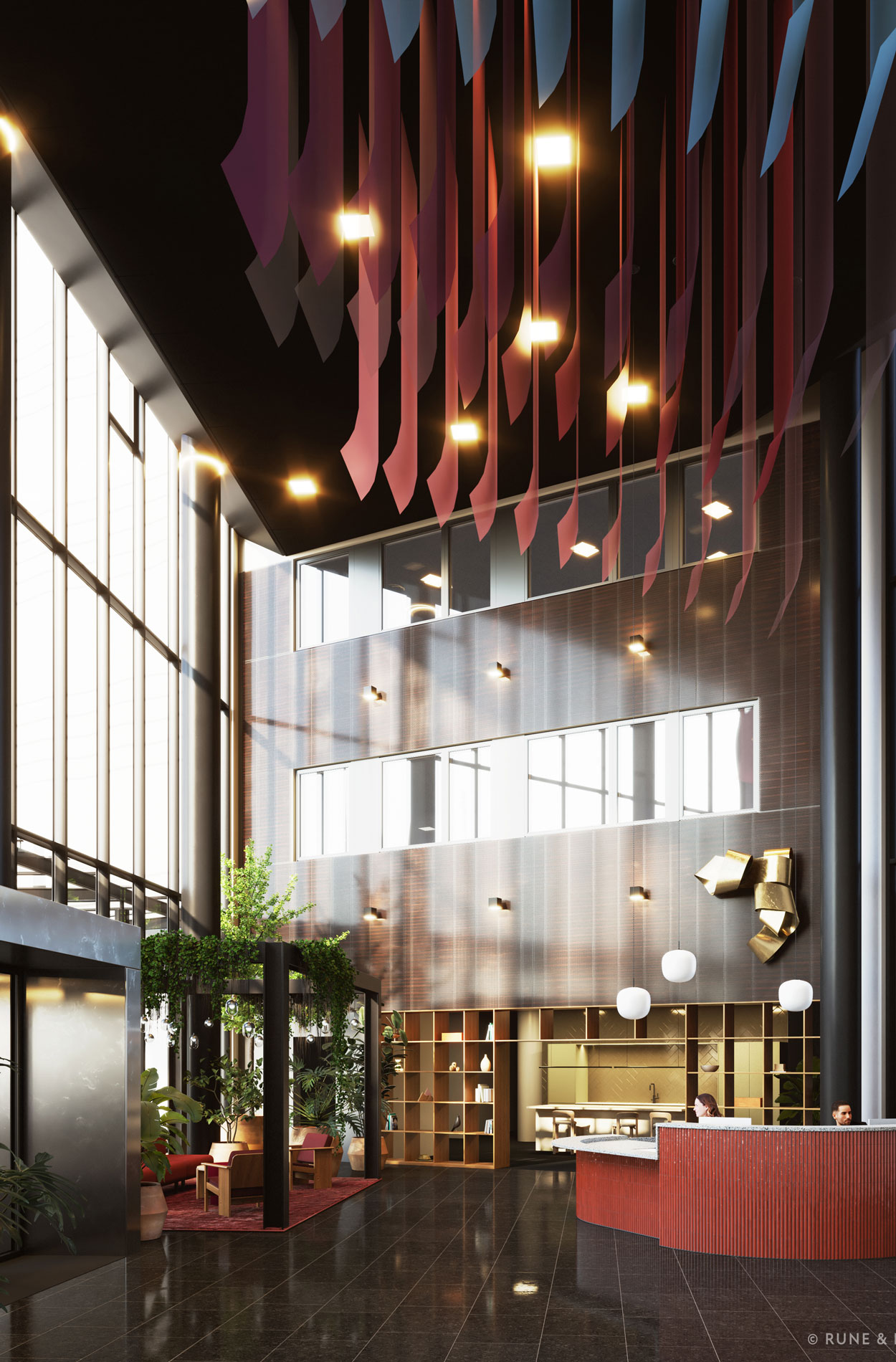
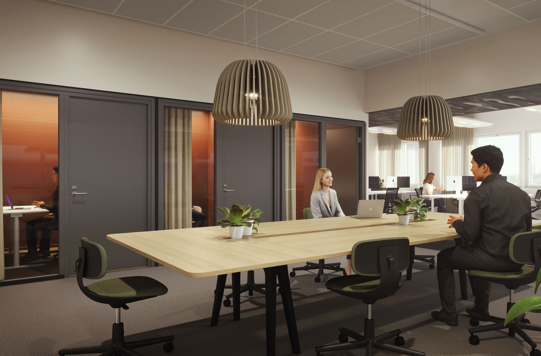
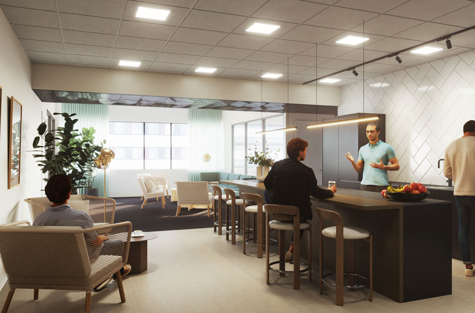
Triotto was originally completed as an office property for two tenants in 2012. When one of the anchor tenants relocated to new premises, the services and spatial layout were updated to accommodate the needs of several tenants. A welcoming lobby was designed on the first floor, along with a working lounge and multi-purpose meeting rooms, which are available to all tenants. Floors 2-7, on the other hand, were devoted to the tenants’ own offices and divided into leasable areas of different sizes.
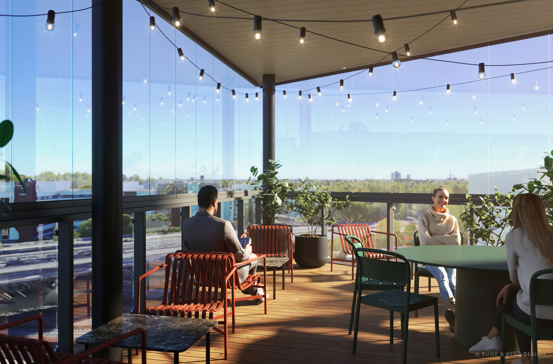
Postmodern business village
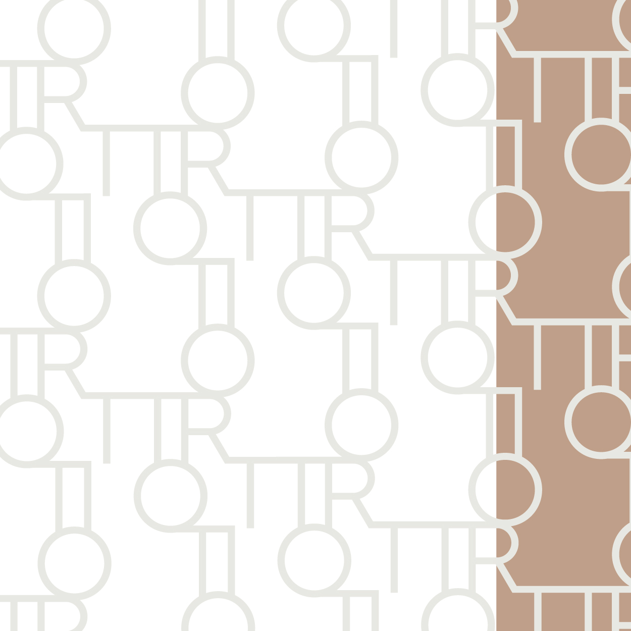
The theme of Triotto’s new concept is “postmodern business village”. The recognisable red colour of the property’s facade and the postmodern architecture were turned into a strength in the exteriors and interiors. These were paired with the green and relaxed atmosphere of the nearby Puu-Käpylä neighbourhood through the choice of colours, furniture and graphic spatial design. The colour scheme of the kitchens and surface materials on the office floors, on the other hand, was kept neutral so that each tenant can build an atmosphere that suits them with furniture and decorations.
“We wanted to make Triotto an attractive property for new users,” says Roosa Nieminen from Avanto Property Team, who is responsible for renting the property.
The concept is based on an observation of the current state of the property, analysis of selected benchmark properties and workshops held with the owner and lessor. Particular focus areas in the design were visual differentiation from other nearby office properties, a selection of services that would meet the needs of different tenants and the number and availability of leasable premises. During the project, we also brought our view of the local business premises market to the attention of the German owner to ensure that the renovated premises and services act as a guideline for the development of the property in the long term.
The renewed Triotto stands out in the neighbourhood and marketing
The project resulted in floor plans and 3D images illustrating the leasable premises, a concept presentation and interior design plans covering the first floor. The first floor will be renovated completely to create a memorable first impression. The renovation of the lobby began in September 2025. There are ideas and plans for the leased office floors, and these will be specified and implemented depending on the tenants.
The new Triotto concept is more than just a theoretical framework: in addition to the renovated property, it is visible in the Finnish and English brochures and on the new Triotto website. We were responsible for the texts, illustrations and layout of the brochures as well as the visual design of the website. The website was produced by Micromedia.
The current tenant praises the renewed Triotto, and the concept has also raised interest among new potential tenants: “We have been really satisfied with the plans. The property is now more memorable, especially the lobby and the common areas. We have also received positive feedback from the real estate agents and the current tenant, as well,” Roosa concludes.
Triotto combines a central location and convenient services with a relaxing and green working day experience.
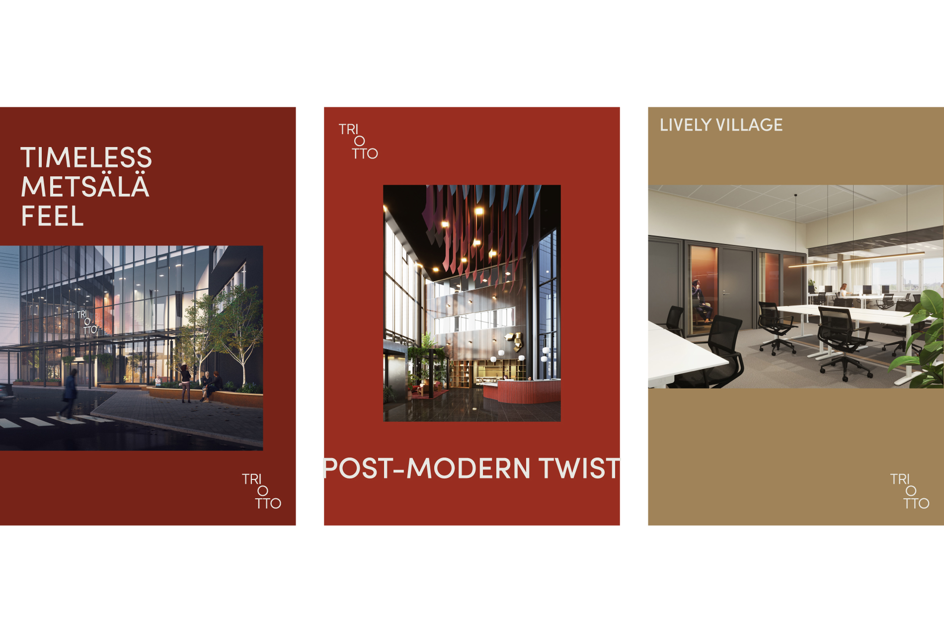
The spaces were designed according to the following objectives:
- Timeless green atmosphere: inspired by the surrounding Puu-Käpylä neighbourhood, inventive use of red, utilising the existing elements.
- Postmodern design idiom: postmodern simplicity, framed shapes, carefully selected visual highlights.
- Lively community: relaxed atmosphere with good services, homely interior design choices, suitable for different tenants.
The brochure and website summarise the concept.
“The property’s new logo and interior design emphasise postmodernism. We turned the ’90s tin brutalism and signature red into an asset in Triotto.”
– Riikka Kuukka, Art Director, Rune & Berg Design
Would you like to learn more?
Let’s talk! We offer everything from strategy to design and vision to implementation.